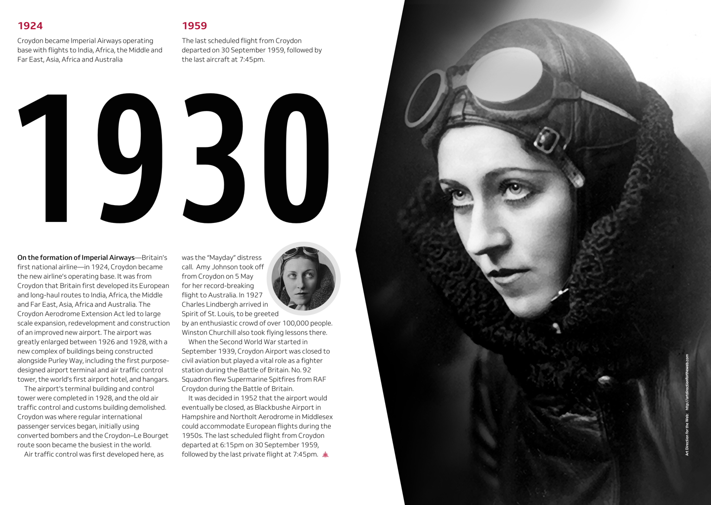
A memo to product and website designers
With modern CSS properties including Grid, Flexbox, Multi-column, and Shapes, designers have countless opportunities to make diverse, and engaging designs. Sadly, many of us haven’t had the memo which gives us permission to make more interesting work, so I decided to write that memo. Feel free to modify the message for your company or organisation and of course, circulate it to the designers on your team.
Memo to designers
Team
For years we’ve told each other the web isn’t print. We’ve told ourselves the things we admire in other design media cannot—and sometimes should not—be used online. We needn’t think that anymore and I’m writing to tell you about five design techniques from other media we can accomplish on the web today. These will make the web more interesting to work on and for people who use what we make.
Aligning elements to flowlines
In print media, it’s common to see elements aligned along their bottom edges. For example, we often see captions aligned to the bottom of an image instead of its top.
In the past, aligning elements to anything other than the top of their boxes was difficult to accomplish, but today we can align items easily to the bottom, center, or top using just a single CSS Grid or Flexbox style. There’s also no reason why captions need to stay underneath images as with a couple of lines of CSS we can place them above, left, or to the right of a picture.
Bespoke and diverse grid layouts
Frameworks including Bootstrap made layout easy and their off-the-shelf grids were useful when implementing responsive designs because their twelve columns are divisible by four, three, and two. Sadly, using the same grid time and time again meant our designs were often barely distinguishable from one another.
Today, modern CSS properties including CSS Grid and Flexbox make it just as easy to implement a diverse range of layouts including column, compound, and modular grids. Designing our own grids will help make our products and websites more distinctive.
First-lines and initial letters
Just like in the offline world, attention to typographic details makes a big difference. Drop and initial caps can be both decorative and useful in that they mark where someone should start reading. Initial caps sit on the baseline and drop caps fall below it.
On magazine and newspaper pages, you’ll often find the first word or line in the first paragraph emphasised in some way. Sometimes set in bold, other times uppercase. Drop caps, initial caps, and first-line treatments are rarely seen on the web but are easy to accomplish using CSS.
Irregular shapes
One of the complaints levelled at website design over the years has been that it’s boxy and rectangular. This was true, to an extent. However, boxy layouts needn’t now be the norm. Organic shapes add movement, which draws people to them and helps to connect an audience with a story.
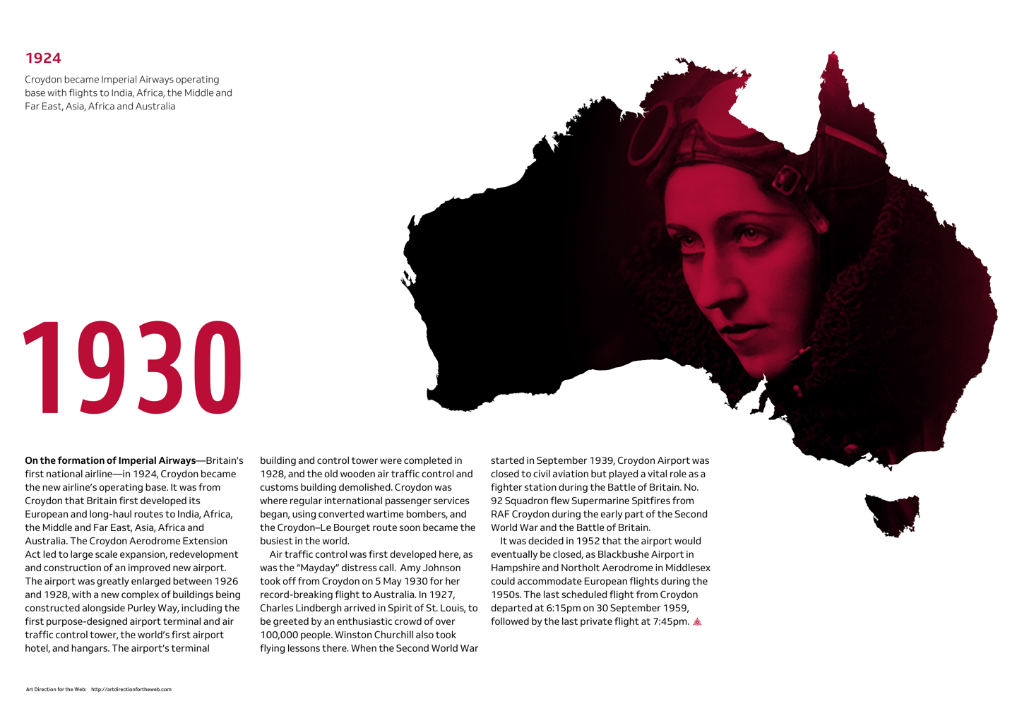
Thankfully, we don’t need to struggle with hacks any more, because CSS clip-path and Shapes make using irregular shapes more accessible for the web.
Wrapping text around shapes
One aspect of print design we wished was more easily achievable on the web was wrapping text around irregularly shaped images. For years developers dreamt up elaborate hacks using presentational HTML in a series of attempts at emulating print layouts. Thankfully, we don’t need to struggle with hacks any more.
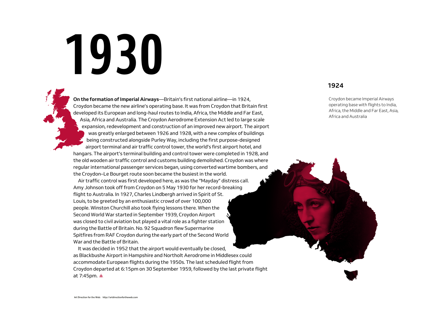
CSS properties like clip-path and shape-outside give us countless opportunities to use art direction to capture someone’s attention and then keep them engaged.
Sources of inspiration
Of course, there are more than those five ways to make designs which are engaging and interesting. Finding those ways is your job as a designer, but here are five places you can look for inspiration:
- Editorial design
- Graphic design
- Magazines
- Posters
- Literally everywhere other than the web
What do do next
- Experiment with new and unexpected design ideas. Use your imagination without limiting yourself to making designs you’ve been told in the past were difficult to implement or inappropriate for the web.
- Share what you make without feeling self-conscious that what you produce has value. You never know, often the simplest idea can start you and others down an unexpected path.
- Write about what you make—preferably on your own blog—and describe what you were trying to achieve, the inspiration you found, and the steps you took along the way.
Modern web technologies have opened the door to opportunities to be creative, not for creativity’s sake but to help us express our point of view and that of our companies and customers. They help us to convey important messages more clearly through design and tell more interesting and engaging stories. Through clever use of these technologies, we can make designs which are distinctive, opinionated, and stand apart from framework-based designs and generic templates. It’s important to remember that these technologies cannot do this alone and we also need creative thinking to bring ideas to life.
Now’s the time to start thinking differently about how we design for the web. Today’s the day we’ll all look back on a turning point in the history of our medium.
Sincerely
____________________
My new book, Art Direction for the Web is available now in beautiful hardcover and digital formats from Smashing Magazine. Buy the book and stream the video course.