First impressions of Typekit
This morning my inbox popped with an invitation to the preview of Typekit, a technology platform that hosts both free and commercial fonts in a way that is incredibly fast, smoothes out differences in how browsers handle type, and offers the level of protection that type designers need without resorting to annoying and ineffective DRM
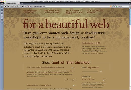
. Back in May I wrote that Typekit will change everything, here are my first impressions of Typekit in action at For A Beautiful Web.
The interface
As you might expect when you combine Jeffrey Veen and Jason Santa Maria, Typekit's interface emphasizes function with understated style. It doesn't try too hard to impress, instead it's quietly confident and self-assured.
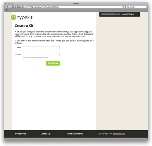
Configuring Typekit
With your account active, create a kit by configuring the name of your site (for Typekit's internal navigation) and its domain name. Each of the kits that you create will be linked to a specific domain.
Installing Typekit hosted typefaces on a site involves little more than copying a few lines of JavaScript into the <head> of your document. The script inserts a linked Typekit stylesheet.
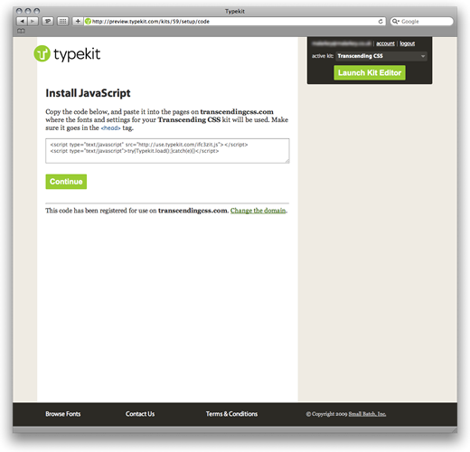
<link rel="stylesheet" type="text/css"
href="http://code.typekit.com/k/xox1rlh-standards.css?12345">
This stylesheet contains font embedding @font-face declarations where, most importantly, the source of your chosen fonts are obfuscated. This is just one of Typekit's layers of copyright protection. (More on choosing these typefaces in just a moment.)
@font-face {
font-family : "skolar-1";
src : url(data:font/otf;base64,obfuscation;
font-style : normal;
font-variant : normal;
font-weight : 600; }
h1, h2, #nav-main a {
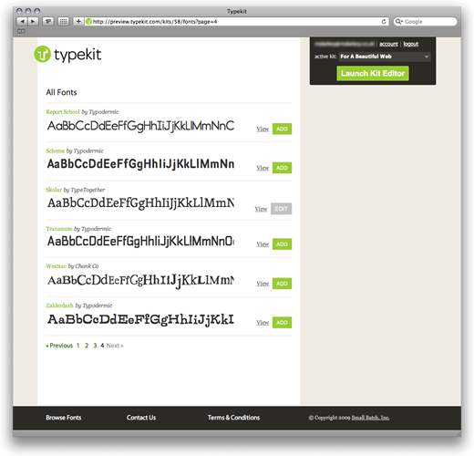
font-family : "skolar-1","skolar-2","Palatino","Georgia","Times","serif"; }Next it's on to browsing Typekit's library of typefaces and choosing one or more for your domain.
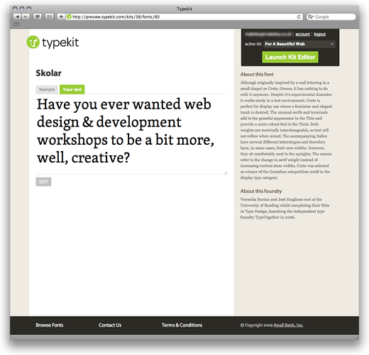
On For A Beautiful Web I'm using Skolar from TypeTogether. As Typekit's handy info panel explains:
Skolar is a text serif which has been originally designed with scholarly and multilingual publications in mind. The typeface maintains its credibility while incorporating a subtle personal style, neither neutral nor conspicuous. Prominent serifs and low-contrast modulation add to its robustness, and together with relatively large x-height, they improve the typeface readability in small sizes. Skolar family of six weights and large character set is flexible enough for complex text settings and editorial work. It becomes distinctive in bigger sizes, thus fitting corporate design demands.
Currently Typekit's available selection is a little thin itself, a situation that is sure to change as more designers and foundries come on board. The browsing functionality itself will need to change too and I would love to see both navigation by type designer and also suggestions from designers like Jason Santa Maria on which combinations of typefaces (serif and sans) work well together. You can preview your choice by characters,

Or by entering your own text.
When you have added typefaces to a kit, launch the Kit Editor to configure, among other things, the CSS selectors to bind your chosen typefaces to your design.
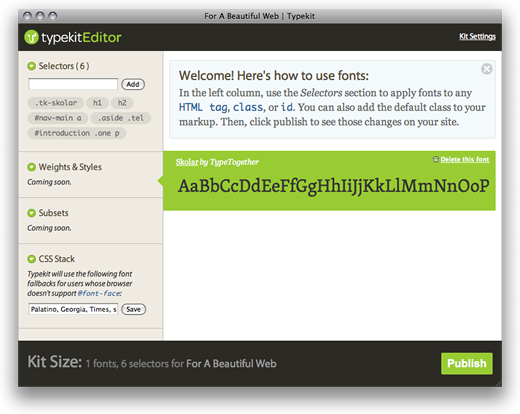
On For A Beautiful Web I chose to use @font-face on <h1>, <h2>, main navigation anchors and the home page's introduction paragraph. More options including additional weights and styles are currently unavailable, but as this screen-shot on Flickr shows, they will include regular, italic, semibold and bold weights (presumably dependent on availability in a font) plus options to choose (or exclude) specific sets of glyphs in order to control the download size of a kit.
Typekit's Kit Editor also allows you to set a CSS stack for users whose browser doesn't support @font-face. So far I've been unsuccessful in seeing this working as this set of BrowserCam images and this screenshot of Internet Explorer 8 (courtesy of Ryan Brunsvold) shows.
The question of type rendering
Studying type rendering closely also calls into question the natural differences between the ways that browsers render type as I discussed in Walls Come Tumbling Down. Safari's text rendering is clearly more refined and superior to Firefox 3.5. Opera 10 Beta 2 on OSX also seems to have a few problems handling Typekit hosted @font-face, although somehow I like its punkish rendering.
Opera 10, Beta 2 on OSX (courtesy of Ryan Brunsvold)
Will Typekit change everything?
Although I never expected anything different, setting up and using even this first preview iteration of Typekit was simple, fast and actually a pleasure. Sure there are many areas that need improving, not least browsing and navigating through the (I hope soon to increase) typeface library.
I would love to see Typekit invent new ways for designers (and especially non-designers) to choose the right combination of typefaces based on designers' experience. Not so much a people who bought this also bought this approach, more intelligent typeface package combinations — what Mark Boulton calls smart defaults. I would also love to see Typekit develop its own fuzzy logic that might warn against certain combinations.
Will Typekit change everything? Maybe. With Jeffrey Veen and others behind it, I'm more than certain that it will deliver everything that it sets out to do. That's in the bag. Not an issue. I'm one happy designer.
Now I'd like to see a hint that Typekit will be more than just a typeface delivery service that increases the range of typefaces we can use on the web. That it can build on the experience of designers like Jason Santa Maria to create something that will truly improve web typography. Typekit. I'm talking to you — don't let me down.
(To best see the results of Typekit on For A Beautiful Web, head for the home page.)