Improve your web typography with baseline shift
The baseline is an invisible line onto which all type characters sit, although of course some characters (including ‘j’, ‘p’, ‘g’ and ‘y’) have descenders that hang below the baseline. Baseline shift involves moving characters up or down in relation to the baseline and using it effectively can make a huge difference to the professional look of your type. Although baseline shift has traditionally been a part of using tools like InDesign or Quark, there are ways to accomplish the same results using today’s CSS.
Baseline shift is a great tool for fine-tuning your typography. Try using it to:
- create fractions manually. Use baseline shift to raise the numerator in diagonal fractions
- optically position symbols, such as register, copyright and trademark (®, © and ®).
- adjust the position of bullets, ornaments and other font-based graphics
- be expressive with type by raising and lowering individual characters to create a jumpy, jittery effect
- tweak the position of parenthesis, braces and brackets relative to the type they enclose
(Source)
Baseline shift using CSS
If you find yourself with a lost weekend, or your sleeping tablets aren’t working, the W3C has a (seemingly) forgotten Working Draft that deals with baseline shift (and other things) — CSS3 module: line — edited, in part, by Eric Meyer.
The contents of that CSS3 Working Draft might one day make it to a screen near you, but why wait to improve your typography when you can shift your baselines now using CSS2.1? Let’s take a look at one or two practical examples.
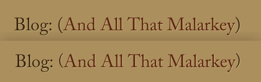
Has it ever bothered you that when you set your text large, parenthesis hang below the baseline and sometimes collide with the stroke of an uppercase character? That is because parentheses work best with lowercase characters and not so well will uppercase or numerals in, for example, telephone numbers. Don't worry, CSS2.1 can help you fix that.
Unfortunately there is no shortcut to selecting those parenthesis, so I wrap a span element around each one.
<h2>Blog:
<span class="parenthesis">(</span>
And All That Malarkey
<span class="parenthesis">)</span>
</h2>
Relative positioning is the perfect choice for shifting characters from the baseline, first by applying a generic parenthesis class (in which I've also slightly reduced the font-size of the parentheses:
.parenthesis {
position : relative;
font-size : 88%; }
Then specific descendent selectors to vary the baseline shift for each specific instance:
h2 .parenthesis {
top : -.15em; }
Here is the before and after. You can see the effect in action on the For A Beautiful Web home page.
You can use the same technique for parentheses around parts of telephone numbers:
<div class="tel">
<span class="parenthesis">(</span>
01745
<span class="parenthesis">)</span>
851848
</div>
.tel .parenthesis {
top : -.15em; }
Has it bugged you that when you separate parts of a number with an endash, that the dash sits a little too close to the baseline. Not to worry.
<div class="tel">
<span class="parenthesis">(</span>
01745
<span class="parenthesis">)</span>
851
<span class="ndash">–</span>
848
</div>

.ndash {
position : relative;
top : -.1em; }
Here is the before and after:

On the For A Beautiful Web home page I also decided to use baseline shift to add a little spice to the blog entry’s publication dates. Here is my baseline enhanced markup and CSS:
<abbr class="updated published">27
<span class="shift">th</span>
Apr 2009</abbr>

.shift {
position : relative;
font-size : 68%;  }

.updated .shift {
top : -.5em; }
There seems to be no recipe for a correct amount of shift so it’s a matter of judgement and a job for the eye. When the position looks right, it is right.
Small details can make a big difference in fine typography. Start shifting your baselines.