The Timex x Pan Am Waterbury Automatic Ace
Talk to my family and friends, and they’ll tell you I never bloody stop talking about the IWC Big Pilot 43 watch that I bought to celebrate my 60th in November. Mechanical watches are all over my social media feeds, and the other day I did a double-take when the algorithm suggested I might like a new design from, of all companies, Timex.
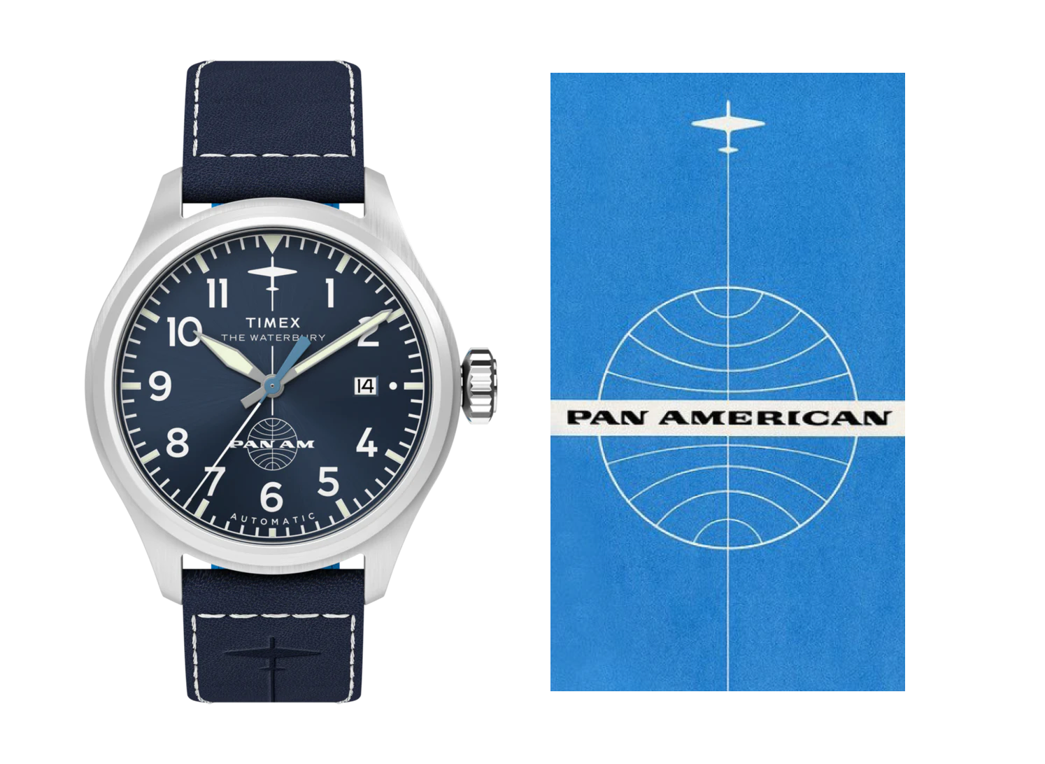
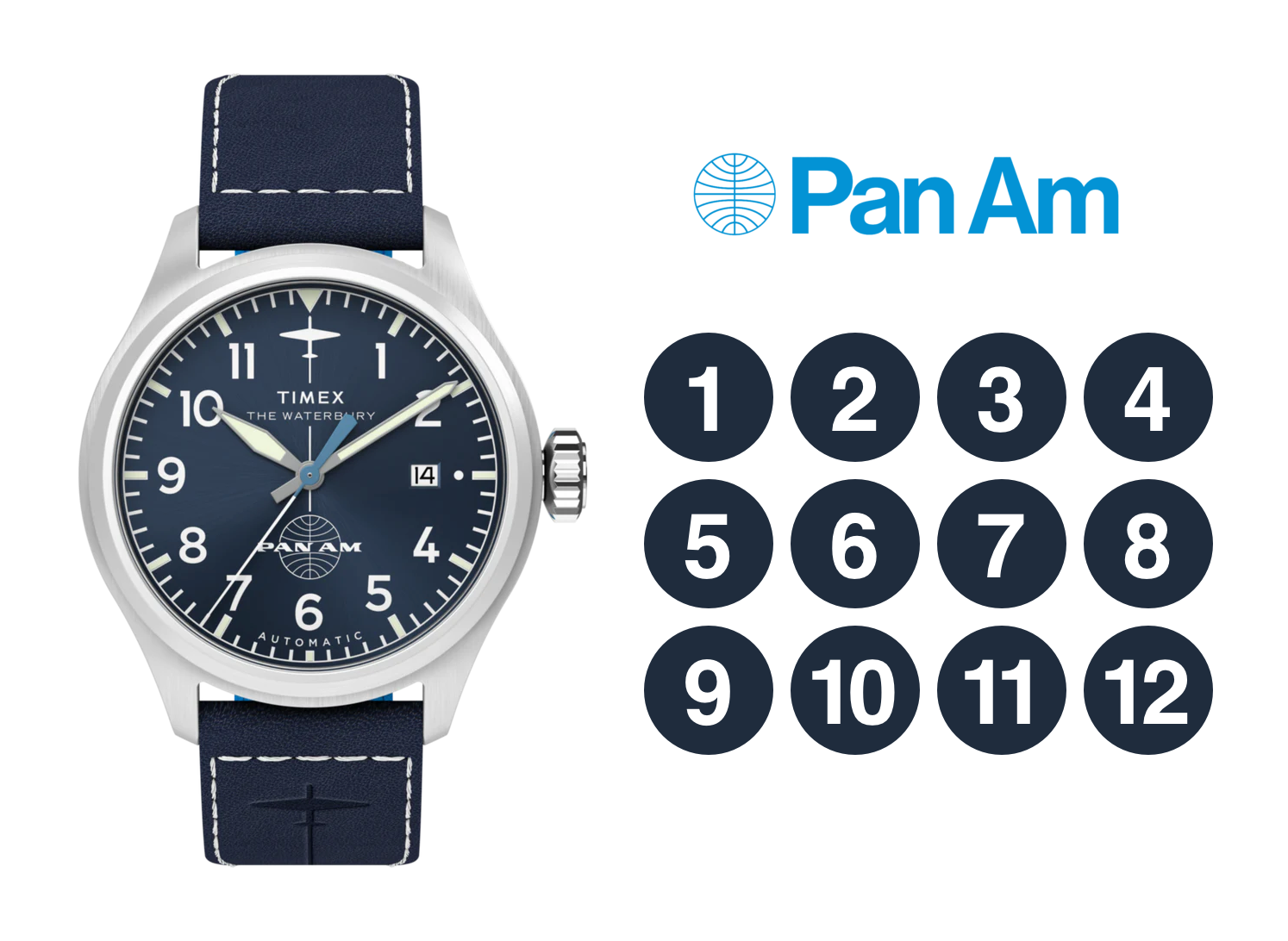
The Timex x Pan Am Waterbury Automatic Ace is a 41mm brushed stainless-steel watch from a collaboration between Timex and the nostalgic Pan Am brand. I immediately thought there was something familiar in this watch’s design. But I couldn’t somehow put my finger on it.
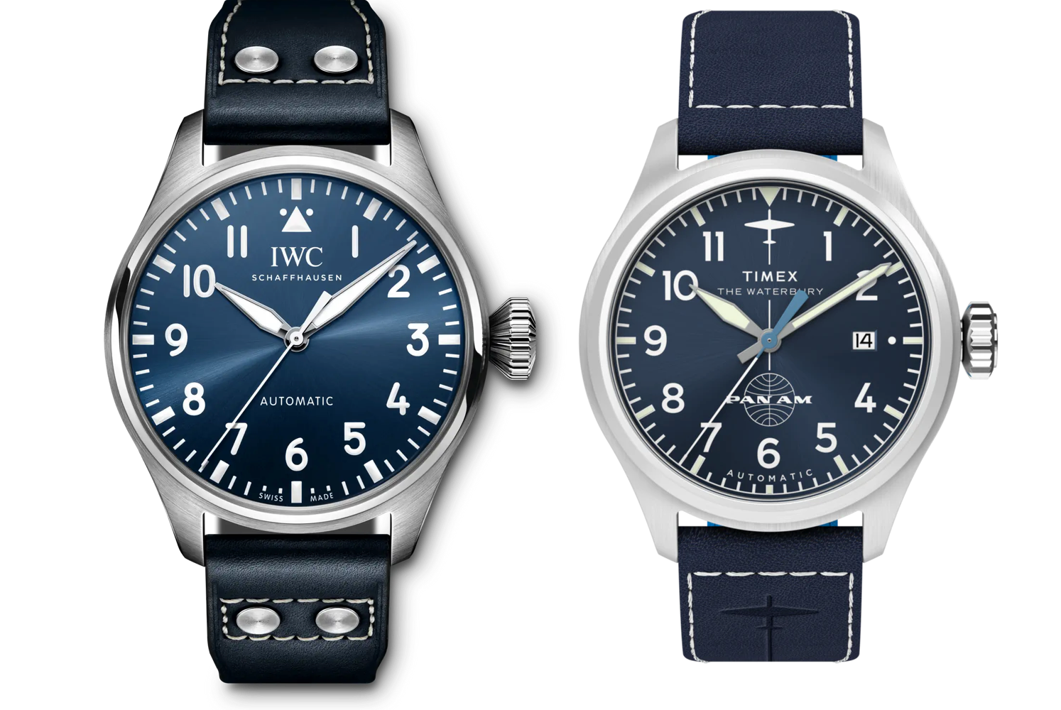
The Timex x Pan Am Waterbury bears more than a passing resemblance to the latest addition to IWC’s iconic Big Pilot line, the Big Pilot 43, which is on my wrist now. But it most closely resembles IWC’s Pilot’s Watch Mark XX. You can see just how closely Timex followed IWC when the two dials are scaled to match.
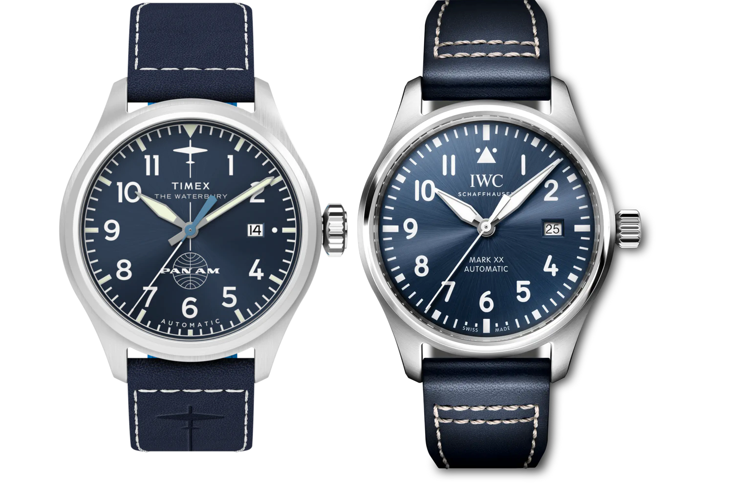
The Timex’s hour and second hands match the IWC Mark XX, while the minute hand is straighter. Its date window is the same size, although I’m unsure why the dot—between it and the marker in the 3 o’clock position—was necessary. Placing the word “Automatic” under the 6 is neat and leaves room for the Pan Am logo above. I actually prefer this placement to IWC’s, where it’s beneath the Mark XX type. The size relationship between the words “Timex” and “The Waterbury” looks identical to that between “IWC” and “Schaffhausen.”
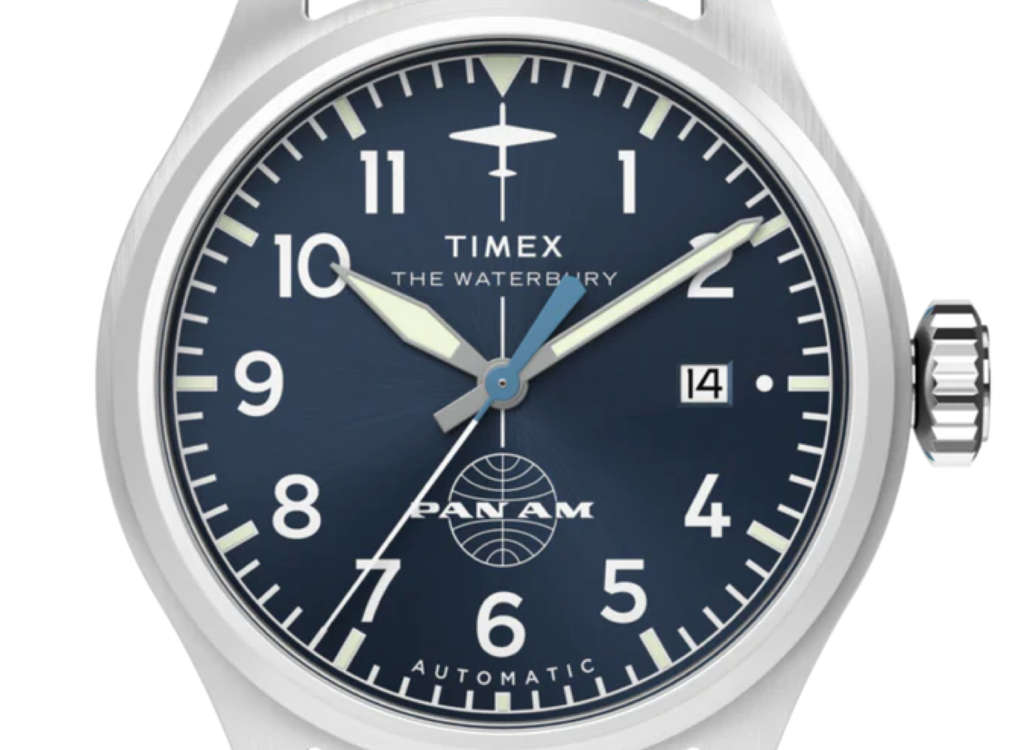
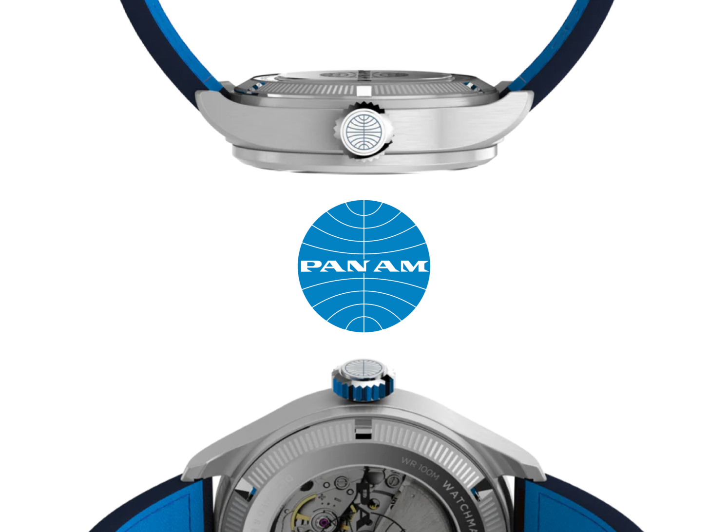
Timex did a nice job of placing the Pan Am logo on the crown and using its signature blue on the inside of the strap.
On the dial, the line between that famous logo and the plane icon at the 12 o’clock position comes straight from Pan Am’s design history.
I don’t know which typeface Timex chose for their numerals on the Waterbury dial, but it certainly isn’t the Helvetica, which Pan Am briefly switched to between 1970 and 1973.
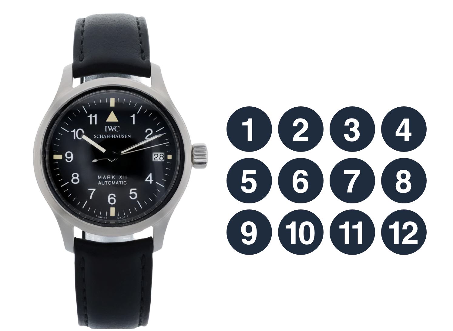
Oh, and if you’re curious how Helvetica looks on a watch dial, IWC used it for the numerals on its 1993-released Mark XII.
I suppose that, being a collaboration with Pan Am, the question to answer is whether this is a successful pilot’s watch design? I’d say it is. It’s not overly large, but it is legible. The skinny minute hand isn’t as obvious as IWC’s, and there’s that inexplicable dot next to the date window, but as an homage to the pilot’s watch, it’s nice. Is it more than an homage to IWC’s iconic Big Pilot design? I’d say so.
But I like it. Hell, I might just buy one for fun to wear places and times when I wouldn’t be comfortable wearing the real thing.
More from Stuff & Nonsense
Services I offer
Product UX design
The contract template trusted by thousands of designers and developers to keep their web projects running smoothly.
Design mentorship and teaching
Whether you’re stuck, starting out, or stepping up—Andy’s here to help you become a better designer.
Squarespace templates for sale
Take your Squarespace designs from good to great with my bespoke templates.
Andy Clarke on YouTube
Join Andy on YouTube to learn how you can make better product and website designs.