Ford Cortina was built by Ford of Britain from 1962–1983, and was the UK’s best-selling car in the 1970s.
Ford Cortina

The Cortina was produced in five generations, Mark I–V, although officially the last one was only a facelift of the Mark IV. From 1970, the Cortina was almost identical to the German-made Ford Taunus. The Cortina name was inspired by the Italian ski resort Cortina d’Ampezzo, site of the 1956 Winter Olympics. As a publicity stunt, several Cortinas were driven down the Cortina olympic bobsled run at the resort. Using the project name “Archbishop,” management at Ford in Dagenham created a family-sized car which they could sell in large numbers. The chief designer was Roy Brown Jr., the designer of the Edsel, who’d been sent to Dagenham following the failure of that car. The car was designed to be economical, cheap to run and easy and inexpensive to produce in Britain. Originally to be called Ford Consul 225, the car was launched as the Consul Cortina until a modest facelift in 1964, after which it was sold as the Cortina.

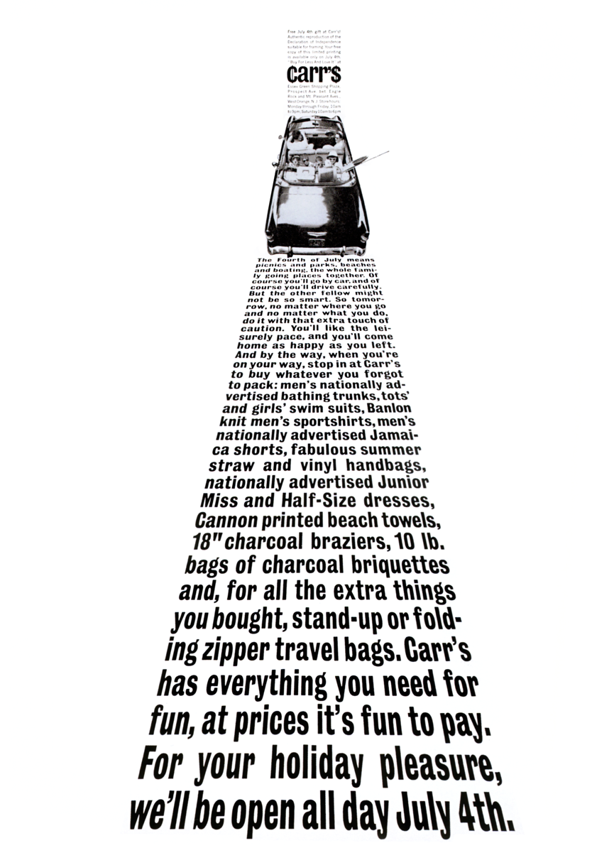
Inspired by Herb Lubalin

Herb Lubalin was fascinated by how typography could be used for communication. He understood how a choice of typeface could fundamentally alter the look and sound of words to communicate messages to his readers.

Lubalin is well-known for his work on Eros and Fact magazines, as well as Avant Garde for which he designed the ITC Avant Garde typeface. His studio worked on magazines, packaging, posters, and corporate identity designs, but his most adventurous and interesting work was for his own U&lc typographic journal. The most complete reference for Lubalin’s work is Adrian Shaughnessy’s ‘Herb Lubalin: American Graphic Designer’, first published by Unit Editions in 2012.

Inspiration for my design

About Herb Lubalin

Throughout his long career, American graphic designer and typographer Herb Lubalin worked on magazines, packaging, posters, and corporate identity designs. He is perhaps best-known for his work on Eros, Fact, and Avant Garde magazines.

His typographic journal U&lc (Upper and lower case) allowed Lubalin to showcase his designs and experiment with creative typography.

Shop the magazines