Fair’s fair (use)
One message I wanted to put across when writing my new book was that there are already examples of art direction on the web, in products and on websites. I wanted to showcase some examples in a series of case studies.
While I was designing the book, I decided that integrating elements from those examples into the design of my case studies would convey their spirit better than using screen captures of a full web page. I aimed to tell the story of why art direction improved the design more effectively, and I think I succeeded in using this approach.
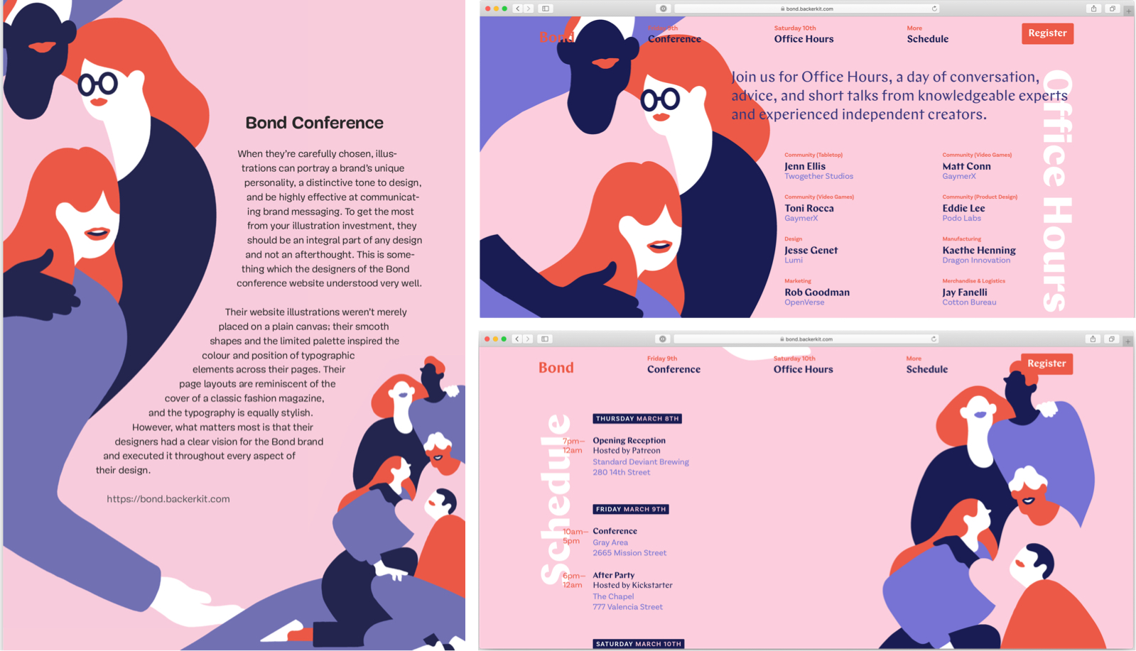
Examples of art direction for the web are hard to find. One of the examples I used was the Bond Conference which I’d seen used elsewhere and I liked for how its illustrations integrate with the background, text colours, and layout. Bond felt like a good fit with my approach of expressing the spirit of the website through the design of the page in my book.
I was very complimentary when I described the Bond Conference website:
To get the most from your illustration investment, they should be an integral part of any design and not an afterthought. This is some- thing which the designers of the Bond conference website understood very well. Their website illustrations weren’t merely placed on a plain canvas; their smooth shapes and the limited palette inspired the colour and position of typographic elements across their pages. Their page layouts are reminiscent of the cover of a classic fashion magazine, and the typography is equally stylish. However, what matters most is that their designers had a clear vision for the Bond brand and executed it throughout every aspect of their design.
I included a link to the Bond Conference website which itself links to illustrator Lisa Tegtmeier. I also contacted Backerkit, who ran the Bond Conference, via their contact form and asked for information about who designed the conference website. I didn’t receive a reply. Now I’ve been made aware that a better credit and a clarification might be needed.
I and the Smashing editorial team consider using elements from the Bond Conference website in the context of explaining how well-integrated illustrations can help art direction to be Fair Use. If you’re not familiar with Fair Use (in the USA,) Wikipedia defines it like this:
Fair use in the law of the United States permits limited use of copyrighted material without having to first acquire permission from the copyright holder. Fair use is one of the limitations to copyright intended to balance the interests of copyright holders with the public interest in the wider distribution and use of creative works by allowing as a defence to copyright infringement claims certain limited uses that might otherwise be considered infringement.
Examples of fair use in United States copyright law include commentary, search engines, criticism, parody, news reporting, research, and scholarship.
“Commentary,” (constructive) “criticism,” “reporting,” and “scholarship” are all fair descriptions of how I included the Bond Conference assets.
At the start of the book I wrote, “I’ve tried hard to find the copyright owner for every photograph used in this book. If I missed you, let me know, and I’ll be happy to add missing credits to a future edition.”
Under Fair Use, there’s no requirement to obtain permission to use material like this in this way. In future, I’ll be more cautious.
In books, we don’t typically list everyone who worked on an example—a font designer, photographer, web designer etc. Aside from as a professional courtesy, there’s no requirement to include a credit either. However in hindsight it would have been polite for me to name illustrator Lisa Tegtmeier in the copy.
Working with illustrators is one of my great passions, and I love to work with, and encourage young and talented artists like Natalie Smith whom I commissioned to illustrate all my Hardboiled book covers. Lisa Tegtmeier does fabulous work and she deserves every success. I regret not naming her when I wrote about the Bond Conference website. Because I do everything I can to support artists, I’m sorry I didn’t do that.
Next time I include inspiring examples of work in my books, I’ll add more detailed credits to the appendix, in the same way I do for footnotes, because it’s important to let readers know about the people behind the work. Credit where credit’s due. I can’t say fairer than that.
My thanks to Rachel Andrew and Vitaly Friedman for reviewing this post.