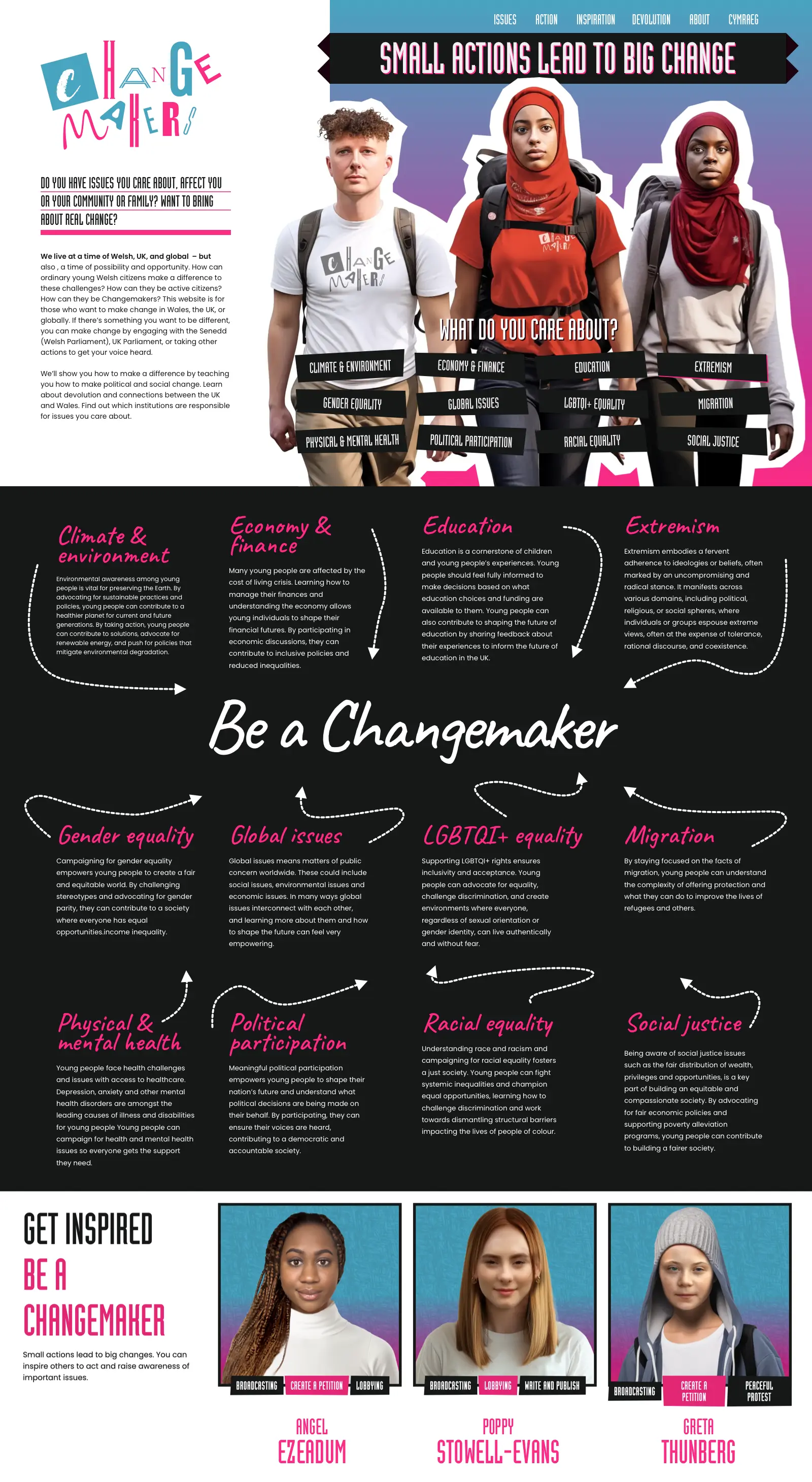
Branding, visual identity, and website design
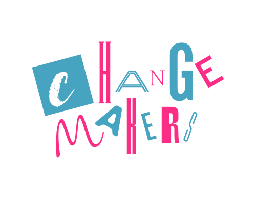
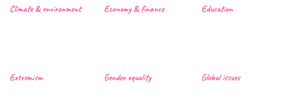
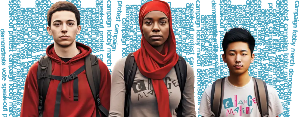
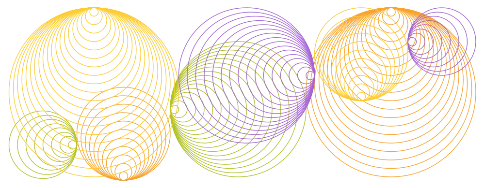
The Open University invited us to work on a design for their Changemakers project, which aims to get young Welsh people involved in the political process. My brief was to design a visual identity and a fully bilingual website that educates, informs, and inspires young people.
Andy is a bloomin’ creative genius, he really is! I massively appreciate not only his talent, but also his commitment to making this project a success.
Dr. Jenny Hewitt
Branding, visual identity, and website design
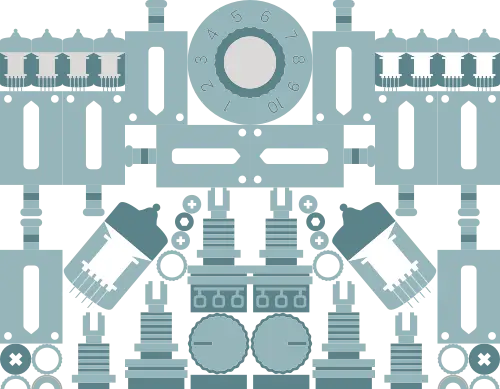
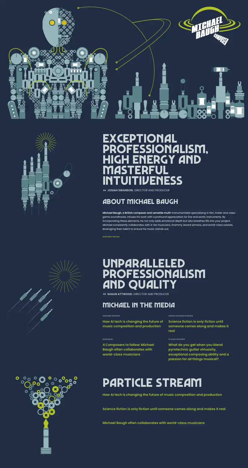
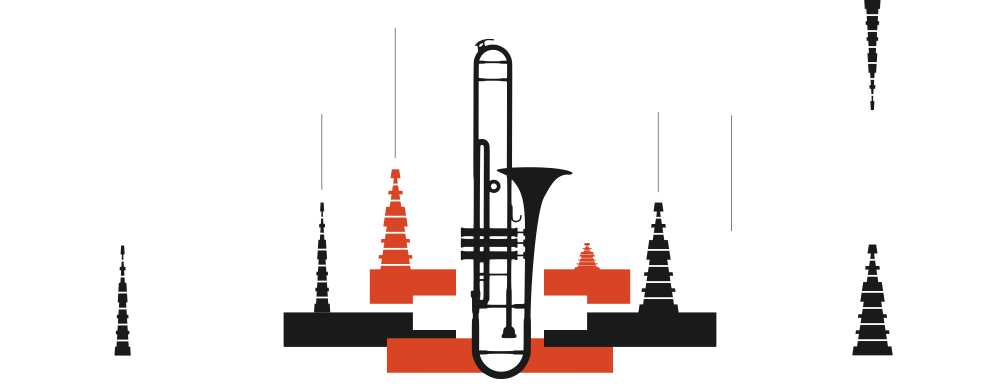
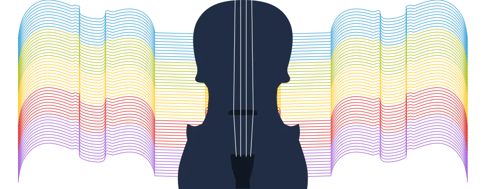
Michael Baugh is a British composer and multi-instrumentalist who works with some of the biggest names in music. He asked me to design and develop a new website that reflects his personality. So, I designed a new visual identity and created a bespoke series of original graphic illustrations with animations and integrated audio players. I developed a flexible website design and integrated a simple-to-use CMS for easy content editing.
I searched long and hard for a web designer to create something unique, that stands out, and is more than a website. Andy delivered precisely that. If you’re looking for attention to detail, collaboration, quality, seamless execution, and maximum creativity, look no further.
Michael Baugh
Branding, visual identity, and website design
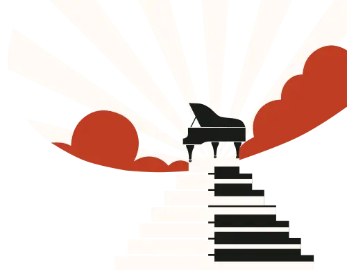
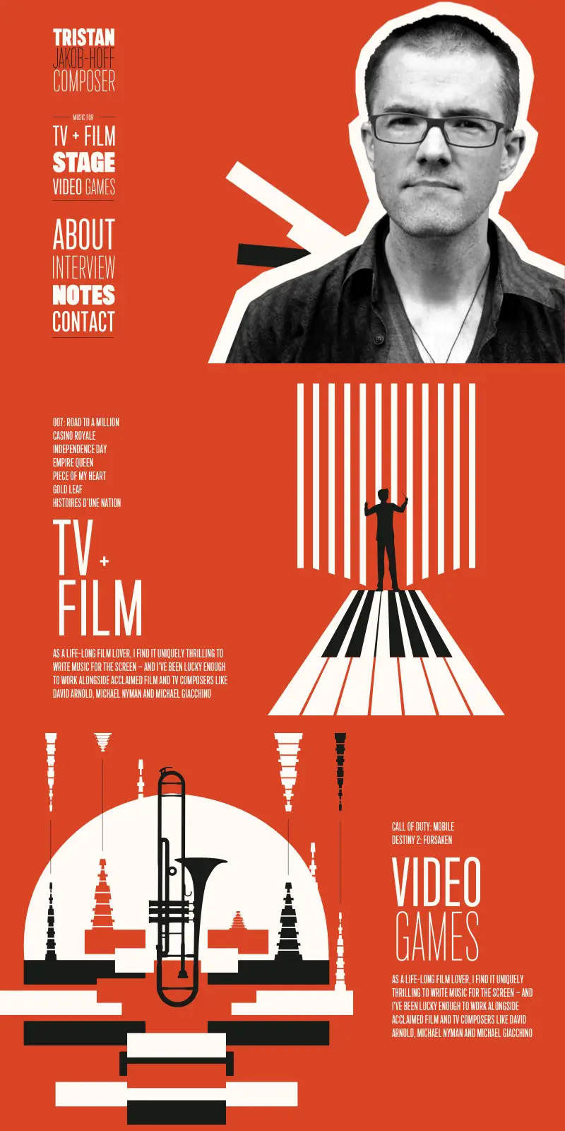
Tristan is a composer for television and film, the stage, and video games. He approached us to design and develop a new website that reflects his unique style. So, I designed a new visual identity with a distinctive colour palette and a bespoke series of original graphic illustrations. I developed a flexible website design and integrated a simple-to-use CMS for easy content editing.
Andy is that rare combination of a designer who really knows his technical stuff and has an incredible gift for design. He’s the go-to person if you want a design which looks fresh and original. It was an absolute pleasure working with Andy and watching him pull from his imagination, things I could never have dreamed of.
Tristan Jakob-Hoff
Branding, visual identity, and website design
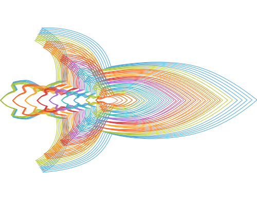
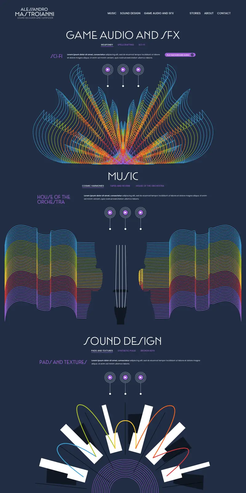
Alessandro is a sound designer specialising in video game audio and sound effects. He asked us to design and develop a new website with an obsessive level of detail to match his work. So, I designed a bespoke series of original graphic illustrations with animations and integrated audio players. I developed a flexible website design and integrated a simple-to-use CMS for easy content editing.
I loved working with Andy. He not only brings his incredible talent to the table, he listens to your ideas and transforms them into a brand that really looks like you.
Alessandro Mastroianni
Branding, visual identity, and website design
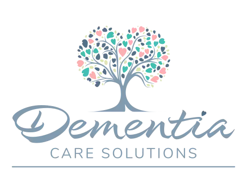
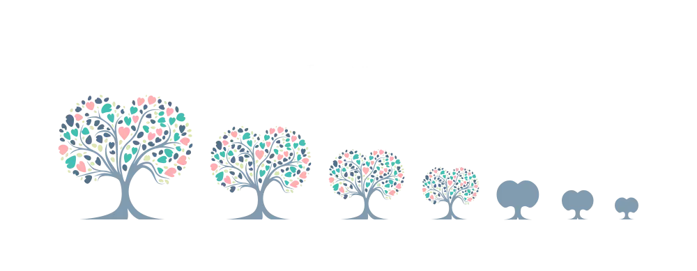
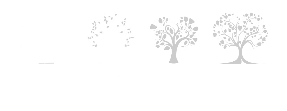
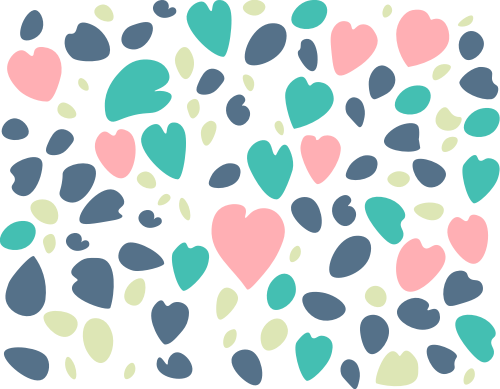
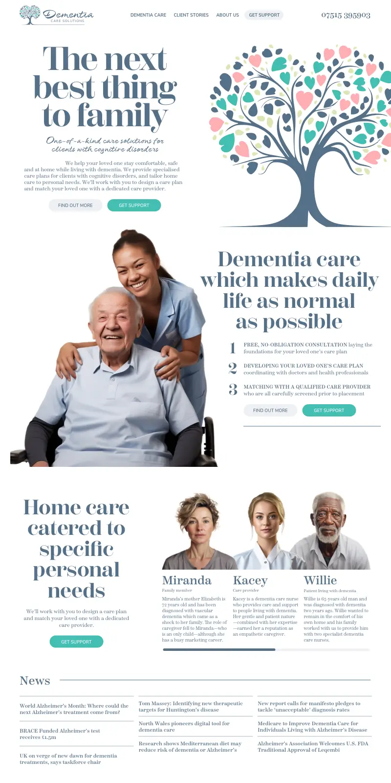
This family-owned business invited us to design a new visual identity and website to appeal to someone with a family member who is living with dementia and needs care to stay in their home. I designed a new visual identity, developed a flexible website design, and integrated a simple-to-use CMS for easy content editing.
Deliverables
- Branding and logo design
- Visual identity colours and typefaces
- Website design and development
Branding, visual identity, and website design
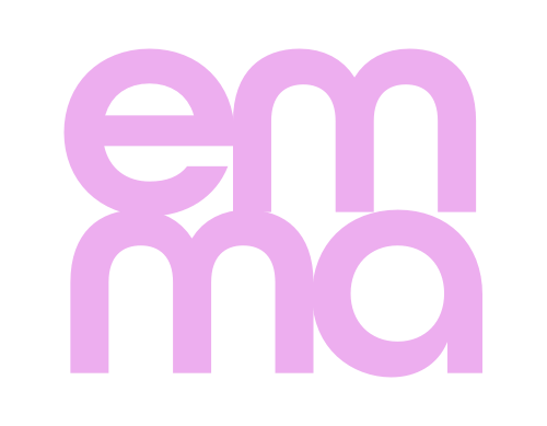
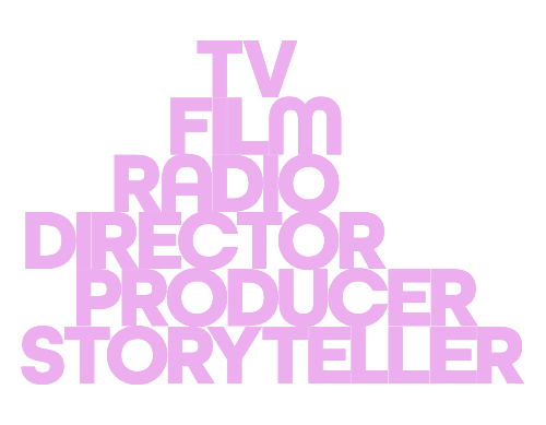
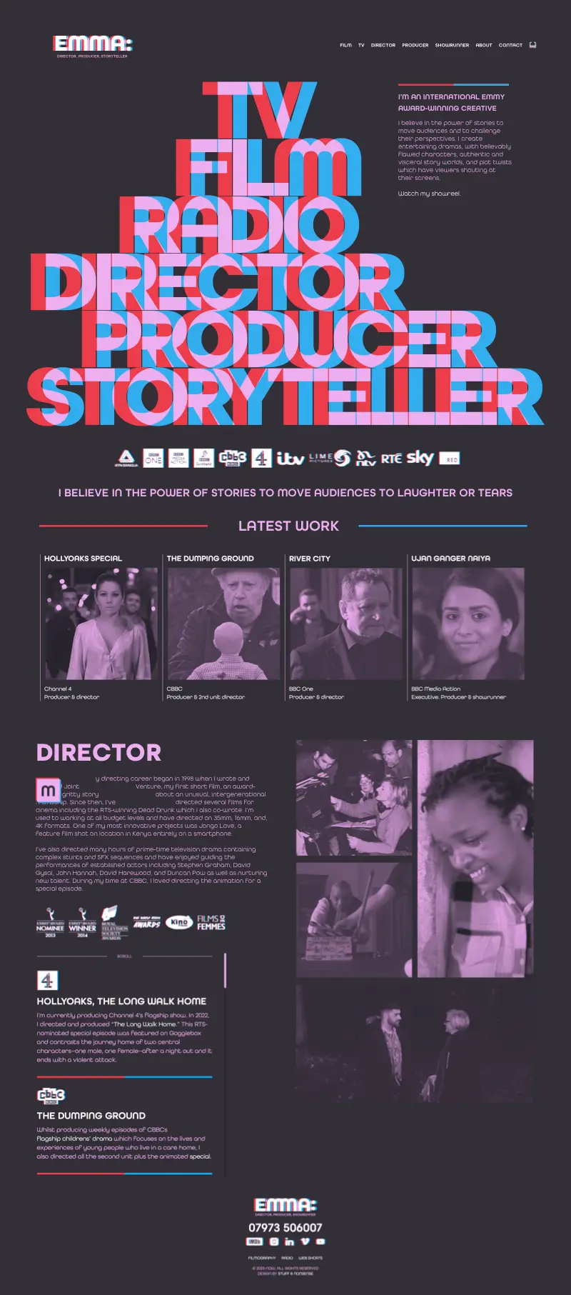
Emma is a film/television director and producer whose work includes many popular UK soap operas. She commissioned us to design a visual identity and develop a website to help her attract new clients. Emma wanted a design that appealed to agents, producers, and production companies. She wanted clear messaging and a distinctive design, giving me complete creative freedom.
I loved collaborating with Andy on my website. Not only are his design skills and tech know-how really impressive, he is also fun and challenging to spend time with. I would highly recommend him to anyone who genuinely wants to investigate their brand and draw people in through clever and functional design with a twist.
Emma Bodger. Director
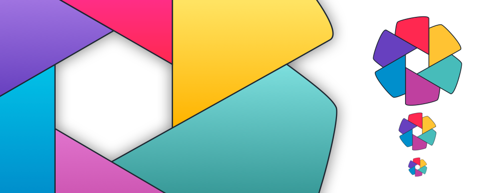
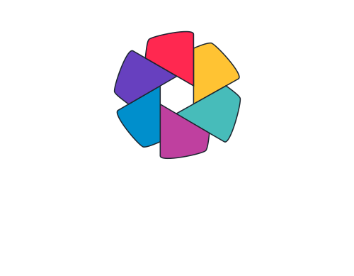
Branding, visual identity, and website design
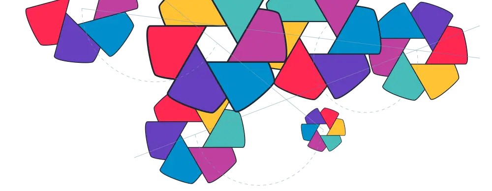
I worked part-time with Nozomi Networks as their Director of Product Design for five years. I grew their creative team and worked closely with designers, developers, marketing specialists, and C-suite executives. Ethos is a cybersecurity cooperative founded by Nozomi Network and its partners to share early threat indicator data. I designed its visual identity.
Deliverables
- Assets for online and print media
- Iconography and logo
- Visual identity colours and typefaces
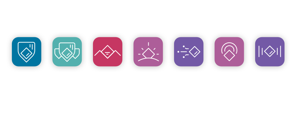
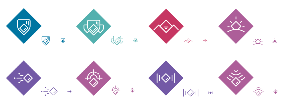
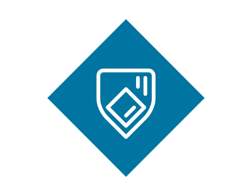
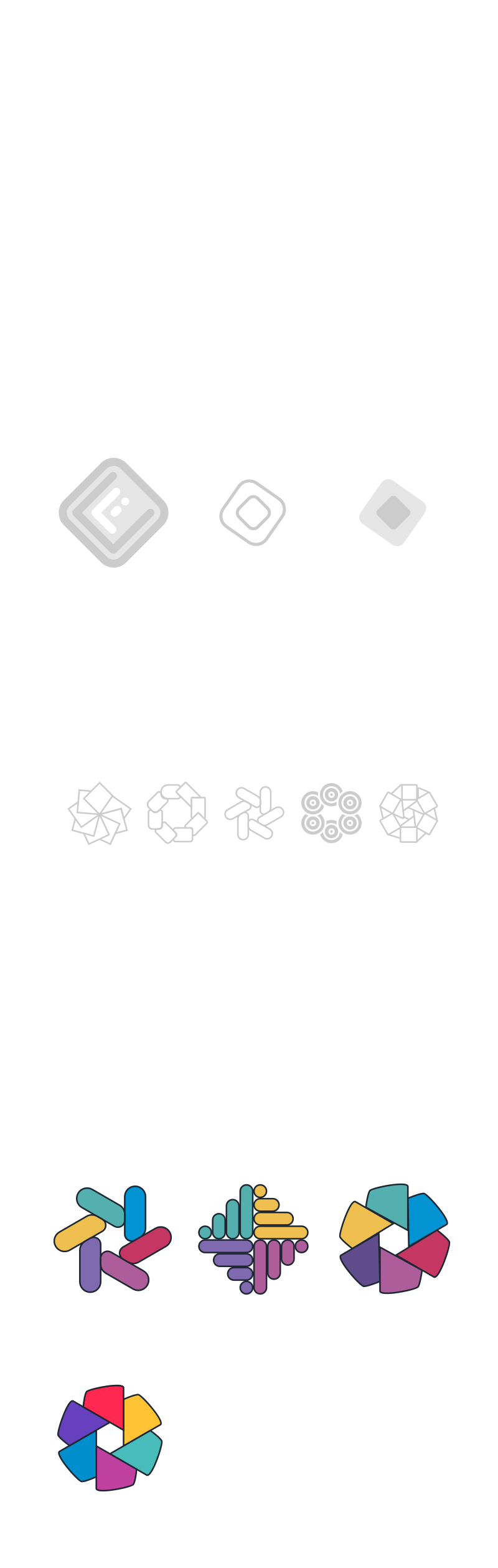
Branding, visual identity, and website design
Nozomi Networks. Product branding
As Director of Product Design at Nozomi Networks, I was responsible for the graphic and user-experience design of their cybersecurity software suite. I developed creative concepts, made and tested prototypes, and produced polished user interfaces for all their products. As their hardware and software products multiplied, I designed a consistent customer experience and a suite of product marketing icons.
Deliverables
- Assets for online and print media
- Product icons and logos
- Creative, UX, and UI design
Branding, visual identity, and website design
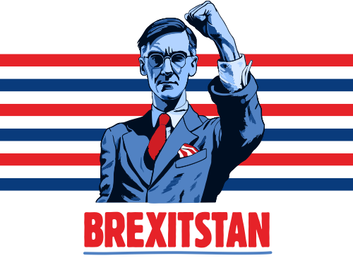
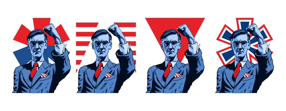
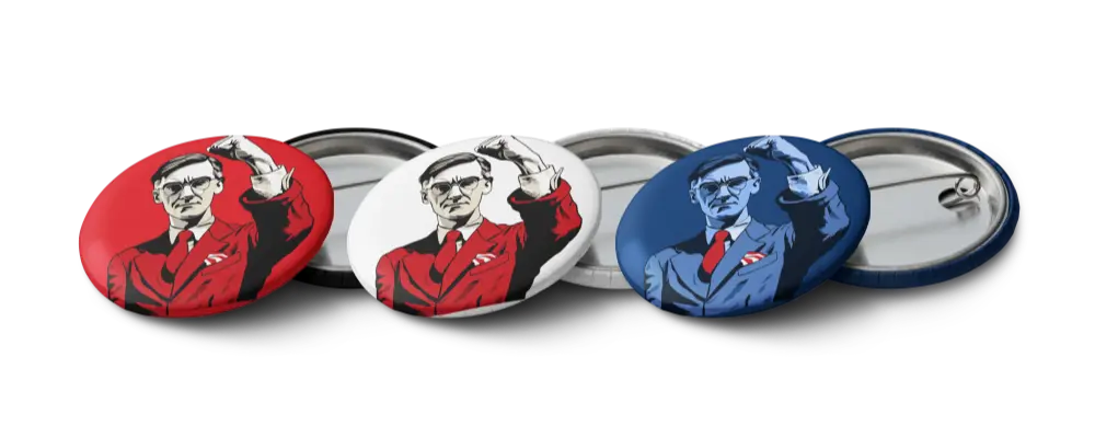
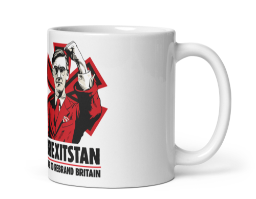
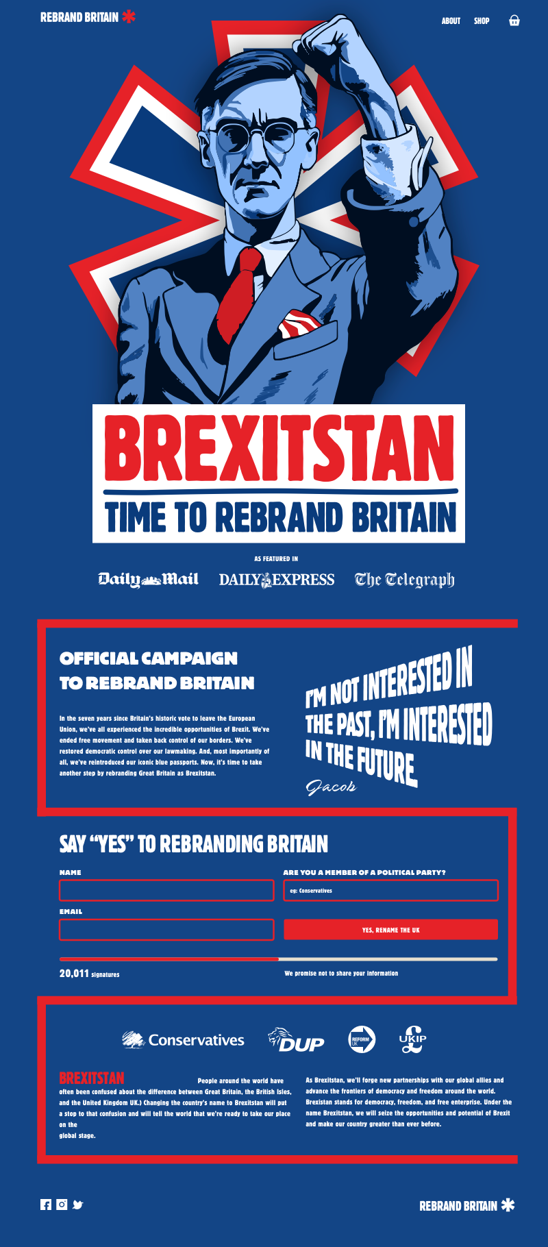
When I explore what new web technologies make possible, I like to create websites for fictitious campaigns, companies, or products. I used this design for a spoof campaign to rebrand Britain as Brexitstan to learn about generating images using AI tools. The project also allowed me to explore more cutting-edge CSS and markup, from custom elements and properties to container queries and transforms.