Quick typography tips №1
Here’s a quick design tip for improving the readability and style of long passages of running text.
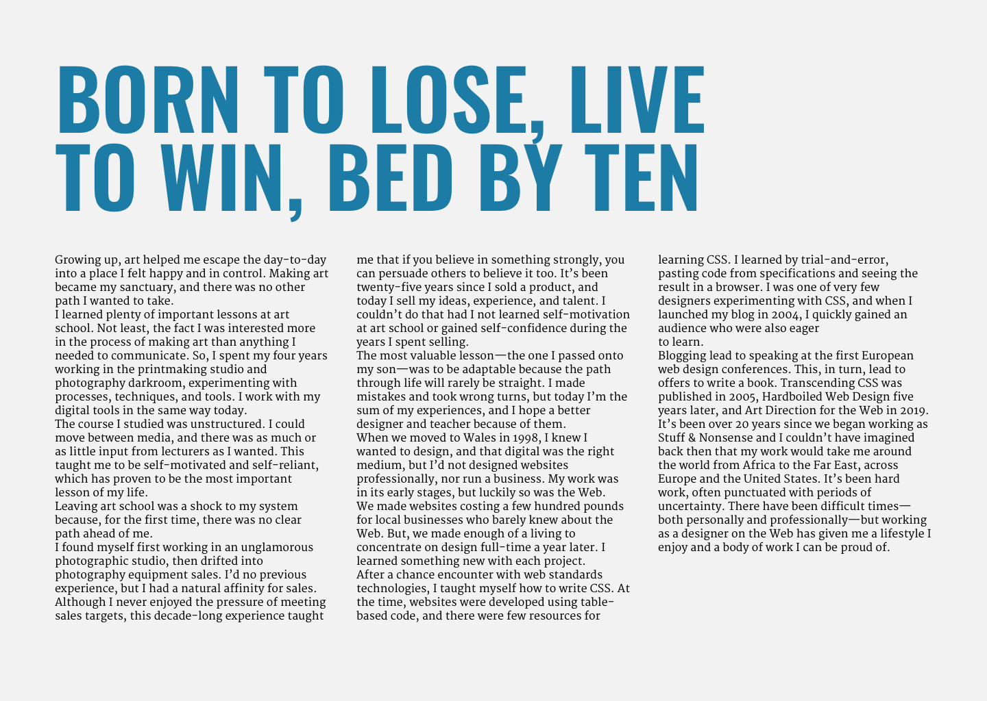
When I see more than one paragraph of text online, they’re almost always set using a space between the paragraphs. Look at your favourite news website and you’ll see what I mean.
But, in other media, text is often set with no space between paragraphs and designers use other techniques to signal the start of new paragraphs.
Removing space between paragraphs creates solid blocks of text which better define the structure of a page. But, with that space removed, when a paragraph’s last line is as long as the measure (line length), it makes spotting the start of the next paragraph difficult.
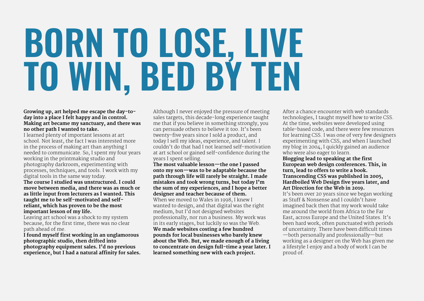
In print media, adding an indentation to the first-line of a new paragraph is a common technique. But there are other ways to improve the readability of long sections of running text.
Recently, I spotted an example of Richard Hollis’ work where the British designer had used alternating weights to signal the start of new paragraphs. Using alternating weights helps make long passages more readable while also adding visual interest to a design.
This alternating weight technique is simple to apply using CSS pseudo-class selectors and even/odd keywords:
.columns p {
margin-bottom: 0;
font-weight: 400; /* regular weight */ }

.columns p:nth-of-type(odd) {
font-weight: 700; /* heavier weight */ }
:nth-of-type is a structural pseudo-class selector which selects elements based on their position in the source order of a document starting at the top.
On reversed-out or dark theme designs, I might choose a similar technique by alternating the text colour of adjacent paragraphs:
.columns p {
margin-bottom: 0;
font-weight: 400;
color: #fff; /* white */ }

.columns p:nth-of-type(odd) {
color: #1c7ca6; /* blue */ }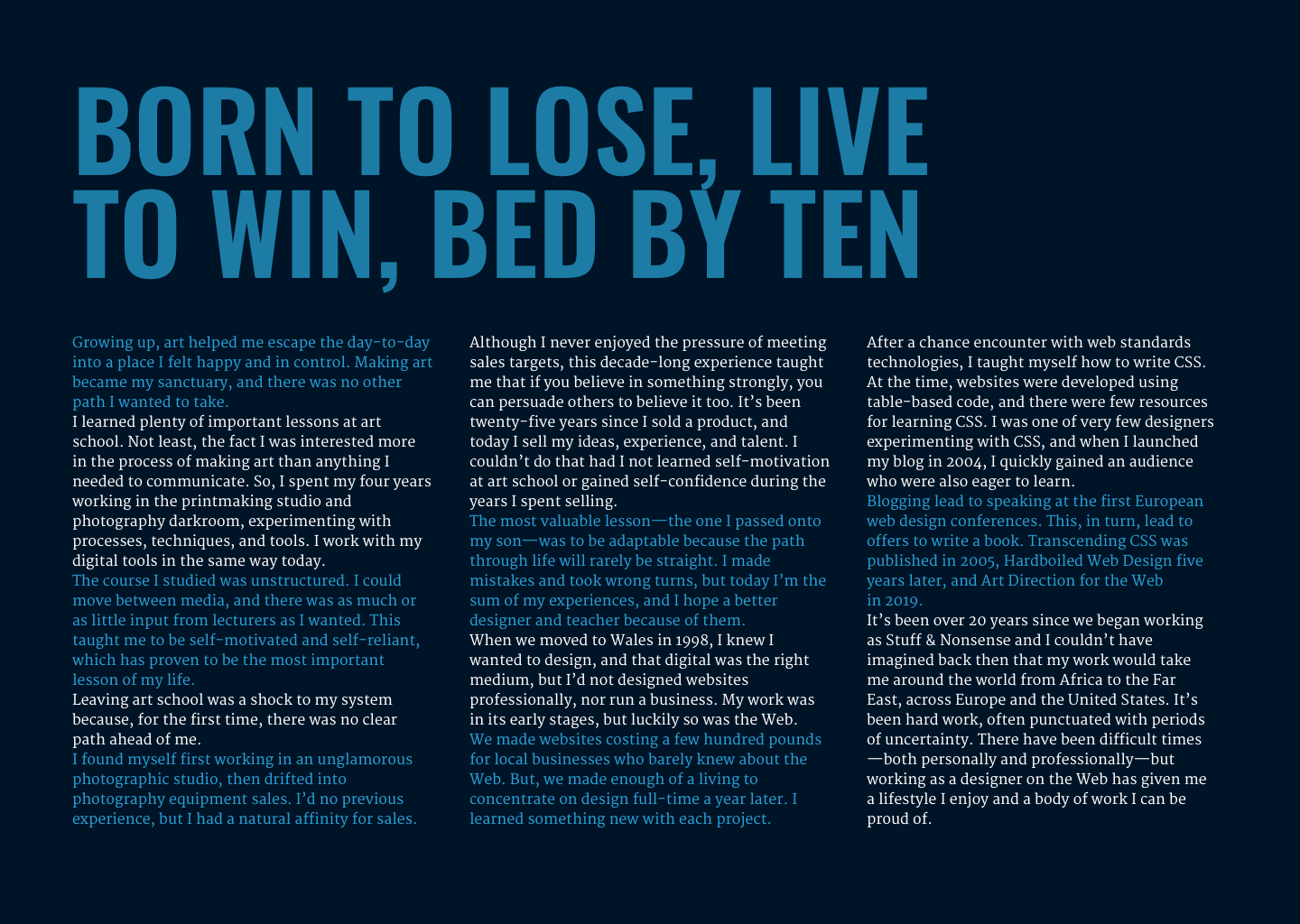
I hadn’t considered this approach as I mostly use first-line indentation when setting passages of running text. But, I will be slipping into my next editorial design project if I can.