SVG experiments for Emma’s website (part one)
Emma Bodger is a film/television producer, and recently, I’ve spent time working on her visual identity and a new website. It’s been a lot of fun, and I also learned more about SVG while working on it. I’m digging into the details this week, and today I’ll explain how I made an experimental word search concept for Emma’s home page.
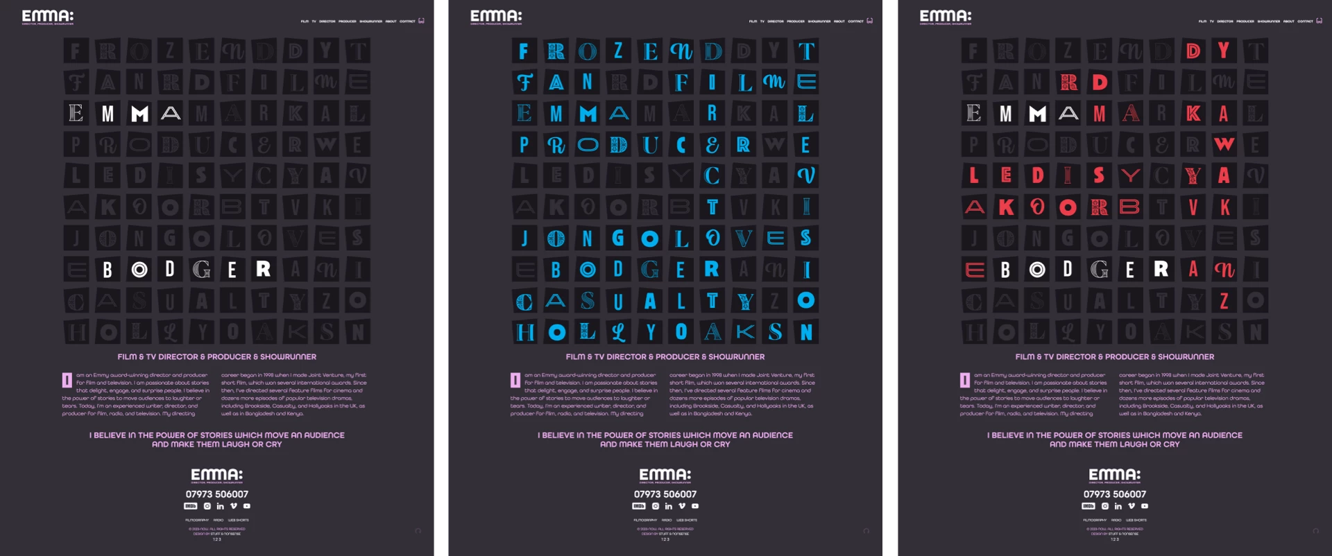
I really enjoy working with SVG. I don’t understand it all, but learning—and often the trial and error which goes with it—is a big part of the fun. It reminds me of the early days of working with CSS. Emma’s new website is chock-full of SVG, which I haven’t used before.
While I prefer Figma for UI design work, Sketch is still my default tool for creating graphics for the web. My process starts with exporting SVG from Sketch, optimising the output using SVGOMG, and hand-editing the files to add attributes and titles.
The first file I exported from Sketch contained all the extra information you’d expect from a graphics application, weighing in at over 500kb. This size is fine for previewing but is too large for production. SVGOMG can reduce that size to around 100kb and even less, depending on the reduction in precision I’m prepared to accept. But there’s also no substitute for hand-editing SVG which can make them even smaller and better organised. For production, I went back to the start of my process and then hand-assembled a new SVG file. The Sketch export contained 100 tiles which meant 100 versions of:
<rect width="115" height="115" x="1265" y="1265" fill="#211E25""/>I minimised and simplified that code using SVG symbols which define an element as a template and can be used multiple times. I defined a tile as a symbol and added a unique ID:
<symbol id="base-1" width="115" height="115">
<path fill="#80738C" fill-rule="evenodd" d="…"/></symbol>
My design uses three tile symbols with slight rotations to create a scattered look:
<symbol id="base-1">…</symbol>
<symbol id="base-2">…</symbol>
<symbol id="base-3">…</symbol>
With those three tile symbols defined, I used the more concise
<use href="#base-1" x="5" y="5" />
<use href="#base-1" x="145" y="5" />
<use href="#base-1" x="5" y="145" />
…
I’m a stickler for well-structured HTML, and I take the same approach to SVG. By organising each word into its own SVG element and nesting them inside an SVG container, I added the structure I needed for interactive effects later in the process:
<svg xmlns="http://www.w3.org/2000/svg" viewBox="0 0 1386 1386">
  <svg x="0" y="0" id="director">…</svg>
  <svg x="0" y="0" id="producer">…</svg>
  <svg x="0" y="0" id="film">…</svg>
  <svg x="0" y="0" id="television">…</svg>
  <svg x="0" y="0" id="casualty">…</svg>
  <svg x="0" y="0" id="hollyoaks">…</svg>
  <svg x="0" y="0" id="jongolove">…</svg>
  <svg x="0" y="0" id="emma">…</svg>
  <svg x="0" y="0" id="bodger">…</svg>
</svg>
Each word contains tile backgrounds and letters, which I exported from Sketch and optimised with SVGOMG. I placed each letter after its tile and positioned it using the translate properties x/y values:
<path transform="translate(25 25)" fill="#332E38" d="…"/>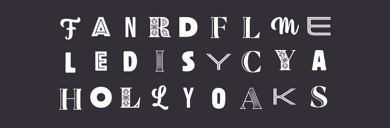
Tip: There’s a handy number precise slider for further optimising paths using SVGOMG. I could take optimisation even further by turning letters that use the same typeface into symbols. Slide to the left to reduce path precision to an acceptable level to create the most optimised file possible.
Adding CSS for interaction
I wanted my word search graphic to be interactive. I know I could do so many things if I used Javascript. But, for this concept, I tried to keep things simple and use only CSS to reveal a word while hovering over any of its letters and change the colour of letters which don’t belong while hovering. First, I added an ID attribute to the SVG which contains orphan letters:
<svg x="0" y="0" id="letters">…</svg>Now, only those letters change to red while hovering:
#letters path:hover {
fill: var(--color-red); }
Then, I added a class attribute to the SVGs which contain full words:
<svg x="0" y="0" id="director" class="solution">…</svg>
  …
<svg x="0" y="0" id="bodger" class="solution">…</svg>
This allows me to style those letters which together form a word in the search, turning them cyan:
.solution:hover > path {
fill: var(--color-cyan); }

.solution:active > path {
fill: var(--color-accent); }
Finally, a transition makes those changing letter colours smooth:
.solution > path,
#letters > path {
transition: fill var(--duration) ease-in-out; }
But, testing this concept revealed a problem I hadn’t considered. Unlike HTML—where elements at the end of the source order appear closest to a viewer—SVG takes the opposite approach, with the closest elements coming at the start of the source. Where words overlapped, the letters they shared wouldn’t change colour if the word appeared later in the source.
Fortunately, CSS does provide a workaround using—what to me was—an unfamiliar selector. ~ is a general sibling combinator. First, I added a class attribute to all shared letters:
<path d="…" class=".cross" />The words “Director” and “Producer” share one letter. Director also shares letters with “Jongolove” and “Bodger.”
<svg x="0" y="0" id="director">…</svg>
<svg x="0" y="0" id="producer">…</svg>
<svg x="0" y="0" id="film">…</svg>
<svg x="0" y="0" id="television">…</svg>
<svg x="0" y="0" id="casualty">…</svg>
<svg x="0" y="0" id="hollyoaks">…</svg>
<svg x="0" y="0" id="jongolove">…</svg>
<svg x="0" y="0" id="emma">…</svg>
<svg x="0" y="0" id="bodger">…</svg>
Whereas an adjacent sibling selector (+) targets an element immediately following another, the ~ combinator targets elements which follow another at any point. Reading this selector backwards from right to left helps to explain its effects:
“Style an element with a class attribute of “cross” which is a direct descendent of an element with an ID of “film”which—at some point—follows an element with an ID of “#director” while hovering.”
#director:hover ~ #film > . cross {
fill: var(--color-cyan); }
In the word search, I used the same selector logic for other shared letters. Now, a letter contained in one word will change colour while hovering over a different word:
#director:hover ~ #film > . cross,
#director:hover ~ #jongolove > . cross,
#director:hover ~ #bodger > . cross {
fill: var(--color-cyan); }
SVG is interesting, but combining it with CSS makes it even more fascinating. I know there are more opportunities to add interactivity and optimise the code further, but I’m happy with how this concept turned out.
Next time, I’ll show more of the experiments I made while designing Emma’s website.