SVG filters for Emma’s website
Emma Bodger is a film/television producer, and recently, I’ve spent time working on her visual identity and a new website. It’s been a lot of fun, and I also learned more about SVG while working on it. I’m digging into the details this week, and today I’ll explain the SVG filters I created to transform images on Emma’s website.
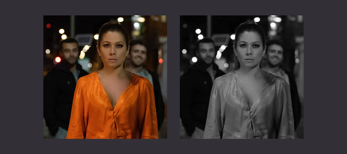
Emma gave me complete creative freedom while designing her website and I worked through dozens of ideas for its direction. One idea—which involves adding pseudo-3D effects using offset red and cyan colours—stuck.
Emma’s filmography includes directing and producing work across many different genres and media. Making images from such a variety of sources feel consistent was a challenge and I considered several approaches to harmonising them and adding a pseudo-3D effect. I considered using Photoshop to create three sets of images:
- Duotone versions for the non-3D theme
- Pseudo-3D versions for the 3D theme
- Full-colour (corrected) for future-proofing
Creating three sets would’ve been time-consuming and meant Emma would need to use the same process when she added new images to the website. Swapping images between themes would add code complexity that I was unprepared to accept. There had to be a more efficient and flexible way to transform Emma’s images. I knew about transforming images using SVG filters but hadn’t used them on a client project. This was going to be a whole new learning experience:
The filter element in SVG enables us to construct a custom filter from its filter primitives. We can apply an SVG filter to an HTML element by using the same CSS filter property as blur, contrast, and drop-shadow. This approach is supported by every modern browser.
I found SVG filters—and their primitives such as feColorMatrix, feComponentTransfer, and feBlend—completely baffling at first, but breaking down what they do into small steps made understanding them a lot easier. To add my pseudo-3D SVG filter, I first added a defs element to contain my filter primitives. These definitions may be applied to an element but won’t be displayed in a browser:
<svg color-interpolation-filters="sRGB">
  <defs>
   …
  </defs>
</svg>
Inside that definition, I added a filter element and gave it an ID of “anaglyph.” It’s this ID which I’ll use to apply the filter from my stylesheet:
<filter id="anaglyph">
  …
</filter>
Now for my first SVG primitive, a colour matrix which takes a full-colour source image and converts it to black and white by applying equal amounts of R/G/B (red/green/blue.) In SVG, feColorMatrix —the “fe” stands for “filter effect”— adjusts the colour of each pixel in an image using a matrix which we can define. This matrix can be horribly difficult to explain and understand, but there are tools available online which make finding the correct matrix values for any effect much easier to find.
Tip: Una wrote an excellent primer on feColorMatrix for A List Apart way back in 2016.
<feColorMatrix type="matrix" in="SourceGraphic" result="desaturate"
values="
1 0 0 0 0
1 0 0 0 0
1 0 0 0 0
0 0 0 1 0"></feColorMatrix>
Look at that code again and you’ll see that I added two important attributes, “in” and “result”: “in” defines the source for any transformation—in my case, a source graphic—while result is the name I chose for the output from the transformation. This name can be anything, but as I’ll be referring to it later, it makes sense to make it something meaningful. At this stage, I have a colour source image which has been converted to black and white.
For the design I made for Emma, I wanted all the images from her film and television projects to be duotone using colours from the website colour palette. SVG filter primitives can also apply this transformation by taking the result from my previous feColorMatrix (desaturate) and applying a gradient map to duotone an image. This primitive is called feComponentTransfer and Sara Soueidan (of course) wrote a fabulous primer on this and duotone effects using SVG. As Sara explains:
The feComponentTransfer primitive allows you to modify each of the R, G, B and A components present in a pixel. In other words, feComponentTransfer allows the independent manipulation of each color channel, as well as the alpha channel, in the input element.
To create my duotone effect gradient map, I use feComponentTransfer with a type of “table.” Using the values in this table, a browser will map colours in an image to those I specify. I wanted to use these two colours for my duotone images. These two colours combine to create my gradient map

To use these colours for an feComponentTransfer, I first needed to find the values of the red, green, and blue channels of both colours from my palette. These values must be specified as fractions, so I needed to convert RGB values to fractions. In RGB, colour values range from 0–255, so to convert them to fractions I divided each value by 255:
DUOTONE LIGHT
- R: 237/255 = .92941176
- G: 174/255 = .68235294
- B: 239/255 = .9372549
DUOTONE DARK
- R: 36/255 = .1411764706
- G: 32/255 = .1254901961
- B: 39/255 = .1529411765
With these RGB values expressed as fractions, I could apply them using feComponentTransfer by taking my previous desaturate result to create a new result which I called “duotone:”
<feComponentTransfer color-interpolation-filters="sRGB" in="desaturate" result="duotone">
<feFuncR type="table" tableValues=".2 .92941176"></feFuncR>
<feFuncG type="table" tableValues=".18039216 .68235294"></feFuncG>
<feFuncB type="table" tableValues=".21960784 .9372549"></feFuncB>
</feComponentTransfer>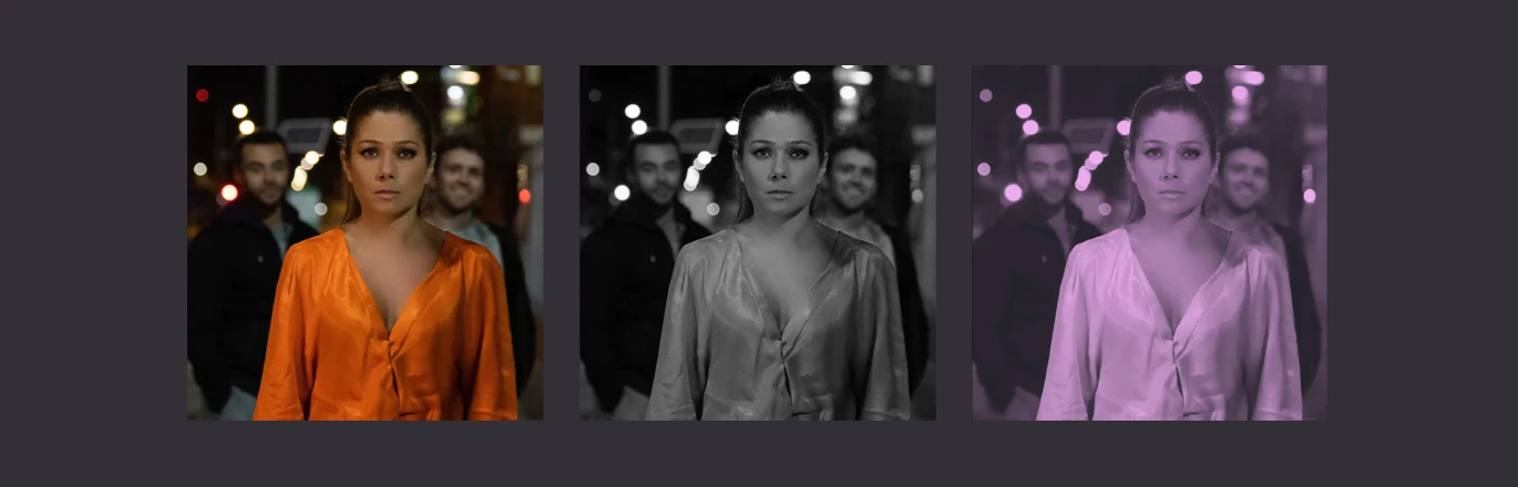
With the duotone gradient map applied, I could then take the results and create two new offset positive/negative layers—one left, the other right— to begin building my pseudo-3D effect. The feOffset primitive allows me to offset an input using horizontal (dx) or vertical (dy) values. For my pseudo-3D effect, I offset the first layer by -3 and named the result “left,” while the second layer was offset by 3 and was named “right:”
<feOffset in="duotone" dx="-3" dy="0" result="left"/#62;
<feOffset in="duotone" dx="3" dy="0" result="right"/#62;
Next, I took the result from “left” and removed all but the red colour values to create a result I called “leftRed:”
<feComponentTransfer in="left" result="leftRed">
<feFuncR type="identity"></feFuncR>
<feFuncG type="discrete" tableValues="0"></feFuncG>
<feFuncB type="discrete" tableValues="0"></feFuncB>
</feComponentTransfer>
And took the results from “right” and remove the red channel. This left both green and blue which combined create cyan:
<feComponentTransfer in="right" result="rightCyan">
<feFuncR type="discrete" tableValues="0"></feFuncR>
<feFuncG type="identity"></feFuncG>
<feFuncB type="identity"></feFuncB>
</feComponentTransfer>
Finally, I blended the results from “leftRed” and “rightCyan” using a lighten blending mode to complete my pseudo-3D effect:
<feBlend in="leftRed" in2="rightCyan" mode="lighten"/>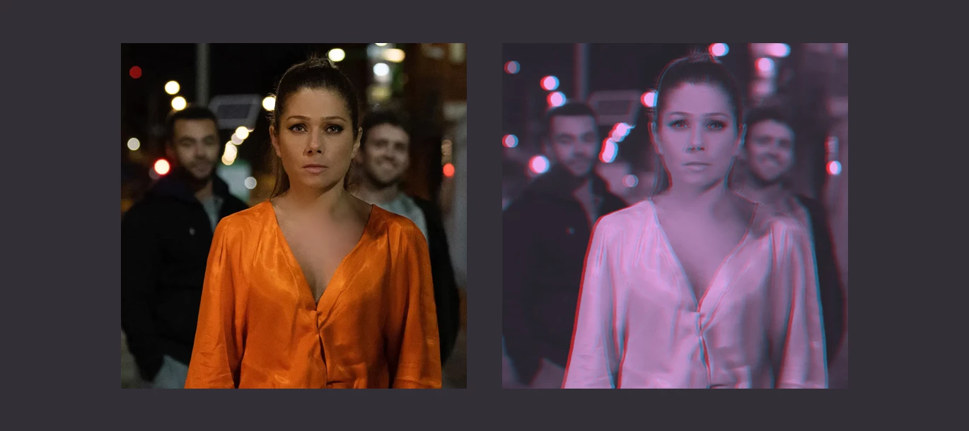
For years now, CSS has had its own filter property which enables us to add filters such as blur, brightness and contrast, hue-rotate, and even sepia. These CSS filters were derived from those in SVG. CSS filters are powerful and well-supported, but lack some of the possibilities of filters in SVG. Fortunately, we can use SVG filters in CSS by referencing them using the url value. To apply my anaglyph filter to all images in Emma‘s website:
img {
filter: url("#anaglyph"); }
It took me quite some time to work out how to create my pseudo-3D effect but that’s nothing when compared to time it will save Emma and I in the future. Whenever she needs to add new images to her website, neither of us will need to spend time in Photoshop creating sets of multiple images. I’m very pleased with the results of my pseudo-3D effect and I learned a lot while making it, but I know I’m only scratching the surface of what’s possible with SVG filters.
Tomorrow, I’ll show you some more of the SVG experiments I made while designing Emma’s new website.