Type does not look exactly the same in every browser
Joe Drew, one of the people on Mozilla’s graphics team has responded to my comment on First Impressions on Typekit; Studying type rendering closely also calls into question the natural differences between the ways that browsers render type as I discussed in Walls Come Tumbling Down. Safari’s text rendering is clearly more refined and superior to Firefox 3.5
.
As one of the people on Mozilla’s graphics team, I’d love to hear what issues Firefox has with font rendering so we can fix them. Doing, say, a follow-up post with screenshot comparisons would go a long way!
I'm happy to oblige.
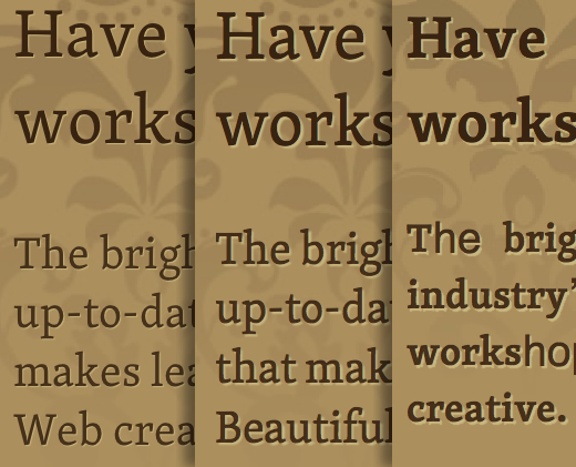
Text rendering. Safari 4 / Firefox 3.5 / Opera 10 Beta
One of the major reasons why I prefer Safari over every other browser on OSX is the delicate way that it handles text rendering, the thinness of its characters and the subtlety of how it handles text-shadow.
In contrast, Firefox's text rendering has always seemed heavy-handed. Characters look bolder and blocky, text-shadow is wider, stronger.
If Firefox is heavy-handed, Opera wears boxing gloves weighed down with lead. Leaving aside its newfound issues with Typekit delivered @font-face, Opera's rendering of any typeface bears no comparison to the subtlety expressed by Safari.
I can hear those words ringing again in my ears, web sites need not and should not look the same in every browser.
Moreover, given the current discrepancies in text rendering, they cannot — no matter how hard you try.