Design deja vu
This week, I launched Design Chatter. It’s a weekly one-hour Zoom call where like-minded designers can give each other constructive, friendly feedback.
Do you freelance, work alone, or with a small team? Does that sometimes feel isolating? Would you like to share your work with other designers who can give you advice and friendly feedback? If that feels familiar, join us for design chatter.
For the design, I wanted to place a full-height, fixed-width graphic in the centre of the layout. On either side, I needed flexible columns so the design would fill the width of the page.
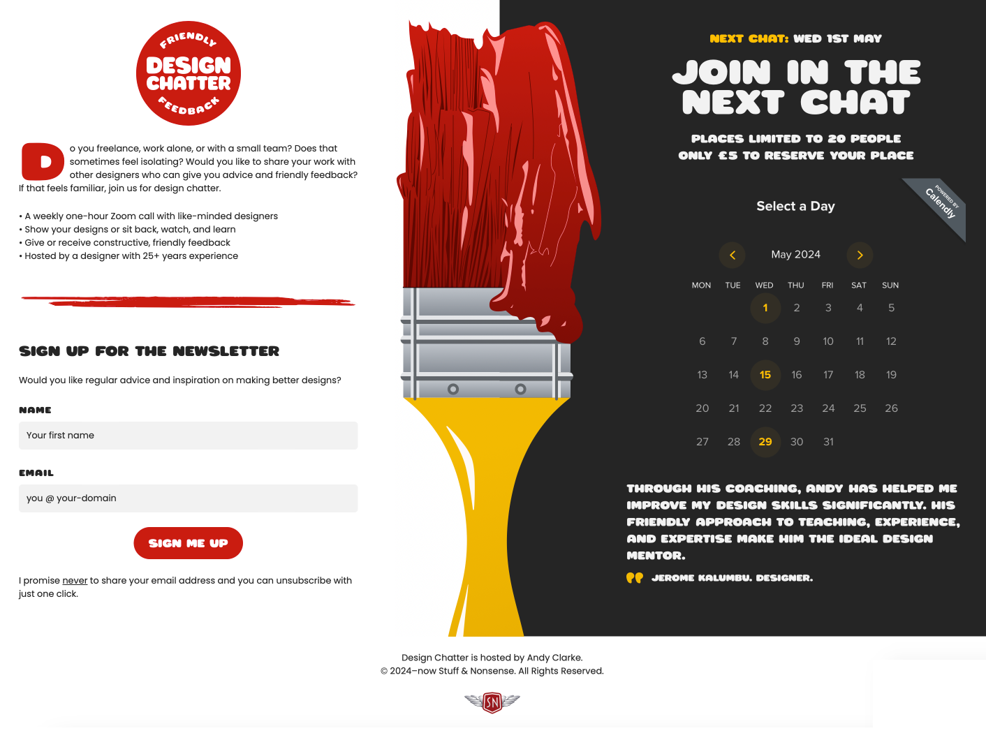
While designing, I had an overwhelming feeling of deja vu and that I’d made a layout exactly like this before. So, I looked through my archives, and lo and behold, there was a liquid three-column CSS layout with a fixed positioned and width centre column design I’d blogged about first back on November 23rd 2005.
Early on in the design, the need arose for a liquid three-column layout which featured two flexible outer columns and a fixed-width centre column, not a layout commonly seen implemented with CSS. I also wanted the centre column to be fixed in the browser window and so not move with the scroll.
The 2005 markup is virtually identical to what I’d use in 2024, with a wrapper around the content and inside, three elements to create the columns:
<div id="content">
  <div id="nav">…</div>
  <div id="content-main">…</div>
  <div id="content-sub">…</div>
</div>
However, the CSS is much less elegant, to say the very least, needing every element to be floated left:
#content,
#content-main,
#content-sub {
float: left;
text-align: left; }
Being in the pre-responsive era, I designed this layout to work down to a 1024px width. The CSS included a tricky mix of percentage and pixel widths. First, the content area filled the full width:
#content {
margin: 0 2%;
width: 96%; }
The floated left column had a 34% width plus 200px of right padding. Why 200px? Coincidentally, that was the width of the fixed centre column:
#content-main {
min-height: 15em;
width: 34%;
padding: 0 200px 20px 0; }
Next, the right column was almost a mirror of the left, with a little negative left margin added to pull the column into position. Once again, the 200px left padding created space for the fixed centre column.
#content-sub {
min-height: 15em;
width: 34%;
margin: 0 0 0 -200px;
padding: 0 0 20px 200px; }
Then, the absolutely positioned fixed, 200px wide, centre column:
#nav-main {
position: fixed;
top: 0;
left: 34.6%;
min-height: 60em;
width: 200px; }
Fast-forward to this week, and my markup is remarkably similar to before, although over the past 19 years, we’ve been given new elements and attributes to work with:
<main>
  <header> </header>
  <section>…</section>
  <section>…</section>
</main>
However, unlike my HTML, the CSS needed for my Design Chatter design is far less complicated and more robust. Gone are the floats and tricky mix of percentage and pixel widths, replaced by the elegance of CSS Grid and modern fractional units:
main {
display: grid;
grid-template-columns: 1fr 300px 1fr; }
Also available today are units which set the minimum height of each column to 100% of the viewport height:
main > * {
min-height: 100vh; }
Then, there’s the modern and far simpler way to place columns onto the grid I’d defined:
main > section:nth-of-type(1) {
grid-column: 1;
grid-row: 1; }

main > section:nth-of-type(2) {
grid-column: 3;
grid-row: 1; }

main header {
grid-column: 3;
grid-row: 1;
background-image: url(brush-l.svg);
background-position: 50% 30px;
background-repeat: no-repeat;
background-size: 100%; }
19 years ago, I didn’t consider different screen sizes, but today, I wrap those grid styles inside a size media query, something else unimagined in 2005:
@media (min-width: 64em) {
…
}
And to present people using smaller screens with an alternative orientation header background:
main header {
min-height: 180px;
background-image: url(brush-s.svg);
background-position: 0 50%;
background-repeat: no-repeat;
background-size: contain; }
Nothing is really ever new in design, but I was surprised to find myself recreating a layout from almost 20 years ago. I suppose that it shows I was interested in creating unusual layouts even then. Thankfully, we now have the tools for implementing them easily and the browser support to display them reliably.