Black and white: Day five
Young Flintshire
We are in the final stages of completing our project for Young Flintshire, an initiative for young people in the county. And the process of design has taken many things from the stuff that I have talked about this week.
For this project, we hired a talented (and beautiful ;) ) young illustrator to design us a cast of characters. As we needed approval at each stage from a focus-group of young people, Holly began by drawing pencil sketches before moving on to inked illustrations (which were scanned and coloured in Photoshop).
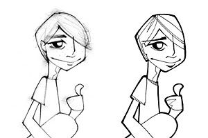 Holly Lloyd’s original artwork
Web page layouts
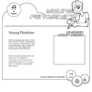
After several uninspired layout attempts :(, I decided to try a similar process with the web page comps and I started with black and white line-work to allow me to focus on composition without the distractions of colour,
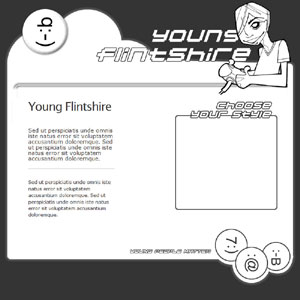
before blocking out areas in ’ink’.
Working with colour
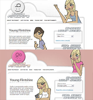
I knew that I wanted a subtle colour palette overall, with only splashes of bright colour to liven up the design, so I created simple colour palettes and added these to the blocked-in layouts.
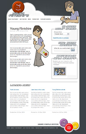 Screen-shot of finished CSS template
Invasion of the Body Switchers
As there are to be three styles (boys, girls and a general older version) to be switched using Invasion of the Body Switchers, I made separate ’frames’ in Fireworks and added each colour set to the line-work. Nothing unusual, but extremely efficient.
And by using multiple classes attached to the body tag of each template, I was able to create different layouts and styles from the same XHTML.
Wrapping things up
I think that I have learned several things from this exercise.
We are all (probably) familiar with separating content from presentation, but when designing it is sometimes all too easy to start mixing layout with colour and other design decisions. By stripping away the colour, I was able to concentrate more on composition and layout. (Maybe one day, I’ll get to do a job which is purely black and white.)
I also learned that it is far easier to get designs approved when you break down a design into stages, as this focusses a clients’ mind onto a particular issue rather than on a mixture of layout, colour etc. Working from a line-work base also meant that it was quicker to build variations-on-a-theme, as I have done with the different styles.
XHTML and CSS on the project is now complete, and we are just waiting for final content. Hopefully I’ll be announcing a launch pretty soon.
I’ve enjoyed rambling about this stuff. Anything to add?
Replies
-
#1 On December 14, 2004 03:20 PM David Horn said:
Anything to add? … just that this has been another excellent series to thank you for. The Young Flintshire site looks like it’ll be great. Good stuff.
-
#2 On December 14, 2004 04:30 PM Turnip said:
Great stuff! This is a fantastically logical way of approaching website design that I’d have never thought of myself. I’m going to try it with my next design… Cheers :)
-
#3 On December 14, 2004 05:41 PM Phil Baines said:
Good work guys! I really like this method of approach. BTW, if you know any good inkers (the comic book type) that need a small break, I have a friend who is looking for one.
So, Andy, you couldn’t wait until tomorrow to post this one aye? It might confuse some folks in the future to see the comments pre-dating the entry! ;)
-
#4 On December 14, 2004 06:51 PM Kevin Tamura said:
Nice, very niced. So, what do you use to do your "line" comps?
-
#5 On December 14, 2004 10:12 PM Malarkey said:
#4 Kevin: I use Fireworks now for 95% of the vector work that I do.
-
#6 On December 15, 2004 11:35 AM Tom said:
Those look good, but please dont make it too "cool", these kids they tend to see straight though that sort of thing.
-
#7 On December 19, 2004 02:44 PM Adam Pink said:
It’s a nice aproach, in some ways quite theraputic, hmm, it’s given me an idea for a site actually.
Tom: Can you explain what you mean…or is it just the "Adults can’t really design for teenagers" angle?
