CSS Specisithity
I don’t look at my analytics often, but after last week’s site revamp, I thought I’d check to see which pages were popular. Oddly, a post in my ancient archives about CSS specificity had been getting a fair few Google referrals, so I decided to spend a few hours updating that, too.
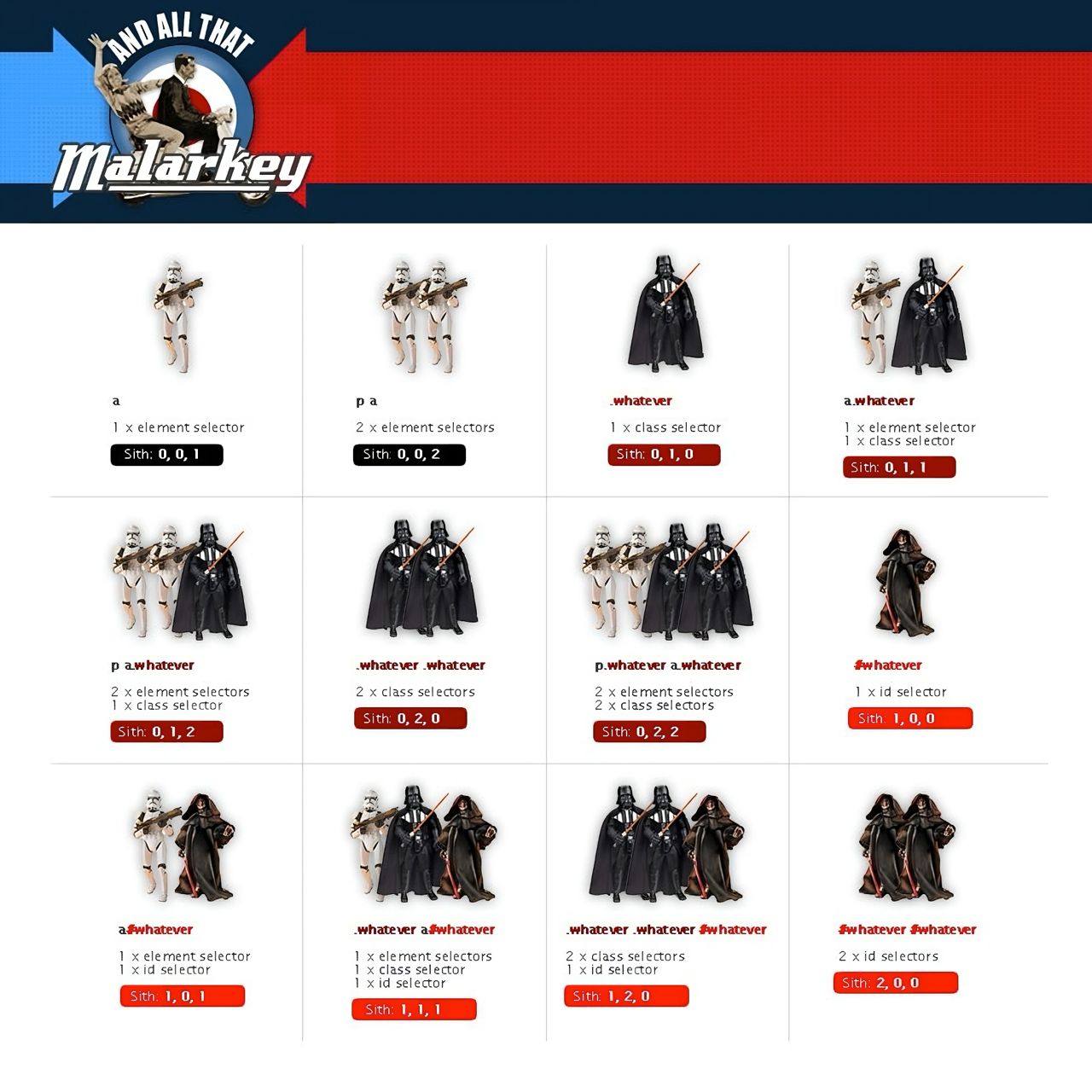
I first explained CSS specificity using Star Wars villains in 2005 because I found the tutorials confusing. The post caught on, and people have often told me it helped them grasp specificity. Previously, what I called Specificity Wars was just a printable graphic or PDF.

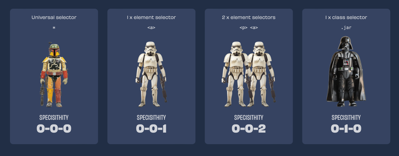
Now, it has a new name, CSS Specisithity, its own URL (stuffandnonsense.co.uk/specisithity), and a new design.

Passion projects like this can easily soak up time, so to make implementing the design for CSS Specisithity a fun challenge, I set myself a two-house time limit. My goal was:
- A flexible card layout without media queries
- CSS-only effects and effects
- Less than 100 lines of CSS
I’d achieved the first two with ten minutes to spare but exceeded my CSS budget. Still, two out of three ain’t bad.
The markup for each specisithity card is nothing to write home about:
<div id="specisithity">
…
<div>
  <p>1 x element selector</p>
  <p><code>a;</code></p>
  <figure>
    <img src="specisithity-2.webp" alt="">
  </figure>
  <h2>specisithity</h2>
  <p>0-0-1</p>
</div>
…
</div>
The fun started with a CSS grid, which fills the layout with cards. Each has a minimum width and expands to fill available space:
#specisithity {
display: grid;
grid-template-columns: repeat(auto-fill, minmax(240px, 1fr));
gap: clamp(1.6875rem, 1.6223rem + 0.3261vi, 1.875rem); }
I added a fallback background colour:
#specisithity > * {
background-color: #364461; }
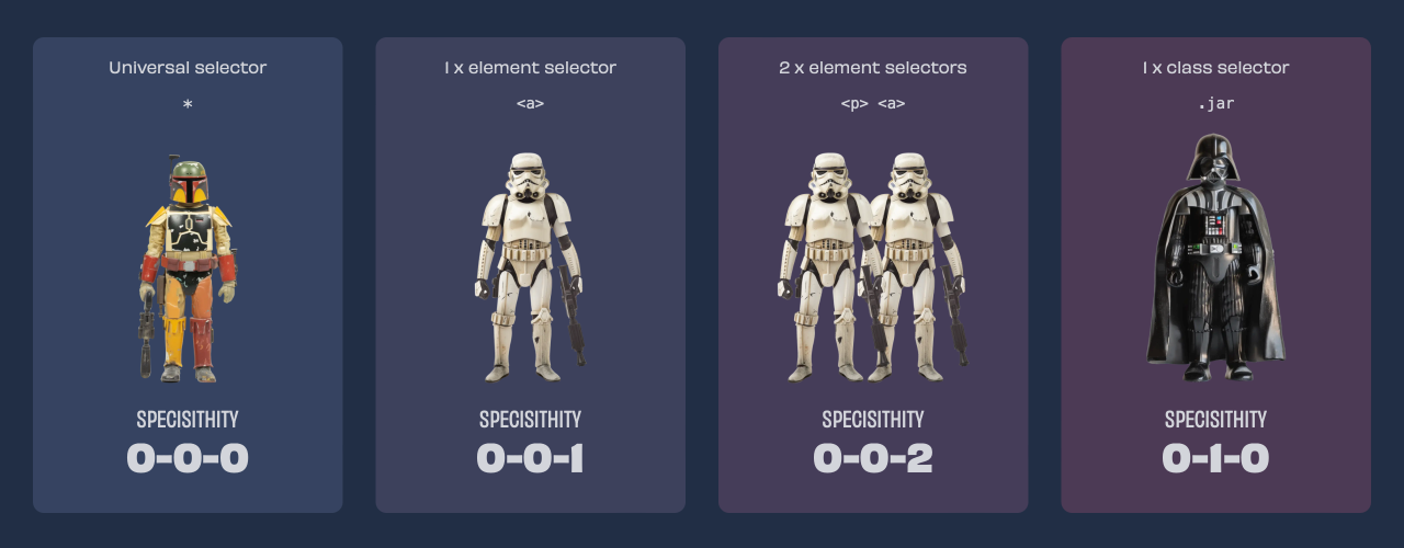
Then, progressively warmer colours as specisithity power increases:
#specisithity > *:nth-child(2) {
background-color: #3d415d; }
…
#specisithity > *:nth-child(18) {
background-color: #8a0f29; }
Card rotations
I rotated the cards anti-clockwise, then used nth-child selectors to achieve the scattered look:
#specisithity > * {
rotate: -3deg; }

#specisithity > *:nth-child(even) {
rotate: 0deg; }

#specisithity > *:nth-child(4n-7) {
rotate: 3deg; }
When someone hovers over individual cards, they smoothly return to the upright position:
#specisithity > * {
transition: .25s all ease; }

#specisithity > *:hover {
rotate: 0deg; }
:has() effects
For this design, I wanted to highlight individual cards, so, using a :has selector, I first reduced the opacity and scale of every card when someone hovers over the entire grid:
#specisithity:has(>*:hover) > * {
scale: .95;
opacity: .25; }
They return to normal opacity and scale when someone hovers on an individual card:
#specisithity:has(>*:hover) > *:hover {
scale: 1;
opacity: 1; }
Background animations
Finally, I wanted to add a spinning graphic to attract extra attention to a chosen card, so I placed an SVG image on a pseudo-element and positioned it behind the card contents:
#specisithity:has(>*:hover) > *:before {
display: block;
content: "";
z-index: -1;
position: absolute;
top: 50%;
left: 50%;
margin-top: -250px;
margin-left: -250px;
width: 500px;
height: 500px;
background-image: url(bg.svg);
background-size: contain; }
A mix-blend-mode blends this pseudo-element with the various background colours:
#specisithity:has(>*:hover) > *:before {
mix-blend-mode: plus-darker; }
A scale transform changes its size and educing the opacity to 0 hides the pseudo-element until someone hovers over it:
#specisithity:has(>*:hover) > *:before {
opacity: 0;
scale: .5; }
To make the element appear, change size, and then spin, I added an animation and transition:
@keyframes spin {
from { transform:rotate(0deg); }
to { transform:rotate(360deg); }
}

#specisithity:has(>*:hover) > *:before {
animation-name: spin;
animation-duration: 10s;
animation-iteration-count: infinite;
animation-timing-function: linear;
transition: .25s all ease; }
All are activated when someone hovers over each card:
#specisithity:has(>*:hover) > *:hover:before {
opacity: 1;
scale: 1; }
I don’t return to my old work too often, but I’ve always had a soft spot for what is now CSS Specisithity. Giving it a new design and its own proper URL feels right, and I hope it’s still useful for teaching people about specificity, as it did in 2005.