Black and white: Day one
When I didn’t know what colour to put down, I put down black. Black is a force: I depend on black to simplify the construction.
Henri Matisse, 1946
Browsing through my photography books collection this week, I stumbled across a book that I have not picked up for around fifteen years, a collection of portraits by celebrity photographer Terry O’Neill. Since the 1960’s, O’Neill has photographed celebrity icons. Along with other photographers including the late Richard Avedon and David Bailey, O’Neill’s work defined a generation of celebrity. If you’re interested in seeing more of his work, an excellent book of portraits is available from Amazon.

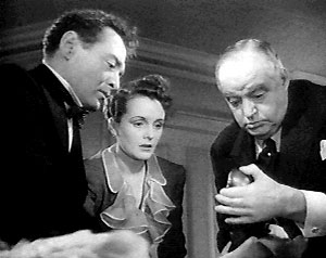
What struck me when looking again at his work, was the power and intensity of his black and white images and the fact that no matter what the period (60’s, 70’s, 80’s or 90’s), black and white amplified the personalities of his sitters. Without colour to divert our attention, the composition and structure of the picture is focussed on the subject.
Having been in O’Neill’s London studio several times a few years ago, I remember how simple his lighting set-ups could be, often using only one diffused, round light on a boom in-front of the subject (you can see it reflected in Sean Connery’s eyes above). His style reminded me again of the dramatic lighting of film noir and pre-war classic movies such as The Maltese Falcon and Casablanca. Here again, black and white served to focus attention of performance and personality, as well as the composition of the scene.

I think that today we take colour for granted and black and white film use is a comparative rarity. So I thought that I would write for a while about black and white in various mediums.
(Ed: What has this got to do with web design? Get to the point.)
I will, over the next few days. ;) Any thoughts?
Replies
-
#1 On December 11, 2004 02:46 AM Andrew Hume said:
Sounds interesting. I think it would be fascinating to look at the effect black and white could have in more contemporary design, even the web ;)
The images above have an extraordinary depth to them. There is pure black, pure white, and every shade imaginable in between them. They are both beautiful and powerful.
As regards O’Neill; thanks for reminding me of the work of this incredible photographer. I had a little brush with his portraits a few years ago when working in theatre. May have to dig out some old prints now.
I await further posts with interest.
-
#2 On December 11, 2004 12:18 PM Neil Whiteley said:
Unusual topic, but interesting.
I’ve always held a pation for Black and White photography or indeed any form of monochromatic imagery.
Many times over the last few years I’ve experimented with monochrome Web design with good and bad results but have yet to find a contract that would suit or a client that would allow such a design to go into production.
A well known Vodka producer ran an on-line campaign a couple of years ago that featured a purely greyscale design with just the bottle label picked out in red. The effect was remarkable.
Apart from the photography and the jolly young things fooling around on the scooter, this site is a quite a good example of the use of monochromatic design with a single accent colour.
The body texture plays havoc with my flat panel however. ;)
-
#3 On December 11, 2004 12:43 PM patrick h. lauke said:
well, as you know, my main interest definitely lies in b/w photography. i just seem to be far more comfortable with this medium, and enjoy the way that even everyday scenes can be transformed into something completely unexpected by simply removing the distraction of colour and concentrating instead on form, shape, shadow and most importantly texture. also, i’ll be the first one to admit that i just don’t understand colour, usually opting for a very simple desaturated look, even when asked to infuse some colour into my designs.
so…are we going to see some examples of how to start a layout purely as a b/w or grayscale mockup, and only later adding judiciously chosen limited palettes? can’t wait… -
#4 On December 11, 2004 09:23 PM Jon Hicks said:
You and Patrick reminded me of Jason Santa Maria’s Grey box methodology -https://www.jasonsantamaria.com/archive/2004/05/24/grey_box_method.php.
Thats how I do a lot of design, mainly due to colourblindness. I find it easier to focus on the design using just black and white.
-
#5 On December 13, 2004 08:34 AM mearso said:
Interesting thread. I’m back in education part-time and one of the things that us designers can be guilty of is to do about 50 variations of a logo, for example, which can give the illusion of throughness for an anxious design student.
Color is very tempting to dive straight in to, as it can give things a lift. I’m reading a lot of "Tufte" at the moment, and his philosophy is to strip out lots of extraneous info - chart junk- he calls it. Color can often be that junk.
