Designing for: Dig Business
It’s always gratifying when someone calls or emails out-of-the-blue and says something like, Can you do… for us?
. It’s even nicer when that person is halfway across the world. Over recent weeks, I have had the pleasure of working with the fantastic chaps at New York based consultancy Dig Business. The result is their new site and company blog.
I thought that rather than go through all that CSS this, and XHTML that malarkey, it might be interesting to take a Yellow Cab ride through the various design stages, the detours into dead ends and (hopefully) ending up on Madison Avenue. So here (without stopping much for coffee and donuts along the way) is Dig Business.
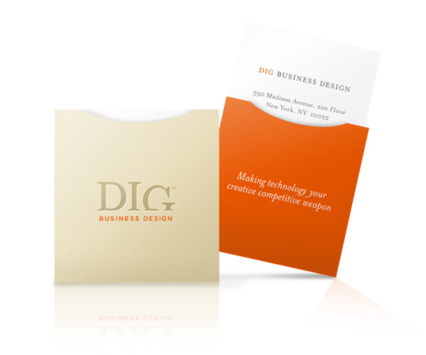 1. Dig’s unusual business cards with a slide-out inner proved an irresistable early inspiration.
 2. The very early draft layouts were unimaginative, but set the colour palette and tonal range firmly in mind.
 3. Design concepts deepened, introducing the card’s stronger colours and shapes. One early idea (proofed in CSS but later discarded) was to position a ’virtual’ business card behind the orange column and use em based top-margin to reveal more of the card as text sizes were increased.
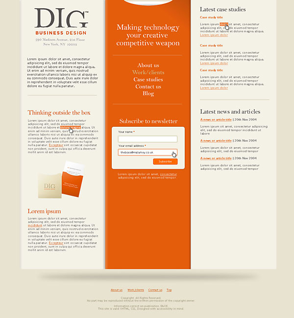 4. Ultimately a dead-end, the home page design developed into a three column design with a prominant center column. This later proved to be tricky to accomplish. Early CSS layout tests showed that either a fixed or fluid layout would be unworkable at less than 1024.
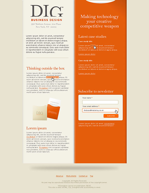
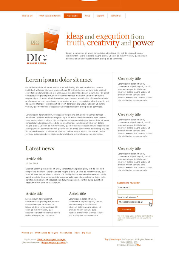
 5. Dig decided to drop the reliance on the card designs and opt instead for a cleaner, more open design with more emphasis on content.
 6. Elements from early designs began to creep back in. Some were abandoned, others found their way into the final design stages.
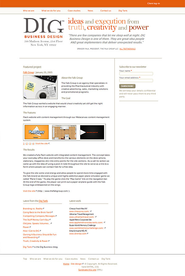 7. A final design comp which brings together various strands of the design process.
Digging deeper
The new Dig Business site and Dig Tank blog are both built using MovableType 3 as the engine, along with numerous MT plug-ins to make it go.
All that’s left to say is thanks to Dig for an enjoyable ride. See you in person for coffee and donuts in March.
Let me know what you think?
Replies
-
#1 On February 4, 2005 09:56 PM Chris Vincent said:
Beautiful! Very unique business cards, I love the way they kind of drove the design. A nice visual branding move.
-
#2 On February 4, 2005 10:05 PM patrick h. lauke said:
insightful and inspiring…great stuff as always, andy
-
#3 On February 4, 2005 10:20 PM Remco Zieltjens said:
A real shame the 3 column layout with the prominent center column (img. 4) proved too impractical to impliment. I love the look of that one. Though I really think the final outcome is also lovely. It’s very nice to see some snapshots of the whole design process.. insightfull!
-
#4 On February 4, 2005 10:22 PM JD said:
No doubt, cards are beautiful. But did you put thought about how an executive may finally store it? Will it fit in standard card holders? If not, then I think probably it’s not very good move.
I also think Contact page asks for way too much information. And it doesn’t do any field checking! I could submit a blank contact form. Same goes for Subscribe option on front page.
Sorry if I sound like an a**hole but I think design and function both should go hand in hand. On DIG site, design is great but function can have some improvement!
JD
-
#5 On February 4, 2005 10:23 PM Jeremy Keith said:
That’s a lovely site. Very pure and elegant.
I’m a sucker for good typography in an uncomplicated layout with generous portions of whitespace.
-
#6 On February 4, 2005 10:25 PM Max said:
Very nice! I love seeing designs going through the approval process like this.
-
#7 On February 4, 2005 10:25 PM Martin said:
Thanks for making posts like this Andy. Its always interesting to see how other designers work. Nice work as per. ;-)
-
#8 On February 4, 2005 10:28 PM Phil Roche said:
It’s really nice to see how a designer’s mind works.
-
#9 On February 4, 2005 11:33 PM Rob McMichael said:
Great evolution :)
I liked the first idea a lot, nice simple but perhaps a bit too bloggy.
The final design is clean, professional and simple, and reminiscent of the cards.
Anyone else just think after eights when they look at the cards :p
-
#10 On February 5, 2005 01:22 AM Matt said:
I prefer the final design, the company are more than just cool business cards at the end of the day.
-
#11 On February 5, 2005 01:41 AM Jeff Smith said:
Definitely an excellent piece of work. I wish I got to deal with more clients like this at my place of work. A lot of my designing is for web apps that have very strict design guidelines about them, doesn’t allow for as much creativity.
-
#12 On February 5, 2005 06:28 AM Josh Jarmin said:
Great work as always. It might just be me, but it seems steps 5-7 look like a print layout. Very good, clean look.
-
#13 On February 5, 2005 12:41 PM Reuben said:
Very nice indeed. ’Print’ style layouts with plenty of white space are my favourite. The subtle shades in there are nice too. Great!
-
#14 On February 5, 2005 02:03 PM John Serris said:
I actually really liked number 4 (3 column layout).
The final design is OK too though. -
#15 On February 5, 2005 02:34 PM Brent O’Connor said:
Good job! I like the 2nd mock-up the best but I can see why you went with the end result. I like the end result as well!
What program do you do your mockups in?
-
#16 On February 5, 2005 04:54 PM Malarkey said:
@ Brent O’Connor: Fireworks, exclusively.
You might also be interested in CSS mark-up guides if you missed it. -
#17 On February 5, 2005 05:01 PM Pierce said:
I like the final layout, but the second two-column layout with the orange right-hand column in image 3 is sweet. Love orange.
-
#18 On February 5, 2005 10:34 PM Kev said:
Excellent stuff Andy. I do agree with John and Remco about the 3 column design though - it is excellent. The central nav is something I have not seen before - it would be great if it was used, structure-wise, in one of your future projects
-
#19 On February 5, 2005 10:39 PM Dan Mall said:
This is really beautiful work. Very inspiring. Thanks for sharing it.
-
#20 On February 5, 2005 10:40 PM Malarkey said:
@ Kev: Funny you should say that Mr. Adamson… :)
-
#21 On February 6, 2005 02:35 AM Nigel said:
Superb! Thanks for sharing.
-
#22 On February 7, 2005 04:01 PM Phil Baines said:
Taxi Driver is an awsome film, and Dig has an awsome design. But what else do they have in common? I’m lost? New York?
Good work guys, I like it.
-
#23 On February 7, 2005 06:36 PM Carlos Porto said:
I always love to see another designers train of thought. I agree with the rest of the gang, the first designs were quite imaginative. Thanks for letting us in for a looksie!
-
#24 On February 8, 2005 12:48 AM Ben Lumpkin said:
I enjoy your methodology. It’s fun to see the visual representations of the "giving" and the "taking" between client and designer. When designing for a client do you normally create this many compositions? Or is based more on time and money of a project?
-
#25 On February 8, 2005 05:46 PM Andy Budd said:
Hi Andy,
I really like the 3-col design. It’s clever and has loads of character. However having read the content, I think the final design is the best fit. It’s clean, clear and really allows the companies voice to be heard. The design is modern, but the serif type face adds a sense of stability and gravitas.
Nicely done.