
Designing for: The Woodland Trust
(This one sneaked out while I was teaching in Cupertino) As a studio we work on a number of e-commerce projects each year. Sometimes where we complete the project from design through to implementation, other times where we work in partnership (often under white label with other creative agencies to implement their designs.
Sometimes projects are large scale, often smaller, giving us the opportunity to work with a range of different clients. It keeps life interesting. So it has been a real pleasure to work with those nice folks at The Woodland Trust, a not-for-profit organisation dedicated to the protection of native woodlands.
The Woodland Trust Christmas Catalogue
 The Woodland Trust Christmas Catalogue
The new Woodland Trust Christmas Catalogue has been designed to work in tandem with their printed catalogue. While some elements of The Woodland Trust branding were carried into the new site, the design process also allowed me to stretch my imagination and develop one or two new ideas while working closely with their in-house designers.
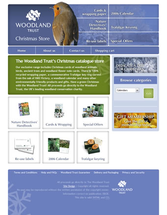
Home page assets
 Home page assets
It was important for visitors to the site to see key visual references from the printed catalogue, to make them feel at home. These references included graphical navigation into the various product categories from the home page. While visually graphical, the navigation was simply a list of links and so was marked up as a simple unordered list.
<ul id="nav-home">
<li id="nh-1"><a href="#">Nature detectives handbook</a></li>
<li id="nh-2"><a href="#">Cards and wrapping paper</a></li>
<li id="nh-3"><a href="#">Special offers</a></li>
<li id="nh-4"><a href="#">Re-use labels</a></li>
<li id="nh-5"><a href="#">2006 Calendar</a></li>
<li id="nh-6"><a href="#">Trafalgar keyring</a></li>
</ul>
We chose to use CSS positioning rather than floats to position the <li>s and anchors rather than the more commonly used float method.
ul#nav-home {
list-style-type : none;
position : relative;
background : transparent url(home-categories.jpg) no-repeat 0 0;
padding: 0;
margin : 10px 0 0 0;
height : 340px; }

ul#nav-home a {
position: absolute;
display : block;
width : 165px;
height : 165px;
text-indent: -9999px; }

li#nh-1 a { top: 0; left: 0; }
li#nh-2 a { top: 0; left: 175px; }
li#nh-3 a { top: 0; left: 350px; }
li#nh-4 a { top: 175px; left: 0; }
li#nh-5 a { top: 175px; left: 175px; }
li#nh-6 a { top: 175px; left: 350px; }
To add a little mouse action we added :hover effects using the single image rollover technique which involves moving the background image position to create the effect. One down-side of this technique is often the pesky flickering in Explorer, so we hid the :hover from IE by using child selectors. This I consider to be gracefully degrading.
 :hover effects
li#nh-1 > a:hover {
background: url(../images/home-categories.jpg) no-repeat  0 -340px; }
li#nh-2 > a:hover {
background: url(../images/home-categories.jpg) no-repeat  -175px -340px; }
li#nh-3 > a:hover {
background: url(../images/home-categories.jpg) no-repeat  -350px -340px; }
li#nh-4 > a:hover {
background: url(../images/home-categories.jpg) no-repeat  0 -515px; }
li#nh-5 > a:hover {
background: url(../images/home-categories.jpg) no-repeat  -175px -515px; }
li#nh-6 > a:hover {
background: url(../images/home-categories.jpg) no-repeat  -350px -515px; }
Browser retirement
Where practical we often choose to use more advanced CSS selectors. Where these selectors are not supported, we aim to provide a safety net for older browsers including IE6. One small example of this is in the Order buttons. We decided to use attribute selectors to convert plain text rather than place images directly into the markup.
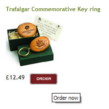 Anchors rendered by Firefox and Safari
<a href="#" title="Order now">Order now</a>

a[title^="Order"] {
float : left;
display : block;
width : 58px;
height : 24px;
margin-right : 10px;
background : url(../images/button-order.png) no-repeat 0 0;
text-indent : -9999px; }
Active branding
The last thing to mention is the treatment of the branding area where I experimented with a concept I have coined active branding. But more on that another day.
 Active branding
I really enjoyed working with The Woodland Trust and being given the freedom to experiment on their site. Any thoughts?
Replies
-
#1 On September 24, 2005 02:57 AM Dylan said:
Couldn’t you have just used the anchor background transparency technique described in the article you linked from wellstyled.com to keep IE from flickering on those mouseovers? I see hover states as pretty important to the overall design of a site and hiding them from such a popular browser seems unnecessary and detrimental if there’s a known technique to prevent it.
Forgive me if you have a specific reason for doing this that I didn’t realize (and of course I’m aware that you knew of the technique since you linked that very article), I’m just wondering about the reasoning.
-
#2 On September 24, 2005 05:03 AM Craig C. said:
The transparency switch is one workaround, but lacks elegance in my book since the :hover background is no longer on the link element, it’s behind it, thus detached from the correct element. I like Dean Edwards’ server-side solution which sends a signal that images are immediately expired so IE won’t bother checking them again. Even that is a bit of a hack, may not be doable on a client site where you don’t control the server, and possibly has other downsides to consider (messing with cache stuff is always a can of worms).
The good news is that most people using IE don’t set their browser to check for updates on every visit (it’s not the default setting, and most real-world users don’t change cache settings from the defaults).
More reading: Minimize Flickering CSS Background Images in IE6 and IE6/Win, background image on <a>, cache=’check every visit’: flicker! and a similar server-side fix for IIS.
-
#3 On September 24, 2005 07:08 AM James said:
The site does not render correctly in all browsers. The last line of the white intro text goes out of that green box and into the white page background making it impossible to see. Also everything just looks big: navigation, text, graphics. If everything was scaled down I think it would be perfect!
-
#4 On September 24, 2005 09:50 AM Malarkey said:
@ Dylan: "I see hover states as pretty important to the overall design of a site. […] I’m just wondering about the reasoning."
A judgement call, nothing more than that. :)
@ Craig: Useful reading for anyone encountering the flicker problems. Thanks!
@ James: "The site does not render correctly in all browsers."
Which browsers are you refering to? The site was tested in IE5.5/6 Win, Firefox Mac and PC, Opera and Safari at 800x600 and above so I would be interested in knowing about the problems you are seeing.
-
#5 On September 24, 2005 10:36 AM Matt Wilcox said:
James, try dropping your browser text size - I have a feeling you’ve got it set above the default (if you’re using Firefox hit Ctrl+0 to return it to default sizing).
Maybe we ought to add that to the testing suit Andy.
-
#6 On September 24, 2005 10:37 AM Chris Neale said:
I can add one browser to James’ list -
Firefox [1.5b1 admittedly] on Linux has overflowing white text in the green box; and the navigation wraps in the blue box at the bottom.
If you reduce the text size twice via in-built text zoom, things fit slightly better.
-
#7 On September 24, 2005 11:50 AM Jon Hicks said:
Wow, jealous! I’d love to work with the Woodland Trust!
-
#8 On September 24, 2005 07:33 PM David Horn said:
Very nice - as ever. Simplicity of markup a constant lesson for the rest of us.
When do they let you loose on their main site - and will you be keeping it in frames? :)
-
#9 On September 25, 2005 01:36 AM Sean Fraser said:
It’s another impeccable Malarkey presentation.
I’ve one suggestion. I know it’s fashionable not to include a description in the head section but a meta:description has it’s benefits. And, it hasn’t anything to do with search engine rankings.
Type "site:www.wt-christmas.org.uk" (without the quotes) into Google and Yahoo.
Google has taken it’s text for a description from "Browse Categories"; Yahoo has read the HTML.
Most search engines will place the meta:description into their search results description. If there isn’t a meta:description, search engines make up their own from what they find in the content of a page.
Meta:descriptions benefit someone searching engines: it’s the first thing that potential visitor will see.
-
#10 On September 25, 2005 09:48 AM Ian Lloyd said:
For maximum impact you wanns put a couple of Great Tits on the home page, not a Redbreast. Is this the kind of comment you were hoping for?
-
#11 On September 25, 2005 01:40 PM Andy Saxton said:
V.Nice. Impeccable visuals as ever with some nice lean code.
I agree with Ian though, a nice pair of Tit’s could make or break the site.
One thing I noticed is that the Woodland Trust logo in the footer (which is also a link) has a hover state and indeed, in IE, flickers. You probably know that already but just incase you missed it ;)
-
#12 On September 25, 2005 03:42 PM Knut Karnapp said:
I would be interested in knowing about the problems you are seeing.
IE 5.01/win has several problems rendering the text-aligning. The nice "header bird" cannot be seen / is not being displayed and the "Browse Categories" form is messed up. Well, it’s IE 5.01/win and you covered 5.5 so I don’t know if you mind 5.01..
-
#13 On September 25, 2005 04:46 PM Matt Robin said:
I’m intrigued by the -9999px on text-indent as I haven’t seen that particular value used before. If it was -10000px would that be too much?!
Interesting article all-round Andy…good one.
-
#14 On September 25, 2005 05:11 PM Matt Wilcox said:
Knut -
The robin is intentionally not shown to IE5 PC, which does not understand the required CSS to produce it with the markup as it exists.Well spotted on the Browse Categories form! I don’t know why that’s fallen apart, but i susspect it’s to do with moving the Dedicate a Tree link from it’s original placement below the form.
Matt -
The 999em (or 9999px) is generally used precisely because it’s an odd loking number. That way you know intuativly that the indent is for image replacement, and not for ’real’ text styling. -
#15 On September 25, 2005 05:30 PM Malarkey said:
@ Matt Wilcox: Good job I didn’t hire you for your spelling. ;)
-
#16 On September 25, 2005 06:09 PM Matt Wilcox said:
Ahh, well I know spelling is a weak point of mine, but my Firefox Spellbound extension needed a dictionary update and wasn’t working.
It is now. :p
-
#17 On September 25, 2005 07:27 PM Matt Robin said:
Matt: Cheers. :)
-
#18 On September 25, 2005 07:41 PM James said:
The browser I was looking at it through was actually my RSS reader’s browser. But I looked at it in Safari as well as Firefox on the Mac and it has the same overflow text problem. I don’t have my text size set to overide what has been set. I can send you screenshots if you want.
-
#19 On September 25, 2005 07:54 PM Michael Painter said:
I’m always intrigued to learn about the differences that each of the browser have and their little quirks. Since I’ve migrated to Macs last year I really haven’t paid attention to the quirks IE 6 has, which is really a shame (A shame that most people still use IE 6 :o).
Anyway, as I was viewing your site in Safari I noticed the "Re-use labels" and "Special Offers" have an extra little something when I moused over. All the other browers were spot on with the Safari exception. I’m on a powerbook running Tiger 10.4.2 with Safari 2.0.1 (412.4) at 1024 x 768.
The addition looks like the beginning of a new set of tabs(If that helps). -
#20 On September 26, 2005 10:10 AM Knut Karnapp said:
The robin is intentionally not shown to IE5 PC, which does not understand the required CSS to produce it with the markup as it exists.
Are you sure? I use absolute positioning on my site to position the logo and it works fine. I can’t see whatelse shouldn’t work in the code.
May be the problem lies beyond this:
which is not
exactlyreally what the w3c intends ;) -
#21 On September 26, 2005 10:16 AM Knut Karnapp said:
Sorry for doubleposting. I didn’t know html code is disabled. IE 5.01 is able to position an element absolute within a relatively positioned parent. I remember IE 5 having probs with elements filled up with nbsp’s. May be trying an alternative text, which is even good for css turned off, could solve this. But first I’ll let you - Matt - explain what you meant by the not understanding behavior of IE 5.
-
#22 On September 26, 2005 10:54 AM Neal said:
This is a small point but goes back to comments on the text-indent values. Just looked at the site and happened to be full screen (1600x1200) and could see the ’hidden’ text for the ’Browse Category’ drop-down… looks like the problem is a missing 9 on the label styling (form#CategorySelector label) as it is only indented -999px.
Sorry for being so picky but I would want people to tell me :o)
-
#23 On September 26, 2005 11:51 AM Matt Wilcox said:
James -
We have tested it on Safari and Firefox Mac and it’s worked fine, so this is something of a puzzle. I’d be grateful if you would send a screen grab to matt @ karova.com , as it’s not a problem I’ve been able to replicate. Cheers :-)Michael -
Cheers! I see what you mean, I’ll see about fixing that now.Knut -
Absolutely sure. It’s to do with mark-up restrictions and CSS inheritance (as understood, improperly, by Mac IE). It just turns out that IE5 can not position the Robin where it needs to go without changing the mark-up; which we chose not to do. I’d be grateful if you’d consider it ’graceful degradation’. ;-)Neal -
Thanks for the heads-up, it’s a missing ’9’, I’ll fix it now.On another note, the text overflow problem that was seen under Linux - we think it’s possible that the font-family is falling back to helvetica, which has a wider character spacing, and thus wraps to more lines. I’ve changed the green box area to be expandable, which ought to cure that issue (though only on our dev server for the moment, while it’s under testing).
-
#24 On September 26, 2005 12:00 PM Knut Karnapp said:
Matt -
I just use IE5 to check how my css works there I do not like the websurfing experience the Internet Explorer provides. I don’t know about IE mac, I was talking about the windows sibbling. But I think you have to confess that whitespace generated by nbsp’s is not the cream of the crop ;) But I like the site design very much, tough. The buttons made me think about styling buttons at all. But there are several problems with the handling of the submit type, only the lovely firefox gets it right running on windows. Sad.
-
#25 On September 26, 2005 01:18 PM Chris Hunt said:
It looks like a typically beautiful and elegant malarkey product, thanks for sharing it (and some of its secrets) with us.
As it stands, though, it’s fundamentally flawed - resize the text up by one step and you start losing text from the green box. Surely this is web design 101 - users can, and will, change the text size on their browsers (especially given the fashion for tiny text amongst some designers). If checking this isn’t in your test suite (hell- it’s about the only thing in mine) you really need to add it. Sure, press CTRL-Plus enough times and any layout will break, but it ought to cope with at least a couple of steps.
PS. Do robins really stand as upright as that? He looks like he’s trying to impersonate a penguin.
-
#26 On September 26, 2005 02:38 PM Matt Wilcox said:
Chris -
As stated above, this flaw has been fixed, but is not yet on the live site.He’s a real robin, cut from a real photo, so I guess they do.
-
#27 On September 26, 2005 04:48 PM Ted Drake said:
Hi Andy
Nice work, I love the layout.
I teach photography and tell my students about the power of the gaze. It’s something I’ve learned about through foreign cinema classes. I like the way you’ve placed the bird to the right of the logo and the bird is staring at it. You’ve created a strong leading line to the logo, forcing the viewer to remember who the page is.I’ve come across several sites that use images in the body and have people staring to the right. Do you want the viewer to look at the scroll bar? I’ve flipped images horizontally if needed (in photoshop) and used the subjects gaze to point out the quote box, sale items, important information, etc.
I hope I’m not stealing your active branding thunder.
Nice work as always
Ted
-
#28 On September 27, 2005 03:29 PM Andy Croll said:
Just curious as to whether you have a standard shopping cart system or have you used Karova as you did on the Disney Store?
-
#29 On September 27, 2005 03:40 PM Bruno Girin said:
It looks good! That only problem I’ve found is, when you increase the font size significantly, you stretch the green box beyond the size of the images used as sliding doors and the middle part of the box is then white text on white background.
It’s also erm… very white if you disable images. Matt, I can send you screenshots if you want.
-
#30 On September 27, 2005 09:36 PM Malarkey said:
Hi guys,
Many thanks for your kind words about the design of the site and for taking the time and interest to look into the code. It is always a pleasure to get such detailed feedback.