Find your way back
Stuff and Nonsense is in the final stages of testing a new e-commerce store for a client (more about that when the site goes live on Wednesday). Key issues for the client were making the new store simple to navigate and highly usable, providing an engaging customer experience.
As part of the planning for the site, we looked at ways that we could increase a customer’s opportunity to buy by providing a range of simple to use navigation devices. One of my favourites is what I call the ’history palette’ (ed: Yes I know Adobe got there first ;) ). This palette tracks viewed items and displays them as links in a persistent panel.
The idea is not new of course, Amazon, the Daddy of usable stores, has had something similar for sometime. But I wondered how widely used this type of device is and at the start of this project I looked at forty e-commerce stores from around the world to see if anyone had equalled or bettered Amazon’s example.
Shopping without shoe leather
The selection of the forty sites was no way scientific. I picked stores from high-street names, used Google to search and tried to avoid sites which were built on specific e-commerce software platforms. I expected to find plenty of Amazon clones, but after a day of shopping without shoe leather, I had found only four stores (including Amazon) which provided a form of history palette. To round the number up to five I added eBay which I knew tracked searches.
Let’s start with the master
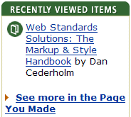
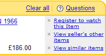
Amazon’s approach takes two forms, a ’Recently Viewed Items’ panel with links back to an item detail page and a cleverly branded ’Page You Made’. The latter is a combination of side panel and a highly useful page which lists viewed items along with recommendations for alternative items. This solution clearly works for Amazon, but strangely neither panels nor page contain any ’add to basket’ buttons and a customer must revisit the item detail page to make a purchase.

Amazon is widely renowned as setting the standard that other online stores dream of emulating. The UK’s own Blackwells boasts over 2.8 million books and it too sports a history palette. Blackwells is the only book store in the forty to do so, a strange finding considering that the list contains such notables as Barnes and Noble and bol.com. Blackwell’s history palette is similar to Amazon’s but adds the facility to clear the list. But once again, a customer must return to the item detail page to make a purchase and the panel is not linked to the shopping cart.
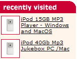
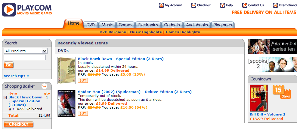
Computer giant Dabs follows suit with a basic palette which adds a tiny thumbnail image of the items previously viewed. Movies and music supplier Play takes a similar approach, this time offering a link to a separate page containing previously viewed items. Unlike Amazon, Play’s listings contain ’Buy’ buttons to save the customer the effort of revisiting the item detail page.
And onto eBay
Strangely, as eBay is not strictly an e-commerce store, it’s history palette offers the most inspiration. While the format and functionality is familiar by now, tiny blue links to ’similar’ items offer a glimpse of what a truly useful history palette could be like.
Learning from history
For the new site I alluded to earlier, I wanted to expand the possibilities of the history palette from this inspiration. Here is what I came up with.
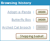
I decided to stick with the traditional links back to item detail pages and added an ’order’ button to each item. This means that a customer can add an item to their basket from any page on the site. Once an item has been added to the basket, the button is ’greyed out’ and disabled to prevent an item from being added again accidentally.
I have limited the number of items that can be displayed to ten (before a link to a separate page appears), although in theory it is possible for a customer to view many more items and then add chosen ones to the basket from one place, anywhere on the site.
The XHTML and CSS for my history palette is straight-forward and I intend to talk more in detail about this (and other features of the site) when the site is ’in the wild’.
What do you think?
Until then, does anyone have any more thoughts? Or have you seen any other interesting examples of a history palette?
Replies
-
#1 On August 2, 2004 03:45 AM Jonathan Snook said:
Right off the bat, all I can say is that your research is thorough and your implementation looks good. Have you tried changing the grayed out button to text that said "ORDERED"? I would think it would be more accurate.
-
#2 On August 2, 2004 06:11 AM Christopher said:
Excellent work. My only suggestion would be to lean towards convention and change the text on your buttons from "Order" to "Add to Cart." I realize it’s longer (which may be a concern) but I’m assuming adding to a cart is what’s going to happen when I push the button. Unless it’s a one-click purchase process.
In conjunction with Jonathan’s suggestion, you could then say "In Cart" and gray out items already there. I think that would make it pretty intuitive.
I just finished reading "Don’t Make Me Think," by Steve Krug. Excellent read!! So this kind of evaluation is what I’ve been doing with my own work.
Overall, I love the concept! Keep up the super thinking and openness.
-
#3 On August 2, 2004 06:46 AM Matthias Viehweger said:
Nice Idea. It’s always the details, isn’t it?
How about a ’disorder’-button (you know: unorder, take off the list)? Or would that cry for even more functionality in the ’recently viewed’-bar?
In the actual concept, graying-out the buttons of the already ordered items is absolutely sufficient. A buttons with a changing caption would be a little disturbing. My light switch doesn’t do that either, but it looks different so I can see wether it’s on or off (even if the light bulb is not working).
Another note: Must be a cool shop if you can adopt-a-panda AND get a butterfly box… :-)
-
#4 On August 2, 2004 08:55 AM Matthew Pennell said:
I’d echo the other comments to say that changing the button for something else (a tick?) would be a more useful visual indicator than greying it out, which has specific connotations in many other applications.
I don’t know what you feel the impact might be from a usability perspective, but more options - remove from list, in basket, remove from basket - could be provided if icons were used instead of buttons/words.
It would enable the user to micro-manage their cart and viewer-history from any page of the site.
-
#5 On August 2, 2004 09:46 AM Adam Pink said:
This is a much more usable version of the history function than I have seen elsewhere. One site I worked on recently had a curious dual breadcrumb system; a ’Where am I’ and ’Where have I been’. These both ran along the top of the page one under the other.
I argued to have the ’where have I been’ one removed and leave the former as my view is that people need to know where they are in relation to the over structure of the site more that know the path they have trod. This was a protal rather than e-commerce site.
The ’where have I been’ in this case was presented like a breadcrumb path, in a single horizontal line separated by verticle bars, so you could in theory have the same link appearing twice in the list…very confusing.
Malarkey’s version is completely sensible and has restored my faith in the idea. But I do agree with Christopher that the button is more familiar as ’add to basket’ or even just ’add’ than ’order’, order seems a little too committed to me.
-
#6 On August 2, 2004 10:29 AM Phunky said:
Im actual implementing a "History Panel" into a Lesiure Center site im doing at the moment and i find that a visual of the page helps alot in idetifing where you have been, so think of Play.com’s "My Basket" panel and change it to a "History" one an di think you get the ideal module :)
I wish i still worked with Sportsshoes.com as there so much i would love to do to that site now, even if they have totaly killed my old design from 2years ago!
-
#7 On August 2, 2004 11:22 AM Phil Baines said:
’in the wild’ - lol, your a funny man!
Keep it up Andy.
-
#8 On August 2, 2004 01:44 PM Chris Hunt said:
I hate to see a "where have I been" trail shown explicitly on the site - that’s what the [Back] button is for! Assuming you don’t break it with silly JS redirects, and give your pages meaningful titles, there’s no reason to duplicate this functionality in the content of your page.
The recent items panel is a different beastie, and looks pretty good. Looking forward to seeing the rest of the site!
-
#9 On August 2, 2004 04:10 PM Rob Cameron said:
I have to agree with some of the other folks on here and suggest not greying out the Order button. I saw your screenshot before I read what the functions are and the first thing that came to mind was that I couldn’t order item 3 because there was something specific I had to do on the product’s info page (pick a size or color maybe). The fact that it was already in my shopping cart didn’t come to mind.
I like the "Add to Cart" button idea, but if the text is too long how about "Add" and a little icon of a cart on the button? ’Course that would mean using an image instead of a button …
-
#10 On August 2, 2004 05:02 PM Christopher said:
You could even go so far as to create an image for each situation. One for adding to the cart/basket (maybe a basket with a box in it?) and one for adding the item to the cart (an empty one with an arrow pointing into the basket?). Swap them depending upon the status of the item.
That would be interesting to watch in a usability study. Would people "get it" or would they ignore them? Using title tags as tooltips might help as well. Small icons would allow people to "micromanage" the cart/basket as Matthew suggested right from the history area, but finding balance is important.
There’s a fine line between too many options and not enough relevant information. I’ve seen people gloss over and ignore little icons that would do cool things in their scan for things they actually recognize. Later they say "I didn’t know those were there…that’s cool," after you point them out.
I’m interested now to see how this plays out…
-
#11 On August 2, 2004 05:40 PM Christopher said:
Sorry - I meant one icon to add the item to the basket and one to indicate the item was already in the basket.
I really must get some more coffee…
-
#12 On August 3, 2004 03:07 AM Sunny said:
The new MSN Newsbot has a history palette (right column of the page has a link) which keeps track of recently read articles.
And it seems they use these for better recommendations. Interesting stuff.
-
#13 On August 3, 2004 09:49 AM Jim Amos said:
Perhaps I am missing something, or I need sleep, but: "Once an item has been added to the basket, the button is ’greyed out’ and disabled to prevent an item from being added again accidentally" -- what if a customer wants to purchase _more_ than one of a particular item (one that she/he already purchased) having just decided that one is not enough?
-
#14 On August 3, 2004 11:05 AM Phunky said:
Then you would change the qauntity when in your cart…
-
#15 On August 3, 2004 12:55 PM Malarkey said:
Hi guys, thanks for the input.
I thought long and hard about the labelling of the buttons in the history palette. The client (being UK based) wanted to use the more British ’basket’ rather than cart and decided that as the button only appears ’after’ a product detail page has been visited, that the text should read ’Order’ (it’s shorter too ;) ).
As for changing the wording on the button, Matthias hit the nail on the head when he spotted the light switch connection. I think that I will add an extended title attribute to the buttons, saying something like "Add to your shopping basket, you can always remove it later" and "This item is now in your shopping basket".
Karova Store has some VERY cool basket functionality. If you press ’Order’ on a product without options (colours or sizes), it is added straight to the basket. If the product HAS options, you are taken to the detail page to choose them.
In the shopping basket, a customer can change quantities or remove an item. If he or she tries to buy more than are in stock, they are informed how many are currently available.
I’m really grateful for your input and still surprised as to how few stores use this functionality. The site goes live on Wednesday (gulp).
-
#16 On August 3, 2004 05:10 PM Andy Budd said:
I think the history panel is a good idea. However I think it should only be used for logged-in users or on a session by session basis.
From a data protection standpoint you don’t really want the next user of your computer to see what you’ve been browsing.
-
#17 On August 3, 2004 05:50 PM Malarkey said:
Hi Andy,
Just to put your mind at rest. The site is configured to dump the basket and history contents one hour after the user-specific XML file has been last updated.
Of course on a site like this which sells ’nice’ products, unless you don’t want your girlfriend to see what you have bought her for Christmas, there should be no issue. But of course, I don’t know what strange and deviant products you are buying online!
;)
-
#18 On August 4, 2004 09:11 AM Phunky said:
So you gonna give us a link when its live :)
Id really love to work a web standards based store, i’ve only worked on one major store really and most of the code base never got updated and was such a hack to get it into otherdesigns and substores, but i did start to do so before i left the company that had the contract.
BTW: Malarkey, what would i have to do to get my self on the Brit List? /me searching for recognition (sp?)
-
#19 On August 4, 2004 10:44 PM Malarkey said:
@ Phunky: Content, content, content… and a large donation of donuts… ;)
-
#20 On August 5, 2004 09:44 AM Phunky said:
hehe yeh! would help if me site’s finished woudnt it :)
Just tend to always get as far as creating the blog, then i just get lazy and work comes into play.
-
#21 On August 10, 2004 05:27 PM Andy Budd said:
I was thinking in terms of not wanting ones girlfriend to see that you’ve adopted an Orang Utan for her birthday.
However I wouldn’t necessarily want her seeing what gimp masks I’ve been looking at either. It’d spoil the surprise ;-)
So if you’re not using cookies/sessions I guess you must be using a cron job or running a script each time a page is hit to check how old the file is. Isn’t this rather server intensive?