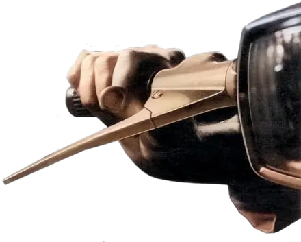
New Labour poster campaign
Oh my kiddy aunt, it’s started already. Driving through Warrington yesterday, I caught my first glimpse of the UK Labour Party’s first campaign posters for the up-and-coming (to a church hall near you) General Election.
(If I can resist for today) leaving the politics to one side, the new posters take their design inspiration from varying periods from Elizabethan times through to the 1960s and 70s. For a brief few seconds I was unaware that these rather striking (no pun) images were political posters. They made me look a second time, and I suppose that is the point. Here they are,
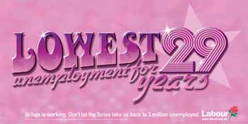
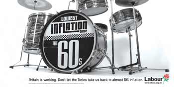
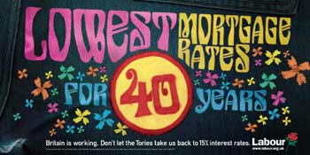
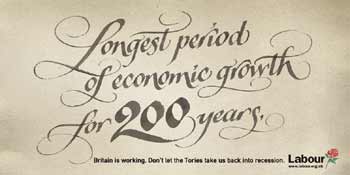
Now with retro nostalgia in vogue, I can see why these themes were chosen, although I think that their designs are generally much weaker than some other notable retro pieces such as last year’s Starsky and Hutch movie posters. But what do you think of them?
Down your street
How to politcal party posters look where you live? I’ve enable images in comments for this post.
Guidelines:
- Please ensure that images are no wider than 320px at 72dpi
- Upload them to your own server
- Add the XHTML for the image <img src="https://" alt="" />
Oh and something else
(You might also be interested to learn that the Labour Party’s own home page is only four minor errors away from XHTML validation. If only their criminal invasion of Iraq validated too… (Ed: I knew you couldn’t resist it!)
Replies
-
#1 On January 20, 2005 11:54 PM Jeff Croft said:
The biggest error on their website has nothing to do with XHTML validation -- it’s ruining those very repectable designs but streching them out like that! Poor posters!
-
#2 On January 21, 2005 01:29 AM Jeff Smith said:
There is absolutely no comparison of the above images and political posters here in Canada. The vast majority of our political posters have absolutely no style at all. The usually consist of: (a) A solid darker background with white text (usually in a typeface such as Impact or the like), (b) a picture of the candidate with some text splashed about, or (c) a combination of both. I’ll try to dig up some images.
-
#3 On January 21, 2005 01:35 AM Jeff Smith said:
Well, my quick search yielded no images, but take a look at the liberal party of Canada’s website will give you a hint about political party’s sense of style here in the great white north.
-
#4 On January 21, 2005 04:02 AM Jon B said:
They still have my vote…
Apart from Gordon Brown and John Prescott Labour still seem to be the only political party that is even slightly aware of the benefits from being moderately uptodate with the changes in society. The posters are cool, but even cooler is the fact that a political party uses such a design style to present their campaign.
-
#5 On January 21, 2005 04:06 AM Tom said:
I quite like them.
-
#6 On January 21, 2005 08:01 AM mearso said:
Funnily enough I attended a lecture on this week on the Tories’ election posters of 1979. Specifically the famous "Labour isn’t working":https://politics.guardian.co.uk/election2001/images/0,9350,449826,00.html poster. The reason I mention this is that many subsequent posters of various political hues refer back to that seminal poster.
If you notice in the taglinie of these posters the Labour party is very careful to draw the sting of the previous campaign, affirming clearly that britain IS working.
The lecture was very good, debunking some of the myths arounud that poster and adding other interesting stories.
-
#7 On January 21, 2005 08:02 AM mearso said:
er, could you fix the link above?
cheers
-
#8 On January 21, 2005 09:30 AM Phunky said:
I do like them but your right, they look more like a night clubs fly poster for a "Retro Nite" then a poster that actualy looks like its from the 60’s
There still nice tho, altho it aint gonna make me vote as there all just as bad as each other
-
#9 On January 21, 2005 09:36 AM Matthew Pennell said:
It’s at times like these that I wish I had a little more in the way of "mad skillz" at graphical design - someone needs to knock out a funky 70s style poster:
"More innocents illegally killed in your name since East Timor. New Labour."
-
#10 On January 21, 2005 10:24 AM paul haine said:
I have particularly fond memories of New Labour, New Danger, because at the time I just thought it was hilarious.
-
#11 On January 21, 2005 02:41 PM Tom Williams said:
The "New Labour, New Danger" ones were quite smart, but the Labour retaliation, "Same old Tories, same old lies" were even better.
-
#12 On January 21, 2005 05:33 PM Carlos Porto said:
Those posters are so much "cooler" then what we have here in the states. But then again I’m not sure I want politics to be so smart with its advertising, although that may have been what the democrats needed to get bush out of office…
-
#13 On January 21, 2005 11:33 PM Rob said:
I agree with Carlos-- at least you have variety in your signs. The most daring departure we have from red, white, and blue came in the form of the black "W- The President" stickers.. (Todd Dominey’s take from October has a good summary).
I’d love to see more creativity in our campaign signs. America’s one big store-- we might as well have the eye-candy displays to sell our leaders.
-
#14 On January 24, 2005 11:47 AM Adrian said:
These posters are the evil siblings of the soundbite. This is what happens when you use Worcester Woman as your persona. They are good designs insofar as they meet their brief: to prevent complacency in the party faithful and to shut out the Liberal Democrats. But was that the right brief in the first place? Making the most of a first past the post system does nothing to increase the number of people voting.
The fundamental assumption here is that to succeed, a party has to follow the model set up by Saatchi with the Labour Isn’t Working campaign in 1979. But it is now 2005. That makes this, and every other, political poster campaign look incredibly dated. This model is contributing to, not solving the problems - cynicism, lack of political engagement, lack of trust - which dog contemporary politics.
Malarkey says
leav[e] the politics to one side
and look only at the design of the posters. Unfortunately, the politicians want the voters to do likewise. That’s the biggest problem of all. -
#15 On January 25, 2005 12:37 AM Pamela Heywood said:
Yes, on face value, the posters are nice. They’re fun.
Analysing it a little deeper though, I think they are a "symptom" of having a PR man for a leader and, a glaring example of what [former] staunch Labour support, Ben Elton, would have labelled "All style and no substance".
They wouldn’t be enough to get my vote back, that’s for sure.
-
#16 On January 27, 2005 04:04 PM Chris Hunt said:
I think they’re pretty cool, but, erm, Andy 200 years ago is not "Elizabethan times" - Elizabeth had been dead and buried for 200 years by 1805.
Won’t get my vote though, the lying b*stards. How about "Lowest commitment to trial by jury for 790 years"? (Magna Carta - 1215, non history fans! )
