Three designs
I thought that it might be fun to talk a bit more about design for a while rather than standards, and release a few work-in-progress designs for sites that will be launched in the next few weeks.
All three projects were blank canvases with no existing design or branding guidelines to follow, so it really was open-house. They are also at different stages of development.
Each of these have been piloted as Fireworks comps and as flat XHTML/CSS layouts before showing to the various clients for approval. We often release designs to clients as graphical comps, but also often make sample web pages as clients sometimes respond differently to designs when viewed as proper pages. I find that because we now separate design and layout CSS into separate files, that it is often a relatively speedy process to turn comps into CSS layouts.
(Ed: Enough about CSS, this is supposed to be about design!)
Osborne House
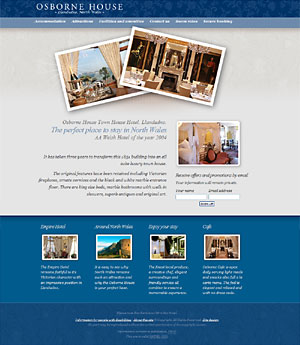
Osborne House is the sister hotel to the Empire Hotel, a long standing Stuff and Nonsense client. Here our aim was to strike a more sophisticated tone while keeping a common theme running between the two sites. Although the main content area is fixed and centered, the layout fakes fluidity by wrapping the three content rows into their own outers/wrappers which stretch to the edges of the view-port. A little background image trickery adds to the effect that the layout fills the screen.
As the hotel is in itself a visual treat (recently awarded best hotel in Wales), and my desk was scattered with photographs of the rooms, we decided to play on the photography theme. But we also thought it might be fun to break up the flat look by adding a highlight which escapes from the photographs.
Rhyl Commercial Property
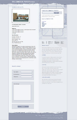
Rhyl is currently attracting a number of European initiatives to help it recover some of its former glory after years of being a faded sea-side resort. One of these initiatives is a commercial property database to encourage businesses to move into the area.
For this project, we wanted to avoid the standard estate agency look, and opted instead for a design concept based on drawings and blue-prints. Geometry is really important for this design and we worked to make sure that everything lines up.
Yorkshire Science
This project is interesting in that there is as yet no content available and we needed to allow space for an unknown quantity of content. The design here really needs to be fluid. (Ed: At last, a real fluid design!) and this will include some branding image trickery where the main image sits inside a fluid container which has a repeating background allowing the branding image to expand to any width. Stock library images still need to be decided on, so place-holders are used to create an overall impression at this layout stage.
Over to you
Funny thing is, is that during the designs we thought very little about standards or CSS until it was time to make the sample web pages. The same thing goes for accessibility too. Not that either will be after-thoughts, but we just don’t set out to design accessible sites.
Hopefully you’ll like them and I’d appreciate any thoughts.
Replies
-
#1 On November 26, 2004 01:13 AM patrick h. lauke said:
"Funny thing is, is that during the designs we thought very little about standards or CSS until it was time to make the sample web pages."
when you design and build a house, do you start by worrying about which mortar to use? no, you think about the bigger picture first, and choose your best materials when it’s time to realise the plan. xhtml, css and accessibility enhancements are simply building materials. you don’t set out thinking "i really want to build my house with this type of mortar"…if you do, you’re misguided ;)
-
#2 On November 26, 2004 01:17 AM Malarkey said:
@ Patrick: Yes, I agree 110%
-
#3 On November 26, 2004 02:33 AM Jonathan Snook said:
While one doesn’t set out thinking of it, I find, invariably, that knowledge of the ’materials’ involved always has a play in how things are designed. I can instantly tell someone who’s traditionally done print design because their comps demonstrate their inability to think outside the boundaries of their Photoshop canvas.
-
#4 On November 26, 2004 02:40 AM Jonathan Snook said:
Oh, I actually wanted to talk about the designs, too. :-) The Yorkshire Science and the Osborne House are really well designed. They suit the feel of what I would expect the organizations to be like. Yorkshire: cold and sterile as only science can be. Very crisp and sharp, though. They mean business. Osborne: Elegant is the word that comes to mind.
But the Rhyl design some ill-suited. The worn look mixed in with the edgy grid pattern and computer-y search panel. It just doesn’t seem to fit. I imagine that you guys were probably trying to do an "industrial" feel but it doesn’t feel like that to me. Not being a designer, however, I’m not sure that I can offer greater suggestion. Maybe more in the white/silver side of the colour scheme.
Anyways, they’re all great looking sites. Great work all-round.
-
#5 On November 26, 2004 09:14 AM Phil Baines said:
Very nice Andy,
I especially like the Osborne House one. I think I will be pointing a couple of our designers to this post to give them an idea of what skill they are up against.
-
#6 On November 26, 2004 10:36 AM Jeremy Freeman said:
Osborne House and Yorkshire Science look elegant and suit the purpose of the business down to the ground.
The Rhyl design - I can see what you are trying to achieve but the effect at the top and bottom to me looks a bit naff and it’s been done before - it’s nothing unique and branding wise it would be difficult to carry that through on their corporate identity / literature.
-
#7 On November 26, 2004 12:41 PM Michael Ward said:
The Osborne House design is fantastic. It’s elegant and suits its subject like an exquisite glove.
If I’m ever in Llandudno (not too far from good ole’ Lancashire) then I’ll have to ensure that I pay Osborne House a visit!
-
#8 On November 26, 2004 01:15 PM Phil Baines said:
After reading that you give people coded mock ups, rather than just graphic mockups, I was wondering, how many mock ups do you allow your client to ask you for?
If you spend the time coding a concept, and then they turn around and ask for another one, what do you do?
Charge them per mockup? or do you say right from the beginning that you only account for a certain amount of concepts.
I’m really interested in how other people do this.
-
#9 On November 26, 2004 02:28 PM Malarkey said:
@ Phil Baines: "Charge them per mockup? etc…"
Ah, I could tell you how we charge, but then I’d have to kill you afterwards. ;)
-
#10 On November 26, 2004 03:14 PM Phil Baines said:
"Ah, I could tell you how we charge, but then I’d have to kill you afterwards. ;)" - It might just be worth it. Not.
-
#11 On November 27, 2004 02:56 PM Rob McMichael said:
"when you design and build a house, do you start by worrying about which mortar to use? no, you think about the bigger picture first, and choose your best materials when it’s time to realise the plan. xhtml, css and accessibility enhancements are simply building materials. you don’t set out thinking "i really want to build my house with this type of mortar"…if you do, you’re misguided ;)"
I would refer to standards and accessibility more as methods used rather than materials. Also accessibility in your example would have been looked at from step one (no pun intended), you can’t just whack access ramps on the side of the Eiffel tower.
However I do agree with the points, recently I have been doing the opposite and thinking… "oooh that looks good and accessible, Ill use that", rather than designing and then building.
Although sub consciously you must be thinking about usability and accessibility even at these early steps otherwise you would end up with some ideas which are just impracticable.
I love your Yorkshire Science design, it is very clean but also colourful, something which is often hard to achieve with science sites. -
#12 On November 29, 2004 12:16 AM Tim Hill said:
I would agree with Rob, while you shouldn’t let accessibility and css limitations restrain your design. I still think you need to be thinking of them from the get go. As you do more sites I guess that becomes easier to do and still develop great sites.
As you seem to do countless times.my comment on the Rhyl mockup, does that worn look fit the audience? I understand the need to bring a more modern feel to the company but I was thinking of a more crisp and clean design, but I guess that is what the other sites will look like.
The starburst on the champagne bottle in the first mockup looks awesome nice effect. Maybe having a more subtle drop shadow so it looks more like they are actually sitting on the background.
And really like the science one, I find it so hard to design when people don’t have content, you conquered that well. -
#13 On November 29, 2004 02:35 AM Tom said:
Very interesting, here are my views on the design. Sod the CSS for another debate.
Osbourne house, I dont like the pictures on there sides. I dont think it fits well with the rest of the site being er "normal" . There kinda big to, I just viewed the page with the webdev toolbar and set my viewport to 800x600, you only see those two photos. Perhaps you could make them a touch smaller and fit a bit of info into the bottom of the page so as to lead the viewer into the text. The "offers" block, I would perhaps put a lighter background and split that from the text so as to create a clear divide. The blue "footer" and the way you have arranged that is really nice. Perhaps you could do that for different features of the the hotel?
Ok the second one, let me just quote you.
"Rhyl is currently attracting a number of European initiatives to help it recover some of its former glory after years of being a _faded sea-side resort_."
You pick a grungy theme? Should it not be clean, modern etc Blueprints are still a great idea.
Select a property type" get some little house icons in there. Im looking at a house, why the hell do I care about Cookies and log files? why dont you put a map of the area there, or more photos.
There isnt much to say about the last one, pickup a copy of NewScientist. Clean easy to read and well designed. They also get some nice illustration and stock so there talking about the end of the universe it looks quite pretty.
Right there you go, honest comments.
-
#14 On November 29, 2004 08:16 AM Malarkey said:
@ Tom: Great, constructive comments on the Rhyl site. I’m going to develop those further, thank-you.
@ Everyone: Seems like the Rhyl site is the weaker one of the three. I’m going to look into alternatives for the ’ripped’ header.
Thanks again. Do you think it’s useful to post columns such as this about work in progress? It’s certainly useful for me… :)
-
#15 On November 29, 2004 09:23 AM Rob McMichael said:
Yeah it’s very interesting to see, and nice to see how they develop over time.
Would also be interesting to see how you get around CSS problems when you convert them, however you may be lucky and clever enough not to have any. But even the simplest things sometimes become stumbling blocks. I spent about a day trying to remove white space from between in-line list items. In the end I just changed my design (its a sort of personal site so :p ). Nevertheless I would like to know pros have the same problems!
Rob
-
#16 On December 1, 2004 01:54 PM John Merrill said:
Great comps. It will be interesting to see the coded pages. I wonder how much disparity we’ll see.


