
Web design depth of field
Photographers commonly use depth-of-field to emphasise certain parts of image by de-focusing others such as backgrounds. Our eyes are naturally drawn to the sharpest part of any image.
I’m not a photographer (although I did work as a freelance photographers’ assistant in London for a year way-back). But I am interested in how photographic techniques might be used in web design. Particularly the idea of using photographic techniques to draw attention to certain parts of a web document.
One common criticism of Amazon.com is There’s too much…
and I don’t know where to begin…
. Designers often focus more now on content (rather than visual bells and whistles) and large areas of content which lack a visual ’focus’ might lead to users being confused as to which areas of a page carry more ’weight’. A photographer might use depth-of-field to lead the viewer, but web designers aren’t simply able to de-focus.
So, I started to think about other ways that I might emphasise areas of content and made some experimental layouts to explore how contrast may play its part. (Ed: I find it useful when looking at the larger images to stare at the gutter between the columns.)
Starting off
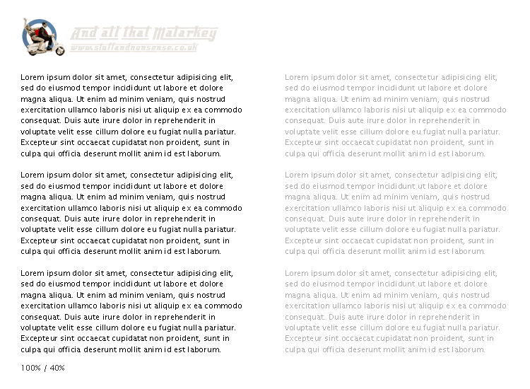
1. First I started with a simple two column layout where the two columns of text are of the same contrast between them and the background. Here there is no emphasis on any one column and my eyes are not drawn to anywhere in particular. It is easy to see how a user might feel a little lost and wonder where to start.

2. So in the next example I de-focussed the right column by reducing the contrast between the text and the background. This seemed to have an immediate effect in drawing attention to the left column.
Adding columns
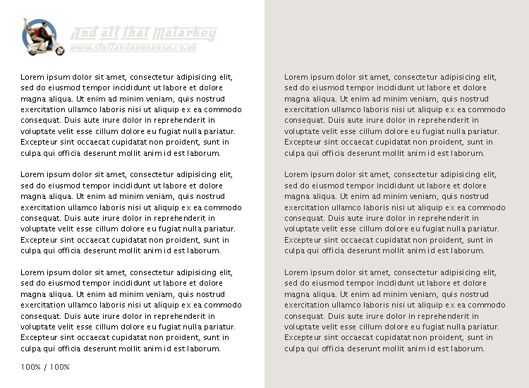
3. Many sites with a column-based layout use background colours to draw a distinction between different regions on a page, (say between content and navigation areas). I wondered whether adding a background colour to the right column would draw my eye first and I was surprised to find that background colour made very little difference.
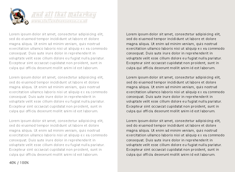
4. So again I reduced the contrast between the text and the background on the right and immediately the left side became more prominent leading me to believe that while the background colour is useful in dividing up the page, it has little to do with emphasising one region over another.

5. I wondered what might happened if the contrast ratios were switched, so I decreased the contrast on the left and increased contrast on the right. Right away, the text on the right became more prominent despite being placed over the background colour.
Mix-and-match
6. Time for a mix-and-match. Here I tried different levels of contrast on both sides and found that my eye was straightaway drawn to the two paragraphs with the strongest contrast.

7. And with the background colour removed, my eyes are again immediately drawn to the second paragraph with the strongest contrast.

What does this all mean?
In all honesty I haven’t really thought this one through yet. I have often thought that you should ’get your message across’ in the first paragraph on a page, because this is (probably) the only one that users will properly read. But it seems that using contrast to draw attention to certain areas might be useful in helping me break free from a top-down, column-focussed approach to my page layouts.
What do you think?
Replies
-
#1 On November 2, 2004 11:53 PM grant broome said:
Nice article. It really highlights the importance of thinking your design through and making it work. A simple principle put to good use.
It would be interesting to see something like this exploring the impact of font style and size changes. -
#2 On November 3, 2004 03:16 AM Jack said:
Well I think you’ve established that color-coding your columns may help to divide content but not necessarily prioritize it. Which is what I always suspected but never asked to confirm.
-
#3 On November 3, 2004 08:19 AM Kris said:
Of course, making it look more important is one thing. Making it be more important another. Using markup like <a href="https://www.w3.org/TR/REC-html40/struct/text.html#edef-STRONG">strong element">the strong element</a> would not be a bad move.
Maybe you should try out this visual thing with colors too sometime. It may lead to some interesting conclusions.
-
#4 On November 3, 2004 08:30 AM Jan Korbel said:
I think that background-color is very strong tool for drawing attention, but in this layout splited to halfs it does not emphasize the text because it sort of looks like just different kind of paper of the page which does not say it is more important.
Background-color works best for smaller chunks in larger single color area. For example try using that background for just one paragraph on that half and you will see. -
#5 On November 3, 2004 09:05 AM Dave Foy said:
I’ve been struggling over a particular layout for about 2 weeks now (seriously!) I usually make a decision pretty quickly and stick to it but this particular site necessarily carries a fair bit of copy and it’s been giving me major grief as to how to lay it out. Background colours; no background colours; 1px #CCC borders only; more whitespace; less whitespace. Grrr….
Reading this has given me a much needed sense of direction again - thanks Andy.
-
#6 On November 3, 2004 09:06 AM Matthew Pennell said:
From the RSS preview I thought you were going to have done something really clever with semi-transparent .png Gaussian Blur overlays to simulate depth of focus on a webpage!
But this was good too…
-
#7 On November 3, 2004 09:07 AM Gazzer said:
An interesting experiment, but I think you should carry it a little further. We are naturally drawn to certain colours, an obvious example being red, which apparently gets our attention as we relate it to danger.
Try changing the colour of the background and text and see what difference it makes.
-
#8 On November 3, 2004 09:24 AM dotjay said:
Picking up on what Grant said:
It would be interesting to see something like this exploring the impact of font style and size changes.
I think that fact that headings tend to be in a larger font size and perhaps stylised in some way in comparison to the majority of body text goes to show that these indeed have a considerable impact. I too would like to see a little experimentation with this.
Thinking a little on the abstract here, but capital letters receive mixed reception. Some find it draws attention, and others find it more difficult to read. I guess those two concepts are a little separated, but interesting all the same.
Ut oh, now my brain’s started thinking even more abstract. I’d better go.
-
#9 On November 3, 2004 09:27 AM John Oxton said:
have often thought that you should ’get your message across’ in the first paragraph on a page…it seems that using contrast to draw attention to certain areas might be useful in helping me break free from a top-down, column-focussed approach to my page layouts.
I think you are absolutely right about the first paragraph being used to "engage", it’s often not done very well though.
Another consideration is perhaps the "fold" of the page in so much that if the reader needs to scroll down or indeed across the page to reach the content then no amount of highlighting will help.
I quite like the idea of highlighting keywords throughout a body of content as a further attempt to encourage the user to read the full piece.
break free from a top-down, column-focussed approach to my page layouts.
I may be getting too set in my ways, far to early on in my career but at this time in my life I can’t help thinking that there is too much of a push to make things different for the sake of it. Books are all pretty much the same format but that doesn’t make them any less engaging if they are beautifully designed. I ran into this problem with a client who was hell bent on having his ’e-commerce solution’ look radically different to any other, as I pointed out to him the format was generally as it was for a reason, to make it usable. Consider this, I asked him with a wry smart ass smile, if you put the door to your shop on the roof do you thing you might lose some customers?
-
#10 On November 3, 2004 09:53 AM Malarkey said:
@ Matthew Pennell:
I thought you were going to have done something really clever with semi-transparent .png Gaussian Blur overlays…
Sorry :( , nothing quite so spectacular I’m afraid.
@ Mr. Oxton: I was really just thinking out-loud on this one, rather than formulating any sort of real theory about colours or layout. But, to explore your e-commerce example for a minute, there might be an application for altered contrast, say to give visual emphasis to special offers or sale products on a ’range’ style page. Ummm…
-
#11 On November 3, 2004 10:01 AM dotjay said:
"I quite like the idea of highlighting keywords throughout a body of content as a further attempt to encourage the user to read the full piece."
I like this idea too… I meant to mention it, but it was then that my brain snapped. highlighting or emphasising important parts of a paragraph can really aid speed reading too. However, there is a point at which it becomes overkill and it can focus the brain too much on those words and not on the main text, losing some of the benefit of scanning pages, like you might a newspaper.
I don’t use this sort of technique enough really. I wonder how subtle such effects can get yet still make an impact. For example, simply increasing the letter spacing on important words in the text.
-
#12 On November 3, 2004 10:09 AM James said:
I agree with John in that there is too much emphasis on making things different for the sake of it, without due consideration to why things are the way they are in the first place. Newspapers have for example stuck to the same format for many years, because it works!
I do agree though that the first paragraph is the important one in any large body of text, and as such should be given status. Some magazines have the first paragraph of any article in bold, or in larger text, whilst others have it in a different colour.
Maybe the way forward is to make the opening paragraph a darker shade than the rest of the body, and have keywords in the rest of the document the same shade as the opening paragraph.
Of course this solution will only work in certain situations - for example the Amazon scenario discussed earlier isn’t simply a large volume of text, but also contains images, price references, stars for grading, and of course references to other material. In this situation I feel that the use of whitespace is a more important tool.
-
#13 On November 3, 2004 11:19 AM Robert Wellock said:
I’d consider the contrast too low; it does not help with how I would scan a page for detail or gather information, more than likely I’d go somewhere else if presented with such a page - though it was interesting to visualise the results.
Overall you basically presented perspective much like with pencil drawings and lead hardness.
-
#14 On November 3, 2004 11:54 AM Martin Blackwell said:
One problem with colour coding elements for priority of reading that doesn’t appear to have been brought up (even though you are probably aware of it) is how relying on colour coding would fall apart if someone who was colour-blind read the page.
I prefer to rely on a point brought up by dotjay and John Oxton- that is to rely more on the style of the content, rather than the colour of content.
However (although purely for my own purposes), i do use the :hover pseudo-class over abitrary elements to emphasise the current section of a document I am reading, in a similar way to how you can emphasise a comment by moving your mouse over it on this fountain of knowledge ;)
-
#15 On November 3, 2004 12:26 PM dotjay said:
@ Martin: Agreed, but there is still relevance in the colour I feel. While it may not have any impact on some users, there is still graphical design considerations which may help some users.
Just as long as changes in colour don’t distract or hinder readability and are not used as a sole method of conveying information.
After all, this is only one of Malarkey’s experiments.
-
#16 On November 3, 2004 12:44 PM Mike Stenhouse said:
The EyeTrack article has some interesting findings for encouraging the user to focus on specific page elements… One thing that surprised me was that smaller text (or, more specifically, a larger contrast between text and it’s heading in small blocks) was read more carefully than more uniformally sized copy, which was more likely to be scanned.
I’m definitely in favour of guiding users with subtle hints (colour, contrast, shade) to make sure that they find the elements that are most important on a page…
-
#17 On November 4, 2004 12:55 AM Scott said:
From what I gather, you’re considering using your new knowledge to enable you to emphasize paragraphs other than the first one, rather than emphasizing the first one as others seem to be suggesting. This will allow you to write differently, perhaps putting the critical paragraph that locks the audience in further down in the document. is that right?
If you’re considering placing emphasis somewhere other than the top of the document, you’ll have to think carefully about how you write. Any information that comes before the emphasized portion should be non-essential (as in the case of my recap above), because chances are it won’t get read. People have a tendency to read from the top down, and I suspect that it’s unlikely they’d return to the top afterward. You’re deffinately on to something here though, and I hope you can make it work for you.
It might also be worth exploring how much the contrast needs to vary in order to create sufficient attention-grabbing impact. I did a quick evaluation and found that less than 4 hex values (#666 vs. #222 for example) won’t draw my attention sufficiently, but that was on your gray background. Things might be different on a white background.
-
#18 On November 6, 2004 06:01 PM Dale Cruse said:
To me, what we’re talking about is really the hierarchical display of visual information. When data is presented, it’s a simple fact that some information is more important than other information. That importance may change based on the goals of the author and/or the intended audience.
There’s a reason why headlines in newspapers are run larger than body text, which is run larger than agate type in the sports box scores.
For anyone unfamiliar with it, I suggest studying great newspaper layout for ideas to incorporate into your web design. Tim Harrower’s "Newspaper Designer’s Handbook" is great place to start.
Good discussion.
-
#19 On November 8, 2004 01:12 PM Paul Nattress said:
My solutions…
Use headers - put white space around them to bring them out of the page. A brief scan over the headers will give you an overview of the whole article.
First paragraph of the article should hook the reader - this is where you emphasis should be.
Experimentation part: I would like to see if emphasising the first paragraph under each heading will help people who wish to scan the article. Can they get the info they require simply by reading the headings and the first paragraph beneath each heading?
-
#20 On November 9, 2004 02:27 AM Stuart Young said:
Background colours - its about saturation - the most saturated backgrounds stand out - muted tones don’t.
See: boxesandarrows.com’s Natural Selections