Web imitates art
My recent post on creating colour palettes, combined with a conversation on painting with my friend Sue, (a Fine Art student at Liverpool University) got me thinking more about colour inspiration for web design.
Art from any period can inspire modern design, so in the first of a series of posts I have chosen my favourite period, 1960’s American Pop Art to create a few colour palettes based on favourite paintings or prints.
Andy Warhol
Few artists are as identified with the Pop Art movement as Andy Warhol. During the 1960s he began experimenting with mass produced objects, famously Campbell Soup cans and Coke bottles. In 1962, Warhol began making silkscreen prints of famous figures including Elvis Presley, Marilyn Monroe and Chairman Mao.
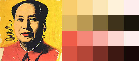 China’s Chairman Mao by Andy Warhol
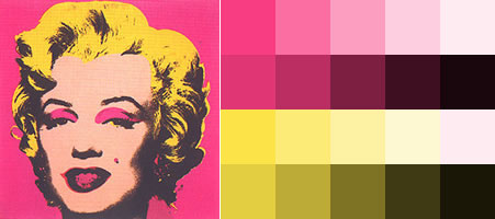 Marilyn Monroe by Andy Warhol
Jasper Johns
Jasper Johns is an American painter, sculptor and printmaker, making art from commonplace objects. Beer cans, flags, numbers and paintbrushes have been the subjects in colourful paintings.
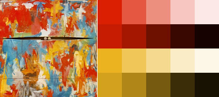 Two Balls by Jasper Johns
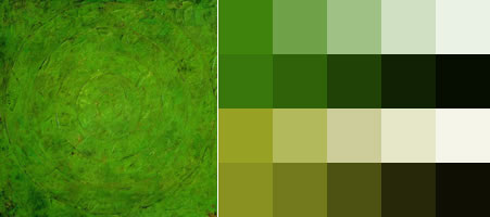 Green Target by Jasper Johns
Roy Lichtenstein
A Pop Artist with an unusual style, Roy Lichtenstein often worked with stencils to produce rows of dots to make his paintings look like mass produced, printed images.
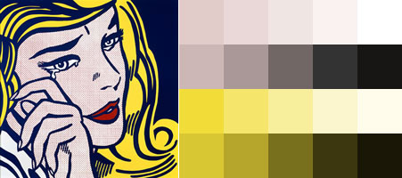 Hopeless by Roy Lichtenstein
What’s up next?
I want to experiment with different painting styles and periods in future posts. Any suggestions?
Replies
-
#1 On May 20, 2004 01:03 PM Phil Baines said:
I love the concept. Nice one Andy.
It ’s a shame that you didn’t grab the blue from Two Balls by Jasper Johns, and have three colours for that one.
:)
-
#2 On May 20, 2004 03:31 PM Trevor said:
This is really cool. I liked the other article you wrote, and I’m going to try and use thie technique. Thanks!
-
#3 On May 20, 2004 06:13 PM Colly said:
What on earth would a Pollock have given us here?! I reckon the Monroe is the most effective on first glance, but the Johns is sublime. Reminds me of old art college sessions extracting colour palettes from everything from Vermeers to Man Rays to bark!
Looking forward to your minimalism set!
-
#4 On May 20, 2004 08:24 PM Tim said:
Yeah, this is a great approach. I like to rip/borrow/steal/appropriate color from Jan Vermeer.
Also, Henri Matisse was an absolute *master* of color.
-
#5 On May 21, 2004 12:08 AM Jules said:
My personal favourites tend to be the impressionists - hmm, that made me sound like what I was talking about - such as Monet. With one of his paintings I have (a copy of), it tends to have a lot of pastels in it and a wide range of selection. One could amost devise a colour scheme just from selecting from the painting rather than using the paint as a starting point. Hmm, my book could use a reference to this technique, wonder how I can squeeze it in.
-
#6 On May 21, 2004 12:55 AM Malarkey said:
Jules
If your book is due in July, you’ll need to move sharpish!
How about an advance copy and letting me write a review?
-
#7 On June 5, 2004 10:31 AM lapin macadame said:
Very nice theory, very usefull.
I’m sure i’m gonna try this if i have some tim.
Especcialy like the Lichtenstein ( but they’re all good, of course ).
