A top down look at the CannyBill redesign
With the first phase of the CannyBill redesign process drawing to a close, I would like to say a huge thank-you to the CannyBill team for encouraging a public, open design process and to everyone who has commented and tweeted their helpful suggestions.
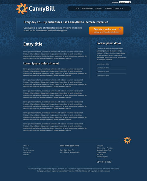
Although there is still work to be done, I want to share the full set of design templates starting with the third major template in the series — the product tour page.
While the original CannyBill site confusingly sports links to both a tour and demos, I am recommending to the team that they combine both features into one new tour section.
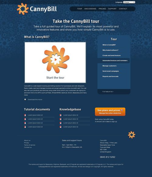
In place of dry lists of features and links to a demonstration area for the application, I am recommending that the team walk potential customers through the application's key features in a series of short videos.
While their investment in the production of these videos will be higher than written copy and screenshots, I think that they can be assured of a better user experience and therefore increased sign ups (although in the absence of data to back up that opinion it remains hopeful speculation. I will be interested in learning the results).
My first idea was to present these videos on a single page using a slick JavaScript interface, but now I am recommending that for several reasons, including better search engine visibility, that the videos be presented on their individual pages.
I also advise the team to group their tutorial documentation (PDFs) and knowledge-base information into categories that correspond with the videos that they present. I will be returning to this section, along with its associated support pages, at a later stage when we have a better understanding of the scope of that content. Until then, I hope that the page's grid structure will be flexible enough to handle almost anything that is thrown its way.
Other page designs
I have taken note of the feedback about the design so far and, where we felt it was appropriate, have incorporated it into the pages. I know that a design project is never truly finished and that we will iterate these designs during and after the build as we get information about how people are using the new site. This concept stage might be drawing to a close, but I can see an ongoing process of iterating aspects of the designs in the months ahead.
Here are the remaining page designs that include several content modules that the team can easily reuse and repurpose to make additional templates. Open them in either Safari 4 or Firefox 3.6 Alpha. Sorry Internet Explorer, Opera or Firefox 3.5 users, look at the screenshots on Flickr instead.
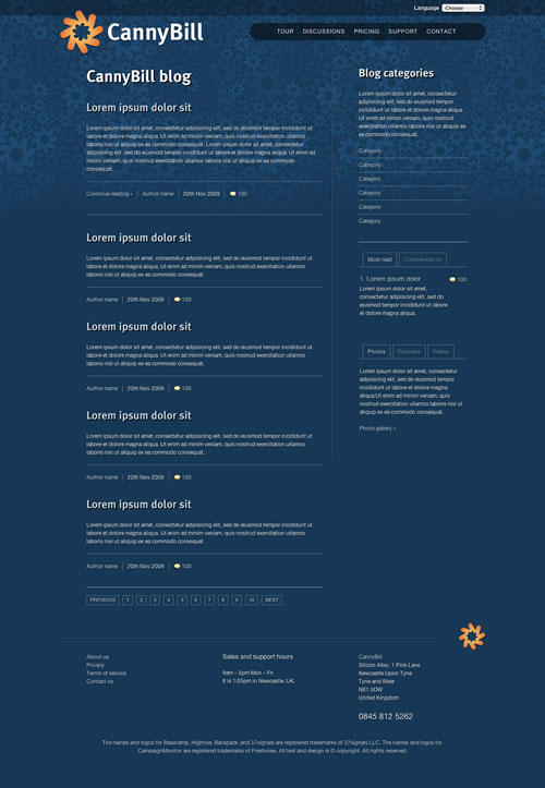
Discussions page: Flickr | HTML
You can also start clicking (or tapping) through the designs from the home page down as all links are now active.
Next steps
Over the next week I will integrate the new written copy that Relly is hard at work crafting and adjust layouts where needed. Then Owen and I will move onto browser testing to see exactly where the natural differences between browsers are acceptable. Look out for a post about that process next week.