Changingman layout (updated)
Changingman, a liquid three column CSS layout with a fixed positioned and width centre column, released under a Creative Commons Attribution 2.0 license. (This entry was originally posted on 23rd November 2005 and has been updated in 2009.)
Exactly four years ago, I wrote about an unusual three column CSS layout that I had been working on. Why am I republishing this article now, four years after I originally wrote it? One reason is that this article is still widely linked to and is one of the most read pages on this site. Another is that I wanted to update the example file as the original version featured branding from a company I sold in 2006. I have also taken this opportunity to explain how the layout was achieved, something I didn't do in 2005.
In 2005, I had been working hard on a new design. Early on, the need arose for a liquid three column layout which featured two flexible outer columns and a fixed width centre column, not a layout commonly seen implemented with CSS. I also wanted the centre column to be fixed in the browser window. Early experiments proved tricky to implement.
First the bare-bones HTML elements.
<div id="content">
<div id="nav"></div>
<div id="content-main"></div>
<div id="content-sub"></div>
</div>
<p id="footer"></p>
The content area fills the full width, with a little left/right whitespace. 80px bottom padding allows room to repeat the ska-squares background image.
#content {
position : relative;
width : 96%;
margin : 0 2%;
padding-bottom : 80px;
background : transparent url(content.png) repeat-x 0 100%; }

#content:after {
content : "\0020";
display : block;
height : 0;
clear : both;
visibility : hidden;
overflow : hidden; }
This layout is designed to work down to a 1024px width and uses a tricky mix of percentage and pixel widths. First, float the left column. It has a 34% width plus 200px right padding. Why 200px? Coincidentally that will be the width of the fixed centre column. More on that in a moment.
#content-main {
float : left;
width : 34%;
padding : 60px 200px 0 0; }
Floating the left column
Next, place the right column. Almost a mirror of the left column, with a little negative left margin to pull the column into position. Once again the 200px left padding creates space for the fixed centre column.
#content-sub {
float : left;
width : 34%;
margin : 0 0 0 -200px;
padding : 60px 0 0 200px; }
Right column (with negative margin)
Now absolutely position the fixed, 200px wide, centre column.
#nav {
position : fixed;
top : 40px;
left : 34.6%;
width : 200px; }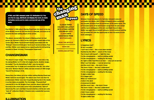
Positioning the centre column and completing the layout.
So here is Changingman (updated), released under a Creative Commons Attribution 2.5 license for you to do with whatever you so choose.