Design of the dead
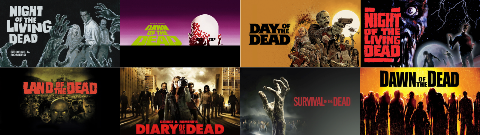
Over the past month, I’ve been upgrading my Apple TV movie artwork from portrait to 16:9. Like the artwork for many older film series, Apple’s artwork for George A. Romero’s series of zombie films is more walking on sunshine than walking dead. So—like I did for other series in my collection—I decided to make my own artwork.
When I’m designing new artwork for my film collection, I often start by looking at the original theatrical release posters. The posters for first three films—Night of the Living Dead, Dawn of the Dead, and Day of the Dead—each have their own style and progressively become more stylised.
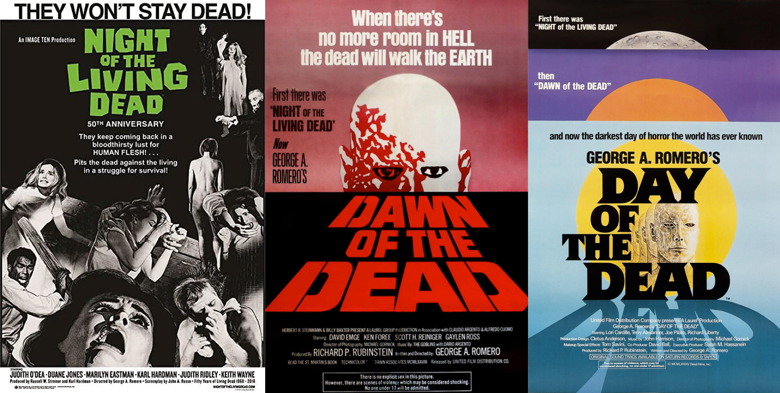
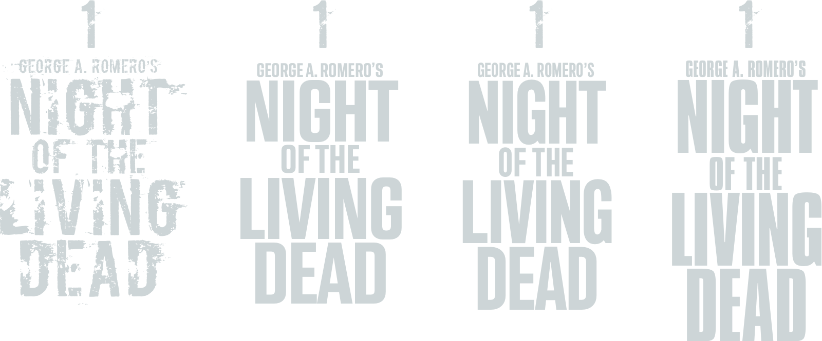
They also contain iconic design elements including the logotype for the original Night of the Living Dead and the perspective logotype from Dawn of the Dead. The designers who made subsequent artwork for the series reused these same elements.
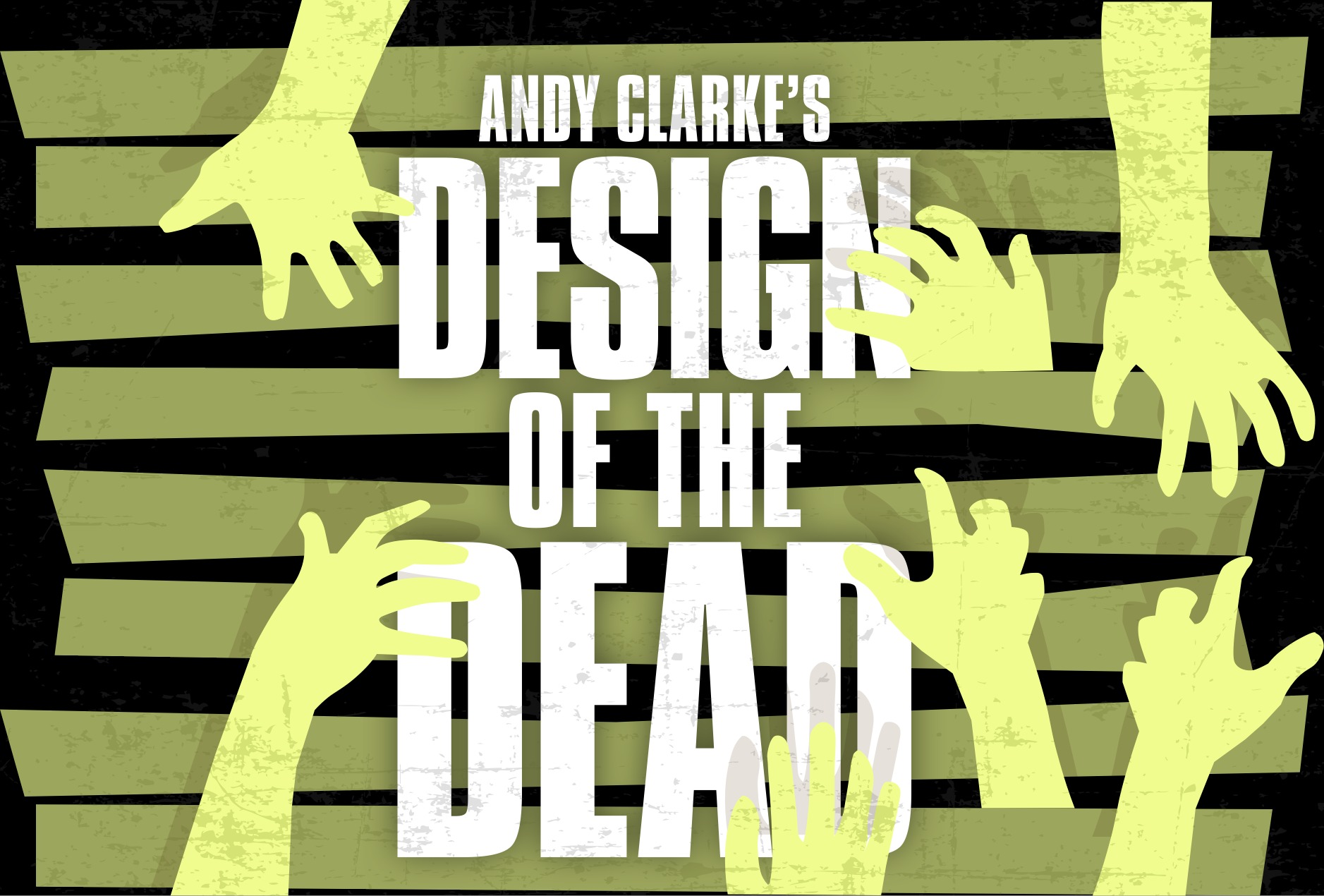
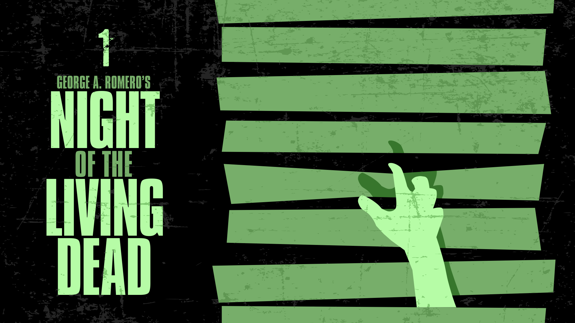
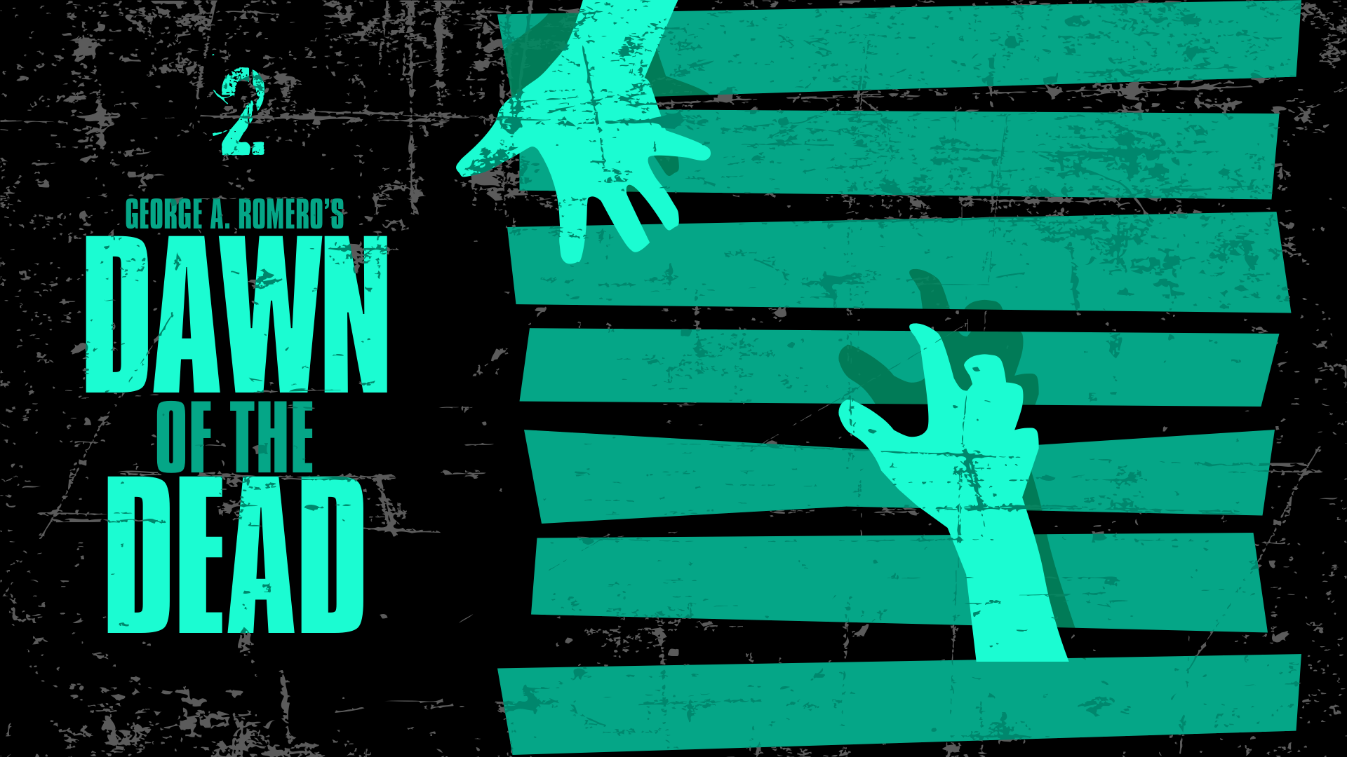
The most successful Apple TV artwork evokes the atmosphere of a movie and has typography which is large enough to be readable from a greater distance. When films are part of a series, I like the artwork to have a consistent set of design elements and make the chronological order of the movies obvious.
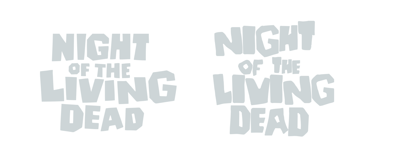
My first challenge was to find a typeface which feels appropriate for these films. None of the zombie-inspired fonts I could find felt right. Deanna—designed based on the original Night of the Living Dead logotype—is a close approximation, but hadn’t the feeling I was looking to evoke.
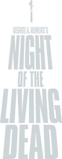
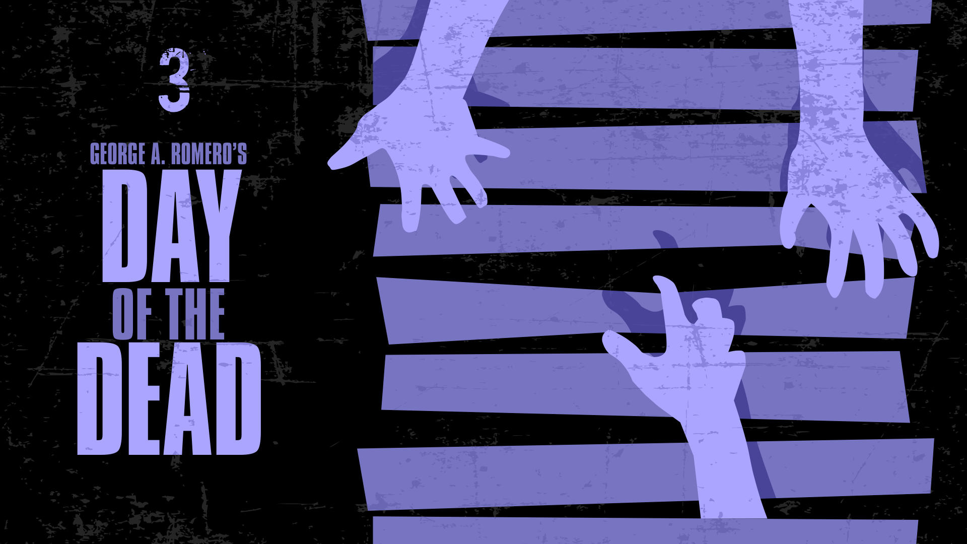
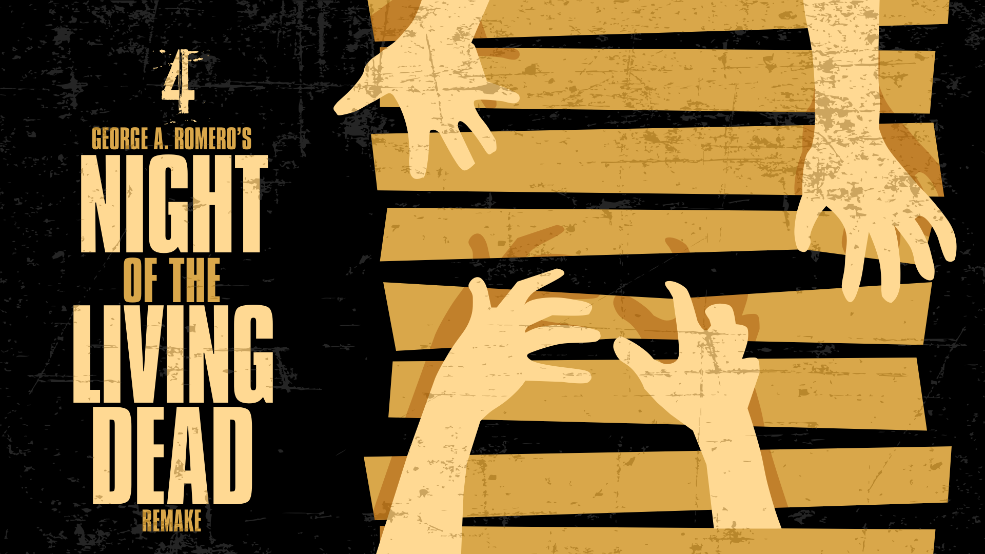
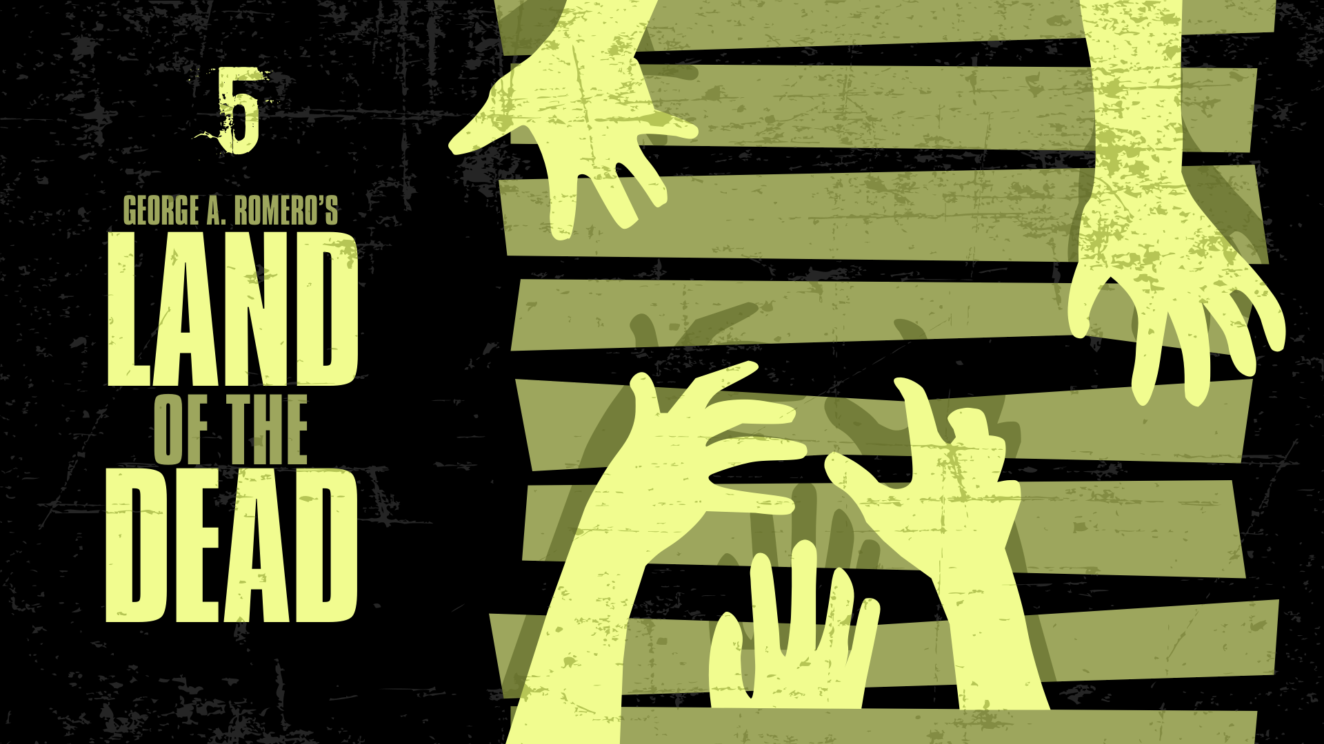
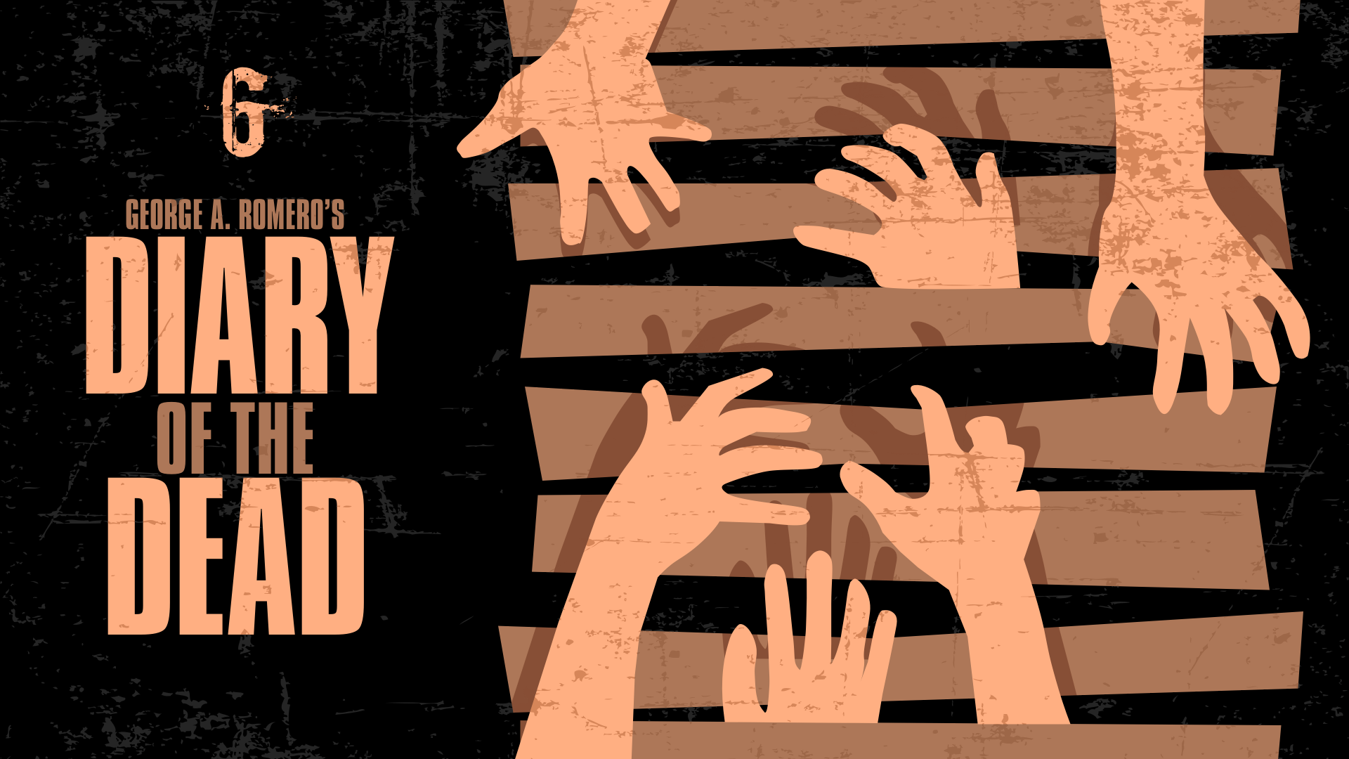
Designs for later films and collections incorporate an uppercase sans-serif, which narrowed my search for an appropriate typeface. My shortlist included the already distressed Boycott, Monte Stella and Marsden Slim (both from Dalton Maag,) and Compacta. I settled on Compacta for my final designs.
 I debated whether to echo the logotype from Dawn of the Dead, but ultimately I decided its perspective works best in portrait format artwork and added unnecessary complexity to my design.
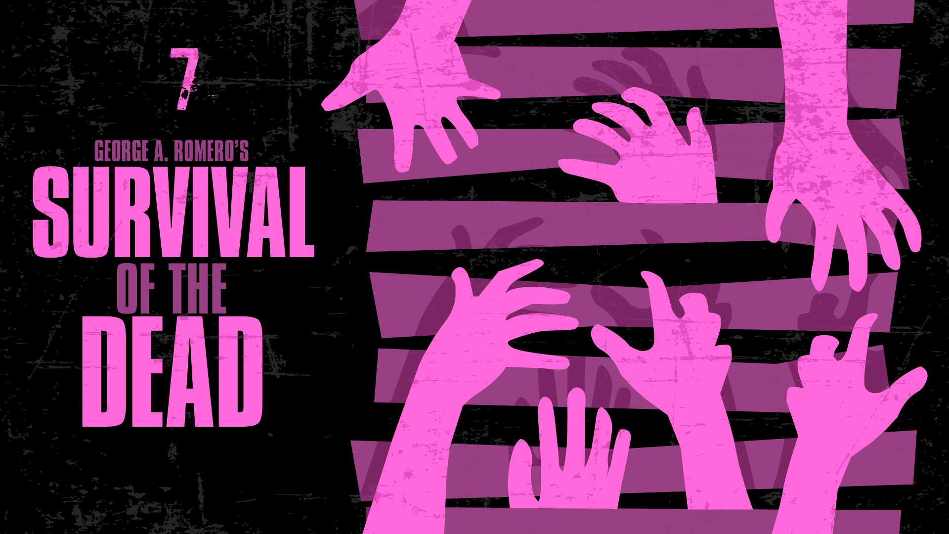
Zombies breaking through boarded-up doors and windows are the among the scariest scenes in Romero’s films and I wanted to bring those images into my designs. I added the boards and hands and increased the number of zombies for each subsequent film. Finally, I added a vector texture to distress the artwork further.
I’m really happy with these Romero zombie film designs and how they form a set in my Apple TV movie library. If you’d like to use them in yours, you can download them above in WEBP format.