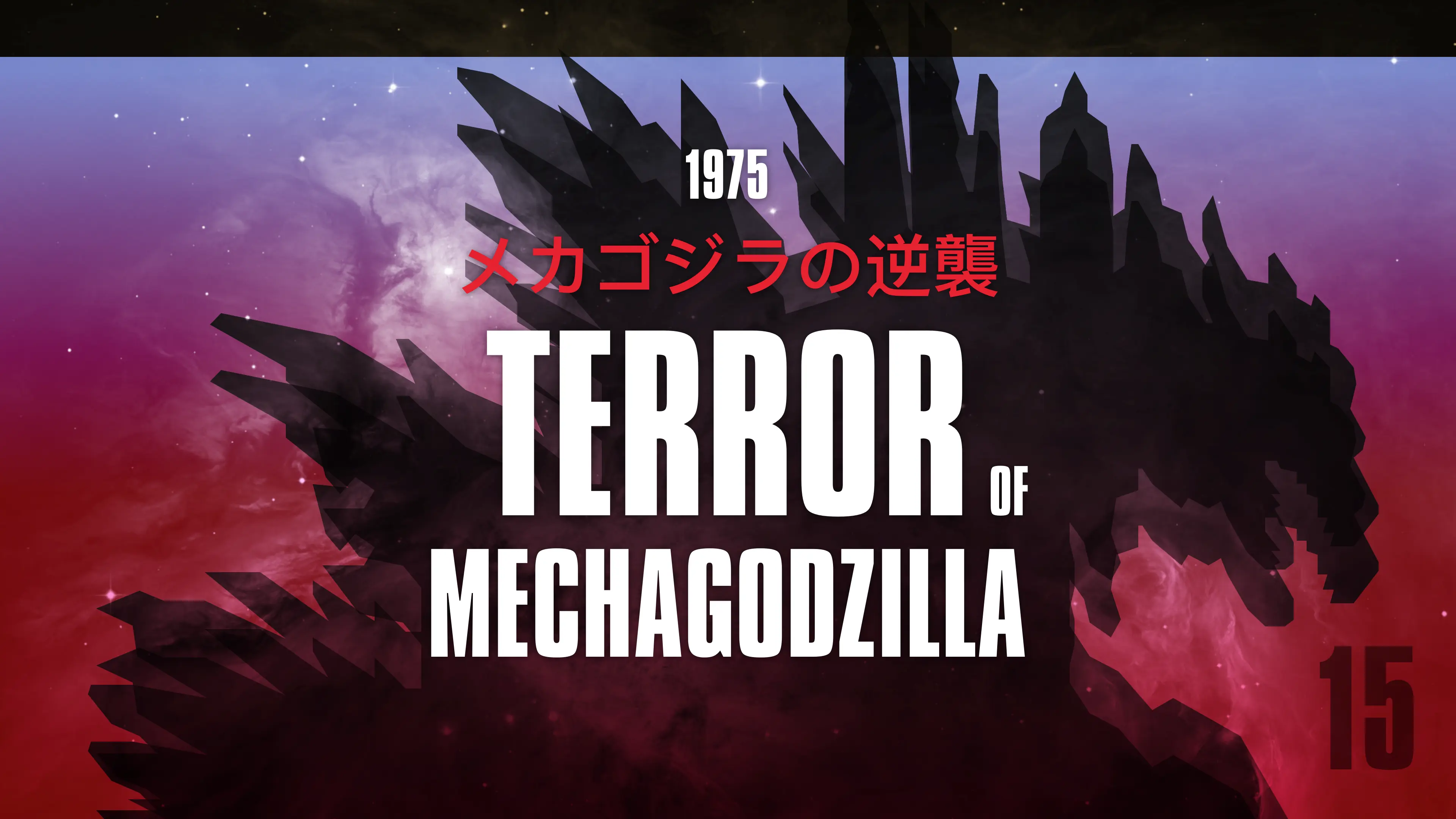
Design vs. Godzilla
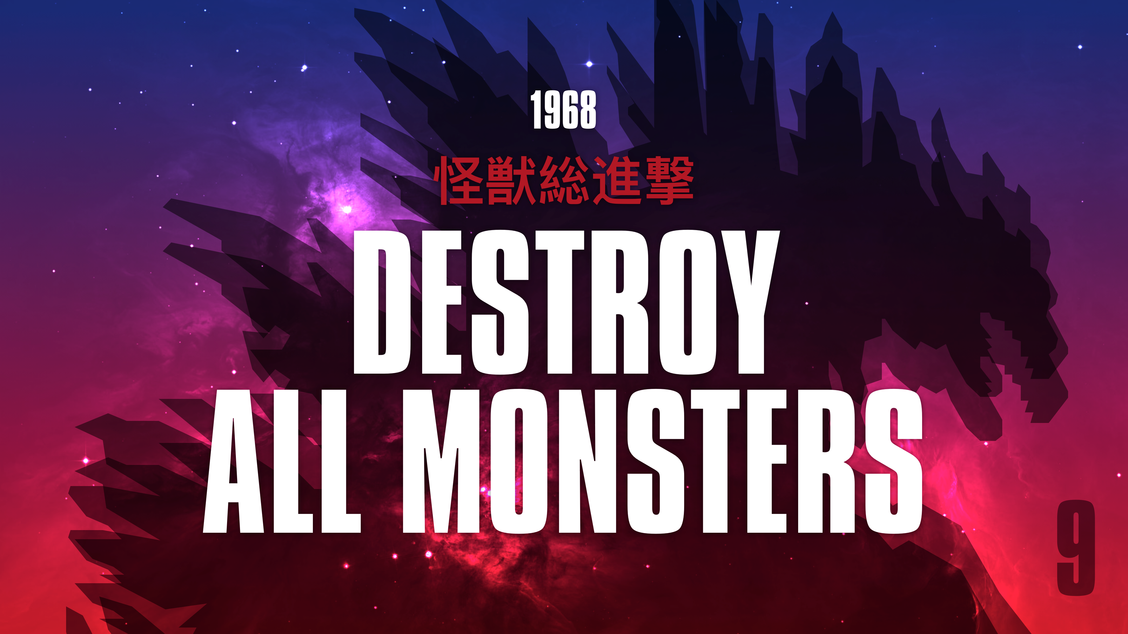
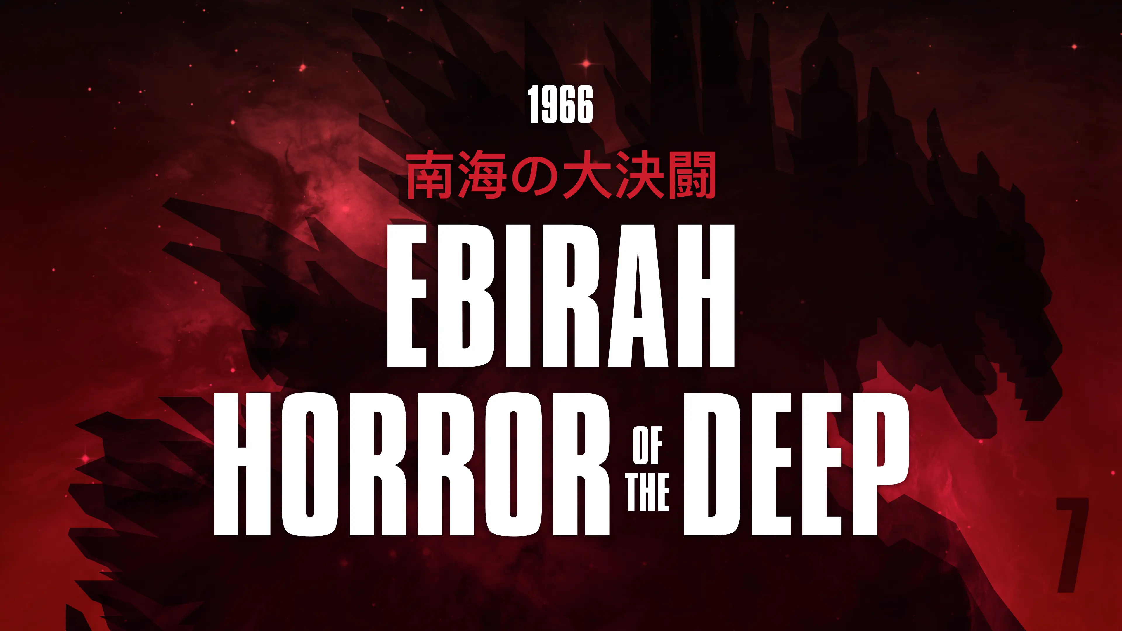
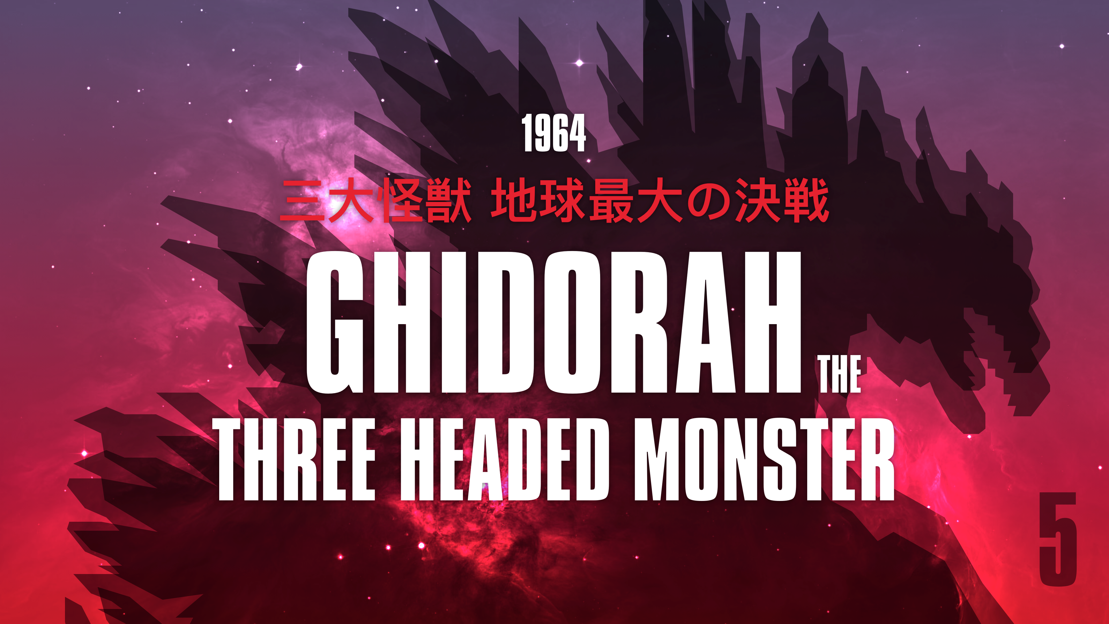
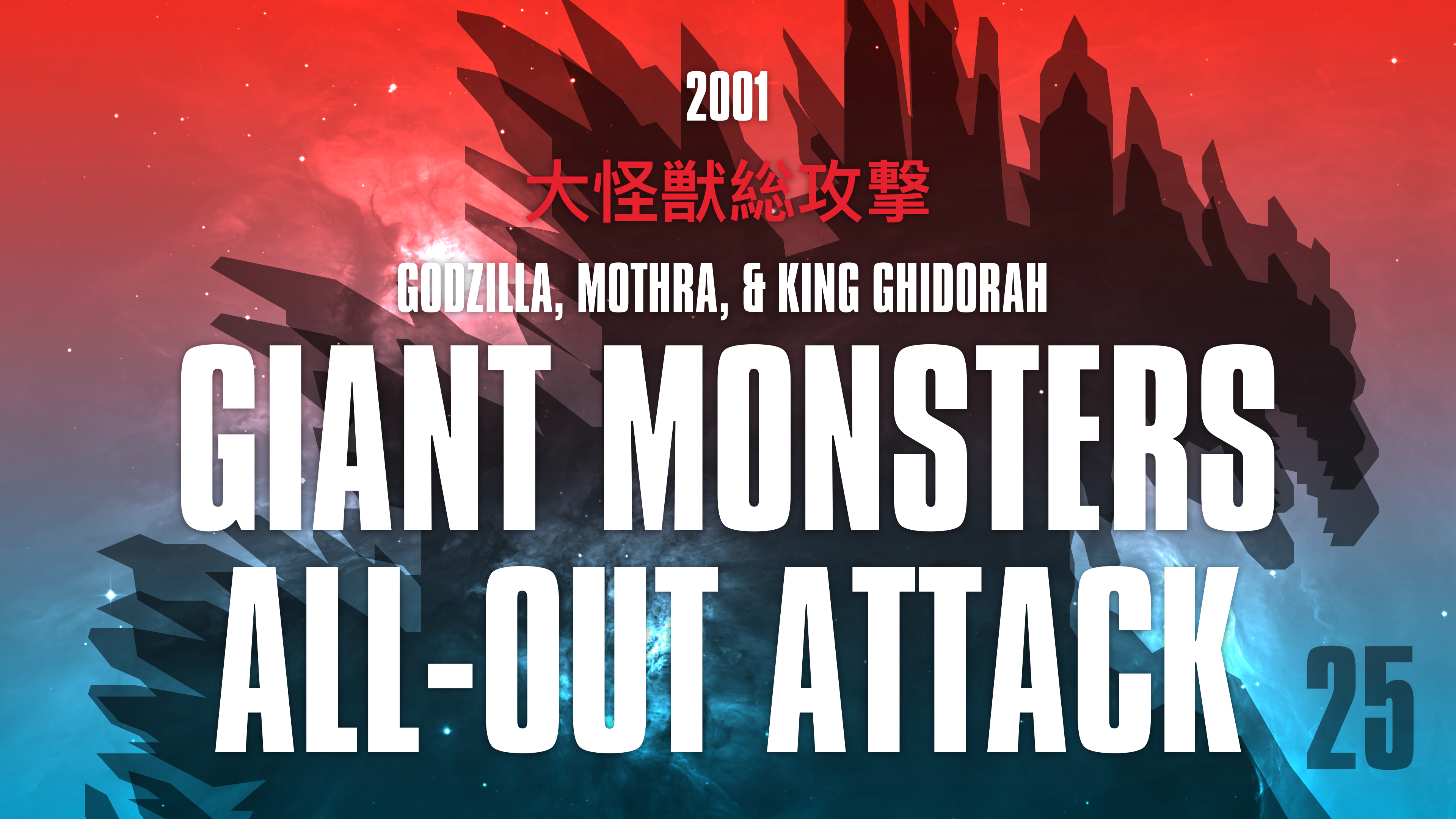
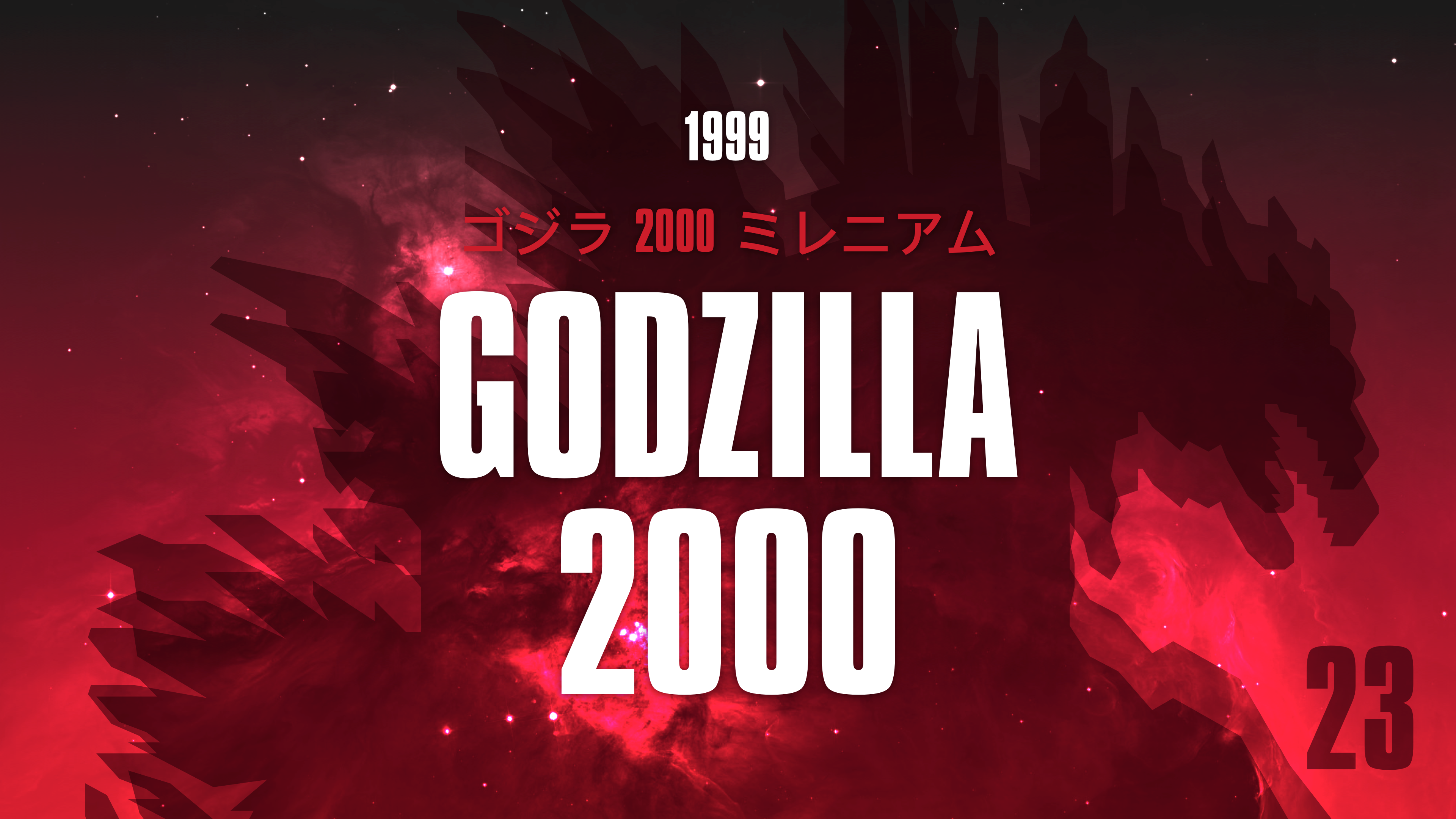
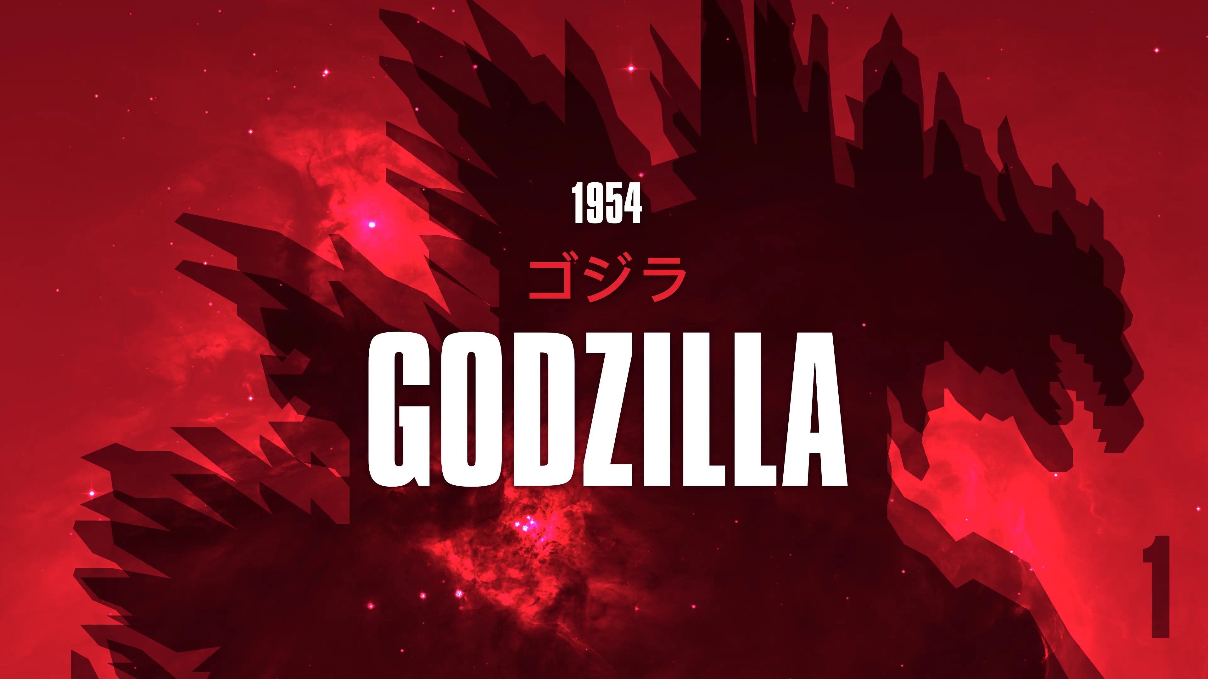
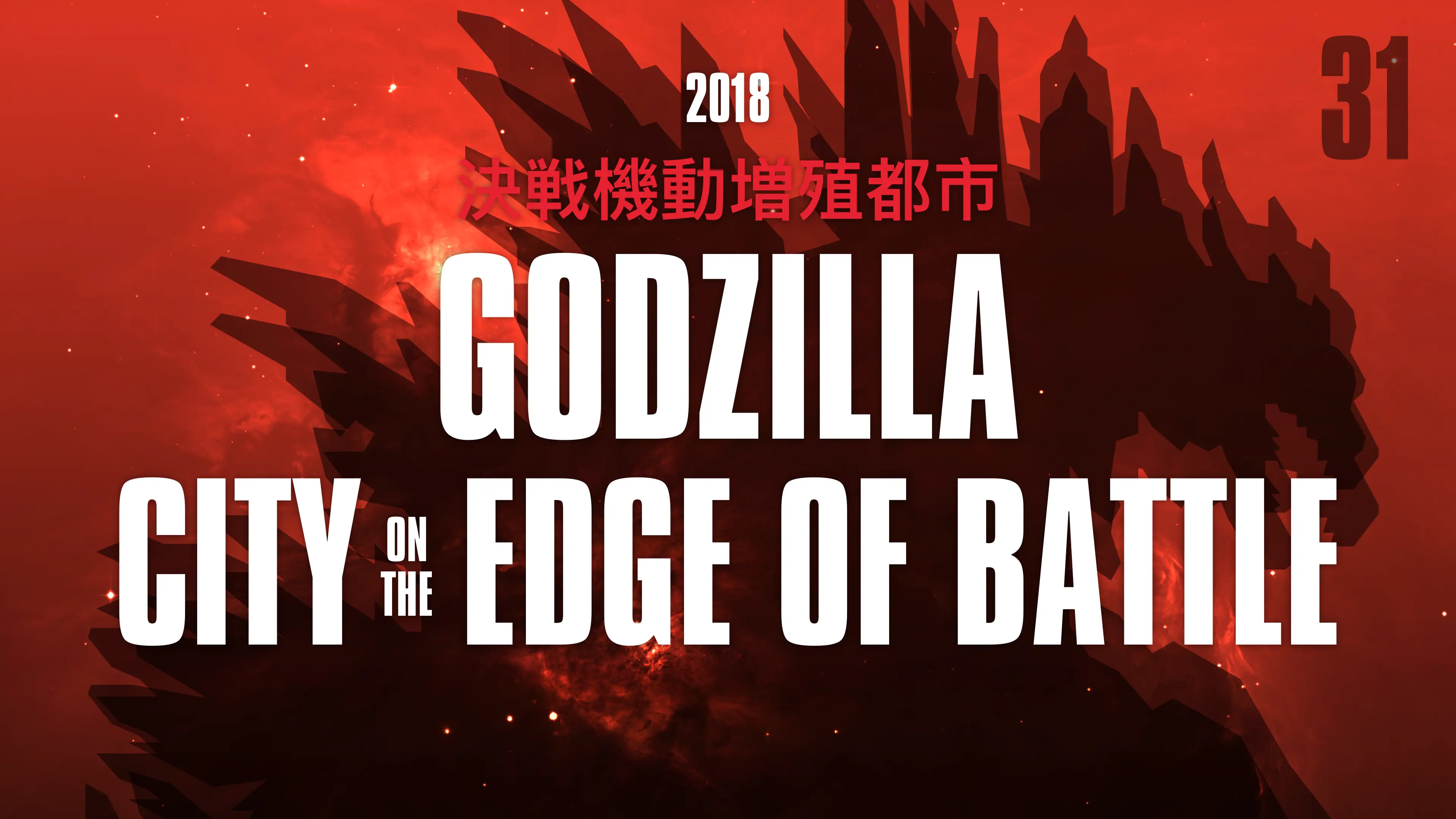
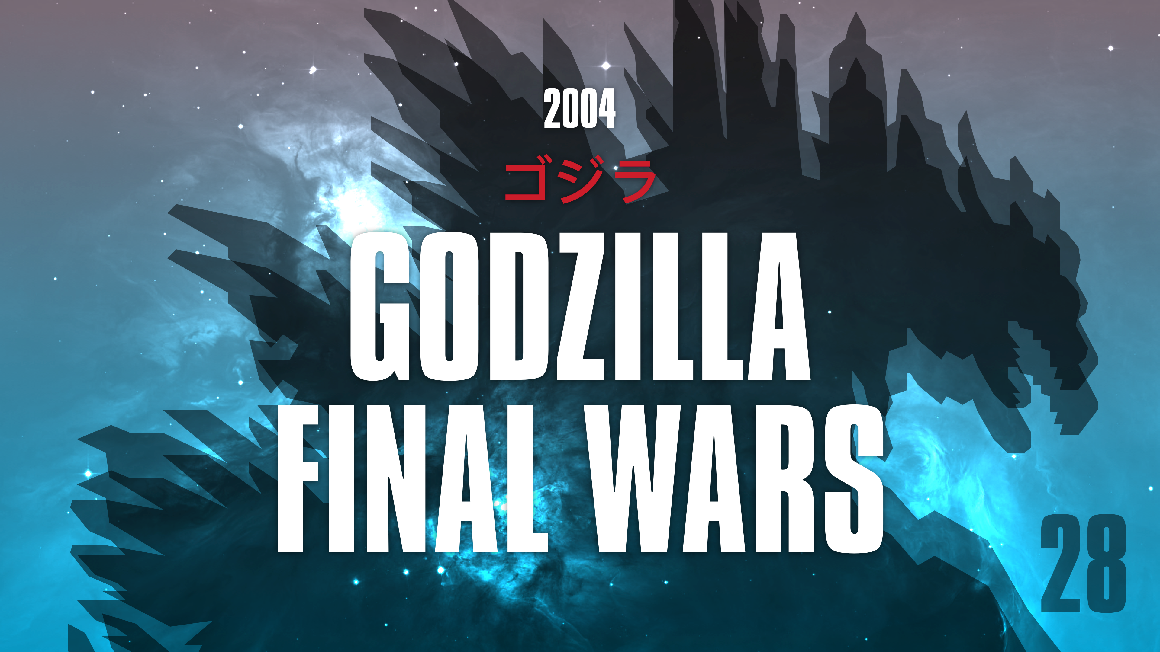
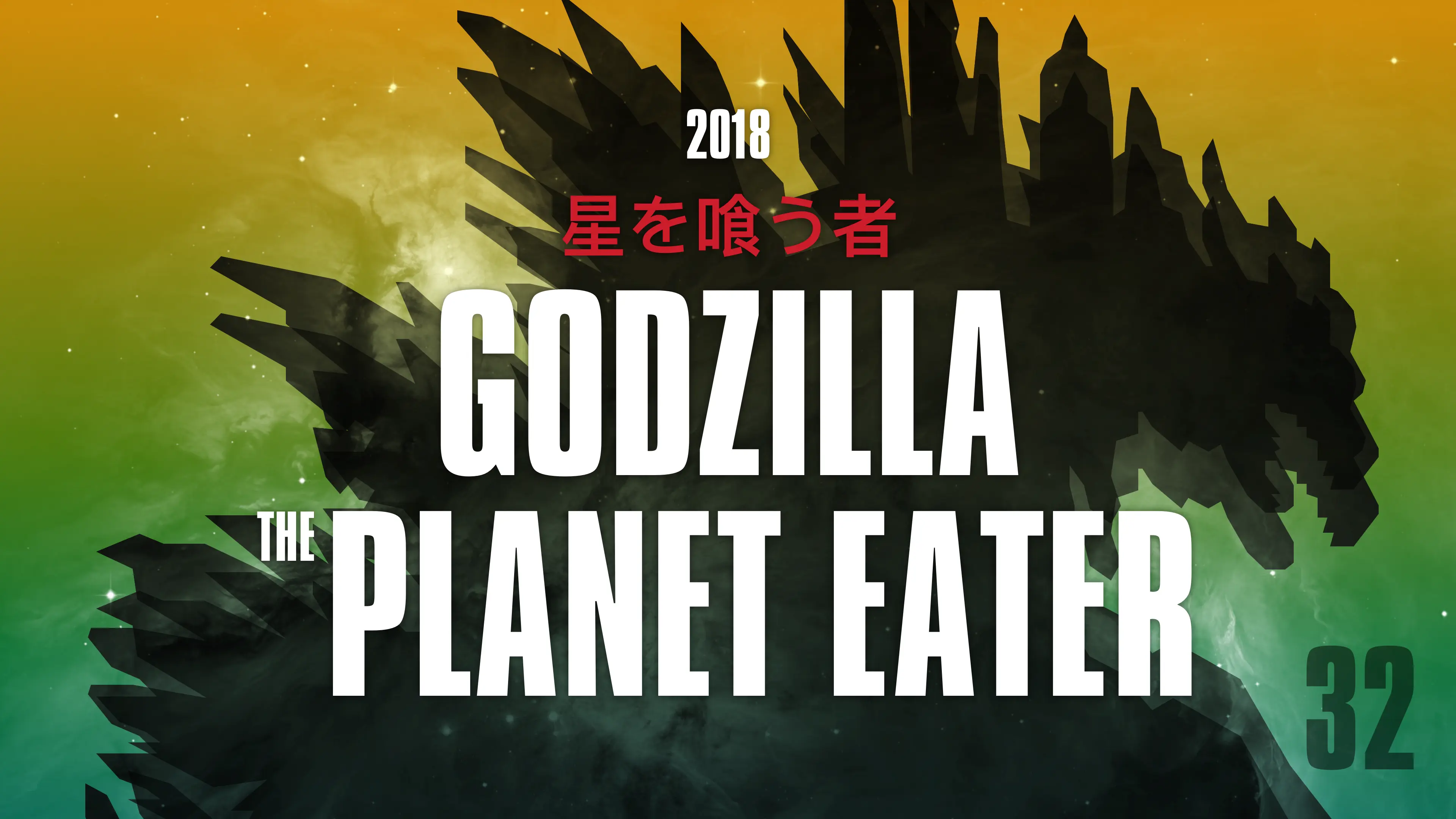
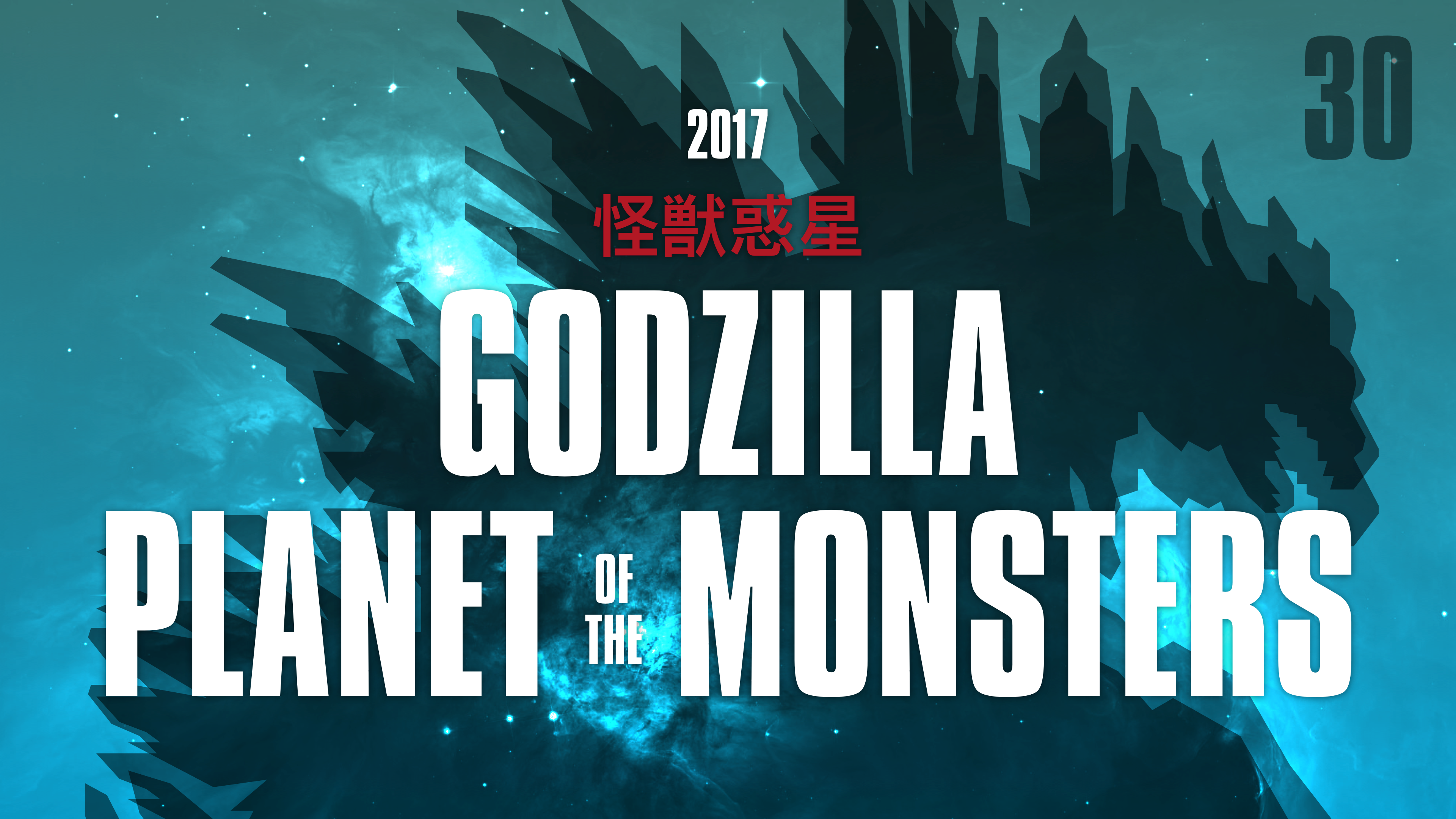
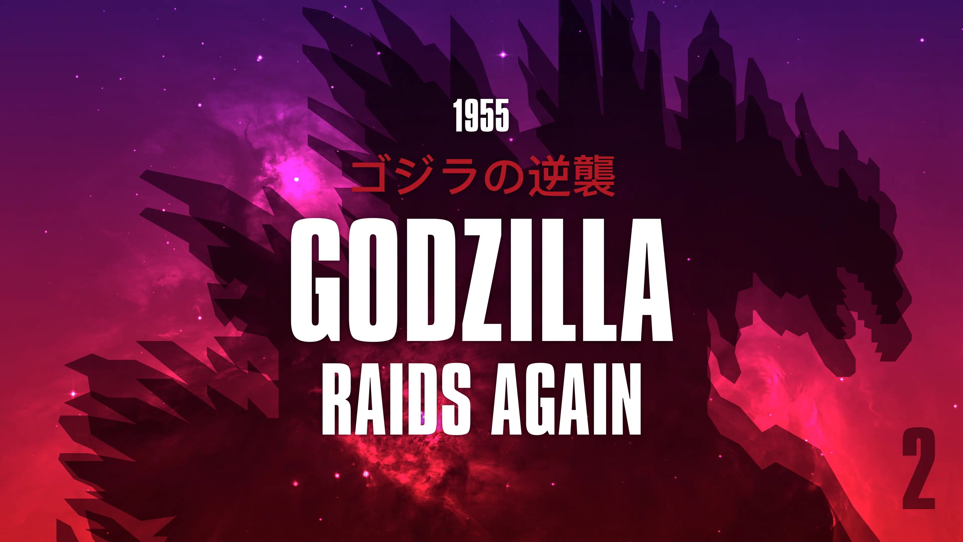
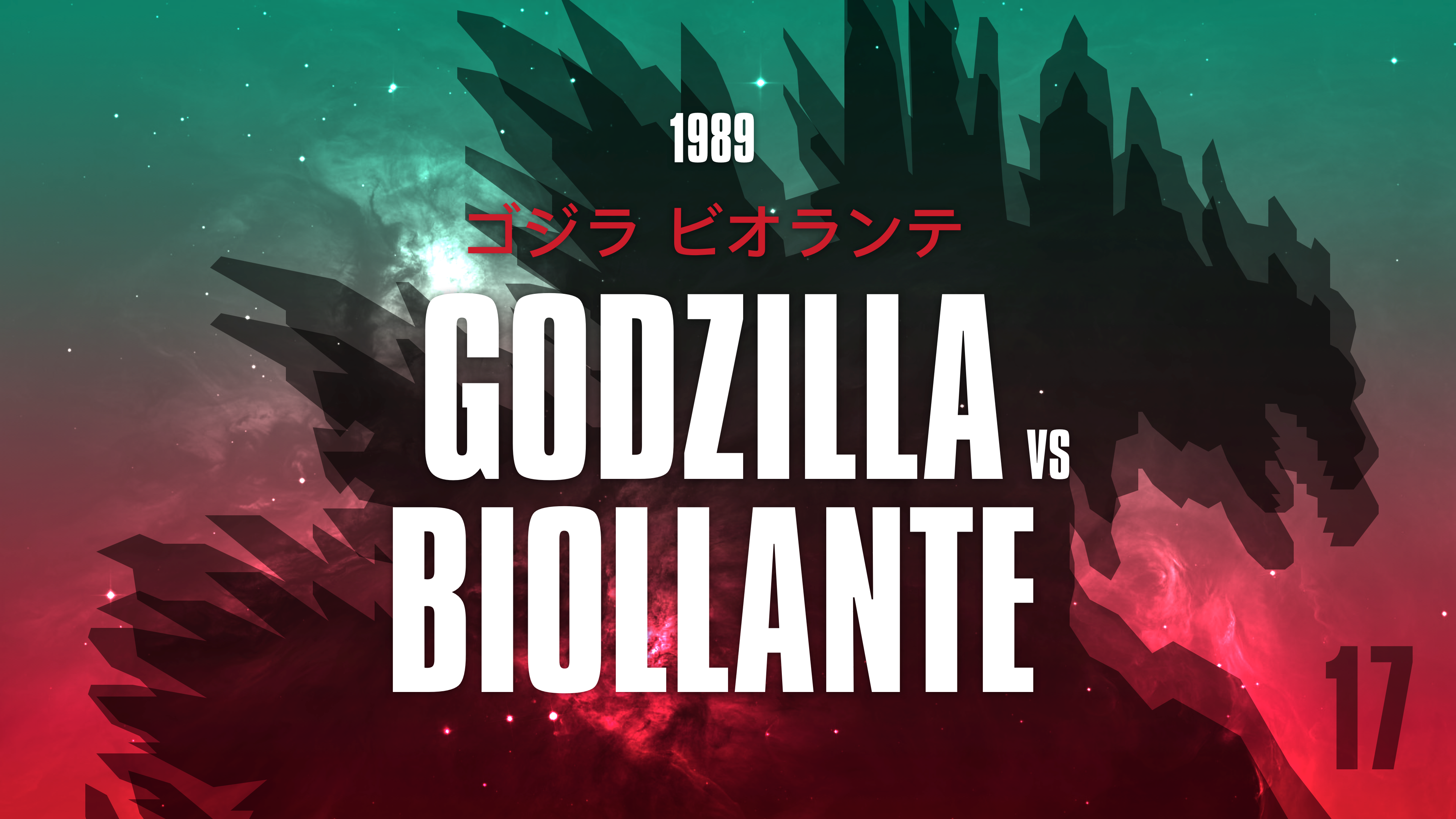
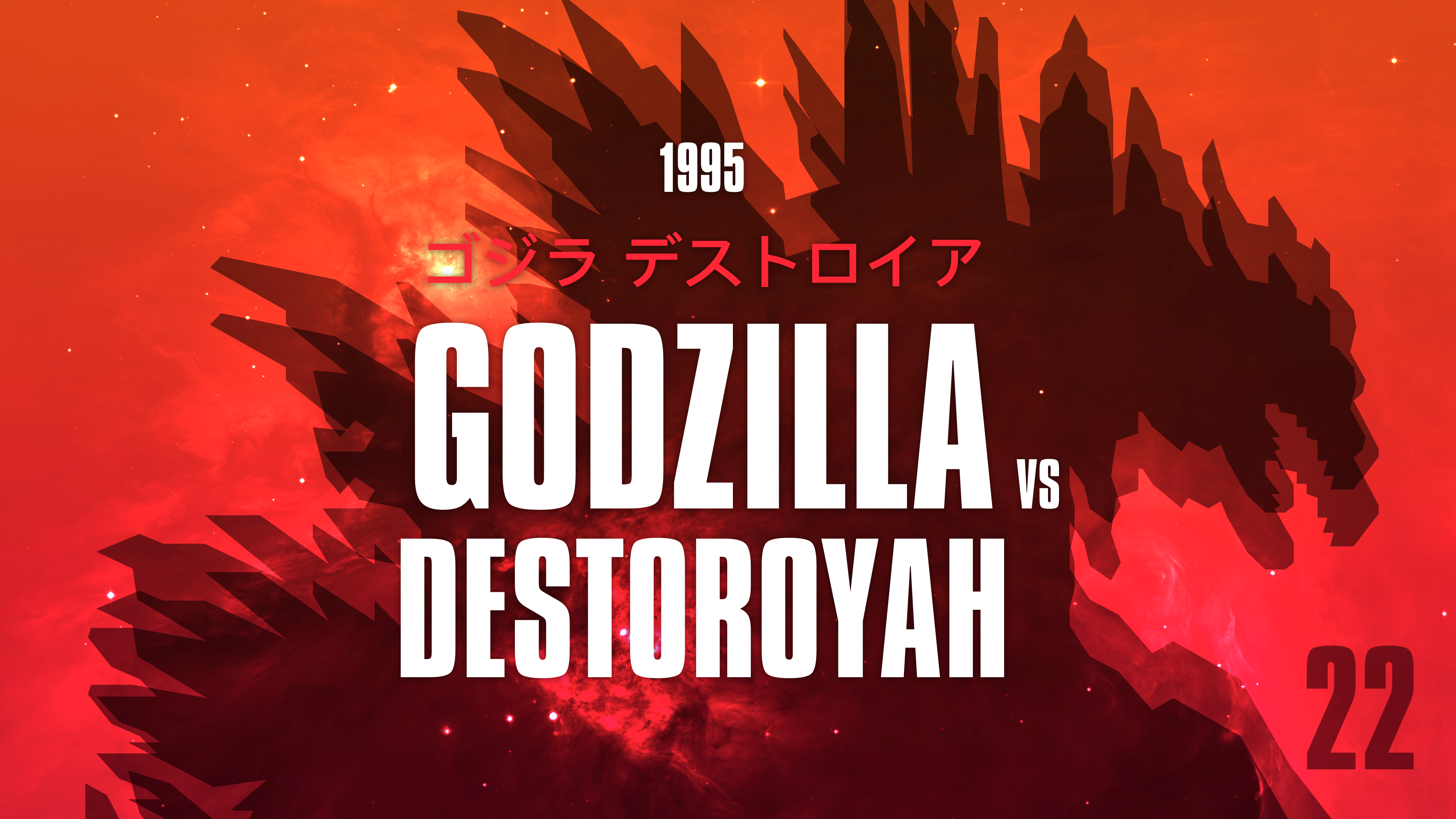
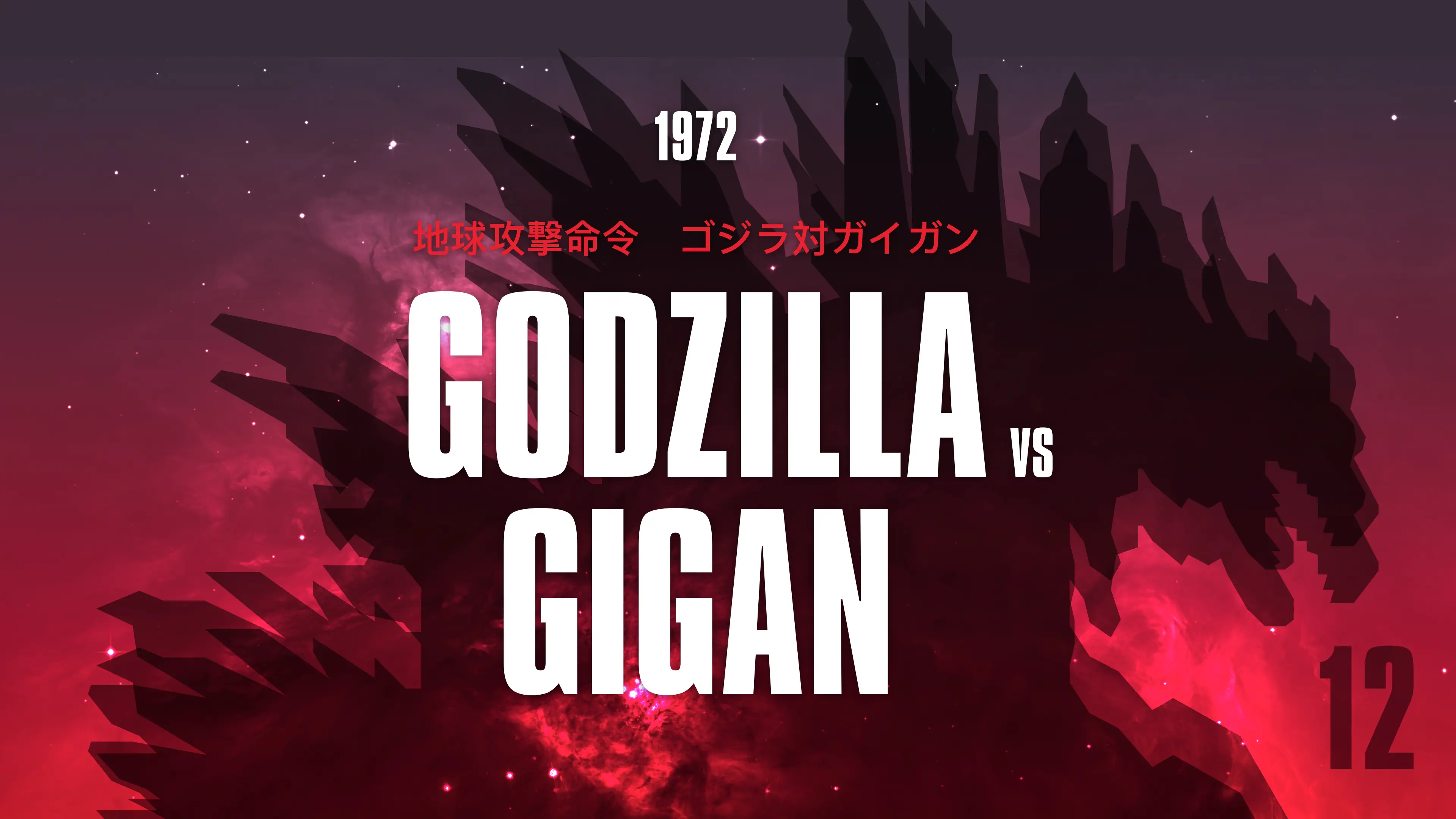
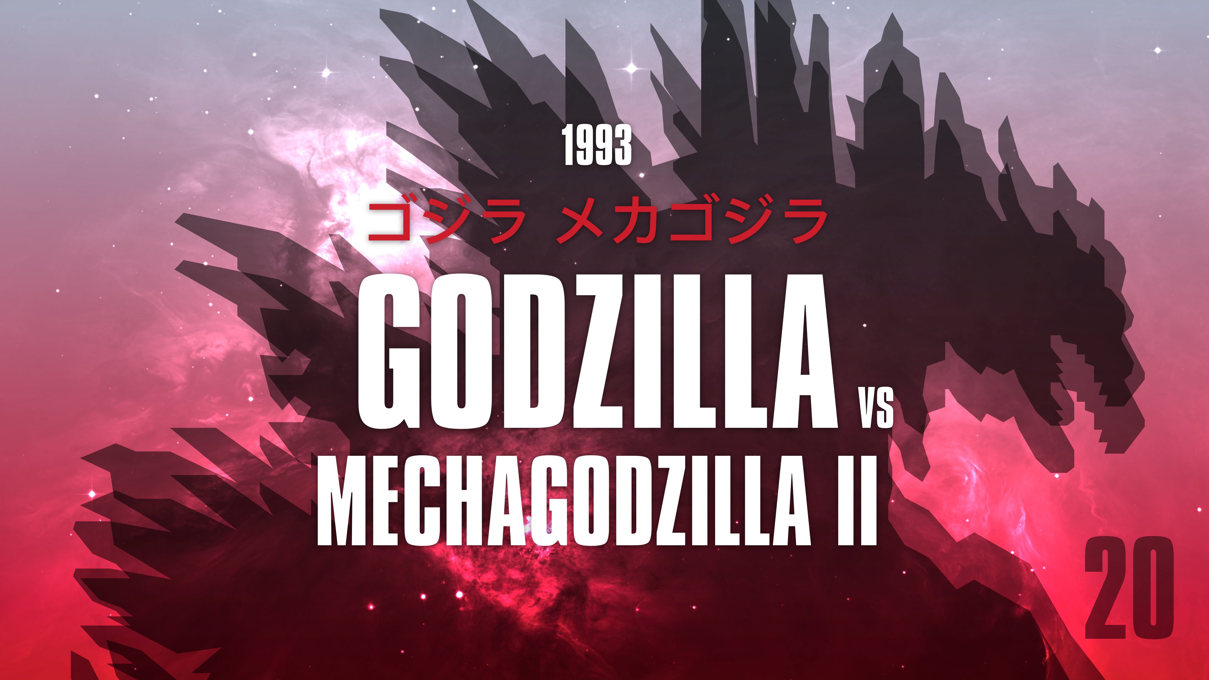
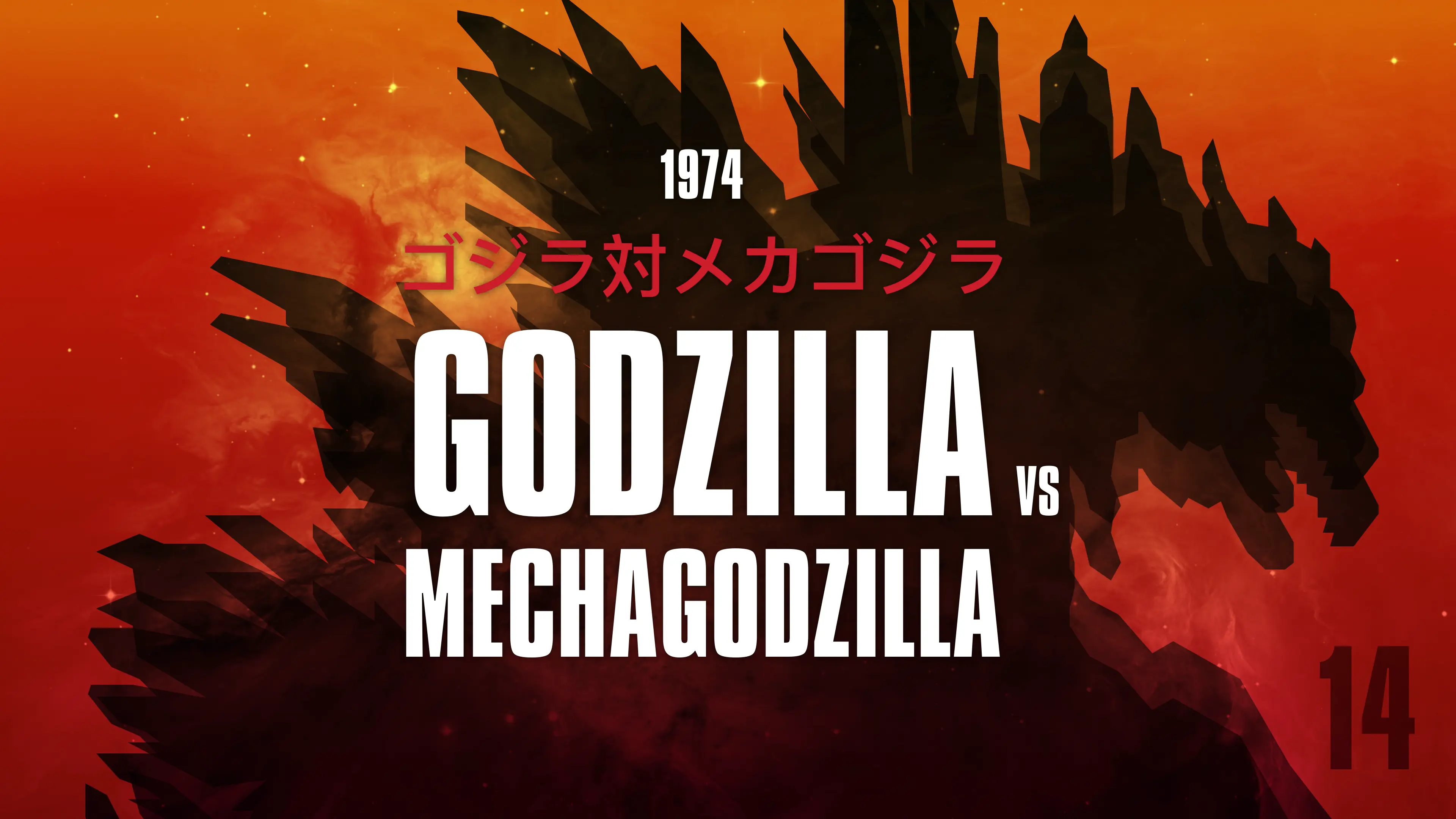
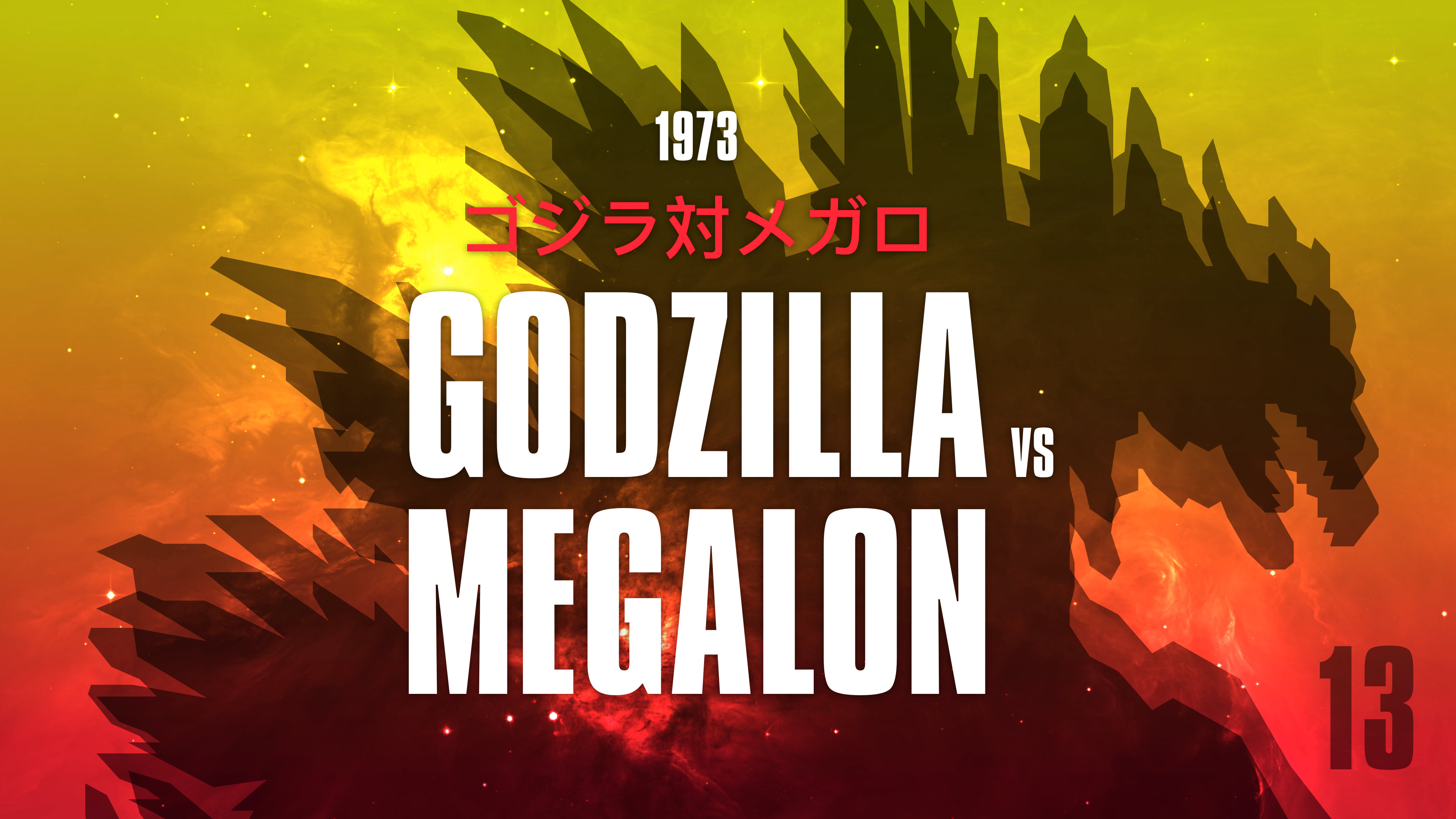
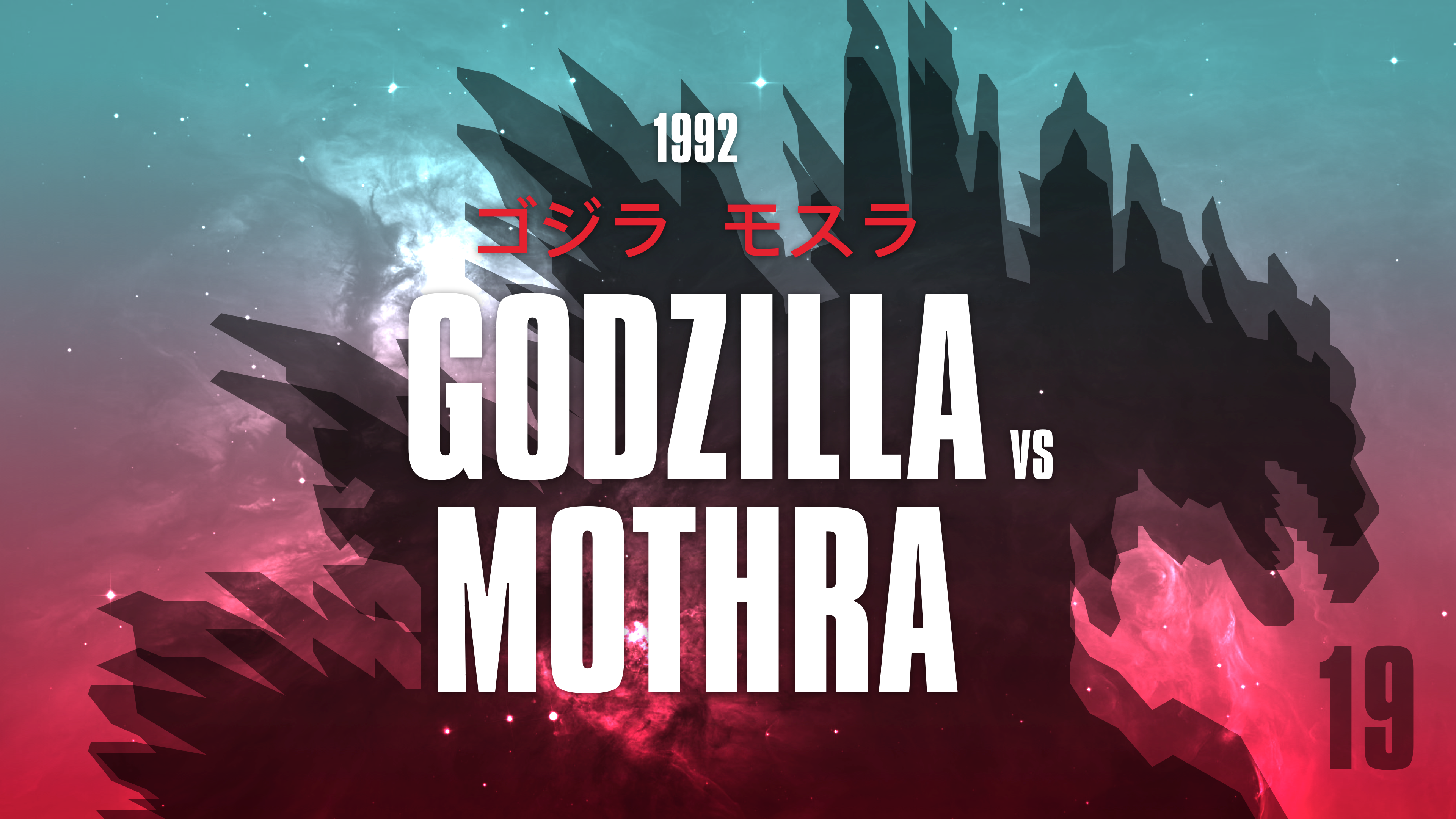
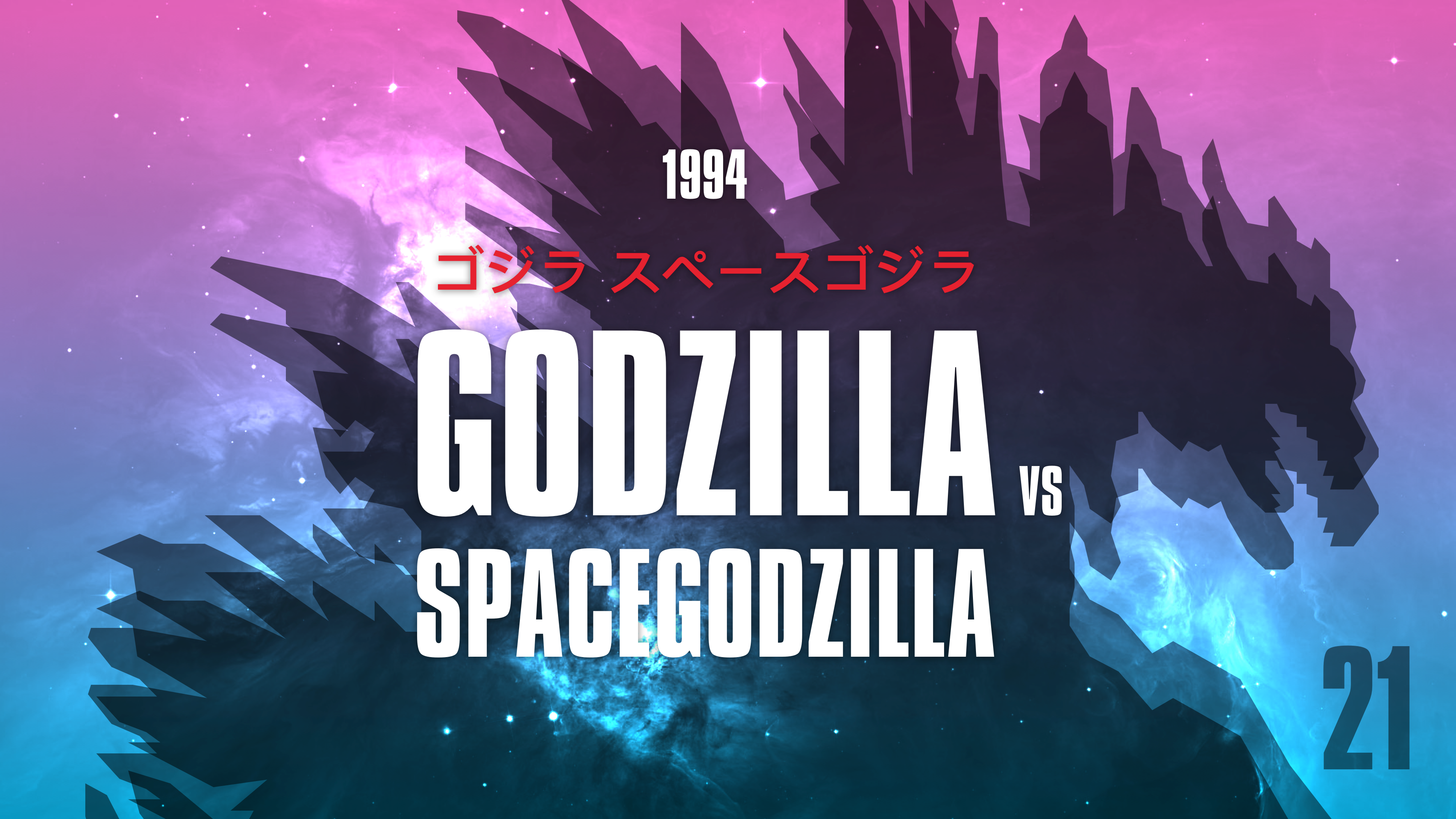
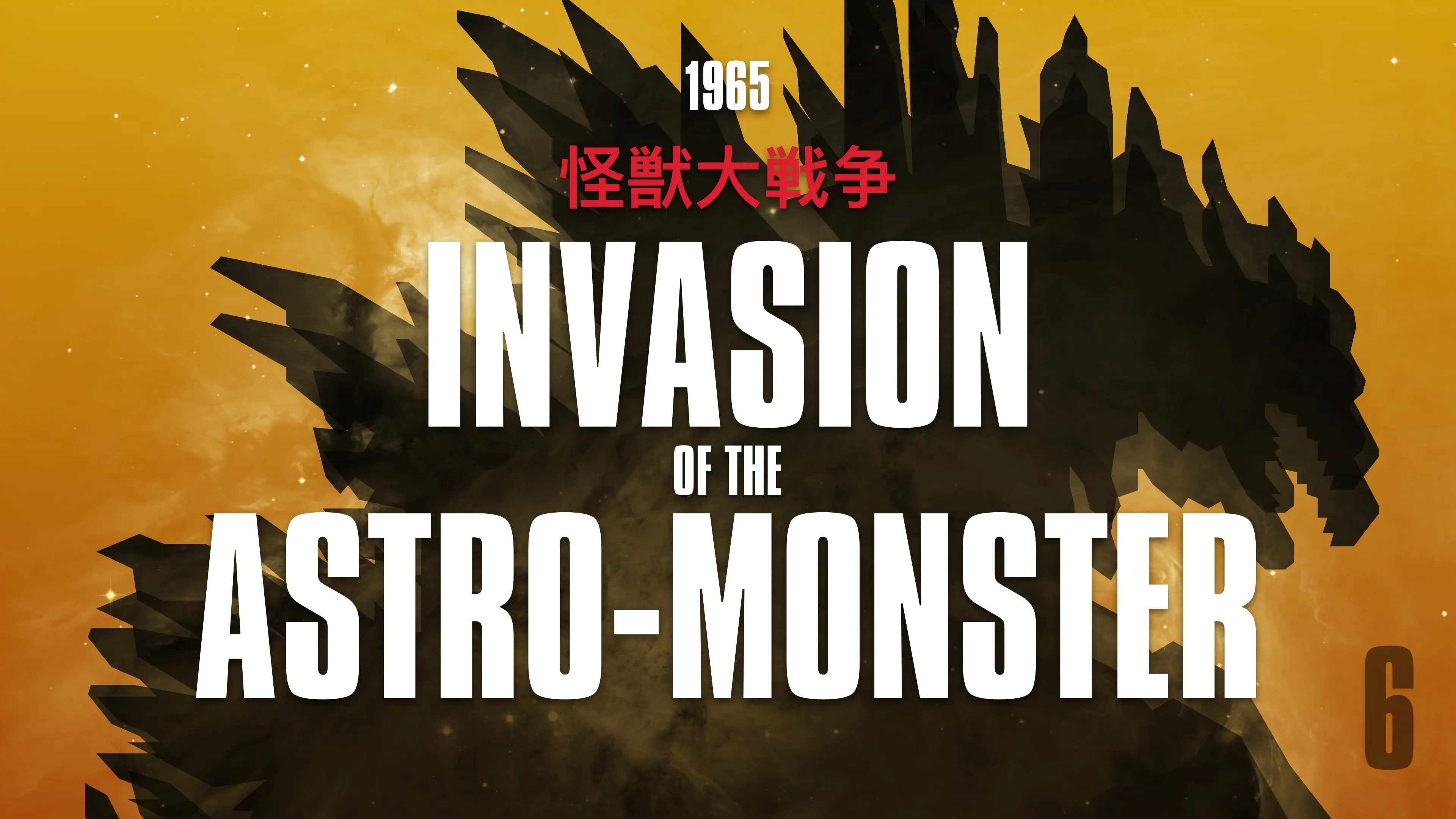
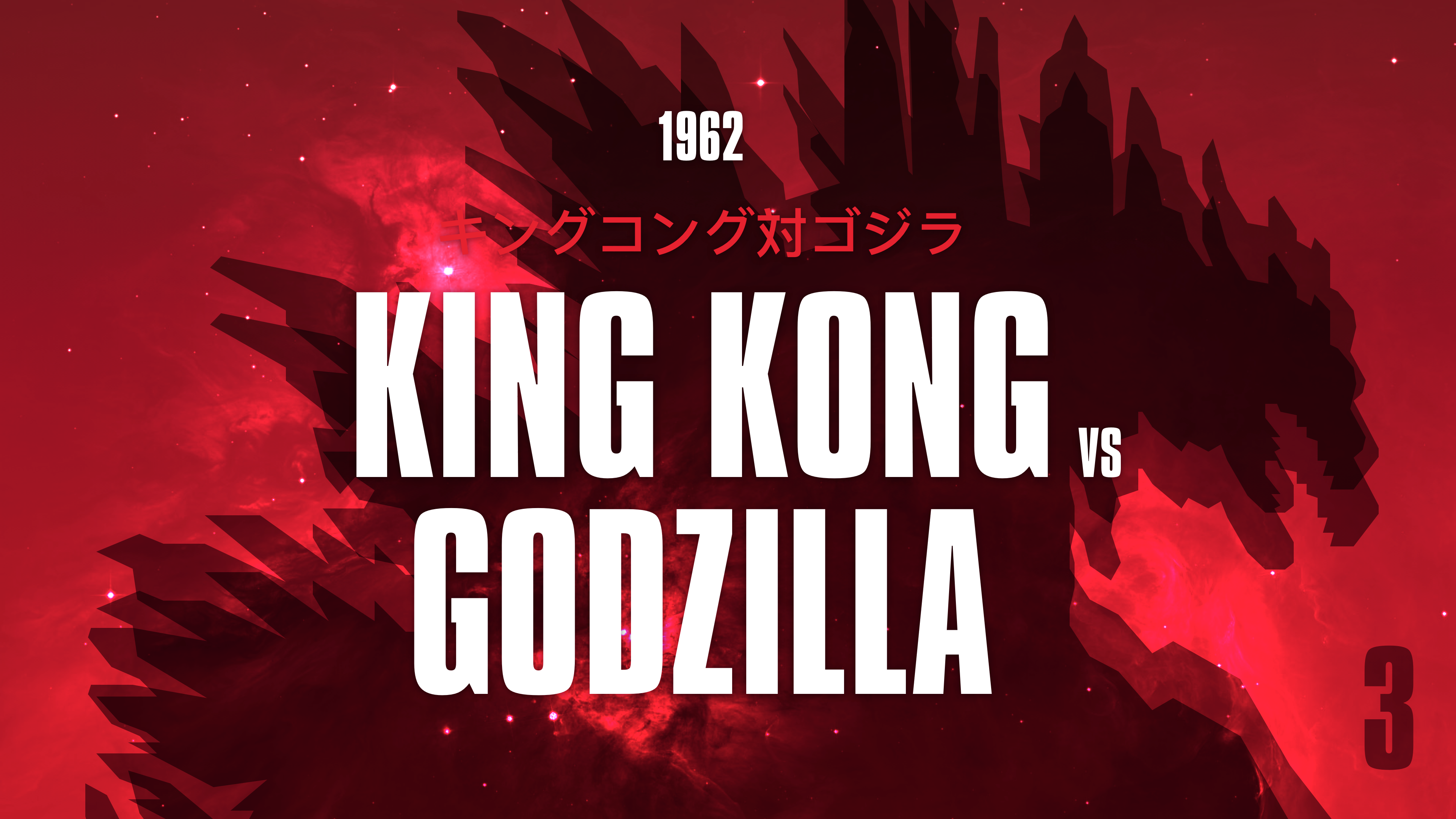
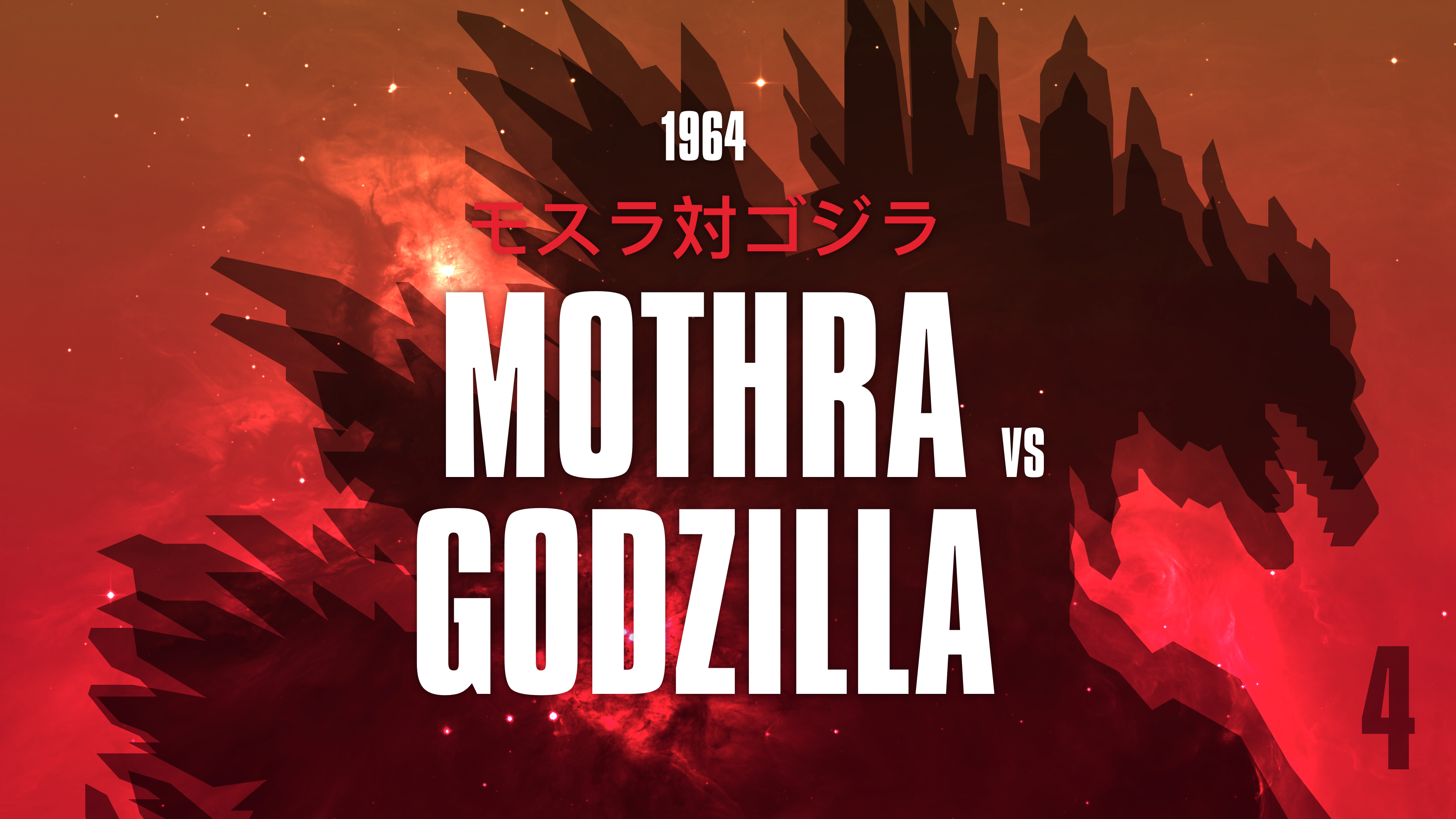
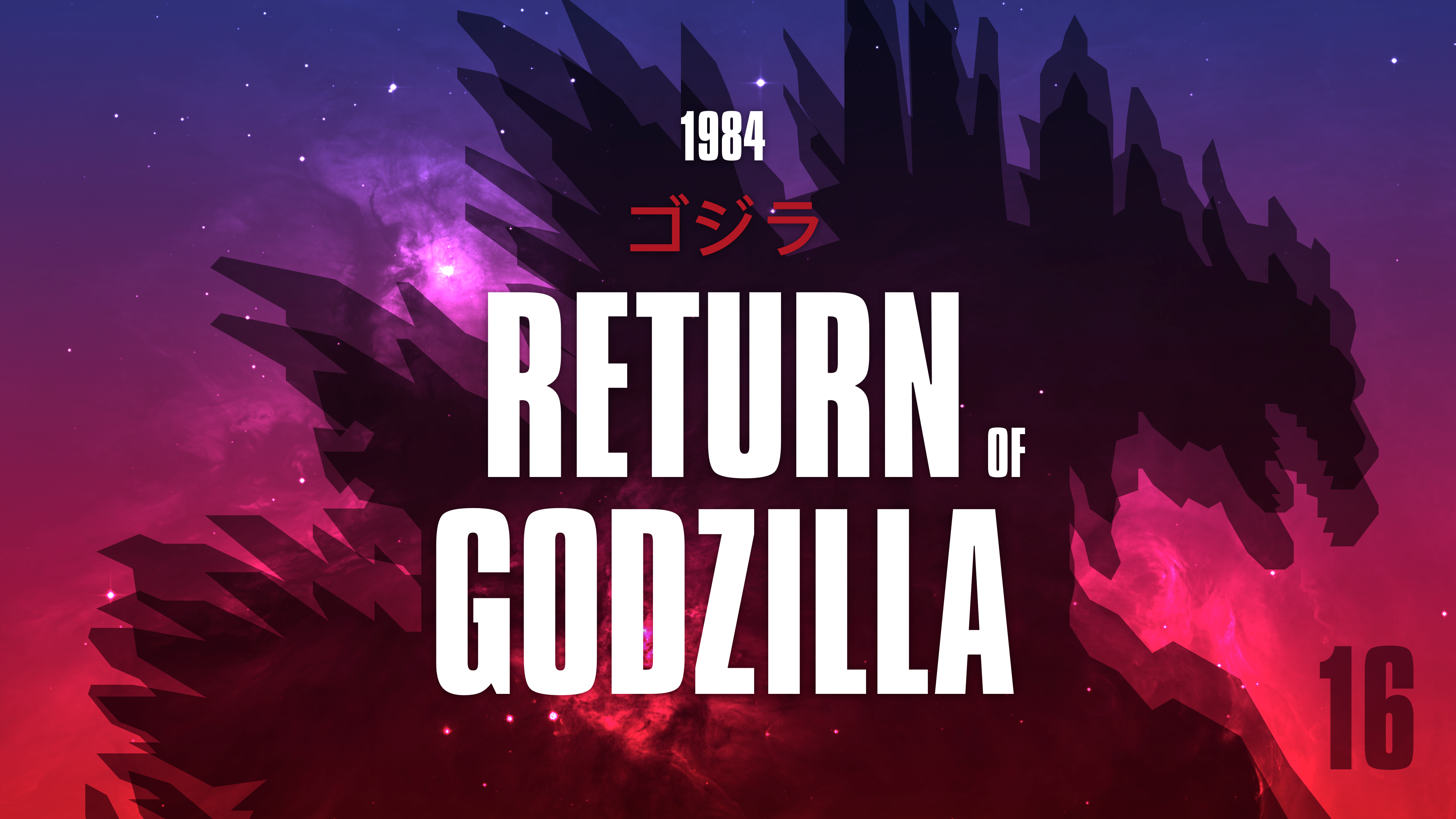
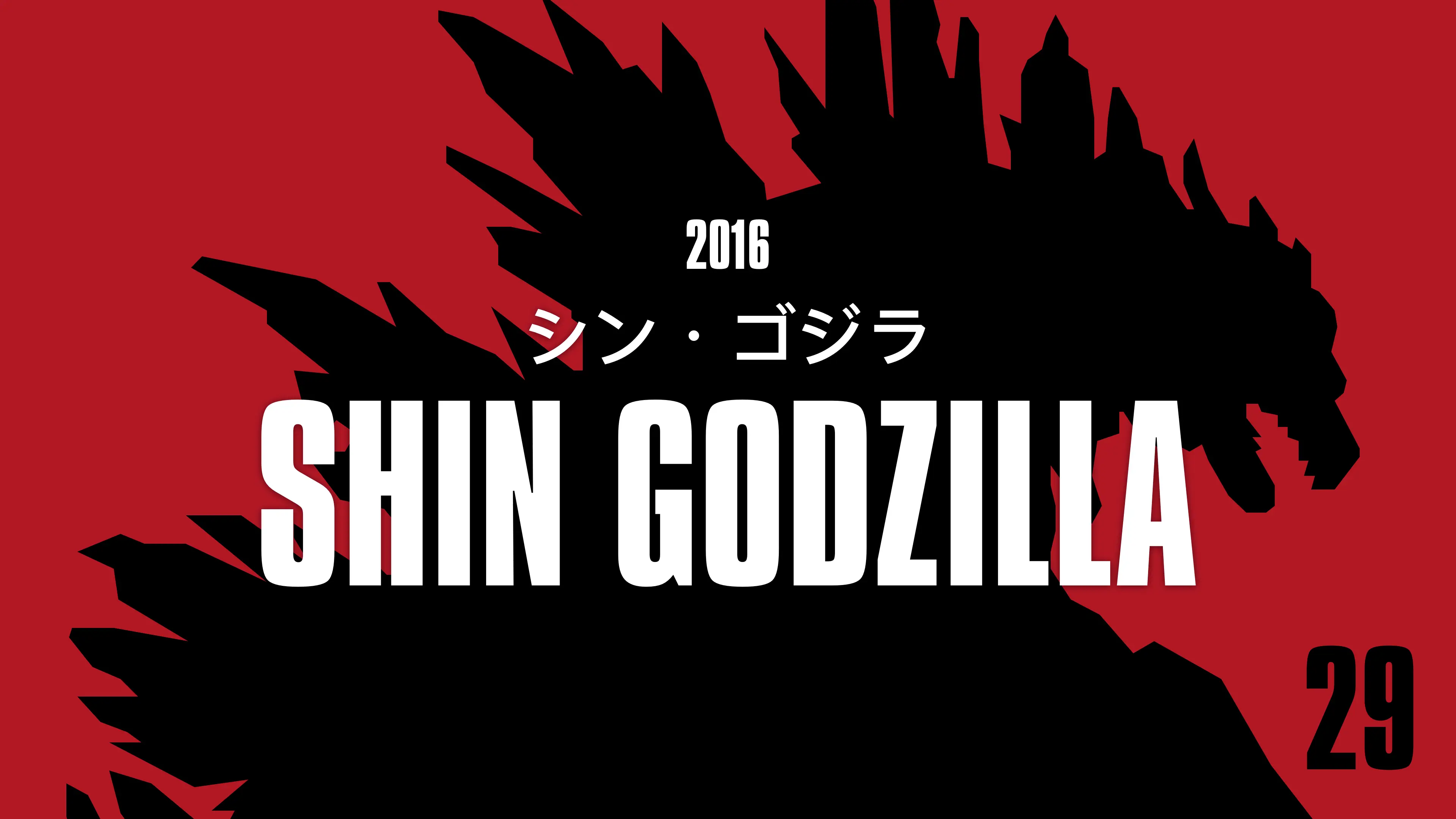
Over the past few years, I’ve amassed quite a collection of Godzilla films, from the original 1954 Toho production to Legendary Pictures’ monsterverse Godzilla vs. Kong. When I was upgrading my Apple TV movie library from portrait to landscape, I decided to make my own artwork.
I doubt there are many people who haven’t seen at least one Godzilla film. The recent series from Legendary Pictures—Godzilla, Godzilla: King of the Monsters, and Godzilla vs. Kong—have all been huge box office successes.

Before them was Roland Emmerich’s 1998 Godzilla with posters that were more interesting than the film they advertised. Before that were 32 Japanese films and altered international versions which pitched Godzilla against other Toho monsters including Mothra, King Ghidorah, Mechagodzilla, and my favourite SpaceGodzilla.
With 40 films released at the box office, VHS, DVD, Blue Ray, and digital releases, plus fan art and other interpretations, there’s an unfathomable amount of Godzilla artwork. Within them are countless illustration and type styles.

The Apple TV artwork for the latest series has a style which brings the films together, but as my library grew to include 40 Godzilla films, finding good artwork became quite a challenge. The original movie posters didn’t convert well to landscape format and the artwork offered by Apple and The Movie Database for these older films didn’t lend itself to making a set.

While the Japanese options for those earlier films are consistent and descriptive, they don’t work for someone who doesn’t read Japanese. On the other hand, the colourfully illustrated international versions of those same films are often downright bizarre.

So, I decided to design my own artwork for the Godzilla films in my collection. My goal was to create a cohesive set with consistent imagery and typography. I wanted to be able to glance at my library and see the order the films were made and I wanted to see which films were dubbed into English and which were subtitled.
To make this set, I first decided on Compacta, a typeface which is similar to that chosen for Legendary’s 2014 Godzilla. I added a silhouette of Godzilla and blended it with a variety of gradients with colours I sampled from the original Japanese cinema posters.
Overall, I’m really happy with these Godzilla designs and how they form a set in my Apple TV movie library. If you’d like to use them in yours, you can download them above in WEBP format:

