Designing for ISO
This year’s been one of my busiest for speaking, teaching and designing for clients. You might not be able to tell that though, because when I deconstructed this site a few months ago, my portfolio was one of the things that didn’t find its way back. I’ll rectify that in the new year, but in the meantime I wanted to share some of the projects I’ve been working on, starting with this — a redesign for ISO, the International Organization for Standardization.
Only rarely have I come across a large organisation as willing to experiment with new ideas as ISO. You might think that an organisation of that size — and with such a global reach — would be a hard ship to steer in a new direction. What I, and my friend and development partner David Roessli, found were people who couldn’t have been more committed to making their site work better for their users.
Our process began by creating seven personas and user stories to guide our design decisions. What pleased us most was how everyone at ISO involved in the project — from the developers, managers, right up to Secretary-General, Rob Steele — became user advocates.
We created a new grid framework based around the proportions of the ISO logo, then designed in the browser over four, intensive, week-long sprints, each devoted to a different area of the site. Our templates were based on 320 and Up and integrated into ISO’s CMS weekly, so that we could iterate the designs using real ISO content.
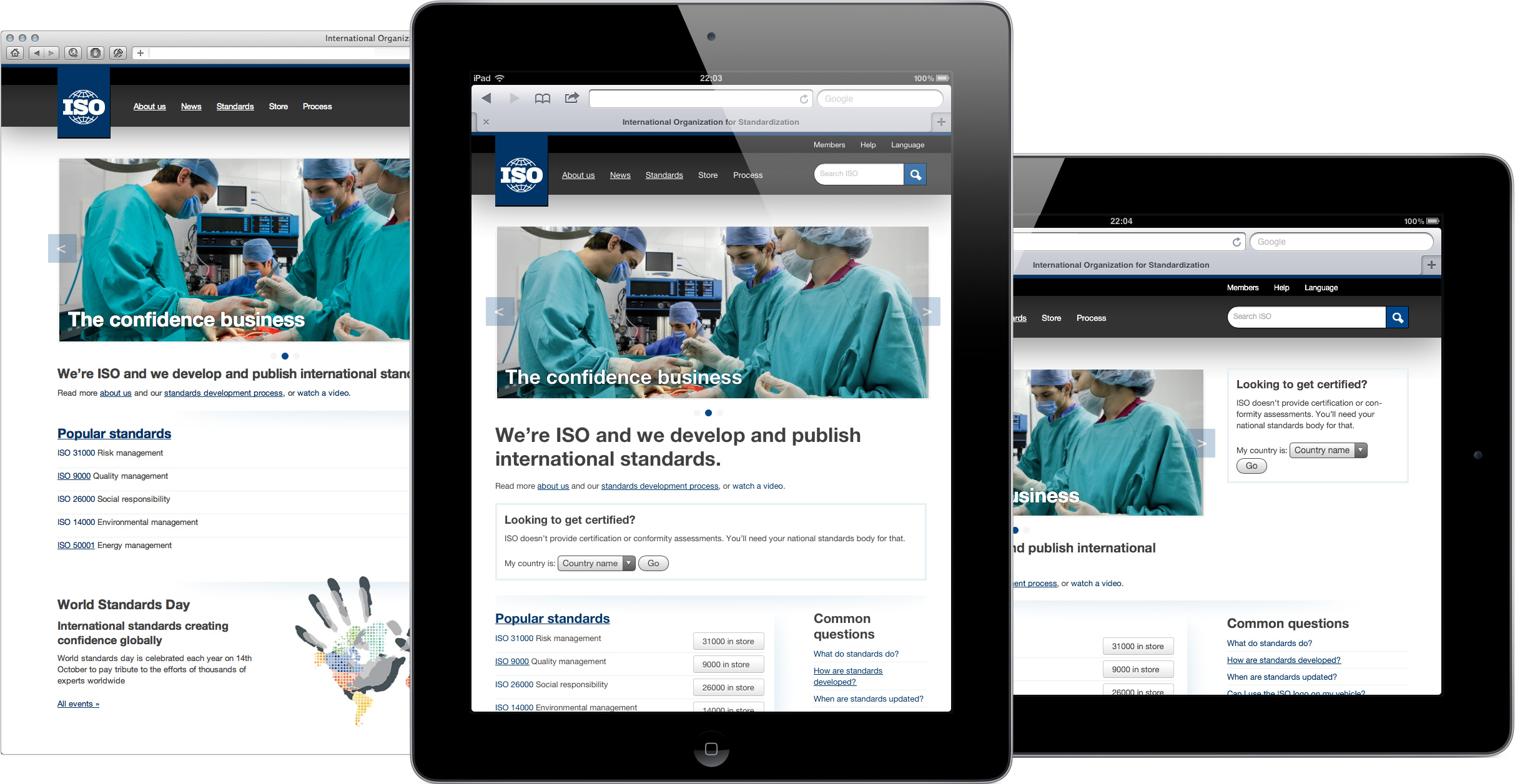
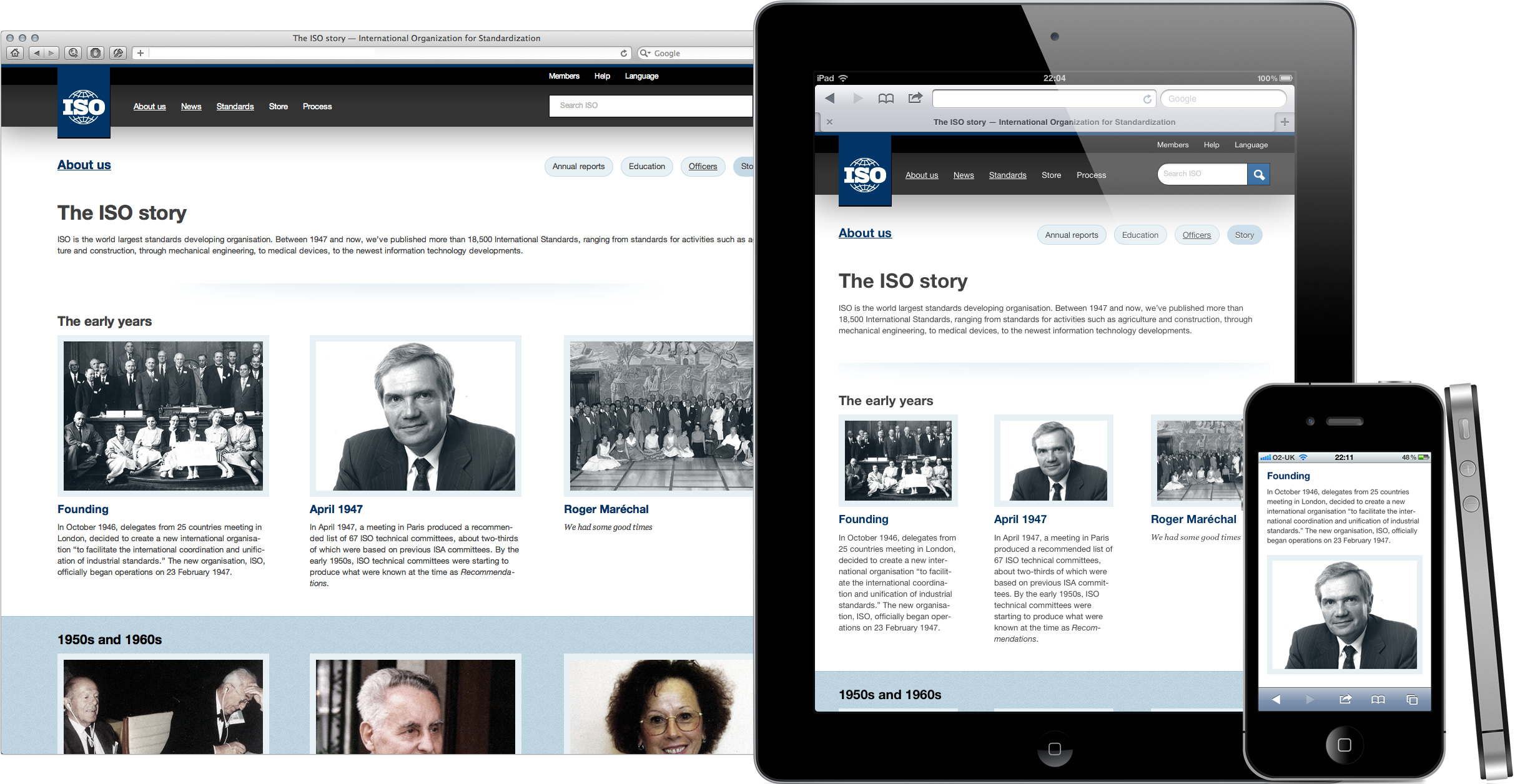
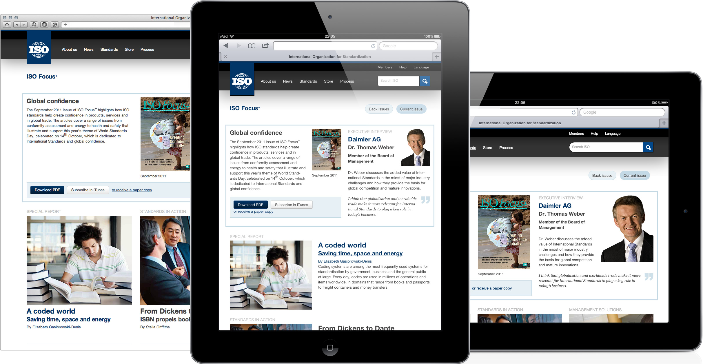
I’ll write more about both the design decisions and technical details when the new ISO site goes live in February 2012, — (cough) CSS3, hardboiled HTML5 and microformats — but here are five pages from the new, content-first, responsive design for ISO.


Working with the team at ISO and David Roessli (again) was a pleasure and a privilege. Throughout this project, Geneva started to feel like home (although with way, way, way better chocolate.)