Designing tweetCC
This week Brian Suda and I launched tweetCC, a Twitter micro-app that allows Twitter users to declare a Creative Commons license for their tweeted content. I’ll be writing more about why we decided to make tweetCC and why licensing you tweets is important in a future entry, but as several people have commented on my design and CSS implementation, first a few words about them.
tweetCC is a simple app and uses just three templates, the home page, search results and a list/article page. This allowed design and implementation to be fast and furious. In-fact I designed the layouts and made the markup and CSS one evening earlier this week. Brian then integrated his php code hooking into the Twiter API and after a few tweaks to the layout and content, the site was ready for its soft boiled launch the same day.
I much prefer to work fast by splashing virtual paint around a canvas. I often find that when a design is spontaneous that I am much happier with the end result than when I labour over every detail. For tweetCC I made a colour swatch and just one rough static visual (for the home page), in Fireworks, to give me a general direction. From there I moved straight into markup and CSS and handled type issues like leading and tracking as well as layout specifics in code. I know that I've harped on about this process before, but designing in the browser is so much faster, more spontaneous and I would dare to say, more creative, than making web page visuals in Photoshop or Fireworks.
Type
tweetCC's design tries to make more from less. Just one (main) typeface and two colours. Depending on your device, you'll see Palatino, Georgia, Times, or a default serif for both body copy and headings. The one place I allowed myself the luxury of another typeface was ampersands in headings. I used italic Hoefler Text via a little (slightly kludgy markup and CSS).
Publish <strong class="amp">&</strong> license tweets with Creative Commons

strong.amp { font-family : "Hoefler Text"; font-style : italic; font-weight : normal; }
I also stuck like glue to a typographic hierarchy placing all type sizes into a scale where they have relationships with other sizes:
body { font : 16px/1.6 Palatino, Georgia, Times, serif; }
h1, h2 { font-size : 48px; }
h3 { font-size : 24px; }
h4 { font-size : 16px; }
That's not a new idea, but when you use only one typeface in a design, even the tiniest decisions matter.
Colours
I made a swatch of dirty colours, but decided to just use two colours in the CSS; one for the base plus white. A long time ago I started trying to reduce the number of colours in my designs, using tints of single colours instead. tweetCC gave me a chance to take this approach in another direction. I used CSS RGBa for the white text at several levels of transparency allowing more or less of the base colour to show through.
body {
background : transparent url(body.png);
color : rgba(255, 255, 255, .5);
text-shadow : #000 1px 1px 2px; }

a, a:visited { color : rgba(255, 255, 255, .8); }

#content { border-top : 3px double rgba(255, 255, 255, .25); }
And so on.
If I used an image, I made it in white and exported it as an PNG image with alpha-transparency to achieve the same effect.
Because I couldn't decide which base colours in my swatch to use in the final design, Brian made the decision for me. We used all of them through a php script that selects a colour at random on page load. There are now ten colours the script can select from.

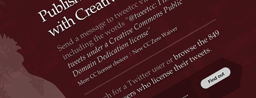
tweetCC red
Of course not all browsers can (or should) see exactly the same design. Internet Explorer in particular cannot understand RGBa. IE6 misses alpha-transparent PNGs too. As it has become traditional for me to make different designs for different browsers, IE7 is served a design that is as close to optimum as it can handle.

tweetCC as seen through IE7
IE6 (the black-and-white TV of the web) is served a black-and-white design.

tweetCC as seen through IE6
My objective here was not to discriminate against people using IE6 In-fact I really like the black-and-white version and I strangely wish that more people could see it.
Other progressive enrichments come in the form of CSS columns for Mozilla and Webkit based-browsers.
#content div {
-webkit-column-count : 4;
-webkit-column-gap : 20px;
-moz-column-count : 4;
-moz-column-gap : 20px; }
The more I use CSS multi-columns, the more I am frustrated that neither the W3C's CSS Working Group or the browser makers who bankroll it have so far come up with a solution to something as fundamental to design as say — columns. But that's a story for another blog.
So there you have it, tweetCC. I hope you like it.