Live and Let Design
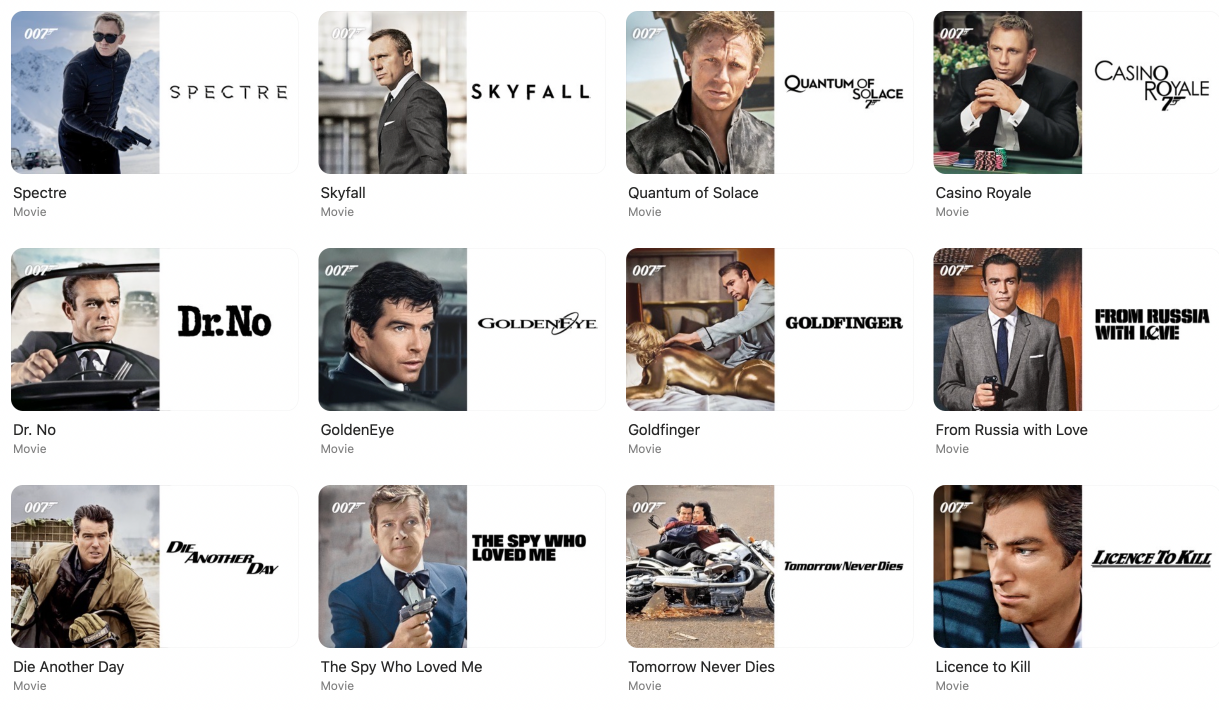
I’ve always been fastidious about how my Apple TV movie library looks. When the time came to change the artwork from portrait to landscape, I was disappointed by what Apple provided for my James Bond movie collection. So, I decided to make my own.
I think it was with Big Sur, that Apple changed the orientation of movie artwork in the Apple TV app on MacOS from portrait to landscape. Recently, I’ve been going through the painstaking process of updating all my movie artwork. Some of the poster art from big studios like Disney, Marvel, and Pixar look great.

They’re not the original movie posters, but like this artwork for its Cars trilogy, they look great together in a library. They help the Cars trilogy stand out and work together as a set.

In contrast, the artwork Apple or the studio chose for the 25+ series of James Bond movies feels like an afterthought. A portrait still of Bond on a white background with only the movie’s logotype in black to distinguish them.

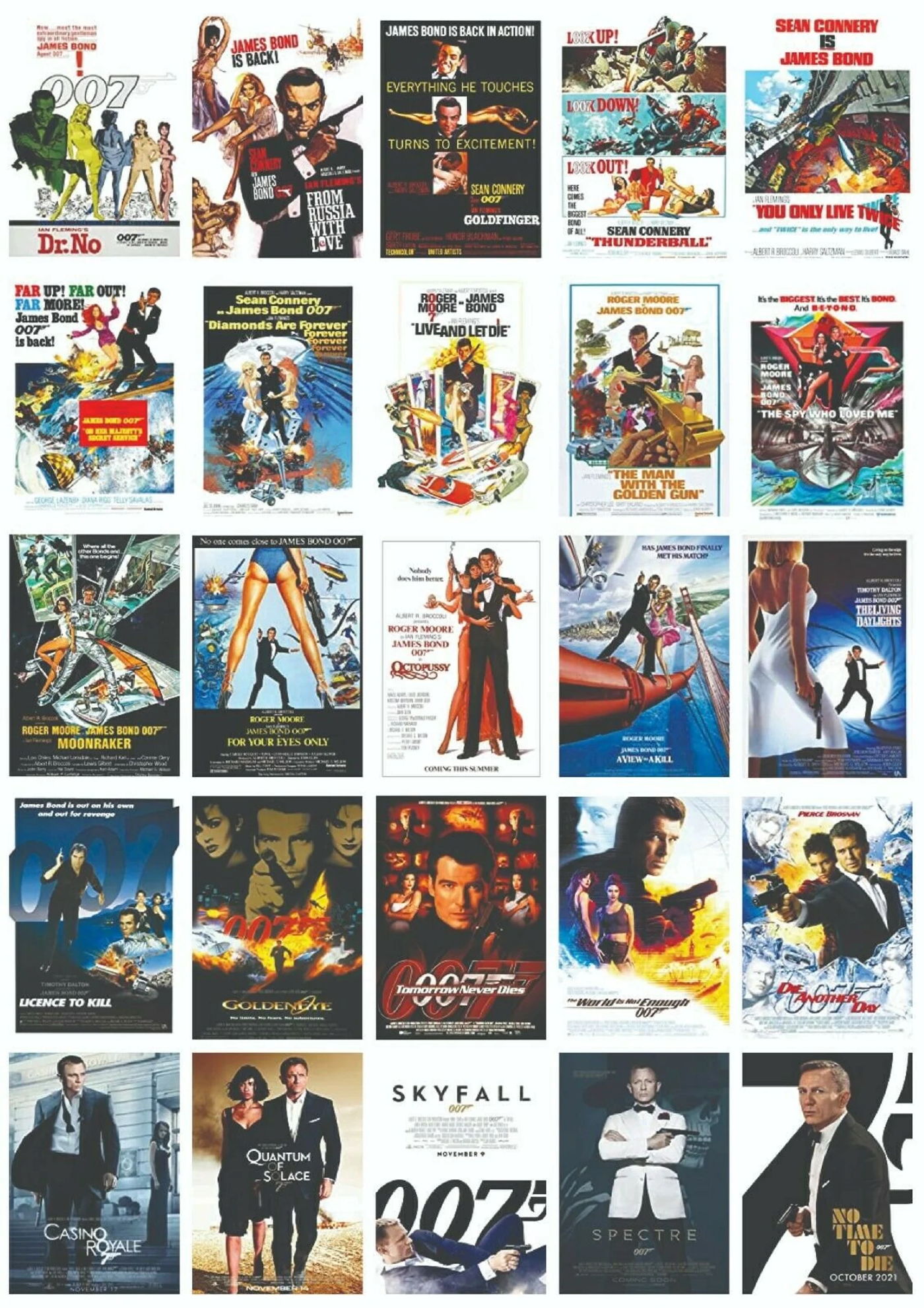
Bond movies have a long a rich visual heritage with iconic posters and title sequences. I could search the web for high enough resolution versions of these classic posters, but their portrait orientation would look out of place in Apple TV’s landscape interface.

So, I decided to design my own artwork for the Bond movies in my collection. I was inspired by Maurice Binder’s opening titles design for the very first Bond movie Dr. No in 1962. Binder used coloured circles—animated by Trevor (no relation) Bond—at the start of these titles.
I used those circles to represent the number of people (James) Bond kills in each movie. Roger Moore’s Bond takes a break from killing in The Man with the Golden Gun, whereas Pierce Brosnan’s Bond goes on a mass killing spree in Golden Eye:
To make this set, I first decided on a typeface—appropriately called Widescreen—designed by Dalton Maag. It’s available as a variable weight font and I use it’s Black weight for the movie titles alongside their Venn condensed medium for the supporting text. Then, I created a grid of sixty multi-coloured circles, keeping just enough to show Bond’s kill count. (I haven’t seen No Time to Die yet—I’m still nervous about spending time with other people in a cinema—so don’t know how many Daniel Craig’s Bond dispatches in that movie.)
I’m really happy with these Bond-inspired designs and how they stand out as a set in my Apple TV movie library. If you’d like to use them in yours, you can download them here in WEBP format:
Download James Bond movie artwork set
ZIP file 2.3Mb


