Paying attention to content hierarchy across screen sizes
I’ve been working on a small travel site over the last few weeks and came across an interesting responsive web design challenge.
Here’s a simplified desktop or large-screen layout. It’s fairly conventional and has a large banner image ( a figure element with a caption) at the top followed by several smaller, floated figures within the body copy.

I’ve bound these figures to the flexible grid so that they scale within a flexible layout. Nothing unusual and works reliably. You’ll find that pattern across many responsively designed sites. So what’s the problem?
It works fine on medium and large screens. Now let’s look at it on a small screen.

Ooops!
What happened?
For small screens, it’s common practice to linearise content, removing floats and columns and using max-width:100%; to ensure elements don’t exceed the width of their parent or the viewport.
But because of this banner image’s wider aspect ratio, when it’s squeezed down to fit a narrow column it loses its position in the visual hierarchy of the page. In fact, the normally smaller inline images appear larger, inverting the visual hierarchy. This is something I’ve noticed happening on responsively designed sites.
Upstatement
Upstatement were part of the team that worked on responsive poster child The Boston Globe.com. Upstatement are rightly proud of their work on The Boston Globe. They’ve made it the biggest image on their home page and a different format to their other portfolio items. On a large screen, the Globe portfolio item dwarfs other portfolio items.
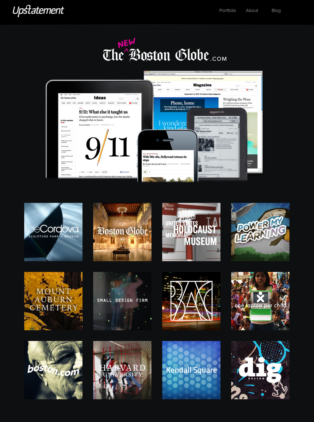
These secondary portfolio items stay the same size across different screen size, Upstatement’s designers preferring to switch the number of columns. It’s a lovely solution, made even better with CSS3 transitions that animate the changes in position. While the secondary portfolio items stay the same size, the large Boston Globe image scales to fit its parent container’s width. Watch what happens at a medium screen size.
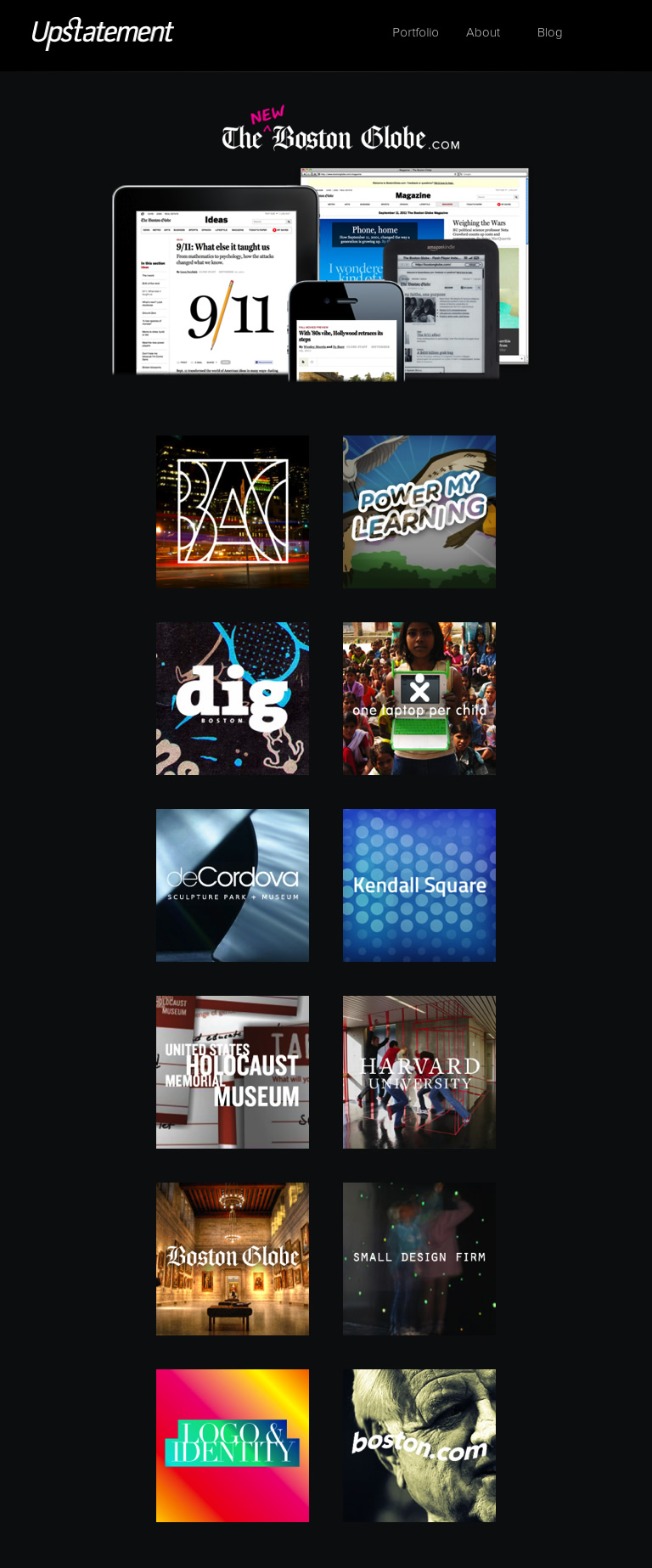
And now on a small screen.
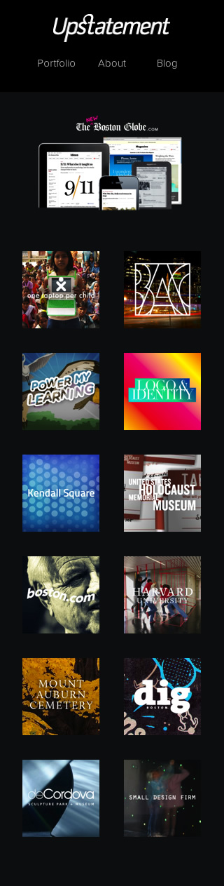
Ooops again.
The Boston Globe image gets smaller so that it’s intended position in the visual hierarchy is lost as the secondary items get larger in comparison. How could Upstatement fix this?
Crush + Lovely
Crush + Lovely are obviously equally as proud of their latest work (for Duet, the one-on-one messaging app. Crush + Lovely’s home page has a similar structure to Upstatement’s, a larger, latest, featured item followed by several secondary items.
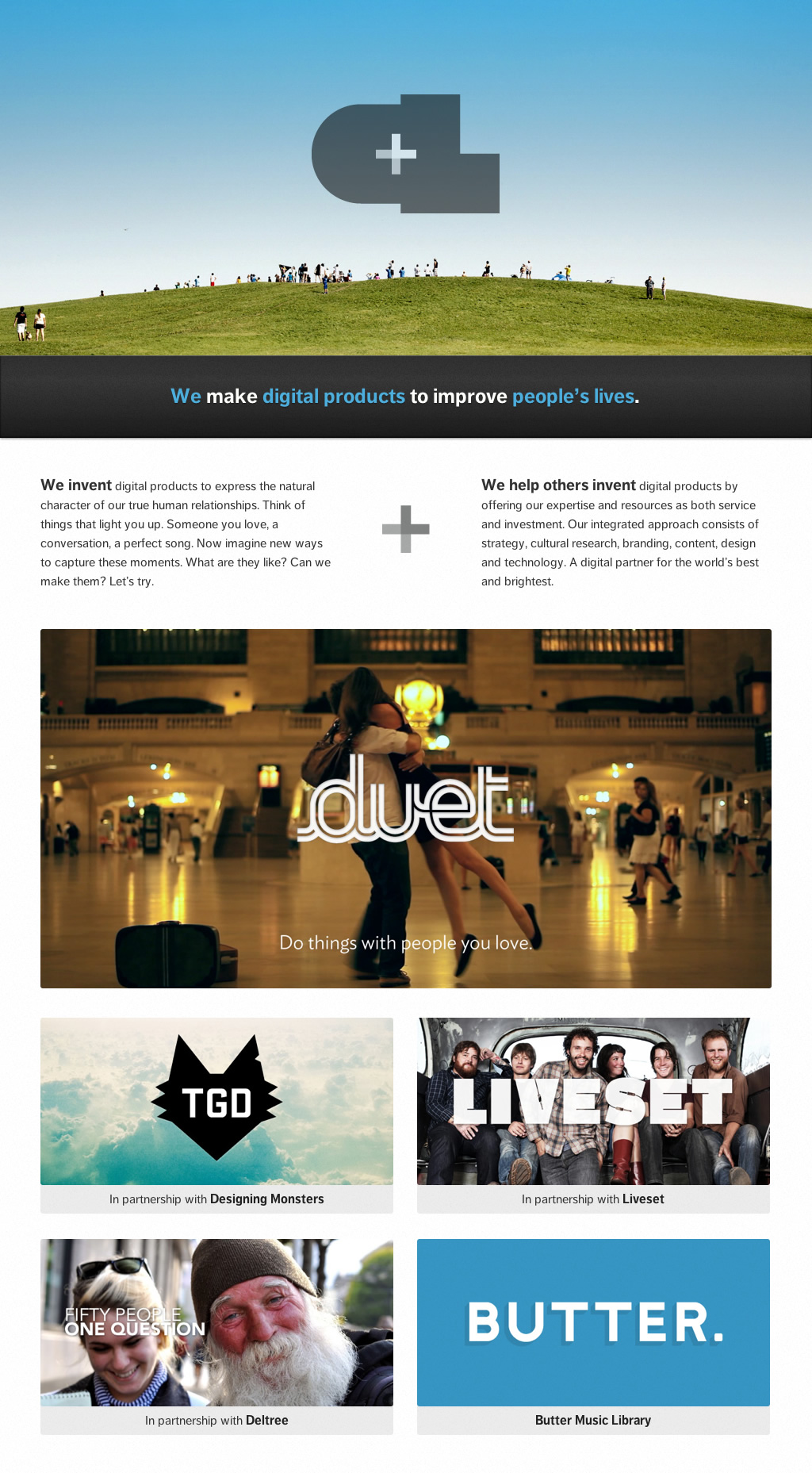
Like Upstatement, Crush + Lovely’s portfolio items stack vertically on small screens. But unlike Upstatement, Crush + Lovely change the format of their featured item so that it maintains its importance visually. The reader can’t therefore mistake what Crush + Lovely think is the most important item on their page.

How can we apply this to other designs, such as my banner image? I’m still experimenting, but so far this CSS seems to work just fine on small screens. Of course you’ll need to override it at wider breakpoints. Apply overflow : hidden; to figures:
figure {
overflow : hidden; }
Reset the max-width, width and height of figure images back to their native dimensions (in my case 800 x 400px) and position the image using margins so that the most important parts of it show in the viewport:
figure:first-of-type img {
margin : 0 -50%;
width : 800px;
max-width : 800px;
height : 400px; }
What are the lessons from all this? It’s that we need to pay attention to the hierarchy of our content across screen sizes, in particular small screens. This definitely applies to images but it could just as easily apply to typography too. Sometimes it’s all too easy just to squeeze elements to fit onto smaller screens, but unless we’re careful, we can significantly change the meaning of our page designs.
(Screenshots taken using Aptus, available on the Mac App Store.)