Prices and plans design patterns
When is it the right thing to do not to attempt to reinvent a well established, tried and tested design pattern or convention. This question has come up while I have been designing the CannyBill prices and plans page.
Although I'm not a fan of Smashing Magazine (or more specifically any list-based article) one article from last year did catch my eye and found itself in my Google Bookmarks, Pricing Tables: Examples And Best Practices. In his article, Györay Fekete looks at best practices and guidelines for designing pricing tables and after a thorough examination of examples he suggests some fantastic advice.
- Use background colours to visually separate different plans
- Use different font sizes and colours for titles and important headlines
- Use unobtrusive CSS and JavaScript when designing a pricing table
- Always show the prices of your plans
- Mention the currency of your prices to avoid confusion, because a dollar sign could represent US, Canadian or Australian currency
In a follow up article from this year, Janko Jovanovic suggests 10 UI Design Patterns You Should Be Paying Attention To, including,
Each plan should be descriptive and provide the following information.
- Name of the plan, such as basic or professional
- Price of the subscription plan
- List of features
- Sign up button
Although like many designers, I am often driven by the desire to create something different and to avoid following what others have created, I have begun to realise that in some situations, following a tried and tested pattern or convention can benefit a person's experience of a design and therefore help the company I am designing for achieve their goals. Conventions can be used as a starting point for design and a platform for innovation.
37Signals and in particular their Basecamp product site and sign-up process are what I consider to be the benchmark in this area. Their pricing and sign up page has become the standard that others have followed, as you'll see if you look at the examples featured by Györay Fekete.
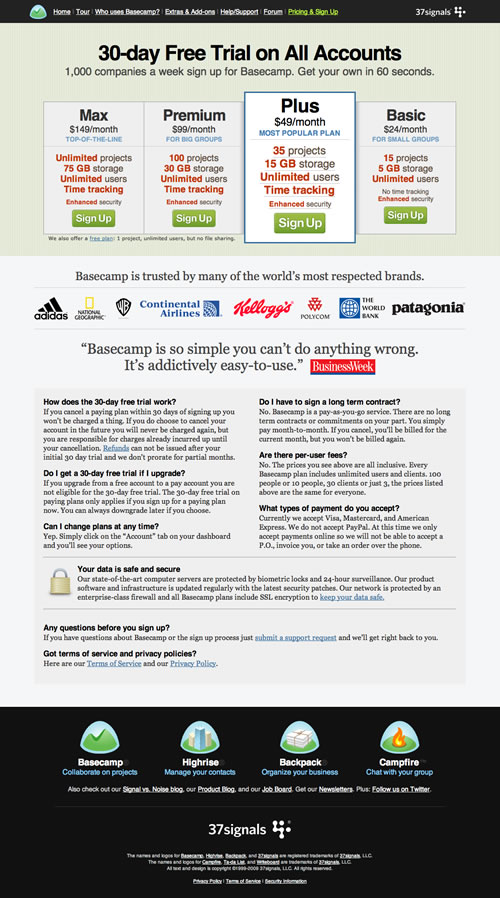
Basecamp's plans and sign up
When I started to redesign CannyBill's pricing and sign up page I tried hard, spending several hours sketching and prototyping, to design away from the convention. No matter how many sketchbook pages I filled, I felt that I was trying too hard to design an alternative solution for something that was so well designed that it needed no alternative.
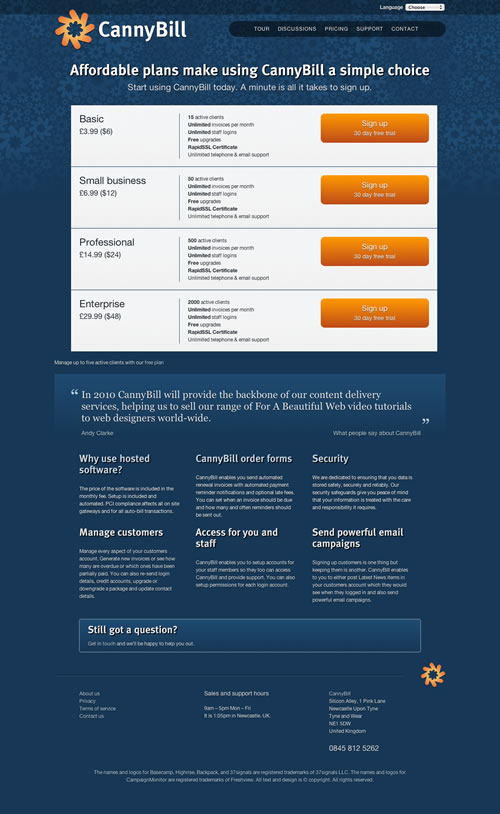
CannyBill plans (early iteration)
The more I worked on design alternatives, the more I wondered about my motivation, about whether my time (and my client's money) could be better spent on my innovating in other areas of the project where that innovation was needed.
With this acceptance, that following established patterns does not always mean that I am any less of a designer, in mind, I started again to design the best interface that I could for CannyBill's prices and plans page.
This page clearly lays out their available plans and options, reinforces the sales message through a customer testimonial, answers key questions that potential customers might have at this stage and ends by offering help if a prospect needs more help or questions answered.
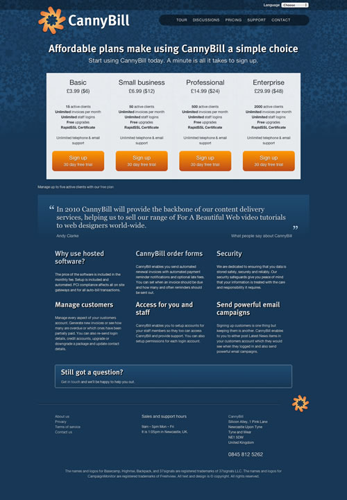
CannyBill plans (later iteration)
Then, taking heed of advice suggested by Györay Fekete and following another established convention, I added a different colour to each of the plans to distinguish it from the others on offer.
HTML5
I made the interface for CannyBill's plans from a simple ordered list (I agonised for, well, minutes, about whether this list should be unordered or not).
<ol class="hlisting offer-sale plans">
<li class="item small"></li>
<li class="item basic"></li>
<li class="item professional"></li>
<li class="item enterprise"></li>
</ol>
Each item has its own class attribute (small, business, professional and enterprise) and a common class attribute value of item. Each item contains.
<li class="item basic">
<h4 class="fn">Basic <span class="price">£3.99 ($6 US)</span></h4>
<ul class="description">
<li><strong>15</strong> active clients</li>
<li><strong>Unlimited</strong> invoices per month</li>
<li><strong>Unlimited</strong> staff logins</li>
<li><strong>Free</strong> upgrades</li>
<li><strong>RapidSSL Certificate</strong></li>
</ul>
<p>Unlimited telephone & email support</p>
<p><a href="#" class="action">Sign up
<span>30 day free trial</span></a></p>
</li>
The distinctive class attributes allow me to style certain elements in these items differently, for example the colour of the sign up buttons.
CSS
The CSS needed to transform this list into the interface that I sketched was simple. Give each of the list items dimensions, padding and type styles, then float them left.
ol.plans .item {
float : left;
width : 180px;
padding : 19px 19px 0;
text-align : center;
border : 1px solid rgb(223,231,239);
color : rgb(32,40,48);
text-shadow : rgb(255,255,255) 0 1px 1px; }
Now make use of those class attributes to colour each of the buttons differently using descendent selectors. Again, I'm using CSS gradient backgrounds and border-radius to create the button shapes without images.
a.action {
border-radius : 10px;
-moz-border-radius : 10px;
-webkit-border-radius : 10px; }
.plans .basic .action {
background-color : rgb(229,195,85);
background-repeat : no-repeat;
background-image : -webkit-gradient(linear,
left top, left bottom,
from(rgb(229,195,85)),
to(rgb(187,160,71)));
background-image : -moz-linear-gradient(
left top, left bottom,
from(rgb(229,195,85)),
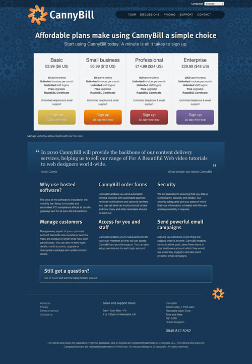
to(rgb(187,160,71))); }If you haven't already, open my new CannyBill pricing and signup page in either Safari 4 or Firefox 3.6 Alpha. Sorry Internet Explorer, Opera or Firefox 3.5 users, look at the screenshot on Flickr instead.
To add sparkle to the interface for people who use progressive browsers (don't forget that now includes millions of Google Chrome users too), CSS transforms and transitions are perfect.
.csstransforms .plans .item {
-webkit-transition-property : scale;
-webkit-transition-duration : 0.2s;
-webkit-transition-timing-function : ease-in-out;
-moz-transition : all 0.2s ease-in-out;  }

.csstransforms .plans .item:hover {
border-radius : 10px;
-moz-border-radius : 10px;
-webkit-border-radius : 10px;
box-shadow : 0 0 10px rgba(0,0,0,.5);
-moz-box-shadow : 0 0 10px rgba(0,0,0,.5);
-webkit-box-shadow : 0 0 10px rgba(0,0,0,.5);
-webkit-transform : scale(1.05);
-moz-transform : scale(1.05); }
People using browsers that have not yet implemented transforms and transitions will not know what they are missing.
Is that a plan?
What do you think? At what stage do you accept and build on the work of others instead of reinventing a solution to a problem that may already have been solved. At what stage does a great solution become a design pattern or convention? And what thoughts do you have on the new CannyBill pricing and signup page.
Update
Thanks to TheFella for pointing me in the right direction. The CSS transitions on the plans are now smooth both in and out (that should please a few people). I have updated the CSS in the article and example file accordingly. Thanks Fella.