Reading room
You might have noticed already, things are looking a little different around here. Over the Easter weekend, I took some time away from the pressing matter of eating chocolate to work on a redesign, specifically to address (justifiable) concerns over the previous design’s readability but also to prepare bringing For A Beautiful Web visually in line with a coming redesign of the Transcending CSS book site.
Almost universally unpopular, the previous design and the process of arriving at it, was experimental. I thought that was a brave move for a business site but it was something I felt I needed to do, after all I've been telling designers for years that it's OK to experiment and OK to fail sometimes. I learned a lot in that process.
When I set out to design the site to launch For A Beautiful Web I knew that I wanted to set a new tone and arrive at something a little unexpected. One of the ways that (I hope) I have achieved that level of unexpectedness was to turn to a classically trained artist, rather than a web designer for creative direction.
[…]
While Ophelia [Chong] got her hands inky in her studio, I set about turning my layout designs in XHTML and CSS prototypes. When we were both finished I took several of her hand-printed images and applied them as background images to my pages. I honestly didn't know what I was going to see, so the results were certainly unexpected. One of the fascinating aspects of collaborating with Ophelia was a sense of not knowing what direction the design might take. Of course I knew what I wanted to achieve from the site in terms of content structure and layout, but I really enjoyed separating these from the aesthetic aspects of the design and letting Ophelia's artwork drive the direction. I suppose that this process was a little contrary to how most designers would approach a project. After experimenting with handing creative control to an artist rather than a web designer, I know that I'm going to do it again as the result is very different from my usual style. That's what I wanted; unexpected. I hope you like it.
You didn't.
Less of a new design and more about a new direction, this new look is intentionally minimal. Although over time I'm sure that I will introduce more imagery, for now that seems unnecessary and I'm happy to let typography and layout do the hard work of framing and conveying the content. Whereas the previous design made a statement about aesthetics while sacrificing the readability of my content, I hope that this new direction puts the focus back onto what I write. I hope too that when I write about design, that this site will quietly take a back seat. Perhaps it will wear earphones and not jump into the front, grab the steering wheel, overpowering me and my content.
Text rendering across browsers
More of an observation rather a comment; when you strip away design to focus on typography, the different ways that different browsers render your type becomes glaringly obvious. I've not yet had a client mention these differences, but it brings home the fact that a web site cannot look exactly the same in all browsers.
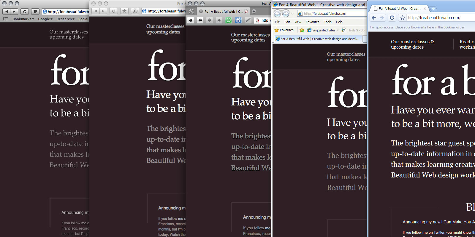 Text rendering across Safari, Firefox, Opera, IE8 and Chrome
I have a lot to write about over the coming months and I feel more comfortable already that the new direction will be better for that content, for me, but most importantly for you. (exhales deeply)
More from Stuff & Nonsense
Services I offer
Product UX design
The contract template trusted by thousands of designers and developers to keep their web projects running smoothly.
Design mentorship and teaching
Whether you’re stuck, starting out, or stepping up—Andy’s here to help you become a better designer.
Squarespace templates for sale
Take your Squarespace designs from good to great with my bespoke templates.
Andy Clarke on YouTube
Join Andy on YouTube to learn how you can make better product and website designs.