Struggling with the New Internationalist wordmark
For the last few days I’ve been working on the branding aspects of my New Internationalist redesign and I have to admit that I’m struggling. There is a raging argument going on in my head. Please help me make it stop.
What's making me schitzoprenic is the New Internationalist wordmark. In my head I hear this:
Malarkey (my evil twin):
You know that you will have to use the Bodega Sans Black typeface don’t you? You know that is the typeface that appears on New Internationalist's magazine masthead, not the one you like so much.
Me:
I realize that, thank-you very much. I realize that the sales and marketing departments are particular about the typeface and I understand the reasons why.
Malarkey:
Then why haven’t you used it? What’s with this Whitney SemiBold Condensed you keep pushing on them? Don’t you understand that readers will expect continuity across print and web? How will they know this is New Internationalist if you don’t use the same typeface? Huh?
Me:
My problem is, and honestly I've been struggling with this for weeks, is that despite everything you've said, Bodega Sans Black just feels wrong on-screen.It’s not just the quirkiness of certain combinations of letterforms (1), I can live with that. But on-screen, even with the most subtle anti-aliasing settings, Bodega just feels tight and cramped. (The light Sans also looks too condensed when used for the accent words like magazine, blog and shop). Somehow it feels aggressive and that is what I’m working so hard to avoid in this new design (2).
Malarkey:
So you thought you’d change their logo? You thought you would change their logo? It’s not all about you, you know? (You’ve been married for twenty years Andy, you should have learned that by now.)
Me:
I didn’t make the decision lightly. I chose Whitney as an alternative because I think it has a similar shape but is lighter, more contemporary, more open. Somehow it just feels right in this design.
Malarkey:
Let the people decide. This is supposed to be an open design process, right?
So I am.
 1: Bodega Sans Black’s quirky letter-forms
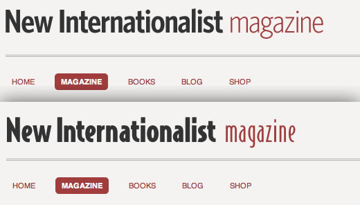 2: My preferred Whitney SemiBold Condensed (top)
Bodega Sans Black (bottom)
Update:
Having taken your advice into consideration, here (top) is a compromise solution that uses a lighter weight Bodega Sans. Below is New Internationalist's print magazine SemiBold.
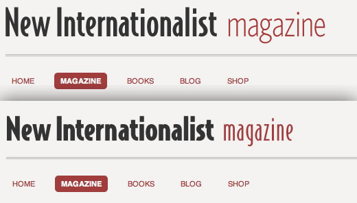 Bodega Sans Medium (top) (with Whitney accent word)
Bodega Sans Black (bottom)