A rule of thumb
As some of you might know, I like to work on e-commerce store designs. Part of what fascinates me about making sites designed to do business is the psychology of designing for e-commerce. I love the planning and the thinking too and I like to study what successful sites like Amazon do so well. Dammit, I even enjoy reading Jakob Nielsen’s website (Ed says: Steady on there Malarkey!)
At times though, looking at e-commerce sites can make me a little sad because of the quality of the images chosen to illustrate products. It sometimes feels like the effects of good planning and usability design are diminished by badly chosen or poorly cropped product images. This issue comes into focus particularly when looking at small, thumbnail images.
Minimize me
When faced with the task of creating small, thumbnail images, many reach out for the closest image resizing tool, creating smaller versions of full sized images for search results or product range type pages. You know the drill;
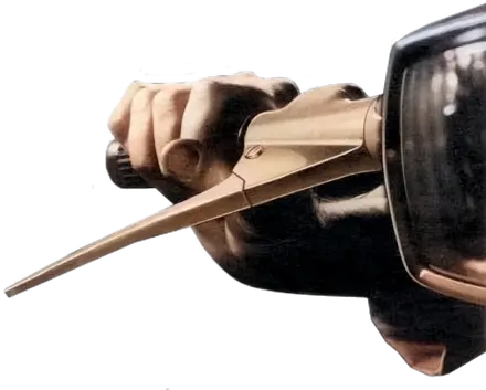
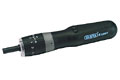
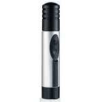
While this may be fine for some items such as book or DVD covers, the results are less than satisfactory when shrinking images of larger items. Take a look at this Amazon cordless drill page and you’ll see what I mean.
Now, let’s play a quick game of Can You Tell What It Is Yet?
 Is it?
- A: A compost maker?
- B: A non-stick fondue?
- C: Anakin Skywalker’s prototype Vader mask?
The devil’s in the detail
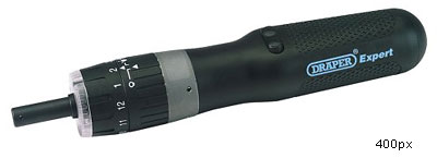
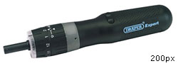
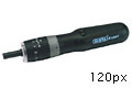
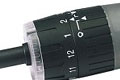
One of the ways to eliminate such confusion, particularly on pages which contain row after row of similar looking items, is to focus on the specific features or unique-selling-points of an item rather than trying to cram a complete product into a tiny space. Let’s go back to our first example of the cordless drill.
Let’s say for sake of argument that this Draper cordless drill has a unique or easy to use bit changer mechanism. Rather than showing the whole of the drill,
it would be better to take a close-up view of the mechanism for the thumbnail and leave the complete item for the larger view on the item’s detail page.
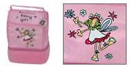
Let’s look at that again, this time with a different item. Here the Fairy Girl lunch box on the left shows little of its USP, the Fairy Girl motif. But with a little sensible cropping over on the right, the motif is clear, perhaps more important to a potential buyer than seeing the lunch box complete.
Where space allows, combination images often prove more pursuasive than either of these two options (a little time spent in Photoshop pays real dividends) and I now often allow a little more flexibility in image sizes to allow for slightly larger combination images where needed. So, taking that approach,
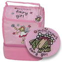
gives us the best of all worlds.
Supersize me
Making pursuasive, informative images sell by demonstrating their USPs is not only relevant for thumbnails. Sometimes the same issues occur in larger product images too. I’ll leave you with this wee gem until another column.
Replies
-
#1 On April 5, 2005 11:47 PM Jon Clark said:
I see your point completely. Not having any experience with designing product pages or e-commerce sites, I haven’t run into this problem literally, but whenever I am making a photoalbum on a website I select a part of the complete image that I think will tease visitors to view the entire image. Sometimes it’s something obvious like a subject’s face, other times it’s something more obscure.
Good to know I’m doing something right.
-
#2 On April 6, 2005 12:00 AM Ben Darlow said:
Interesting. Problems I shall doubtless be interested to hear suggested solutions for on our particular conundrum of a website…
One issue that has always perplexed me, though, is the subject of dynamic resizing and cropping. Obviously the above sample images were all resized and cropped manually with Photoshop, but if when you’re talking about an e-commerce system source images could well be initially supplied in some horrid format (our suppliers often give us images as bitmap or TIFF files - 1xxx pixels + in each dimension) so the only way of rationalising a large number of these images becomes automatic batch resize/conversion. This doesn’t lend itself well to crisp, decent looking thumbnails, much less allow intelligent cropping. So just what can we do in such a situation?
Answers on the back of a postcard!
-
#3 On April 6, 2005 12:22 AM Stuart Young said:
What we do is offer the choice to the client, do you want:
* Cheap images (all Photoshop batched, no individual attention, other than a quick custom crop of the full-size one)
* Expensive images (individual care and attention, colour correction, custom crop of both full size and thumbnail, i.e. relevance-enhanced thumbnails, etc).cheers
-
#4 On April 6, 2005 12:24 AM Mike Piontek said:
It seems to me the problem here is that a large commerce site will have thousands and thousands of products. It’s probably not very practical to generate every thumbnail image by hand. As you’ve demonstrated, good thumbnails require intelligent decisions that real humans aren’t always very good at, let alone automated processes.
Great points nonetheless, and I’ve often times been frustrated with this myself. Especially when you click for the all-important enlarged image… Only to get the same tiny thumbnail!
-
#5 On April 6, 2005 12:27 AM monooso said:
I agree with you 100% with regard to the frustration of seeing a design ruined by poor quality - or just poorly chosen - photography.
I’ve worked on quite a few automotive-related sites in the past, and despite clear guidelines *and* a CMS that provides the client with the ability to resize and crop images as required, they still end up inserting some appalling imagery of their stock vehicles. Makes you wonder why you bother sometimes.
I’m not so sure about the "cropping to show the product’s USP" point though - sounds great in practise, and I can understand the logic behind it, but I know from past experience that I quite frequently scan thumbnails looking for a product that I will recognise when I see it.
Taking the "Fairy Girl" lunchbox as an example - I should imagine that the USP of the ever-popular Fairy Girl hip flask would also be the logo / illustration, so how am I to distinguish between the two? I could read the title of course, but my point is that a thumbnail of the whole product - whilst admittedly less attractive - is actually more informative.
Speaking as a shopper rather than a designer, I would probably find full-product thumbnails more useful.
-
#6 On April 6, 2005 12:57 AM Kevin Tamura said:
Anakins helmet, definitely anakins helmet.
I agree that taking a detailed shot in nine times out of ten makes for a better image. However that one out of ten is like the fondue pot, I mean anakin’s helmet’no matter which way you do, the thumbnail image is goign to look off.
-
#7 On April 6, 2005 02:33 AM Tom said:
When I buy things from ebuyer. Dirt cheap may I add. I don’t really care about the image, I’ve already don’t my research on the Belkin and Nvida website to know what I’m buying.
On the other hand when I’m shopping for a present, I like to be given more information about what I’m buying and what makes it so cool. Take an iBook for example.
We have toonnnnnes of info on the product pages but no "add to cart" button?
https://www.apple.com/uk/ibook/The actual "add to cart" page has very little info on it.
(I cant seem to link that page)I guess Apple assume that you will go off and "ooh and aaah" before you even look at the price. There’s probably more issues here, but I guess it boils down to the product and why your selling on the web.
Are you selling Tesco Value or Sainsburys Taste The Difference?
-
#8 On April 6, 2005 07:50 AM Graham Bancroft said:
I think the product images are of paramount importance not only size and relevance of the thumbnail images but quality also. Take a look at my first effort site (not valid anything yet, tis two years old though :o{ ) The product images I think are not great and it makes a massive difference. I did however try to give the shopper a bit more with the various shots of the item.
As for your mystery items;
A compost maker and a battery powered pepper mill? -
#9 On April 6, 2005 08:11 AM Tommy said:
Good points, Andy. Creating a thumbnail is often more about cropping than resizing, focusing on and highlighting the important part of the image.
-
#10 On April 6, 2005 09:07 AM Kate said:
Unfortunately, a lot of the images out there for e-commerce sites are done by the owner of the site and not the designer — it’s easier to throw up some database-driven lump of a site that allows the owner to update willy-nilly than it is to spend all your time resizing tiny little images for all the different stores you’ve created.
But it’s definitely something to speak to store owners about when designing the site in the first place. Thanks for this!
-
#11 On April 6, 2005 09:07 AM Kate said:
Also, that last one is so obviously a lightsaber…
-
#12 On April 6, 2005 09:22 AM Holly said:
I worked on the design of that fairy girl bag. Spooky.
-
#13 On April 6, 2005 09:23 AM Tim Parkin said:
we’re in the process of building an asset manager drop in that allows the administrator to define a set of ’common’ crop sizes that are used throughout the site. When an image is uploaded in ’high-res’ form, the crop manager prompts to create a crop each of the common sizes. Once a crop has been created, it appears in the cms for that part of the site (eg a press article may require a thumbnail, a wide and a full image .. when choosing the thumbnail, only the prepared crops are(could be) shown). We’re using a flash cropper from silver orange that’s been modified to allow inernationalisation, crop pre-setting and unlocked aspect rations. Once we’ve got it all working we’re going to release it back as open source so (the asset manager is being built in python btw) here’s our original mock-up (700k) https://www.pollenation.net/assets/public/assetmanager.png
-
#14 On April 6, 2005 10:19 AM Ben Sekulowicz said:
I find it really frustrating that on so many electronics sites, the biggest image of the product is about 400px wide. I ewant to see the product!
Not having somehting tangible to examine before your purchase is the second biggest problem with e-commerce, so giving us tiny images is just worsening it. Why not give us the option to download full screen images to really get a look at the product?
-
#15 On April 6, 2005 10:27 AM Rob McMichael said:
I must say that talking from a consumers point of view I normally know what the product looks like but like to be able to see a full shot so I can reference to that.
With your drill example a consumer would not know if the drill was cordless, had a massive battery pack or even how bit it was.
Obviously both have their pros and cons but with the simplicity of creating the standard type its clear why its more popular throughout the interweb.
-
#16 On April 6, 2005 12:38 PM blanchrt said:
Ha, ha!, even before looking at the larger picture of the last item, one would think it was meant for other part of the body…not a very commercial display decision, indeed.
-
#17 On April 6, 2005 03:08 PM Jason Beaird said:
As a designer whose hand has been forced to do product entry, I LOATHE working with product images. I love e-commerce. I particularly love making my company’s cart solution look and work better and better - but PLEASE don’t make me do product entry.
I think the last straw was a sunglass site that we’ve been working on for some time now. There are currently 539 products. Many of those products have 5 or more variants of lens and frame color. Even though the CMS creates thumbnails from large images automatically, and can change them image when a user selects a variant from the dropdown, creating images for each variant would be ridiculous. We’re still working on improving the site and increasing the inventory, but here is an example category page (with thumbnails) and here is the product detail page (showing all the variants in a single image.
-
#18 On April 12, 2005 02:48 AM Thomas said:
Never really thought about it before but now that you mention it it totally makes more sense and the image quality specks for itself. Great little write up. Thanks
-
#19 On April 13, 2005 05:17 PM elliot said:
I work on the Marks and Spencer website. Being a large e-commerce site, page weight is the main issue here.
The overal page weights if anything are very unrealistic, though they’ve come from marketing management who don’t really know alot about the in’s and out’s of designing for the web.
Reading through this article the iamge of the drill has given me some inspiration as alot of the time an image can’t fit into the template of the page. I do crop images so that you she the best bits, though having it enlarged as much as you’ve done could look really good. I’ll give this a go!cheers
-
#20 On April 14, 2005 05:26 PM Daryn said:
have a look at zoomify.com.
light swf zoomer. very good.