And all that (Design) Malarkey
It’s here. I’ve been meaning to redesign this site for a little while now and since I have emerged from my black, depressive state, the urge was getting too strong to ignore. I just had to do it.
Funny thing this design malarkey
I have been sketching ideas on the back of fag packets for about four months, but none of them made it much past the scribble stage. I knew that I wanted to do something radically different with the design and with the layout, but none of my ideas were hitting the spot. Then I realised that that was the problem. I was confusing layout with style, mixing them together into what I thought was design.
So I went back to basics and created (first paper, then Fireworks wireframe layouts which housed the main content and navigation. As the site is getting more content, I wanted to improve usability by adding better archives and a search facility, but I also wanted to avoid, where possible, a conventional blog layout.
So, after spending much time researching magazine contents pages (more on that another day) I had an urge to experiment with that format on the web and early signs were encouraging.
But even with the wireframes in an advanced state and some early XHTML/CSS prototypes ready, I still had no clear thought in my mind as to the style and character of the new site. But I did know that I wanted to break away from the previous darkness and yet retain elements of the Mod symbolism without being overtly retro
Designing scraplets
Separating design from layout in my mind was liberating. It allowed me to play with colour and symbolism without thinking once about headers, footers or sidebars. I scoured my record and book collections and (with a little help from Google) I designed a series of what I now call scraplets. These scraplets were in effect the design of individual page elements devoid of their context.
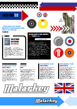 A collection of scraplets (larger view)
It might seem odd to make elements before seeing how the fit within a complete scheme, but for me this is definately the way to go in future.
Early versions
The first complete layouts were interesting, but not different enough from the (then) current site.
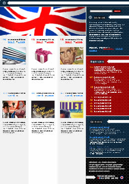 An early version
 Experimenting with a header graphic
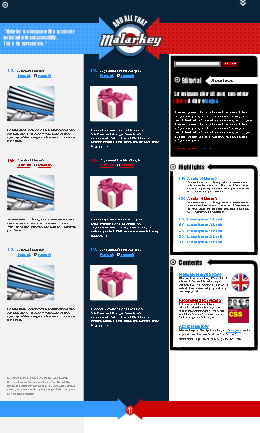 Another early version
As ideas developed and I knew I would be sticking to MovableType, I made four template prototypes.
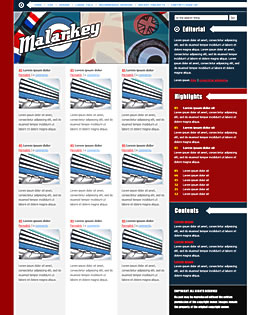 An early XHTML prototype
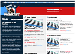 A later XHTML prototype
Come together
With the redesign I also wanted to break away from certain conventions, for example with the layouts of my recommended reading, badges and blog-roll pages. Looking back through my magazine and record collections, certain motifs kept reappearing and it seemed like a fun idea to take these elements (not commonly used on the web) into the site design.
And that just about wraps up about four months (on-and-off) of work. I hope you like it.
Replies
-
#1 On May 11, 2005 09:27 AM John Oxton said:
I love it!
The stopwatch is running, how long before the showcase sites start popping! :)
-
#2 On May 11, 2005 09:53 AM Dan said:
Nice work Andy. The site is looking awesome. Took me a while to get used to it, and I think I still am finding my way around somewhat. But the new design is great.
I love the setup of the homepage. It’s quite unique and gives the site a nice edge. Also good to see your keeping to the mod style as well.
Great work. I wonder how long it will be till you get listed on all the galleries? I will give it to the end of the day before most have picked up on it.
-
#3 On May 11, 2005 09:56 AM Malarkey said:
Just testing, but it appears that the problems with comments and the search facility are cured. They were due to the server move.
Many, many thanks to Derek Featherstone for all his hard work on the server-side malarkey.
-
#4 On May 11, 2005 10:01 AM Olly said:
You know, I quite like this.
Unfortunately the headings look very jaggedy on Windows XP if you don’t have cleartype switched on (I have a CRT so I still use Standard font smoothing for the most part). Its a pity because the rest of the site looks lovely.
Oh, and I was unable to post this on the all new article…
-
#5 On May 11, 2005 10:02 AM Derek Featherstone said:
No problem, Andy. Glad we finally got it launched, and glad to see it up and running. Some interesting CSS Malarkey going on to investigate… :)
-
#6 On May 11, 2005 10:05 AM Ischa Gast said:
What a redesign, I love it.
I really loved the redesign from John Oxton with his unique design and then this another new never seen before design.
Who’s next?
-
#7 On May 11, 2005 10:05 AM Colly said:
Yes, yes, yes, yes, YES!!!
Instantly passed my "first impression" test. Lately I’ve been fairly underwhelmed by a lot of redesigns, but this one is a treat for my tired old eyes. Hooray for bold palette over the old browns.
Scraplets are fabulous. I’d stick this straight on Stylegala, were it not for the fact that I’ve been showing increasing bias towards the Brits. Someone else better do it…fast. I’d better eview some Moldovan or Bulgarian sites first.
Good to have you back, old chap.
-
#8 On May 11, 2005 10:11 AM Colly said:
PS: Digging the new look ’n feel of the Destinations page. Very flattering blurbs. You old softy.
-
#9 On May 11, 2005 10:32 AM Mark Boulton said:
It’s a beaut. I’ve been looking forward to this when you mentioned it to me a few weeks ago (in amongst moaning about Doctor Who). Loving the idea of scraplets - looks like a sheet of stickers. Well done mate, first class.
-
#10 On May 11, 2005 10:32 AM Jim said:
FP to you. Like the new design.
-
#11 On May 11, 2005 10:50 AM Anthony said:
The Special(s) IE version is very Two Tone Tastic too.
-
#12 On May 11, 2005 11:11 AM Jon Hicks said:
Andy - that ’experimental header graphic’ is superb! Why was that scrapped?
I love the new optimistic colours - ’going underground’ keeps popping into my head. The only element I’m not keen on are the pixel fonts at the top.
-
#13 On May 11, 2005 11:44 AM matthijs said:
Great design, my compliments. However, as Olly pointed out, on my system the headers look jaggedly too (xp, no clear type). I know how to change the settings to clear type. However, with cleartype everything looks a bit too fuzzy on my crt screen. So, I don’t want to nitpick or expect you to change your headings :), but I was wondering if someone could point me to some resources and/or statistics about how many people have cleartype installed etc. It makes a huge difference how a website looks, but there’s not much documentation about it in webdesign resources, at least as far as I know. And that while it is important to know for the choice of fonts for a website.
Matthijs -
#14 On May 11, 2005 12:02 PM Peter J.Lambert said:
Oh my word! Good job done well, Malarkey.
Just viewed it in IE aswell. That fucking rocks my world.
-
#15 On May 11, 2005 02:12 PM J. J. said:
Looks awesome, but I agree about the WinXP headers being grainy. I’m also curious if I’m the only one that thinks the arrows are all a little lopsided with the top diagonal (or left on the comments) edge being longer than the bottom….? Stylized quirk?
-
#16 On May 11, 2005 02:20 PM zeronine said:
awesome job.
-
#17 On May 11, 2005 02:32 PM Rob Mientjes said:
Um. Blimey. Better get to the drawing board again. Nice work Andy. For some reason, it already feels ’you’. I guess that’s a good thing, so I better say it is. Good stuff. Only thing: pixel fonts. Why? Everyone’s entitled to their own opinion, but I hoped we got over that thing. It doesn’t look bad, I just think it’s out of place with the rest of the design. But it is badass.
-
#18 On May 11, 2005 02:34 PM Matthew Pennell said:
Nice job - I think I got first review in while you were offline!
Will there be a write-up on the IE decision process soon? I’ve got a work experience lad with me at the moment; we looked at your site on my machine (Firefox), I sent him away to look at the code and see if he could work out how you had done stuff, and he came back saying it was totally different on his machine (IE)!
-
#19 On May 11, 2005 02:47 PM B. Adam said:
She’s a keeper. Wonderful job, Andy!
Great idea, also, to launch the redesign with all the different posts about the redesign. Really makes it an event.
And I echo Matthew’s observation … Dude, site’s black and white in IE -- that’s fantastic!
-
#20 On May 11, 2005 02:53 PM Steve said:
Man oh man, I’m sitting here on a PC with IE and thinking what a great redesign, thanks for laying out your process, blah blah, then I see Anthony’s post in the comments about the special 2-tone IE version and I instantly feel robbed, cheated, swindled, short changed, hood-winked, and even violated. Against US Army regualtions, I open Firefox and see what all the Malarkey is about and nearly fell off my seat. I just thought the comps you posted were all scratched for the black and white taxi-cab version.
Great stuff man, really nicely done.
thanks. -
#21 On May 11, 2005 03:21 PM Scrivs said:
It’s good and stretches the medium just a bit further. However, as a couple others have mentioned the headers are nearly impossible to read. And I am on a 30" Mac OS X LCD so it should be clear as day. Maybe the kerning is too tight or something, but any header that isn’t in black just makes my eyes hurt.
Get that straightened out and you have one of the top redesigns this year I believe.
-
#22 On May 11, 2005 03:50 PM Rob Weychert said:
Looks great, Andy! I’m particularly fond of the homepage layout and overall color palette.
I do have to register dissatisfaction with the headers, though, as I am generally opposed to any use of Impact, and the tight kerning here makes the face doubly difficult to read.
Otherwise, this is a great treat on an otherwise uneventful Wednesday morning. Nice work!
-
#23 On May 11, 2005 03:57 PM Kate said:
swaaaaaaaaaaaaaaaaaaaaaaaaaaaaaaaaaaaaaank.
I bow before greatness.
-
#24 On May 11, 2005 04:20 PM Malarkey said:
Hi guys, and thanks for the lovely words (I’ll eat them later).
Ooooh, that old Impact font malarkey… it’s interesting that some people have such objections to it. Personally, it’s one of my most hated type-faces, but I used it for a real reason - it was in common use of many (most?) of the resource designs materials I studied. So… to keep the Mod spirit, Impact was the answer. If anyone can recommend a better alternative, I’d love to hear your thoughts.
-
#25 On May 11, 2005 04:29 PM Chris Hunt said:
Pretty impressive, though I’m afraid I have to agree with other posters here about the blocky appearance of "Impact" headings. Maybe use "Haettenschweiler" instead?
I know it’s some kind of modern design rule that you have to use the smallest font size you can get away with, but the code examples now appear so small as to be almost illegible. A quick ctrl-+ in Firefox makes the whole site a lot easier to get along with almost everywhere, even the Impact bits look better.
-
#26 On May 11, 2005 04:35 PM Jason Beaird said:
Excellent Job! It’s great to see the early versions and scraplets… it says a lot about your design process and consistant vision for the redesign.
-
#27 On May 11, 2005 04:37 PM Paul Livingstone said:
Very nice work mate. Love the scraplets, they look like my old high school jotter covers. The font smoothing on the Mac is a bit harsh on your Impact (it looks like impact anyway) headings… but other than that, it looks very nice indeed. The front page is awesome work. Nicely structured and pretty… have a mars bar on me.
-
#28 On May 11, 2005 04:59 PM Jaakko Knuutila said:
Your re-design is fresh and certainly a beauty to watch! My only rant is the pixel font used for the topmost navigation, it really doesn’t fit into the mood of the rest of the site. And while I’m on it, a bit more character spacing to the Impact-font wouldn’t hurt it looks a bit too cramped at the moment.
All in all a solid re-design!
-
#29 On May 11, 2005 05:00 PM Mark Boulton said:
Malarkey - You may want to try Helvetica Condensed (Bold or Black) instead of Impact. It has enough similarities and renders pretty well at small sizes on screen. Not sure what Flash would make of it though.
-
#30 On May 11, 2005 05:01 PM Matthew Pennell said:
You could always judiciously sIFR the Impact headings to reduce some of the blockiness. Personally I really like it as a typeface, but it isn’t really suited to small font sizes on the web.
Maybe bump up the font sizing a little? I upped your body setting to 110%, and the headings smoothed out a lot.
-
#31 On May 11, 2005 05:10 PM Mike S. said:
All I can say is wow. This site and your hard work on it has definitley inspired me today. Fantastic job Andy.
-
#32 On May 11, 2005 06:13 PM Andrea said:
The Impact doesn’t bother me in the headers, but I do find it hard to read in the blue pullquotes. For me, a bit more letterspacing so they’re not kerned so tightly would make a big difference.
It works for me with the design, though-- I especially like the way it interacts with the arrows in the comments.
-
#33 On May 11, 2005 06:14 PM Tony said:
I like it…except for the left sidebar (From the archives). On my monitor, the links…both visited (red) and not visited (blue) are *very* hard to read. They blend almost completely into the dark background. I see the white headings (Accessibility, Code, CSS, etc.) just fine, but the rest is a dark blur…if I look carefully, I can make out what the links say…
Perhaps lighten them up a shade or two?
-
#34 On May 11, 2005 07:02 PM Dan Cederholm said:
Fantastic job, Andy. I especially love the arrow treatments (recommended reading, comments, etc.). The whole site feels like a comfortable, coveted album sleeve.
-
#35 On May 11, 2005 08:46 PM Graham Bancroft said:
Nice one, like it a lot.
Thank goodness there’s no flowers.
-
#36 On May 11, 2005 08:50 PM dotjay said:
Nice one, Andy ’n Derek. The new design makes an … (Dr Evil length pause) … Impact.
Mmmm - un-tasty, bland IE - just what it deserves if you ask me. Good luck with sorting the all-but-smooth Impact font issue.
-
#37 On May 11, 2005 09:34 PM Keith said:
Looks terrific! I love the use of color, very bold, very telling…emotional even. Oh and the arrows…nifty.
One, slight little niggle, I to am having problems with some of the headings. They look, fuzzy, sort of. But it’s nothing major.
Stay mod man.
-
#38 On May 11, 2005 10:08 PM Ronald said:
Well…
When I looked at it this morning on IE6.0/win (obligatory company installation; yeah, I know, get back to work…) I was rather… shocked. Black ’n white, for crying out loud!
Now, on Moz, I’m relieved to see some colour, but I still think you’re being a bit too harsh on IE users; a lot of them have no choice, you know… (like me, not working and doing the daily blog check).
By the way: nice job!
-
#39 On May 11, 2005 11:21 PM Olly said:
Andy - Its not that I hate Impact as such. Its just that on a non anti-aliased screen it looks jaggedier than a sharp bow-saw. Of course a nice bit of sifr would sort that… ;-)
-
#40 On May 11, 2005 11:33 PM Andrew Krespanis said:
Smooooooooooooth!
Nice work Andy :D -
#41 On May 11, 2005 11:44 PM Justin Perkins said:
I like it because of the semi-liquid layout and because of the left-aligned nature. I am so sick of center aligned sites, but I cannot seem to create a left aligned site (I never have enough content).
I really don’t like the small copy font though, it’s really hard to read for me :(
-
#42 On May 11, 2005 11:52 PM clint said:
nice organization of content, i’m really diggin those cols…
heh I noticed the impact right away too ;)
-
#43 On May 12, 2005 12:47 AM Splash! said:
Hmm…. I’m not convinced, personally. I prefer a more conventional layout… this one is counter-intuitive to me. And I dont like the impact font.
But I am in the minority, and I applaud the brave departure from the norm :)
-
#44 On May 12, 2005 12:51 AM Splash! said:
…and, (sorry for the double-comment, but I couldnt figure out your contact page), old links arent working anymore.
My poor bookmarks…. :P
-
#45 On May 12, 2005 05:51 AM Katie said:
You’re my new favourite designer :) I checked out your portfolio and I really love your work! Keep it up and keep us inspired!
-
#46 On May 12, 2005 05:55 AM Peter Asquith said:
By golly, I like it! Particularly the splendid arrow treatment in the recommended reading section and the freedom the flow-to-the-right layout gives you. Very nicely done!
-
#47 On May 12, 2005 08:48 AM Malarkey said:
What a day!
Wow, what a day it was yesterday. I was overwhelmed with the kind words from people I respect/know/don’t know. I also appreciate the very constructive nature of some of the criticisms. Thank-you all so very much.
2 Tone / 2 Old
I had a few comments (here and on CSS Vault and CSS Beauty about my 2 Tone version for IE. My favourites include;
Why do you hate the IE so! I know its not the best browser but I still like to use it every now and again.
c’mon, don’t hate IE..gimme some color!
Why the hate for IE? I browes in both IE and FF and it really sucks to come accross your site and have the need to switch. Why no love? Dont you think Bill G. will feel lonely?
Well, I don’t hate IE. I thought it might be fun (as most of my readers use Safari/Opera/Firefox) to include a little IE Easter Egg in the form of the 2 Tone (2 Old) design. I purposefully didn’t mention it before and just waited to see what the reaction might be.
I wanted to make the IE design so very different, not because I hate IE but because I could and I thought it would be fun. I tried to put as much thought into 2 Tone as I did for Mod. I even threw in some IE only extensions just for good measure ;)
Of course, on a commercial project I would be more limited, but here I can afford to experiment. What do you think?
-
#48 On May 12, 2005 09:37 AM Dave said:
What can I say that hasn’t already been said? This is something special.
Well done Andy
-
#49 On May 12, 2005 10:44 AM Medo said:
I love the 2 Tone. Something different and refreshing.
Overall, I really like your new site. Keep it up and keep inspiring.
-
#50 On May 12, 2005 11:32 AM Pierce said:
I’m in work, with only IE at my fingertips, so I’m really wondering what everyone is talking about. Anyway, until I can see the site elsewhere, all I can say is too much, too young.
-
#51 On May 12, 2005 11:47 AM Phunky said:
Wow, im loving this really does have that 60’s MOD vibe going for it and also looks splended!
You make me wish i was’nt so lazy!
-
#52 On May 12, 2005 12:22 PM Chris Hunt said:
More from the "giving advice to people far more talented than me" department…
On the front page, you have a column of articles headed "Editor’s Choice" where the image (where present), number and title are all links to the article in question.
In the "In this issue" column, only the number and image may be clicked. As well as being inconsistent, it’s also irritating (to me at least) - When I read the title of an interesting-sounding article, I want to click on it to read it, not look around to try and find the link. Don’t make me think!
-
#53 On May 12, 2005 12:55 PM Anthony Casey said:
Maybe the Two Tone thing is missed by some of our American and European cousins?
That’s perhaps why a few people are reacting a touch negatively, as they don’t quite get it?
The only reason I looked at the site in IE was to see how you’d got around the extensive use of the attribute selectors… I wasn’t quite prepared for the answer!
-
#54 On May 12, 2005 02:04 PM Malarkey said:
@ Chris Hunt: Seems like a reasonable request, your wish is my command!
-
#55 On May 12, 2005 03:12 PM Pablo Coberly said:
I think I’ve said this before, but thought I’d mention it here for posterity.
It’s wicked amigo. Totally-super-sweet.
-Pablo
-
#56 On May 12, 2005 04:05 PM Philipe said:
I love the design. But you forgot to close the first paragraph in the content.
-
#57 On May 12, 2005 05:03 PM Brian said:
Maybe I’m dense but I can’t figure out how you’re serving the images as black and white in IE. The image source is the same as in Firefox and when I save it it’s in color.
Is it something done on the server side?
-
#58 On May 12, 2005 05:11 PM Malarkey said:
@ Brian: My ’proprietory CSS file which contains the (non-standard) code
img { filter : gray; }
;)
-
#59 On May 12, 2005 05:40 PM Andrea said:
I love the IE easter egg. Like you said, it’s not as if you neglected the design there-- it definitley holds its own.
A question: does this equal extra work for you keeping the site maintained in two designs, or is your CSS so well-planned that you don’t really need to think about it?
-
#60 On May 12, 2005 06:04 PM raimundo vazquez said:
Lindo, lindo.
Absolutely fantastic piece of work. I think is the topping of all the great output you have been creating lately.
Even the 2 Tone is fantastic, made me play some old records .
Maybe you would like: https://www.skatalites.com/music/musicsamples/ReggaeInTheWind.mp3Thank you for sharing.
Raimundo
-
#61 On May 12, 2005 06:28 PM Marco said:
This is what I get for having only IE at work. I wasn’t even aware of the full colour version…
I thought the black and white look was cool. This makes it even cooler.
Excellent!
-
#62 On May 12, 2005 08:12 PM kartooner said:
Groovy man, groovy!
-
#63 On May 12, 2005 09:40 PM Philroche said:
Super design .
Surprised nobody has picked up on the hidden skip to content link, I love it.
-
#64 On May 13, 2005 02:01 AM Jules said:
WOW!!! Amazing new design!
-
#65 On May 13, 2005 06:39 AM Prabhath Sirisena said:
Wow, it can’t get any better than this.
I don’t get anti-aliased fonts, but hey, who cares when the rest of the design is this good.
-
#66 On May 13, 2005 06:50 AM David said:
Hi Andy,
This is probably the best redesign I’ve seen so far. It’s got lots of style and spunk.
I’ve always enjoyed your site and with the redesign it’s become a real inspiration for me.
When I grow up I want to be Malarkey :oP
-
#67 On May 13, 2005 08:34 AM Malarkey said:
sIFR
Hi guys,
Iin response to the comments about anti-aliasing (or lack of it) on that pesky Impact font on some platforms, I’ve set up a test page using sIFR to see if it helps.
I’m looking for a few beta testers. If anyone is interested in a bit of testing/debugging, please let me know.
-
#68 On May 13, 2005 04:56 PM rude boy said:
Damn, you, Malarkey! I only discovered your site in the last ten minutes via Molly and see that you’ve "stolen" my Two Tone idea. Of course, I kid, and say kudos. :)
Great job, Malarkey! I’ll be stopping by your site again. And stealing something. Something? Anything, dammit. Hmmm, I seem to be using one form or another of this sig more and more often to display my envy/sloth/praise:
Ideas are a dime a dozen. It is the execution of the idea that separates the wishful from the accomplished.
FYI: No biggy, but there’s a one-pixel anamoly with Firefox 1.0.3’s rendering of the lower right blue field under the red arrow. Slightly annoying though is that IE6/XPsp2 forces a short horizontal scroll on a 1024x768 setup to see all the text. Buy me a new monitor? :)
-
#69 On May 13, 2005 09:45 PM Adrian Kostrubiak said:
Wow, I really love the new redesign. Fresh new look, something that isn’t all that common out on the web now-a-days.
Good job, and keep it up.
-
#70 On May 16, 2005 05:14 PM Sean Fraser said:
Very cool.
Site(s) are cool; code is cool; and, the irrespresibleness of Malarkey’s unchanged - very cool.
Odd, isn’t it. I collected the different album covers of Ian Dury’s "Do It Yourself" even though the content of the records was identical. [I remember three different wallpaper designs but it may have been four.] As an artistic endeavor, I believe that a MOD version and a SKA version are like different album covers: something for Everyone. Malarkey "branding" remains distinguished across each browswer; content’s identical; philosophy’s identical; humor’s identical; it’s presentation which isn’t. Designers couldn’t do different presentation styles for ecommerce, could they.
It seems that your work on the Disney store has fermented onto your’s.
