Arrangement de couleurs
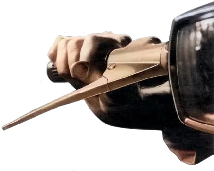
One of the things which I love so much about southern France is colour, the way in which man-made colours are affected by the elements and in particular the strength of the sun. On my recent trip around Minervois I made a series of close-up photographs of shutters and doors, hoping that they would provide colour inspiration for an up-and-coming design project.
Creating Colour Palettes recap
I’ve written before about my favourite techniques for creating colour palettes, so I won’t go over that again. Here instead is a short series of colour palettes and the images that they were inspired by.


Photoshop Color Tables
Here is a simple technique for creating colour swatches from photographs which is buried inside Photoshop’s menus.
1. Open an image in Photoshop.
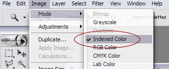 2. Select Image > Mode > Index Color.
 3. Choose the number of colours you require for your palette.
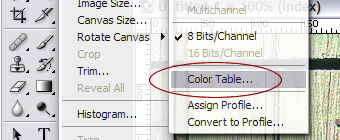 4. Select Image > Mode > Color Table.
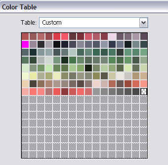 5. Save the resulting color table.
C’est tres bon?
Oui?
Replies
-
#1 On August 16, 2005 12:29 AM Tom said:
Oui, tres bon. But, colours are everywhere, not just in France. :)
-
#2 On August 16, 2005 01:44 AM Chasen Le Hara said:
What perfect timing. I’ve been flipping out over a recent design I made, and as a poor designer (and with no intention to become a professional at any point in my life) I was just using the technique in the past article that you linked to (Color Palette v.1.2).
I had already been thinking about using a photo in my design, but I didn’t know how to properly pull out the colors out of the photo (I was using Smart Blurs before), and now I do. Thanks!
-Chase -
#3 On August 16, 2005 01:57 AM Chris Lienert said:
Aha! Very handy tip.
-
#4 On August 16, 2005 02:19 AM David Brent said:
hehe. Handy Andy.
-
#5 On August 16, 2005 08:11 AM Laura Zucchetti said:
Neat trick. I hadn’t spotted that in Photoshop before. Thanks!
-
#6 On August 16, 2005 08:28 AM Gerard McGarry said:
That’s a great photoshop trick! My technique to date has been similar to yours, but more "click a color-picker in the picture until I get a color I like".
Now I can get Photoshop to do the dirty work for me! Yay!
-
#7 On August 16, 2005 09:37 AM James said:
Learn something new everyday. I took some shots of houses/buildings in Slovenia a few years back that has some really nice muted pastels, might try this technique on them. Thanks for sharing.
-
#8 On August 16, 2005 10:20 AM Tim said:
This is a nice tip - have used a similar method in the past.
I have found one problem with it though - you can’t order colours in your swatches (or a colour table). It would be nice to reorganize them by hue, saturation or luminosity.
This is the nice thing about your original tutorial. All the shades are grouped together which makes creating a well balanced design a lot easier. (At least it does for me anyhoo).
-
#9 On August 16, 2005 11:04 AM Faruk Ateş said:
I’ve been looking for this passively for years! Like, really passively. That is so very useful, Andy. Thanks! :-)
-
#10 On August 16, 2005 11:24 AM Pierce said:
It’s hilarious how crap this post is in Internet Explorer. Heh.
I’m in work with no access to anything else. I’ll just imagine the nice colours.
-
#11 On August 16, 2005 02:06 PM Jens Meiert said:
!Muy bien, gracias!
-
#12 On August 16, 2005 02:42 PM Bruno Girin said:
That’s a great simple tip Andy! Thanks for sharing. Now where’s my camera so that I start building my stock of colour palettes?
-
#13 On August 16, 2005 10:14 PM Rob Lewis said:
Genius, merci beaucoup!
And nice comment form styling and preview too!
-
#14 On August 17, 2005 09:12 AM Andy Saxton said:
Nice post,
Carrying on from your tip with Photoshop, for those that do not know, there is a very similar thing you can do in Fireworks with the free Draw Swatches Extension.
From the description:
The extension creates a new Fireworks document that includes a summary of all colors used in a document as well as their RGB (Red Green Blue) hexadecimal values. Colors that are not web-safe are highlighted. This tools is useful for HTML integration.
Hope people find it useful.
-
#15 On August 17, 2005 03:24 PM James said:
Had a play with some travel photos on my site - they came out really well. Interesting what you said Molly, I used this technique on a photo from where I am (Western Australia), the palette came out nice and earthy - lots of red dirt in the photo.
-
#16 On August 17, 2005 03:25 PM James said:
Had a play with some travel photos on my site - they came out really well.
-
#17 On August 17, 2005 04:15 PM Peter Holloway said:
I think it’s time to go back through those holiday photos. I’ve tried using the color picker to get me started, but this works so well!