But where are the cows?
Here it is, the new Stuff and Nonsense portfolio site.
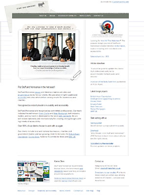
I always find it hard to design our own company portfolio site. So this time I took a different approach and decided to concentrate on the content first and let content dictate the design.
With a list of all the sections and pages which I wanted to include, I prioritised the most important areas and first made pencil sketches and then made simple grey box layouts in Fireworks. These grey box layouts were developed into mark-up guides showing in detail the structure of the templates and dictated the <div> and class names. One of the advantages of working this way was that the XHTML was coded only once during the build and at no time did I need to change the mark-up later for any presentational reasons.
With the mark-up set, I could work on the design and CSS, and decided to opt for a plain monochrome design which uses colour only in the screen-shots of client work. Hardly an original idea, but I hope that it works.
And the cows?
I decided to ’lose’ the cows as they have been a part of many of the designs over the past few years. They will be making a return in the New Year, courtesy of a new logo by a famous celebrity designer… I’m in two minds about the cows going, on one hand it feels like ’growing up’ and on the other I hope that we don’t lose any of our ’personality’.
A few old favourites
There are a few techniques on the new site that might seem a tad familiar;
- Web design depth of field to highlight the main content
- Trimming form fields on the contact form
- E-commerce definition lists on the recommended reading page
- Accessible alternatives
And of course, Invasion of the Body Switchers ;)
And some other stuff too
There is also some bespoke DOM scripting by the fabulous Brothercake, in particular the roll-over effects on the home page image. This combines an unordered list styled with Mr. Shea’s CSS Sprites with dynamic <blockquote>s which remain fully accessible and can also be triggered by the keyboard as well as the mouse. (That script isn’t a free template, so please don’t re-use it without permission ;) )
Rough me up a bit
<gulp>Let me know what you think.</gulp>
Replies
-
#1 On November 22, 2004 08:56 PM Colly said:
Andy, it’s a bit crazy on Safari - looong horizontal scrollbar, floating form fields, missing header graphics…
Looks good though. Like the folio wallpaper.
-
#2 On November 22, 2004 09:07 PM Jon Hicks said:
What he said. Safari/Omniweb and Shiira (all webcore browsers) don’t show that background image properly, its way off to the right. I can’t see why looking at the css though.
There’s also some strangness happening with the email sign up boxes too. I know its hard when you don’t have a mac.
Looks superb though!
-
#3 On November 22, 2004 09:15 PM Colly said:
You’ve almost fixed it! Just the email sign up float now, then we can start gettin’ positive…
-
#4 On November 22, 2004 09:30 PM Malarkey said:
Thanks for that, Brit Packer Mac geezers.
You should find that that works OK now in Mac Safari and Opera (according to Brothercake). Interestingly, the problem looks like it was caused by my ’off-left’ technique. Apparantly, Safari sometimes screws this up when it is used in certain combinations of other elements. So using,
off-left {
position : absolute;
top : -10em;
}an off-top instead of off-left cures the problem (weird).
I’ve kept Mr. Hicks’ email suggestion too, just in case anything else turns up.
Oh, and thanks to Eric for the typo spotting :(
-
#5 On November 22, 2004 09:33 PM Malarkey said:
I spoke too soon, it breaks IE PC which seems to only allow you a certain amount of off-top. Bummer, I think I’ll leave the form visible until I can figure a solution.
Nothing like washing your dirty pants in public, eh guys? ;)
-
#6 On November 22, 2004 09:40 PM Daniel Oliver said:
I really like it. I liked the other design as well though, but I think it is an improvment.
I like ideas in the design and think you have carried them out well. I like the notepad idea as well.
It’s all good.
Nice work. -
#7 On November 22, 2004 09:45 PM paul haine said:
Looks great, and I love the portfolio wallpaper idea. Also, the red-haired woman in the photo is quite fanciable.
I find the footer text too pale to read, though - perhaps a darker text using :hover ? Just a thought. Not even that, really. More of a thoughtette.
-
#8 On November 22, 2004 09:50 PM Matthew Pennell said:
I prefer the old version (sorry!) - it might just be that the background image grates with me, but the old site had such a strong personality that any reining-in of that seems like a step backwards.
I also get the feeling that the footer text doesn’t exactly comply with the spirit of WCAG checkpoint 2.2.
-
#9 On November 22, 2004 10:27 PM Emiliano said:
Beauty the portfolio wallpaper :-) Goood
-
#10 On November 22, 2004 10:48 PM Jeremy Freeman said:
Love the wallpaper - but I’ll be honest I prefer the old website! There is too much information on the front page - it just looks to busy. I miss those cows too! To be quite frank - all the fun has gone from the site. The new site looks too serious - I mean that photo - it just looks like a free image from Microsoft Publisher!
I’ll go away now - hope you don’t hate me! I still love your work though but not this one!
-
#11 On November 22, 2004 11:53 PM John said:
Nice in white and an great way to view some good innovations and projects live.
I just get confused about your various url’s
https://www.malarkey.co.uk/ serves up Stuff and Nonsense while https://www.stuffandnonsense.co.uk serves up And all that Malarkey but then I’m easily confused :) -
#12 On November 22, 2004 11:53 PM John Oxton said:
I really like it a lot, it has a nice touch of humour to it… which I think is good personally.
It would be good to be able to click that karova link on the left though.
-
#13 On November 22, 2004 11:59 PM Malarkey said:
@ John: "I just get confused about your various url’s"
Yup, so do I. For the reasons why, see Underpants over my trousers.@ John Oxton: Figure out how to make a background image clickable and win a very big prize.
-
#14 On November 23, 2004 12:36 AM Tom said:
XML + XLST sounds really really sexy. thang.
https://www.malarkey.co.uk/Design.aspx
https://www.malarkey.co.uk/design/
Would sound oh so better.
-
#15 On November 23, 2004 12:48 AM John Oxton said:
Thinking on my feet here, as always, but couldn’t you add a standard text link, do that FIR thing but just don’t do a add a background image and position the ’hit area’ over the background area you want clickable…
…sounds ugly though doesn’t it…
-
#16 On November 23, 2004 01:19 AM Ryan Brill said:
More great work. I love it.
Might be cool if the handwritten www.karova.com on the left would link to the site, though… Just an idea. ;)
-
#17 On November 23, 2004 06:15 AM Raven said:
Well I guess making the handwritten karova.com link on the right clickable is not that much of a problem really. Just include an div tag with link to karova web site (or you can put the whole text on the right in there) and then hide the text, make it wide about 20px, high as you will need it and then position it absolutely. Just a suggestion.
Otherwise nice website, stylish and, well, I think I won’t be far from truth if I say that potential clients will love it. ;) -
#18 On November 23, 2004 06:16 AM Raven said:
Ehm, I keep switching right and left lately, what is happening to me? :) Of course I meant "on the left side". Sorry.
-
#19 On November 23, 2004 08:07 AM dotjay said:
I like it , Mr Clarke. Kudos to both you and Mr Cake. It’s good to see this go live and to see your site customisation.
Is it worth allowing a visitor to change text size via the style switcher? I know that the user agent can do this, but not everyone knows how to do that. You could note how to do it on your customisation page, but then you get into the excess of having to cover every browser, etc.
I said to you before about the monochrome design, but I think it works - it has relation to the last Stuff and Nonsense site and brings the images alive. Perhaps I’m just a little unsure of how it balances though.
-
#20 On November 23, 2004 10:25 AM marko said:
Am i the first one to notice the message which reveals when you enlarge text? The feature is awesome!
-
#21 On November 23, 2004 12:03 PM Mike Stenhouse said:
Ooooooh, very nice indeed! It’s individual, well structured and attractive. I’m loving that stuck on photo!
If it were me I’d order that right column a little differently. I’d like the ’latest design projects’ more prominent, perhaps with a featured screenshot - to give some immediate credability, more like the content pages. The ’articles elsewhere’ and ’all that malarckey’ give the user the chance to escape your site too early on in the content, in my opinion. You know where your business comes from though so you can safely ignore me.
The favicons is top too!
-
#22 On November 23, 2004 12:37 PM Rubber Duck said:
Hmmm……. I have seen something like this before, I also remember speaking to a certain gent who said to me ’I would like to be able to move the business cards around’ this ring any bells Andy ? ;-) You should see the preview of the notice board that I am thinking of doing, all on the examples page…..
All in all though, the new site is polished, preened and as faultless as we have all come to expect. -
#23 On November 23, 2004 01:03 PM Phunky said:
Wow im loving this :)
-
#24 On November 23, 2004 02:05 PM Keith Bell said:
@ Malarkey: "Figure out how to make a background image clickable and win a very big prize."
Andy, I often do this - just an "empty" (i.e. no text) link inside a suitably dimensioned DIV, which, depending on circumstances, you might need to position absolutely or you might get away with just setting margins. An example from one of mine:
https://www.auditsunlimited.com/
The logo top right is clickable but is in a background image. Look for a.homelink in https://www.auditsunlimited.com/shared/base.css
And it leaves no trace when viewed without styles.
-
#25 On November 23, 2004 02:11 PM Keith Bell said:
Continued, you might say, from #24 - Just remembering that on the example I quoted, it was even simpler. The link was set to display:block, dimensioned and positioned with margins. No extra DIV was needed in that case.
-
#26 On November 23, 2004 02:15 PM Ryan Brill said:
It would be good to be able to click that karova link on the left though.
Man, I need to read the comments better before posting…
-
#27 On November 23, 2004 03:39 PM Raven said:
Keith Bell: Sometimes it would be good to read the discussion, because then you would notice that I suggested the same thing about 8 posts ago. ;)
-
#28 On November 23, 2004 05:16 PM Neko said:
It’s beautiful! Nice colours, easy to navigate, the "hidden" image… :3
I really like your "content first" approach, it’s something I will take note for future projects. I literally love how you implemented rollovers on the main image (and it’s something I’m going to blatantly rip-off someday MWUHHAHAHAHA!!!1… ouch! Did I really say that loud?).
~Neko
-
#29 On November 23, 2004 05:55 PM Keith Bell said:
@ Raven: "Keith Bell: Sometimes it would be good to read the discussion, because then you would notice that I suggested the same thing about 8 posts ago."
Well hush my mouth!
I think I contributed by providing a live example, and one which is a little simpler than your suggestion. I was less concerned with being first than with being helpful -- which I am sure is what motivated you to suggest a method a few posts after John Oxton had already proposed a solution. ;)
Now, shall we stop using Andy’s blog to "score points"?
-
#30 On November 23, 2004 06:06 PM Raven said:
Oh my, I am so sorry for providing a solution that is semantic and correct, oh my god. Oh and by the way I suggested the same thing, just semantically correct, so please, if you don’t mind - read other peoples comments carefully.
-
#31 On November 23, 2004 06:45 PM Malarkey said:
@ Raven and Keith: Thanks for your suggestions. I’ve got a raft of ideas from these comments and in my next free bit of development time, I’ll look into them in more detail.
@ Mike Stenhouse: I really appreciate those comments. You’ll see that I’ve already changed the side column as you suggested.
@ Marko: I’m glad you found my ’Easter egg’ :)
@ Neko: MWUHHAHAHAHA! Errr, no you won’t… ;)
@ Everyone: I really appreciate your kind comments and constructive criticism.
-
#32 On November 24, 2004 01:43 AM Chris Lienert said:
Most impressed though I’ve spotted a minor bug on the Contact page: the email address error "[The address that you entered was invalid]" is added for each failed submission attempt. Clumsy explanation, but try submitting the form without an email address a couple of times to check it out.
I’ve been looking for a good form validation solution for quite a while and might, err, borrow from your example :)
-
#33 On November 26, 2004 09:37 AM Tom Armitage said:
Clickable background images:
I had to do this for a site I recently did. I used a single background image with multiple links - imagemap style, as it were - but it should work for anything. Basically, the background image is defined in the id of the [div]. You then place a link inside the [div], with an id unique to that image and inside the link, put a text equivalent of the link in, say, [em] tags.
In the css, you make .divclass a em {visibility: hidden;}, which hides the [em]’d text you’ve put in (but leaves a textual equivalent in the unstyled doc), and define a#uniqueid to have the pixel area of the image (or area of image) you want the link.
Thus: it degrades nicely, but it also gives you a pixel-accurate link over the top of a background image.
Does that help?
-
#34 On November 26, 2004 07:35 PM Chris Gwynne said:
Looks really hot, I love it.
BTW, I didn’t know you was so close to me. Been to Llandudno recently? :)
-
#35 On November 27, 2004 02:02 AM Neil Whiteley said:
Hi Andy,
I have just submitted your subscribe form with empty fields and immediately crashed your server. Sorry mate, but you may want to check that out.
Site looks great I think.
-
#36 On November 27, 2004 02:18 PM Malarkey said:
@ Neil: Thanks for that. A team of highly trained Ninjas are currently looking at the problem… after which, they’ll be round to your house.
-
#37 On November 27, 2004 06:08 PM Kev said:
Smoother than a Shaun Connery one-liner! The effect as a result of enlarging the text is very clever and the site looks great.