Empire Hotel: Then and now
This is likely to be my last column before I take off for France on Saturday for a two week holiday with Sue and Alex.
We have just completed a small site redo for a long standing client, the Empire Hotel in Llandudno, North Wales. We have had the pleasure of working with the Empire Hotel for almost as long as we have been in business. And while this project was not a large one, I was keen to give it my best attention.
The hotel itself has changed very little in the last six years, the web site however has changed enormously! Working with the same client for a number of years has made it possible to examine the differences in my techniques and thinking between then and now.
Party like it’s 1999
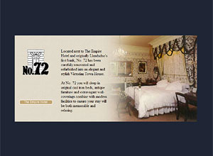
Technically, today’s site is a million miles different from the site I made in 1999 which lumbered visitors with three levels of JavaScript before any content was visible. First came a JavaScript which checked for a screen resolution over 800x600 and bounced 640x480 users to a warning page proclaiming,
Polite notice - your monitor screen is set to only 640x480 pixel size. In order to view this site, please resize your monitor resolution to a minimum recommended 800x600 pixels. Consult your computer, graphics card or monitor manual for instructions on how to do this. We are sorry for the inconvenience.
If this wasn’t rude enough, the next page checked for the Flash plug-in and a further one detected the browser type. A poor soul not using Internet Explorer 4 (the best browser on the planet) would get this little pearl of wisdom.
Sorry, this site can only be viewed in a web browser of version 4 or later due to the advanced techniques used. If you are using Microsoft Internet Explorer 3.0 or earlier, or Netscape 3.0 or earlier you should upgrade now and make your web browsing a more special experience.
(ed: Isn’t that hilarious? In those days, upgrading to Netscape 4 would give you a ’special experience’…)
 1999
1999
If by now I wasn’t sobbing with embarassment, I might find it funny to remember that the first page that a visitor actually ’saw’ was, wait for it… a Flash ’splash page’! And the best bit of all? The whole site sat in a ’letterbox’ frameset consisting of no fewer than six frames!
A new millenium
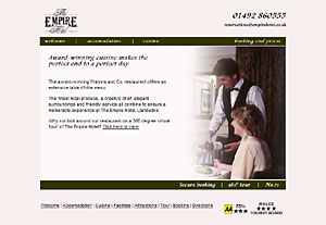
Strange though it might seem (I really appreciate it if you’re reading this Elyse), we were asked to make a new site for the Empire Hotel in 2002. This time, out went the paranoid JavaScripts and frames (a splash page still remained) and in came a basic CMS built on a simple Access database and a Java based ’virtual tour’. Looking back now, the Java took longer to load than a weekend in Llandudno and I bet no one ever got beyond the reception.
 2002
2002
Although stuffed with spacer GIFs, rollovers and Dreamweaver 3 scripting, the site wasn’t bad looking for the period (as seen above) and was very indicative of the work we were doing at the time.
Today’s the day
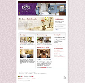
What a difference a few years make. Today’s site is valid XHTML, CSS and faster than ever before. There is still Flash on the home page courtesy of Todd Dominey’s excellent Flash slide show (although different mark-up to Todd’s is used to ensure that the page validates), but the Flash is used sparingly and only on one page.
 2004
2004
But the major difference is not in the technicalities, but in my whole approach to design. Today’s focus is on usability, accessibility and content; three areas that would not have occurred to me in 1999. I have tried to make the home page functional AND stylish, offering more information and navigation than on the whole of the 1999 site put together.
It is strange to know that however attrocious the previous sites were, no one ever complained. The sites lasted for years and despite their obvious faux-pas, the Empire Hotel did (and continues to do) good business. Many of the visitors come from overseas and many have had their first look at the hotel on the old web sites.
I hope that this time I may have got it more right than before and that from today I will reward the client’s loyalty with a site that will do better business than ever before. They have embraced the idea of standards and accessibility, even going so far as to write a special page about physical access to the hotel. I wish that all my clients would take accessibilty on board with such vigour. My only regret is that the secure booking pages are not yet standards based or accessible. These pages are (so far) outside of our control and I hope that the company responsible will take our wishes to heart and let us help them redesign the front-end.
Have you got any old sites still ’lurking’ that you want to get off your chest?
Go on! Make an old man very happy… ;)
Replies
-
#1 On August 10, 2004 01:27 AM Brothercake said:
Oh dear yes … I remember those messages .. "Please change your screen resolution" .. or "you cannot view this site without Flash" .. or "Please use internet explorer".
Please use internet explorer!? Might as well have a road sign that says "please use a different car".
I’m certainly glad we know better now - I can hardly believe some of the HTML I called acceptable …
-
#2 On August 10, 2004 04:10 AM Andrew Krespanis said:
Mmmm…. Warm and inviting.
I loved seeing this site when you put it up for critique at accessifyforums. This one, along with West Rhyl Young Peoples Project are two of my favourites from your work.Oh, and for the record, Netscape 4 will still give you a ’special experience’!
-
#3 On August 10, 2004 04:37 AM Ryan Brill said:
I’ve already told you this, but the site is beautiful. Congratulations on a job well done.
The link structure, on the other hand, is not. I’ve really been digging cruft-free URLs lately, and I’d be willing to bet that any site could benefit by using URLs that make sense.
-
#4 On August 10, 2004 12:16 PM Phunky said:
I love the way you have done the form elements on the site! Works so well, one of the best form designs ive seen in a long time…
The top nav could do with some form of :hover state mind you! I just dont like it when nav’s dont do anything.
Also i belive a site like this would great’ly benefit from IFR specialy for all those large titles…
But its a great redesign.
-
#5 On August 10, 2004 03:59 PM Jim Amos said:
That is a beautiful website.
-
#6 On August 10, 2004 06:49 PM Carlos Porto said:
God I remember those days, let us all not forget the image website with the image map navigation, which was the first type of website I created.
I was all geeked out because I got to animate the company’s logo.
Ahh the good old days…
-
#7 On August 11, 2004 11:57 AM dik said:
This isn’t inteded as a dig, more the kick-start to a discussion, does anyone else feel that many XHTML/CSS sites are beging to have a certain look to them?
If this is due to the limitations of the meduim is unclear, but there does seem to be homoginized elements.
Then again, perhaps I should put my money were my mouth is…
-
#8 On August 11, 2004 01:26 PM Darren Torrel said:
Well done! Clean, quick, and attractive.
Formatting in IE only shows 2 columns..push 3rd to bottom of page.
-
#9 On August 11, 2004 01:49 PM Matthew Pennell said:
My first ever site was a frameset consisting of 17 frames, and the graphics were created in MS Paint - what do I win?
-
#10 On August 11, 2004 02:01 PM Malarkey said:
@ Dik: You don’t expect me to agree with you… so I won’t. I can show you a zillion sites made with old-fashioned methods that look the same. One of the issues with web-standards work at present, is that there are so few doing it in earnest and ideas and techniques are re-worked. Of course, many blogs are similar and that format is dictated by content, not by technologies.
@ Matthew Pennell: You win a copy of Dik’s new book, "Plumbing with Web Standards"
-
#11 On August 11, 2004 11:57 PM Patrick H. Lauke said:
ah, what a refreshing trip down (your) memory lane.
luckily my first few websites have long since disappeared (and no, back then i didn’t believe in making backup copies of my work…after all, this was the web, and everything would stay there in all eternity…), but a few shameful spots still remain. feast your eyes on this little gem https://www.freeminds.co.uk/ (can’t believe the site is still up, as i know for a fact the owner hasn’t paid hosting charges for, let’s see, 5 years now) and on the frames-based monstrosity that is the site for my former multimedia collective (i think i may have mentioned them to you the other week, andy) https://www.cloudbass.comanyway, have a lovely one in france (and i hope you feel the envy in my words there)
-
#12 On August 12, 2004 10:33 AM Phunky said:
Hmmm i dont see how there’s any ’Design Limits’ to CSS sites, i mean all you have to do is look at CSSZenGarden to see how well CSS/XHTML can be implemented…
i mean, look at my site and go thru the 3 main version (2003, 2004, 2005) there all XHTML/CSS based (even tho they dont validated due to old content from blog!) yet they vary in style and feel…
-
#13 On August 12, 2004 04:04 PM Jim said:
One problem with the new site - at large text sizes the text:
"A superb business, holiday and vaca…"
overlaps the sign-up for email bit.
-
#14 On August 13, 2004 07:51 AM Adam Pink said:
My turn to confess to the group…
Actually if I were to confess all the embarrassments I have offered in my Web career (since 1995) then we would be here until malarkey gets back from his holiday…but here’s one little gem.
I designed the user interface for the very first announced online bank in the UK (The Royal Bank of Scotland), There was an icon for each major section that was created in a 3d modelling program and animated on rollover (they included a sort of nodding space shuttle - I can’t even remember what that was for).
The the big tumbleweed moment was presenting initial concepts to the board of the bank. In my wisdom I had decided that I would take the RBS logo and re-create it in 3d (not that I was obsessed or anything) then I would create a series of icons using parts of the new 3d RBS logo, like people and trumpets…again I have no idea what they were for…anyway, needless to say the first meeting was a little quiet to say the least.
But most of the 3d nonsense was approved and went live on the first release of the application, thankfully it didn’t live long before a more sober UI replaced it.
There, I feel much better now that has been excorcised.
-
#15 On August 13, 2004 02:01 PM Mike Stenhouse said:
This might be a bit random but I really like your treatment of the contact form…! The use of fieldsets, colour-coding and rollover highlighting is great and I don’t think I’ve seen it done quite that way before. The rest of the site’s top as well but I particularly like that form.
-
#16 On August 13, 2004 02:06 PM Mike Stenhouse said:
Hmmmm, my last comment doesn’t seem to have been posted so I’ll try again…
I was trying to say that I really like your treatment of the contact form. I don’t think I’ve seen anyone use that combination of fieldsets, colour-coding and DHTML highlighting before… The rest of the site’s top too but that form is very original. Good stuff!
-
#17 On August 13, 2004 02:08 PM Mike Stenhouse said:
[sigh]. Now they’ve both popped up… Sorry boys, my bad.
-
#18 On August 14, 2004 07:18 AM Andrew Krespanis said:
Mike - behold the glory of Movable Type’s Pearl generated pages…Comment delay..
