Jasper Johns’ Flag at MoMA
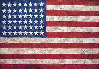
Last week I came back from a (semi) working trip to New York. As it’s been nine years since I was last in the city, I did all the usual tourist attractions (Empire State Building, Circle Line cruise, Central Park) and I ate hot-dogs and donuts and bagels and pretzels; rounding it all off with a visit to MoMA to see a painting that I have wanted to see in the paint for over twenty years: Jasper Johns’ Flag.

I’m not sure why this painting has cast such a spell over me for so long. I became a fan of Johns when I was at art school and I think what attracted me to his work, and others in the pop-art movement, was the strong, graphical shapes and bold colours. Reproducing large paintings like Flag in art books can often reinforce the graphic nature and it can be difficult sometimes to appreciate the depth of the layers and three-dimensional effect of the paint.

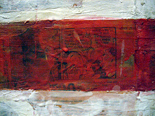
Seeing Flag up close, pushing my nose as near as the gallery attendant would allow, gave me a totally different appreciation of the work. It is a complex mix of paint and collage, with cuttings from newspapers showing through the layers of paint. Rather than being flat, Flag has real texture and a wonderful three-dimensional quality that has inspired me to bring a little of its richness into my designs.

I think that the idea of layering design elements on the web by using semi-transparent PNG images to create these types of effects is really exciting as I’m bored by the cute-and-cuddly, Web 2.0 design trends that so many clients seem to be asking for. Maybe I’m out of step with the fashion, but I would love to see flat colours and gradients give way to more visual richness and depth.
Replies
-
#1 On November 9, 2006 01:21 PM Andy Higgs said:
The ’Web 2.0’ style boom is just a phase and we will eventually embrace new design styles. One of the major reasons the gradient/flat combination was adopted was due to the problem of rendering text over fast moving contrasts - often making text unreadable; a malignant problem on many older sites. This can be overcome using graphical elements (alpha enabled PNGs) as you suggest, and I think something we will see emerging in the next few years.
Other reasons for it’s popularity was it’s lower bandwidth requirements (tile it) and lower skill level needed in the image construction. We now have faster connections and we can afford a little movement (although in my opinion we shouldn’t justify huge files because we have much faster connections).
It would be an interesting to see if people start providing (optional) "high-bandwidth" CSS style sheets though… might be an interesting avenue to explore.
’Web 2.0’ still has a while to run it’s course, but there is no reason why some experimentation can’t start now.
-
#2 On November 9, 2006 01:34 PM Adam Spooner said:
Wow! I’m starting to venture into an appreciation for the traditional arts (read: non-digital art forms) and this is some amazing work. The attention to detail is beautiful. I’ve been the to the MoMA in CA; now I need to get to the MoMA in NY.
-
#3 On November 9, 2006 01:39 PM Jason Beaird said:
I whole heartedly agree. I think too many designers these days are relying on gradients and rounded corners to emulate depth. It would be interesting to see collages of virtual found materials used on the web as Johns did with his flags and color numerals.
-
#4 On November 9, 2006 02:15 PM Dave said:
Well, I think it’s about time that someone invented the impasto image file, allowing you to feel the depth and undulations of the digital image… now if only we had the monitors to support that… Design conversations would be like
"So, what do you think of my new texture?"
"You haven’t sent me it yet"
*Sends newtexture.imp*
"Woo! feels like concrete…"
-
#5 On November 9, 2006 06:14 PM Ade said:
hi, umm..
what is exactly like the web 2.0 trend ?
oh by the way how do i get to use different styles for different media?
do i have to set a script? or just making different styles and specifying for wich media?
-
#6 On November 9, 2006 06:44 PM Steve Williams said:
An incredible art piece and I think you’re right about the dullness of the current trend for rounded designs with simple grades and shades.
But isn’t what you’re talking about very similar to the visual richness of the wickedly worn look, executed so well by Cameron Moll? Or would an evolution that does away with the worn element be closer to the mark?
-
#7 On November 9, 2006 07:42 PM Leanda Ryan said:
I too came across this painting whilst at art school, I then saw it in the flesh ten years ago on my first trip to New York and regretted not buying a poster print from MoMA for years. On a recent trip to New York I bought the print which now hangs on the wall of my kichen, so I can appreciate this image everyday. It’s my all time favourite painting.
-
#8 On November 9, 2006 07:59 PM Malarkey said:
@ Leanda: I’ll be back in NYC next week for a couple of days and I’ll be buying the poster too to take pride of place in my new studio.
@ Steve: What I’m really getting at I supppose is bringing more ’organic’ elements into what we design. Whether that be ’found’ elements, or inspiration from other places - building and layering rather than confining things in boxes.
-
#9 On November 9, 2006 11:17 PM Rachel said:
I love Jasper John’s work too, and hope one day to be able to see it in the flesh. So much art needs to be seen in ’real life’ to be fully appreciated instead of in photos. *Starts dreaming of trips to NYC*
@ Dave - I reckon! Wouldn’t it be great if one day we really could touch and feel web pages, so that they could have real depth and texture instead of just emulated.
Whenever I am shopping I am always picking stuff up, feeling the texture of the fabric, etc. but shopping on the web I’m stuck behind a 2 dimensional screen. At least print they have the texture, weight and feel of the paper or magazine.
Anyway, thanks Andy for another inspiring comment :) Since Web Directions I’ve been collecting so much stuff for a redesign of my own site and really hope to use some of these ideas.
-
#10 On November 9, 2006 11:18 PM Rachel said:
I love Jasper John’s work too, and hope one day to be able to see it in the flesh. So much art needs to be seen in ’real life’ to be fully appreciated instead of in photos. **Starts dreaming of trips to NYC**
@ Dave - I reckon! Wouldn’t it be great if one day we really could touch and feel web pages, so that they could have real depth and texture instead of just emulated.
Whenever I am shopping I am always picking stuff up, feeling the texture of the fabric, etc. but shopping on the web I’m stuck behind a 2 dimensional screen. At least print they have the texture, weight and feel of the paper or magazine.
Anyway, thanks Andy for another inspiring comment :) Since Web Directions I’ve been collecting so much stuff for a redesign of my own site and really hope to use some of these ideas.
-
#11 On November 9, 2006 11:19 PM Ben Buchanan said:
I think you have inspired a great many people to get more creative with their designs, hopefully with plenty more to come when your book hits our shelves :)
Re: concrete… it’s underrated :) My local cafe is called Concrete, the whole place is different finishes from rough to polished. It’s a great mix of industrial and comfortable.
I am sure I started somewhere near a point, but I’ve wandered off completely. Oh well. How’s *your* Friday morning going? ;)
-
#12 On November 10, 2006 12:14 AM Dave said:
@Malarkey & Rachel: And there I was thinking people would just roll their eyes at my strange ideas. I’ve been giving the whole "textured screen" some thought and its been blowing my mind how much more detail and character could get put into websites… bandwidth would be a killer though :(
For a mor on-topic matter though, I am a really big fan of textured works, JJ’s Flag being a very good example of what you can acheive with a touch of impasto. My love is a wonder with impasto and you can’t help but stroke her pieces of art. **is envious**
-
#13 On November 10, 2006 10:22 AM Malarkey said:
In an email to me yesterday, Els reminded me about Kurt Schwitters, an artist that I had forgotten about and another great source of inspiration.
-
#14 On November 10, 2006 12:38 PM Simon Clayson said:
I was also lucky enough to spend a while with this painting earlier in the year. I find it a completely brutal work of simplicity. I had a simlar experience with Willem De Kooning’s "Easter Monday" painting at the Met in NYC. A painting that has enthralled me since sixth form, to actually spend an unhealthy amount of time with it to appreciate the complexity of the layers of paint and colour, has been one of my highlights of the year. Sorry, but it was worth stamping on my carbon footprint for it to get to NYC.
Physical work trumps anything on the internets everytime. And always will.
-
#15 On November 10, 2006 06:03 PM Inflicted said:
I’ve seen the white version of this painting in Amsterdam many years ago, and still love it!
