320 and Up
As Jeremy mentioned yesterday, just before An Event Apart in Seattle, I spent a few hours on a spot of guerrilla testing at an AT&T store. Specifically, I was looking at how Windows Phone 7’s Internet Explorer browser handles ‘responsive sites’.
As Jeremy described, I was shocked, particularly at how it rendered some of my latest work, in particular Hardboiled Web Design. This cemented a suspicion I’d had for a while — that starting with a desktop specific stylesheet and design, then pruning back elements to fit a smaller screen is the opposite of how we should be designing and building websites.
On the plane back from Seattle I started on a set of files to use in a ‘small screen’ or Mobile First design process.
A lot can happen in a week or two. A few days later Paul Irish, Divya Manian and Shi Chuan launched Mobile Boilerplate — a collection of mobile best practices that happens to include my previous Hardboiled CSS3 Media Queries but one that still starts, as I did previously, with a large screen first. Now, developing a ‘tiny screen first’ alternative/extension made even more sense.
So here’s ‘320 and Up’
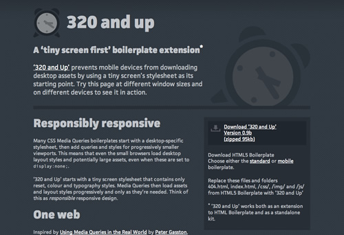
Many CSS Media Queries boilerplates start with a desktop-specific stylesheet, then add queries and styles for progressively smaller viewports. This means that even the small browsers load desktop layout styles and potentially large assets, even when these are set to
display:none;.‘320 and Up’ starts with a tiny screen stylesheet that contains only reset, colour and typography styles. Media Queries then load assets and layout styles progressively and only as they’re needed. Think of this as responsible responsive design.
A few notes about what’s in the files.
I’ve been using HTML5 Boilerplate a lot lately — and digging into Mobile Boilerplate — so it made sense to combine the relevant parts of both of those together and maintain their conventions and structure. Then I added a few other polyfills that have been in my toolkit for a while:
- Ethan Marcotte’s imgsizer.js: improve IE’s rendering of resizable images
- selectivizr-1.0.1.js: bootstrap CSS3 selector support and DOMAssistant-2.0.min.js to boost Selectivizr
Plus (and bang up-to-date):
- Mathias Bynens’ scripted fix for iOS Safari’s viewport scaling bug
- Mathias Bynens’ bootstrap for HTML5 placeholder support in legacy browsers.
- respond.js: bootstrap CSS3 Media Query support.
Speaking of respond.js. Scott Jehl was kind enough to spend his weekend extending it to include support for linked as well as inline Media Queries, ready for ‘320 and Up’.
Try it, use it and improve it
‘320 and Up’ works well as an extension to HTML5 Boilerplate (simply replace a few files) but if you’re not a boilerplate user, it works as a standalone kit too.
The ‘320 and Up’ page acts as a demonstration. Try it at different window sizes and on different devices, then download the files.
I’d love your contributions to improve it.
More from Stuff & Nonsense
Services I offer
Product UX design
The contract template trusted by thousands of designers and developers to keep their web projects running smoothly.
Design mentorship and teaching
Whether you’re stuck, starting out, or stepping up—Andy’s here to help you become a better designer.
Squarespace templates for sale
Take your Squarespace designs from good to great with my bespoke templates.
Andy Clarke on YouTube
Join Andy on YouTube to learn how you can make better product and website designs.