A book for your inspiration collection: Robert Massin
My bookcase holds my growing collection of books about editorial and graphic design and studying them has completely changed how I approach design. To help get web design out of its rut, I think people should broaden their knowledge of these areas of design. So, I’m sharing my collection as it grows.
Massin
(Robert) Massin—he enigmatically stopped using his first name in 1950s—was a French art director, book and graphic designer who caught my attention because of his stark black and white imagery and expressive typography.
Massin’s typography is interesting, not because of exotic typefaces, but because of the ways he used seemingly ordinary typefaces and arranged type in unusual ways. About typefaces, Massin said:
“There are no ugly typefaces, you just have to know how to use them.”
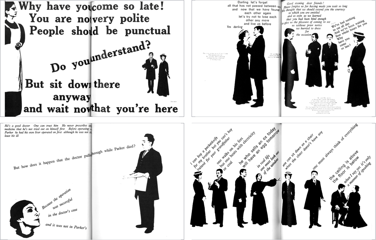
Like all great typography, Massin’s type designs tell stories, like this famous work for Eugène Ionesco’s The Bald Soprano in 1965. For Ionesco’s book, Massin’s goal was to, as Laetitia Wolff described, create “the dynamism of the theatre within the static confines of the book.” His typesetting made the words reflect the personality of the characters and what they were saying.
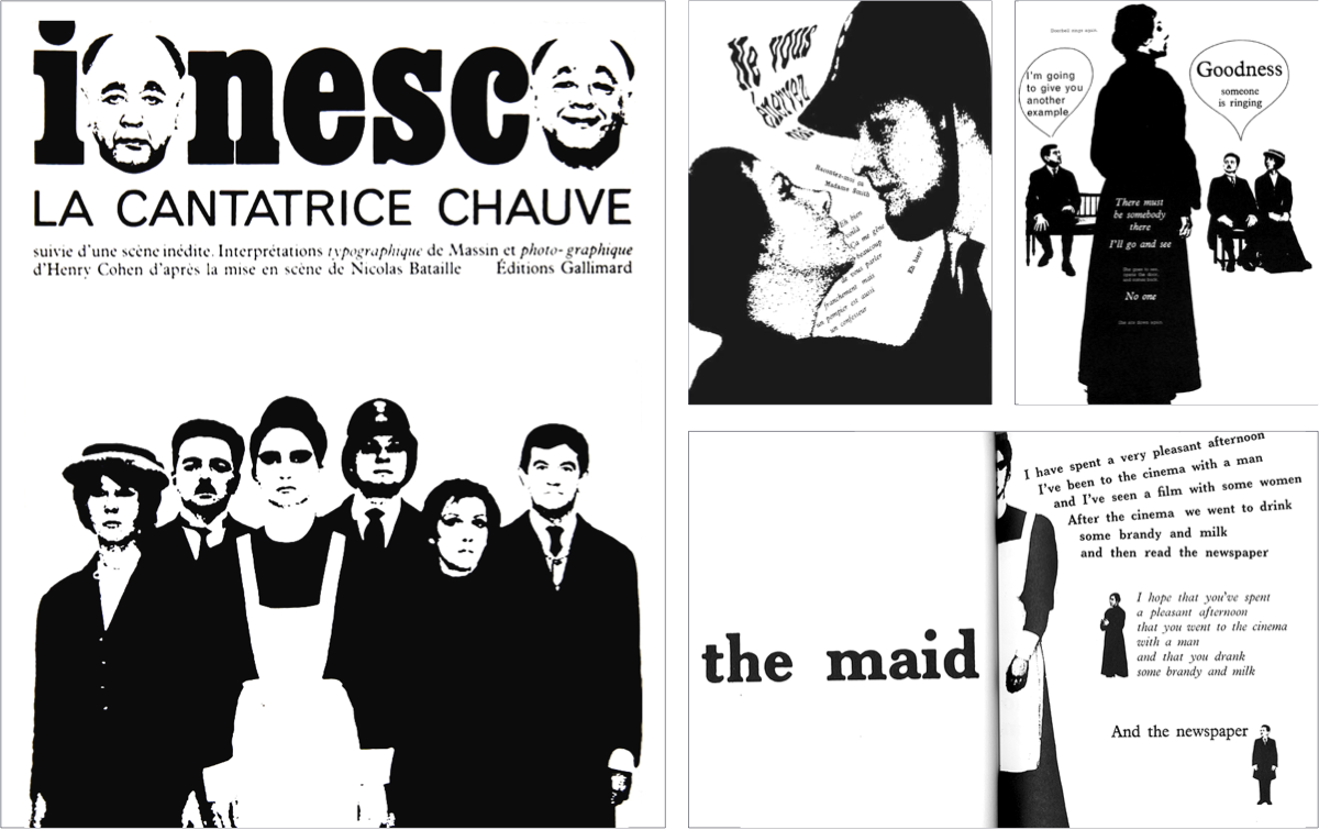
Compared to other masters of type like Herb Lubalin and Herbert Matter, there’s a subversive, almost anarchic feel to Massin’s designs. In many ways they remind me of Sniffin’ Glue and other punk zines from a decade later.
Massin was self-taught and developed his style throughout his career in book covers and interiors. Massin’s work is less well-known than Max Huber, Herb Lubalin, or Herbert Matter. I’ve never seen his name in an article about web design or mentioned at a design conference.
Buy the book
 Massin died sadly in 2020. This monograph of his work by Laetitia Wolff—which was published in 2007—definitely deserves a space on my bookcase, and yours.
I earn a small amount when you use this affiliate link.