A pseudo-3D effect for Emma’s home page banner
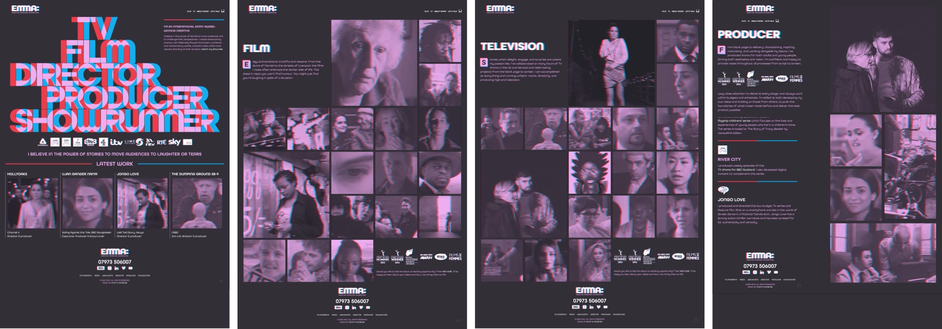
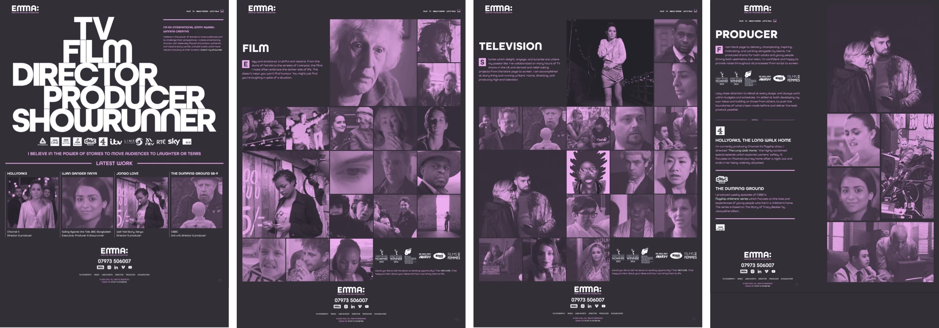
Emma Bodger is a film/television producer, and recently, I’ve spent time working on her visual identity and a new website. It’s been a lot of fun, and I also learned a few things while working on it. I’m digging into the details this week, and today I’ll explain the pseudo-3D design I created for Emma’s home page banner.
While we were discussing the work Emma does across media—from film, radio, and televisions—describing it as “multi-dimensional” made sense to us. I wondered about how I might make her new design multi-dimensional too and I struck on the idea of referencing the pseudo-3D anaglyph treatment which makes images appear three-dimensional while wearing red/cyan glasses.
First, to toggle any anaglyph effects on and off, I added a data- attribute to the root element:
<html data-effect="anaglyph-on">
<html data-effect="anaglyph-off">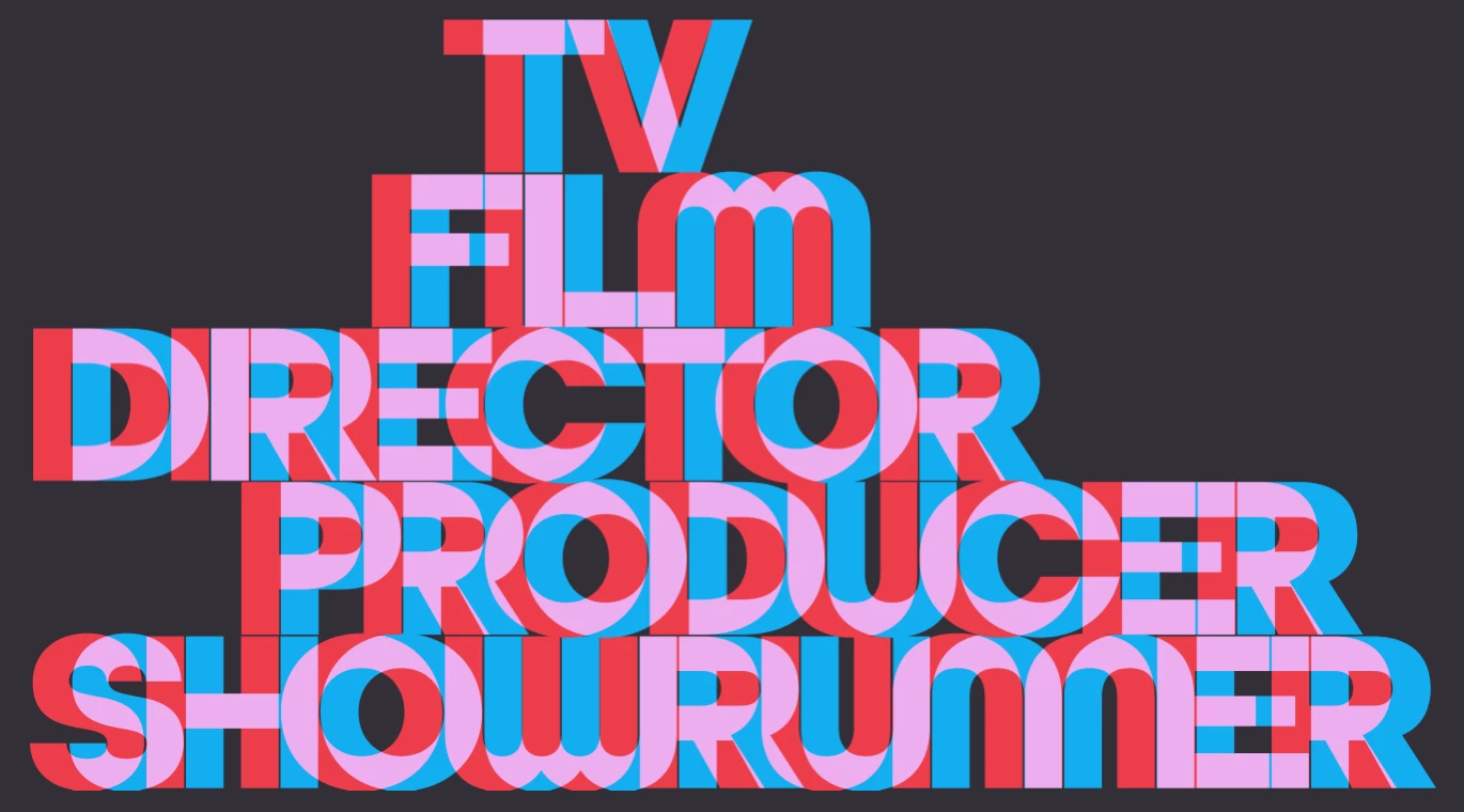
The large banner graphic on Emma’s home page is SVG with CSS transforms and transitions to add movement to the effect. Each of the five words consists of a set of three paths; red, cyan, and a white base colour:
<svg xmlns="http://www.w3.org/2000/svg" viewBox="0 0 1520 802" class="introduction">

<a href="" title="Showrunner">
<path class="color-red" fill="#ed3d4a" d="…"/>
<path class="color-cyan" fill="#11aeefF" d="…"/>
<path class="color-base" fill="#fff" d="…"/>
</a>

<a href="" title="Producer">…</a>
<a href="" title="Director">…</a>
<a href="" title="Film">…</a>
<a href="" title="Television">…</a>

</svg>
I wanted to give people the option to disable the pseudo-3D effects, including in this banner graphic. The color-base paths come at the end of the SVG source and obscure the red and cyan paths. For when the anaglyph effect is turned on, I offset the red and cyan paths and blended them to create the pink colour I used for the rest of my design. I moved the red path to the left:
[data-effect="anaglyph-on"] .introduction .color-red {
transform: translateX(-20px); }
And, the cyan path is moved to the right and blended with the red:
[data-effect="anaglyph-on"] .introduction .color-cyan {
transform: translateX(21px);
mix-blend-mode: lighten; }
When the anaglyph effect is on, I don’t need to see the white base path, so I reduced its opacity to 0;
[data-effect="anaglyph-on"] .introduction .color-base {
opacity: 0; }
When someone hovers over any part of the banner graphic, the transforms are removed and the paths move back smoothly to their default positions:
[data-effect="anaglyph-on"] .introduction path {
transition: fill var(--duration-quickly) ease-in-out; }

[data-effect="anaglyph-on"] .introduction:hover .color-red,
[data-effect="anaglyph-on"] .introduction:hover .color-cyan {
transform: translateX(0); }
Although it’s made from type, I decided to develop this large banner graphic using SVG because of its ability to resize easily across screen sizes and precise control over its characters. But, I was curious about whether I could develop this banner anaglyph using HTML text and CSS. Doing that involved splitting a first-level heading element into multiple hyperlinks and adding a title attribute which repeats the link text:
<h1>
  <a href="" title="TV">TV</a>
  <a href="" title="Film">Film</a>
  <a href="" title="Director">Director</a>
  <a href="" title="Producer">Producer</a>
  <a href="" title="Showrunner">Showrunner</a>
</h1>
First, I styled those links inside the heading element. I used a container query length unit (cqi) which is 15% of the heading’s container. I used a cqi unit again to add negative tracking (letter-spacing:)
h1 a {
display: block;
position: relative;
font-size: 15cqi;
letter-spacing: -.05cqi; }
leading-trim is a new CSS property which crops off the extra spacing above and below characters reserved by a font and makes styling more predictable:
h1 a {
text-edge: cap alphabetic;
leading-trim: both; }
This uses another new property, text-edge, to instruct a browser that the edge of the link text should be the cap height and the alphabetic baseline and trims it above and below. Finally, I made the link text transparent:
h1 a {
color: transparent; }
Then, I used two pseudo-elements to replicate the anaglyph effect. These ::before and ::after pseudo-elements take their content from the title elements I added to each hyperlink. I positioned them absolutely and blended them together:
h1 a::before, h1 a::after {
content: attr(title);
position: absolute;
top: 0;
left: 0;
mix-blend-mode: lighten;
transition: all .5s ease-in-out; }
I move the ::before element to the left and add a red colour, then move the ::after element to the right and colour it cyan:
h1 a::before {
transform: translateX(-10px);
color: var(--color-red); }

h1 a::after {
transform: translateX(10px);
color: var(--color-cyan); }
To add movement to this text-based version of the home page banner, I reset the position of those two pseudo-elements when someone hovers over the heading and change their colour to white:
h1:hover a::before, h1:hover a::after {
transform: translateX(0);
color: #fff; }
Finally, to replicate the graphic feel of the banner design, I offset three of the hyperlinks using a character unit (ch)—which is defined by the width of the character 0—and target them using an attribute selector and their title elements:
[title="TV"] {
transform: translateX(3ch); }

[title="Film"] {
transform: translateX(2ch); }

[title="Producer"] {
transform: translateX(2ch); }
While this approach works well in Safari, results are less predictable in other browsers as—in March 2023—no other browsers have implemented leading-trim or text-edge. This makes SVG still the best solution for graphic text designs like the one I designed for Emma’s new website.
I hope you’ll take a good look at the new website I designed for Emma. If you do, you might also notice the anaglyph treatment I applied to her images using SVG filters:
[data-effect="anaglyph-on"] img {
filter: url("#anaglyph");
clip-path: inset(3px 3px); }
But, that’s the subject for tomorrow.