Adding gradient masks to Emma’s website
One of my favourite CSS writers Ahmad Shadeed has written about CSS Masking and I thought I could put his techniques to good use on Emma’s website.

Emma’s website includes several horizontal and vertical scrolling panels which show off her experience in film and TV. When I launched her website, these panels had hard stops. Now, I’ve softened the ends by fading out the content using CSS masks.
I won’t reiterate what Ahmad wrote. You should read his whole article from start to finish. I simply added one line to my vertical scrolling panels:
#scroll {
max-height: 80vh;
overflow-y: scroll;

/* Mask image ____________________________________*/
mask-image: linear-gradient(180deg, #000 75%, transparent 100%); }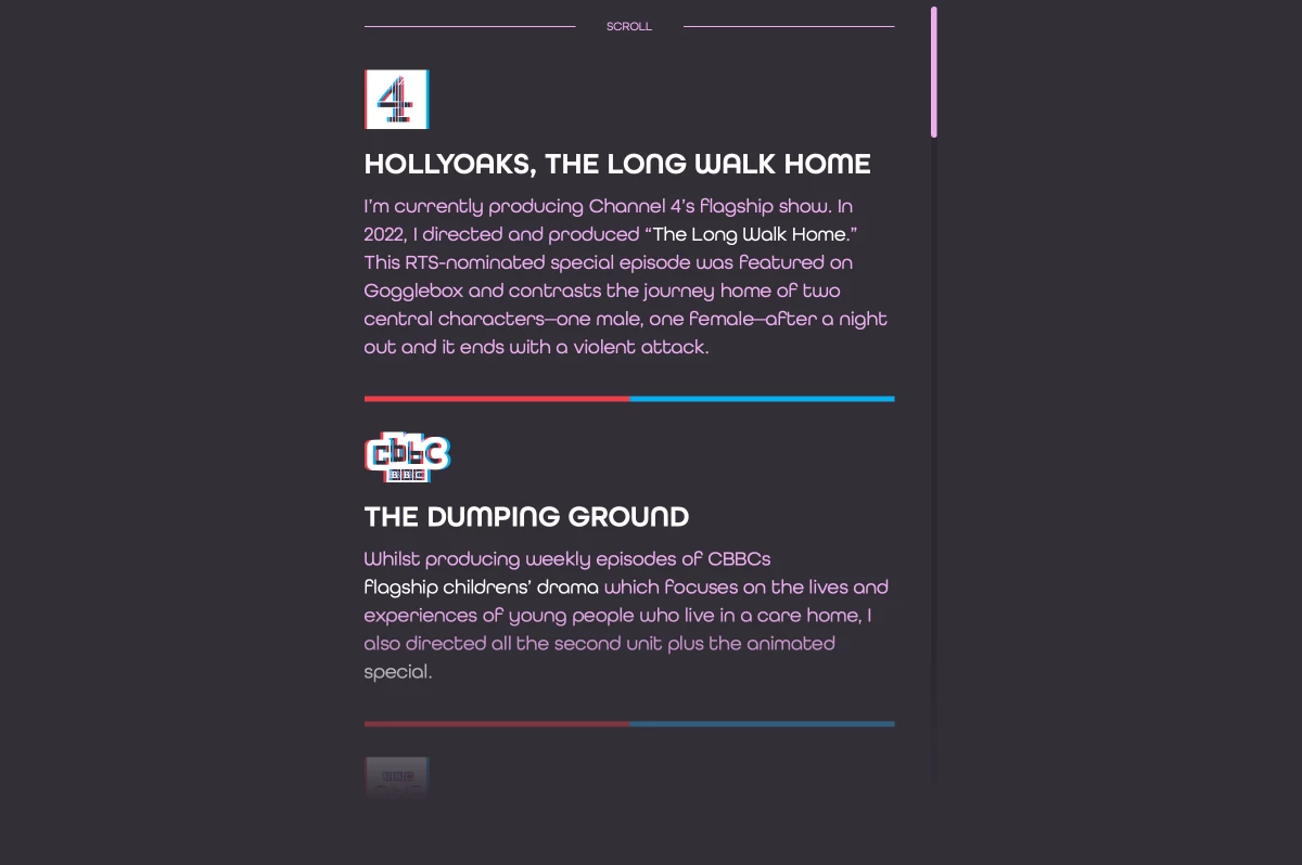
Now, instead of a hard stop, the content appears to fade out towards the bottom. A similar linear-gradient—this time with four stops—adds mask areas to the left and right of my horizontal scrolling panels:
my-reel {
display: flex;
align-items: flex-end;
gap: 0 1rem;
overflow-x: auto;
overflow-y: hidden;
scroll-snap-type: x mandatory;

/* Mask image ____________________________________*/

mask-image: linear-gradient(90deg,
transparent 0%,
#000 10%,
#000 90%,
transparent 100%); }
I think those panels look much better with the CSS masks. Now, I just need to tell Emma.