Advanced CSS Styling and the CannyBill redesign project
It’s not everyday that I get to work with a client that completely gets why it’s important to push the progressive enrichment boundaries by using HTML5 and the kind of advanced CSS styling that I teach at my workshops. Luckily, the CannyBill team do more than get it. I’d like to share a little of the HTML5 and CSS that I’m using for this project.
HTML5
Over the last few months, as I've learned more about HTML5, I've wondered about the advantages that I might gain by using it. Recently I realised that the question shouldn't be why use HTML5 but why not? From what I've learned from reading and by talking to people, the only reason that I can find not to use it is that without JavaScript, HTML5's added elements (section, article, aside, figure etc.) cannot be styled in Internet Explorer.
While this stays a minor concern, I'll accept this irritation because content remains fully accessible without JavaScript. Major plusses for using HTML5 on the CannyBill project and others I have in the works are the new elements and particularly the way that it allows me to wrap an anchor around multiple block-level elements, for example in the list of applications for CannyBill.
<a href="#">
<h3><img src="avatar-malarkey.jpg" alt="" class="photo" />
<span class="fn">Andy Clarke</span> sells his tutorial subscriptions</h3>
<p>Designer and author Andy Clarke uses CannyBill to sell subscriptions
to his online tutorial master classes.</p>
</a>
Although I still prefer to write markup using an XHTML syntax, closing elements using a trailing slash, HTML5 is refreshing simple to write.
<!DOCTYPE html>
<html lang="en" dir="ltr">
<head>
<title>CannyBill</title>
<meta charset=utf-8 />
</head>
<body>
</body>
</html>
I have used HTML5's new elements extensively during the redesign where I feel that they add more focussed semantics.
<header> for both the branding header of a whole page and also as a header for each article in the blog/discussions pages, <nav> to denote navigation (usually wrapped around both a descriptive heading and an accompanying list of links, <section> to separate different topics (but not as a generic container for content (that is still the job of a division)) and <figure> with it's dt and dd semantics for captioning images and video.
To work around these issues with the new elements, I am relying on Modernizr to create these new elements in the DOM for Internet Explorer plus some simple CSS to enable their styling.
article, aside, dialog,
figure, footer, header, hgroup,
nav, section {
display : block; }
Advanced CSS Styling
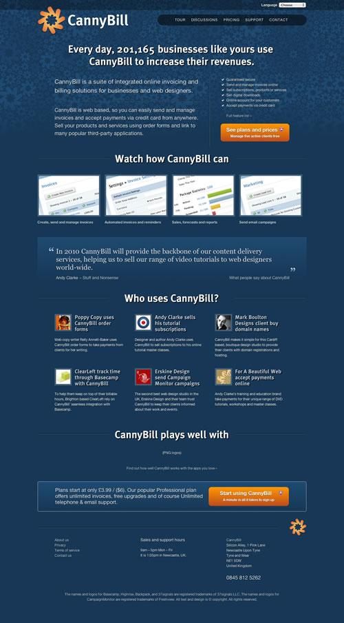
Before you read on, open the latest iteration of the CannyBill home page in either Safari 4 or Firefox 3.6 Alpha. Sorry Internet Explorer, Opera or Firefox 3.5 users, look at the screenshot on Flickr instead.
I'm making heavy use of Modernizr's ability to establish whether or not an HTML5 or CSS feature is implemented in a browser and its adding an appropriate class attribute to the HTML element. For example, if a browser has implemented border-radius Modernizr will add borderradius. If not, it will add no-borderradius. This simple technique makes designing alternatives depending on a browser's capabilities easier by using descendent CSS selectors.
.borderradius a.action {
border-radius : 10px;
-moz-border-radius : 10px;
-webkit-border-radius : 10px; }

.no-borderradius a.action {
/* Alternative styles */ }
After-all, it's important to remember that websites don't need to be experienced exactly the same in every browser.
For CannyBill I am using Modernizr to check for border-radius, CSS transforms, CSS transitions, multiple background images, RGBA and opacity (and I dare say a few more by the time I'm finished.)
If you've already looked at the latest home page iteration, you might have spotted my using RGBA on both the top (language) bar and the main navigation list.
.rgba .tools {
background-color : rgba(0,0,0,.3);
color : rgba(255,255,255,.9);
text-shadow : rgba(0,0,0,.8) 0 1px 1px; }

.no-rgba .tools {
background-color : rgb(0,0,0);
color : rgb(255,255,255);
text-shadow : rgb(0,0,0) 0 1px 1px; }
A little more subtle is the effect that it creates for text and box shadows. You'll also probably have spotted border-radius on the main navigation and the orange call-to-action buttons. But I am using three more advanced CSS techniques on this page: CSS gradient backgrounds, CSS transforms and transitions. First let's take a look at CSS gradient backgrounds on the call-to-action buttons. Here is the HTML5 markup.
<a href="#" class="action secure">
<h4>See plans and prices</h4>
<p>Manage five active clients free</p>
</a>
And now the CSS, first for Webkit-based browsers and then for Mozilla. The gradient colours are added to the CSS background-image property.
.action {
background-color : rgb(218,109,14);
background-repeat :  no-repeat;

background-image : -webkit-gradient(linear, /* Gradient type */
left top, left bottom, /* Gradient direction */
from(rgb(255,153,0)), /* Starting colour */
to(rgb(190,75,26))); /* End colour */

background-image : -moz-linear-gradient /* Gradient type */
(left top, left bottom, /* Gradient direction */
from(rgb(255,153,0)), /* Starting colour */
to(rgb(190,75,26))); /* End colour */ }
Although the syntax is, at first glance, a little complicated, you should soon get used to it. A great place to start experimenting is Westciv's linear gradient demonstration, but be sure to adjust the syntax for Mozilla as it differs a little from Webkit's implementation as the syntax has not yet been agreed between them.
CSS transforms
To add emphasis to the video screen-captures, I've used CSS transforms and transitions (plus a little generated content). Here is the HTML5.
<figure class="video-tour">
<a href="#">
<dd><img src="video-small-1.png" alt="" /></dd>
<dt>Create, send and manage invoices</dt>
</a>
</figure>
The CSS, first for Webkit-based browsers and then for Mozilla is simple with the scale property, followed by a scaling factor in parenthesis.
.csstransforms figure.video-tour:hover img {
-webkit-transform : scale(1.15);
-moz-transform : scale(1.15); }
To smooth the transition to the scaled images, I used CSS transitions.
.csstransforms figure.video-tour:hover img {
-webkit-transition : all .2s linear;
-moz-transition : all .2s linear; }
Then a little CSS generated content to add a play icon over the scaled images which is positioned absolutely.
figure.video-tour:hover dt:after {
content : url(figure-open.png);
position : absolute;
top : 35%;
right : 40%; }
Here are the results in the finished home page. (You will need to look at the page in the browsers I mentioned to see the effect of transforms, transitions and generated content.
CannyBill home page in Safari 4 (with full support)
And here in Firefox 3.6a.

CannyBill home page in Firefox 3.6a
And finally the latest iteration of the CannyBill home page in HTML5 and CSS.
If you'd like, look at how the page renders in an older version of Firefox or Opera 10, the latest and greatest from that browser. As I've written about before, I can easily live with the natural differences between browsers as I've accepted that there will probably never be a time when all browsers implement the same CSS at the same time.
To expect this is a utopian fantasy as CSS3 was designed so that browser makers can choose which CSS modules to implement and when.
If right now you're asking yourself what your clients might think of this approach, remind yourself (and them) that only web geeks use more than one browser and will never see the differences between even these modern browsers.