An appropriate use for CSS frameworks
Could this be the day that I eat my words about CSS frameworks? I’ve been mean to them in the past, written harsh things. I once likened them to instant cake mixes in response to Jeff Croft’s What’s not to love about CSS frameworks?
In the early stages of the redesign project, the team at New Internationalist asked that the new site be developed using Blueprint, because they were familiar with that framework having used it to make the current site's blogs. They wrote about why CSS frameworks make sense on the New Internationalist Tech blog.
I still think that I am right to be tough on CSS frameworks (and tough on the causes of CSS frameworks). I don't want to reignite the whole framework debate. Let me just say that I think that developing a page layout, either during prototyping or for production code using a pre-packaged framework like Blueprint or grid960 is a bad idea.
Not just because of their presentational attributes (you can work around those), but because they encourage people to conceptualize their markup from a presentational, rather than meaningful starting point. Although these frameworks, and others, have been built on work by Eric Meyer (reset) and Mark Boulton and Richard Rutter (typography), their pre-packaged nature suggests a one-size-fits-all solution. I wrote about this recently in relation to leading and typefaces.
That said, working on the New Internationalist redesign project has made me re-evaluate where using a framework might be applicable. Not for wide-scale page layout but for interface details.
The homepage teaser
This teaser is intended to replace the myriad of colorful (and confusing) internal navigation disguised as advertisements on the current site. The markup is straightforward.
<ul>
<li>[content]</li>
<li>[content]</li>
<li>[content]</li>
</ul>
The teaser must be flexible to handle different numbers of items (columns), item widths and styling. My initial struggle was in maintaining a balance between keeping markup light and meaningful, while at the same time making it simple for the New Internationalist team to update. I suppose it's time for me to eat my own words, but the most appropriate way to keep that balance was to use the framework that New Internationalist are already familiar with.
<ul>
<li class="a-magazine span-9">[content]</li>
<li class="a-subscribe span-9">[content]</li>
<li class="a-shop span-6 last>[content]</li>
</ul>
Although CSS equal height columns might yet make an appearance, I applied a tall background image to the unordered list, specified by a class attribute value that reflects the column configuration.
<ul class="v9-6-6">
<li class="a-magazine span-9">[content]</li>
<li class="a-subscribe span-6">[content]</li>
<li class="a-shop span-6 last>[content]</li>
</ul>
<ul class="v9-9-6">
<li class="a-magazine span-9">[content]</li>
<li class="a-subscribe span-9">[content]</li>
<li class="a-shop span-6 last>[content]</li>
</ul><ul class="v6-9-9">
<li class="a-magazine span-6">[content]</li>
<li class="a-subscribe span-9">[content]</li>
<li class="a-shop span-9 last>[content]</li>
</ul>
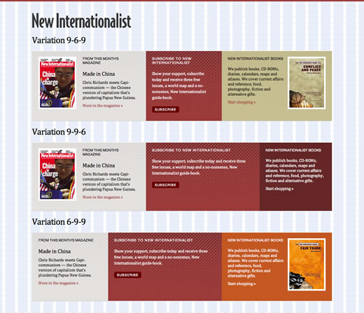
Teaser variations (View in your browser)
A Fireworks PNG toolkit makes it easy to export background image variations of columns and color schemes that compliments the content.
Allowing for different image widths in current (wide format) articles
As I wrote earlier this week.
The wide format layout for current articles has largely been received well, but the team at New Internationalist have expressed concern about the availability of super-wide images. Most of the images in their library are portrait and would not adapt well to cropping to a letterbox format. Fair point, but I was concerned about different image formats diluting the drama that I hope my layout conveys through its slightly unusual, single column format.
My solution? Define ten possible image widths from 540px to 940px (plus padding) based on the Blueprint alignment grid that underpins the design. With a little auto-margin centering on their container, these image sizes all fit well above the single content column.
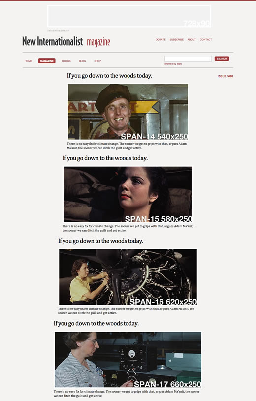
Article image variations (View in your browser)
<div class="span-17">
<h1 class="entry-title">If you go down to the woods today.</h1>
<abbr class="entry-issue"><a href="#">Issue 500</a></abbr>
<img src="span-17.jpg" alt="" />
<div class="entry-summary">
<p>There is no easy fix for climate change.</p>
</div>
</div>
How do those words taste?
Well, if CSS frameworks are like instant cake mixes, pretty damn good. I still stand behind everything that I've said in the past about the unsuitability of pre-packaged frameworks used wholesale for page layout. But for small areas that demand regular updating by people who may not be familiar with CSS layouts, from now on I'll consider that an appropriate use for CSS frameworks.