Creating a colour palette inspired by Martin Scorsese’s film Hugo
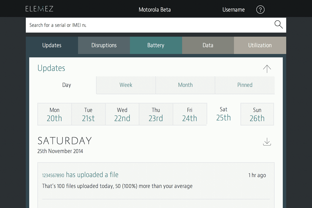
Over the last few months, we’ve been working with a client on the design of a mobile analytics ‘web app.’ I’ll show more of it when we add it to our portfolio, but because lately one or two people have asked me about how we choose colour palettes, I thought I’d share how we came up with the colours for the Elemez app.
Its developers brief to us was that their application was very different to their competitors and that the design should reflect that. In particular they wanted to stay away from typical app colour palettes epitomised by Bootstrap. At the start of our branding design phase, we spent a good deal of time talking with the Elemez team about what they perceived the personality of the app to be. During those conversations, Martin Scorsese’s film ‘Hugo,’ based on Brian Selznick’s novel ‘The Invention of Hugo Cabret’ came up more than once.

I’ll admit that I hadn’t seen Hugo, so I downloaded a copy. One of the things that struck me right away was the film’s distinctive colour grading and its limited colour palette.
Filmlight has this to say about Hugo’s colour:
In keeping with the film’s theme, the look of Hugo was strongly influenced by early French cinema. […] Similarly, in grading the film, Fisher used Baselight’s palette of digital tools to emulate the look of early cinema. “Hugo is a digitally-shot, period film,” Fisher observes. “We looked at a lot of old photographs and old film stocks, and we tried to emulate the colourimetry of those classic films… but we didn’t want it to look old. It still needed to look like a new film.”
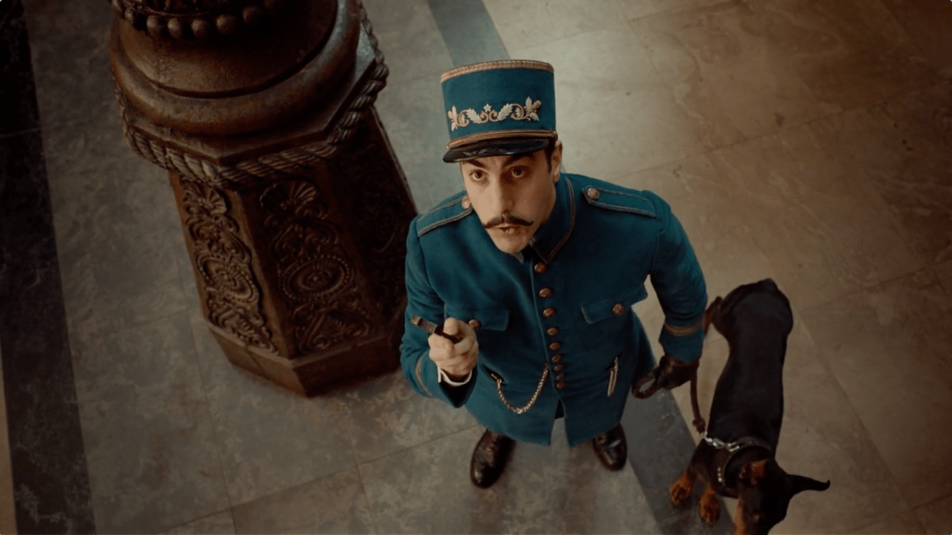
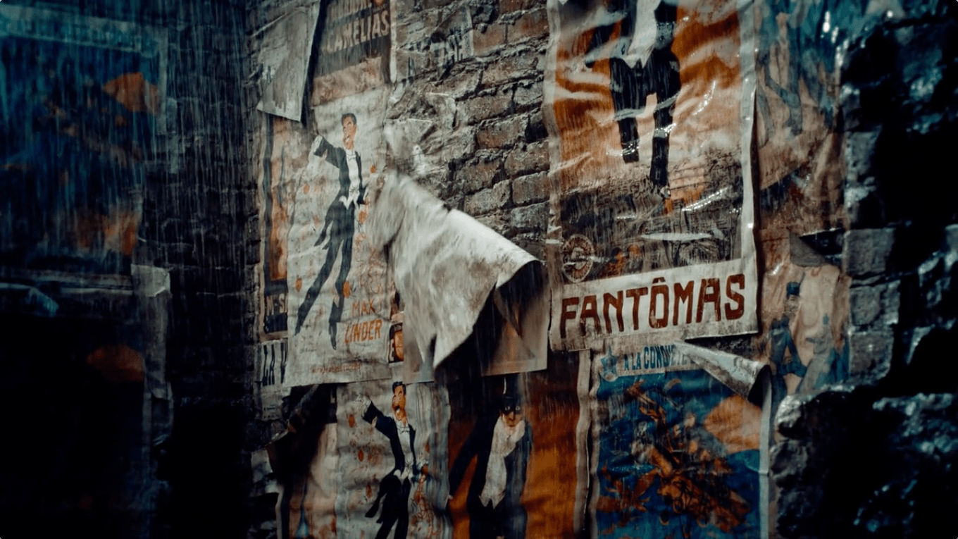
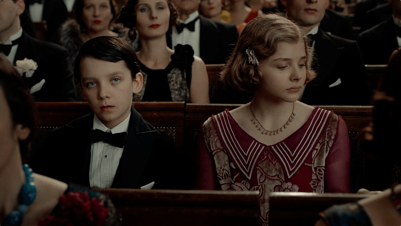
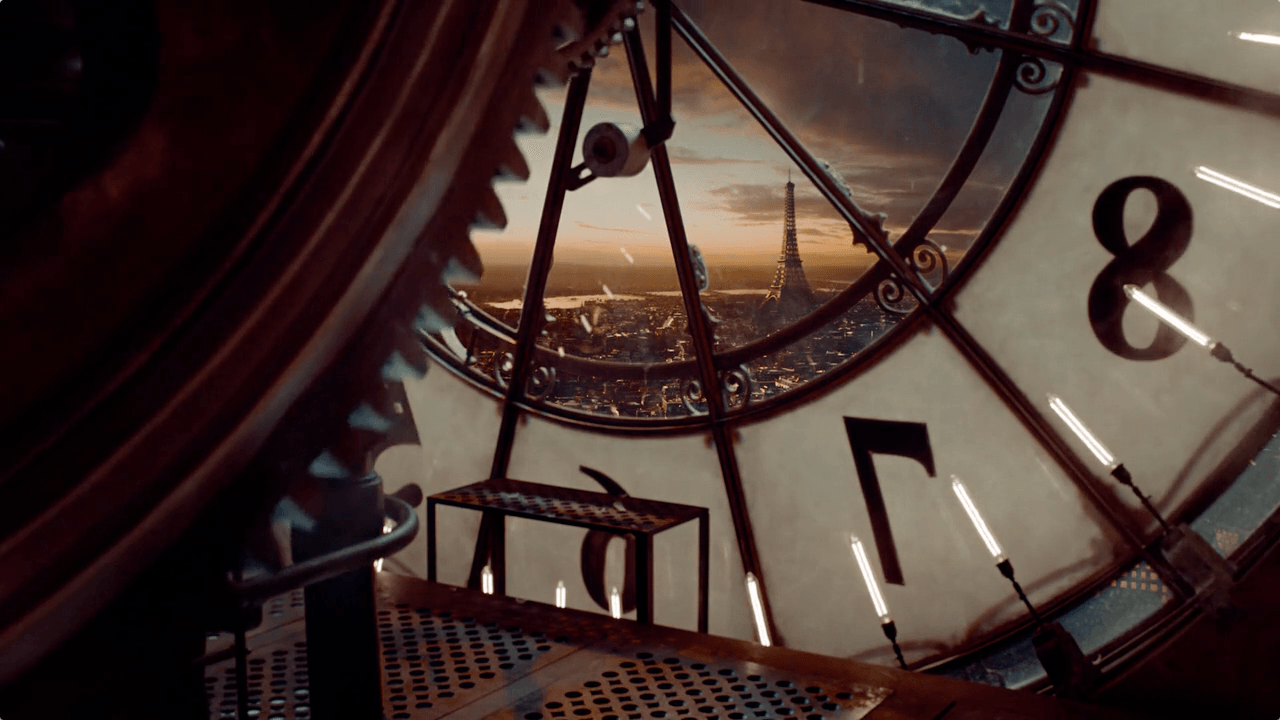
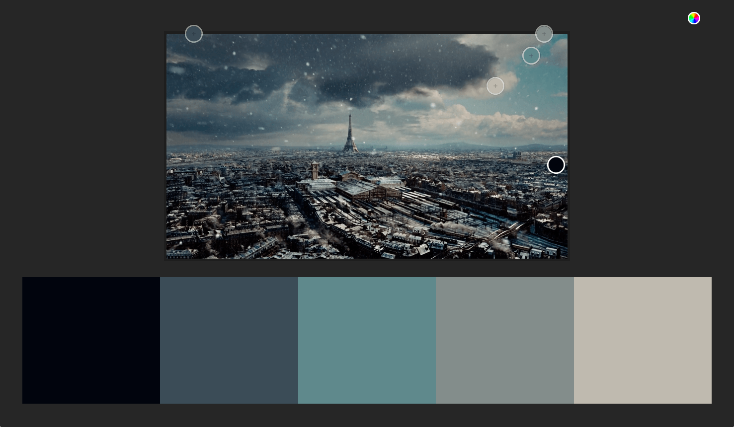
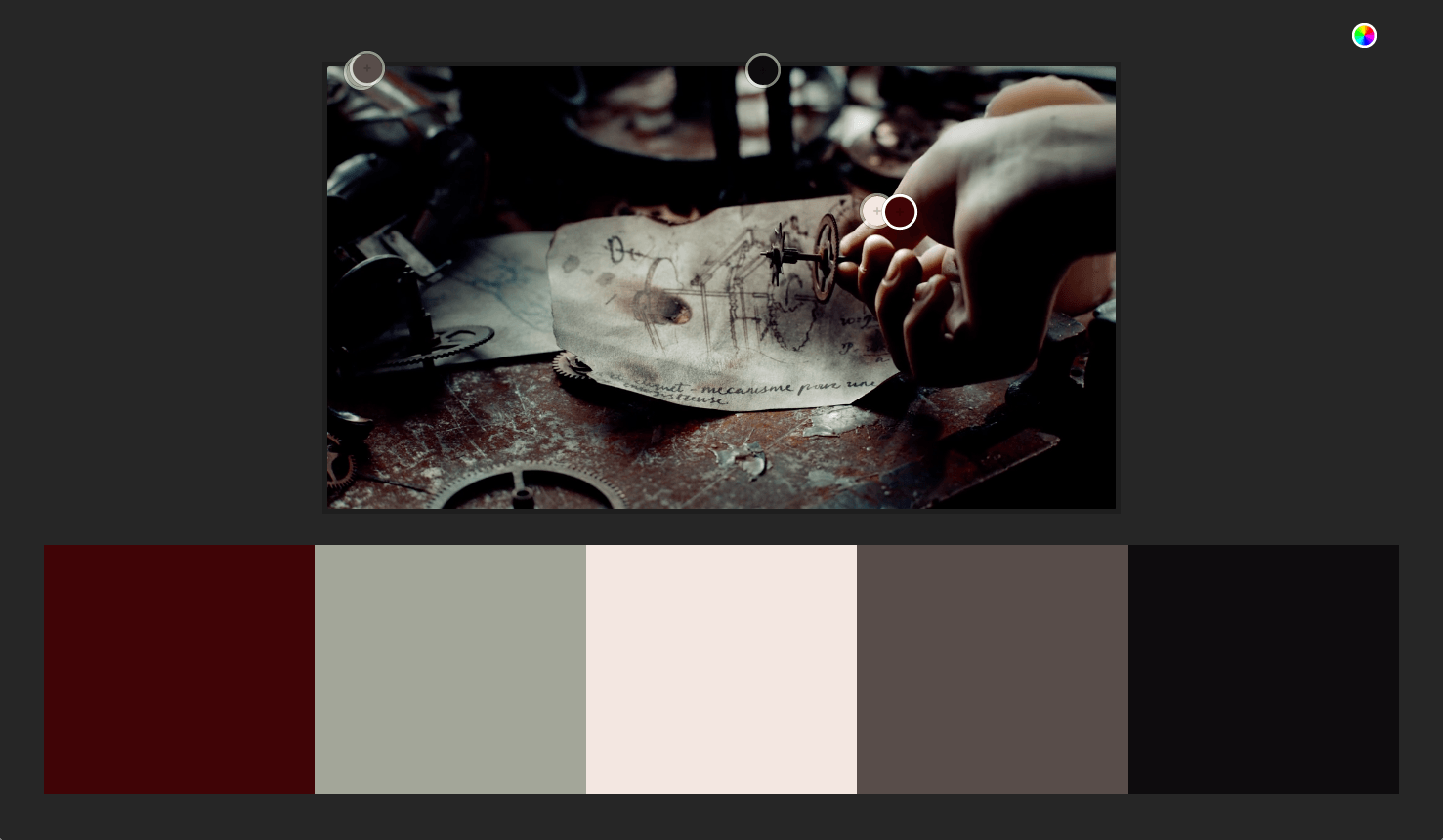
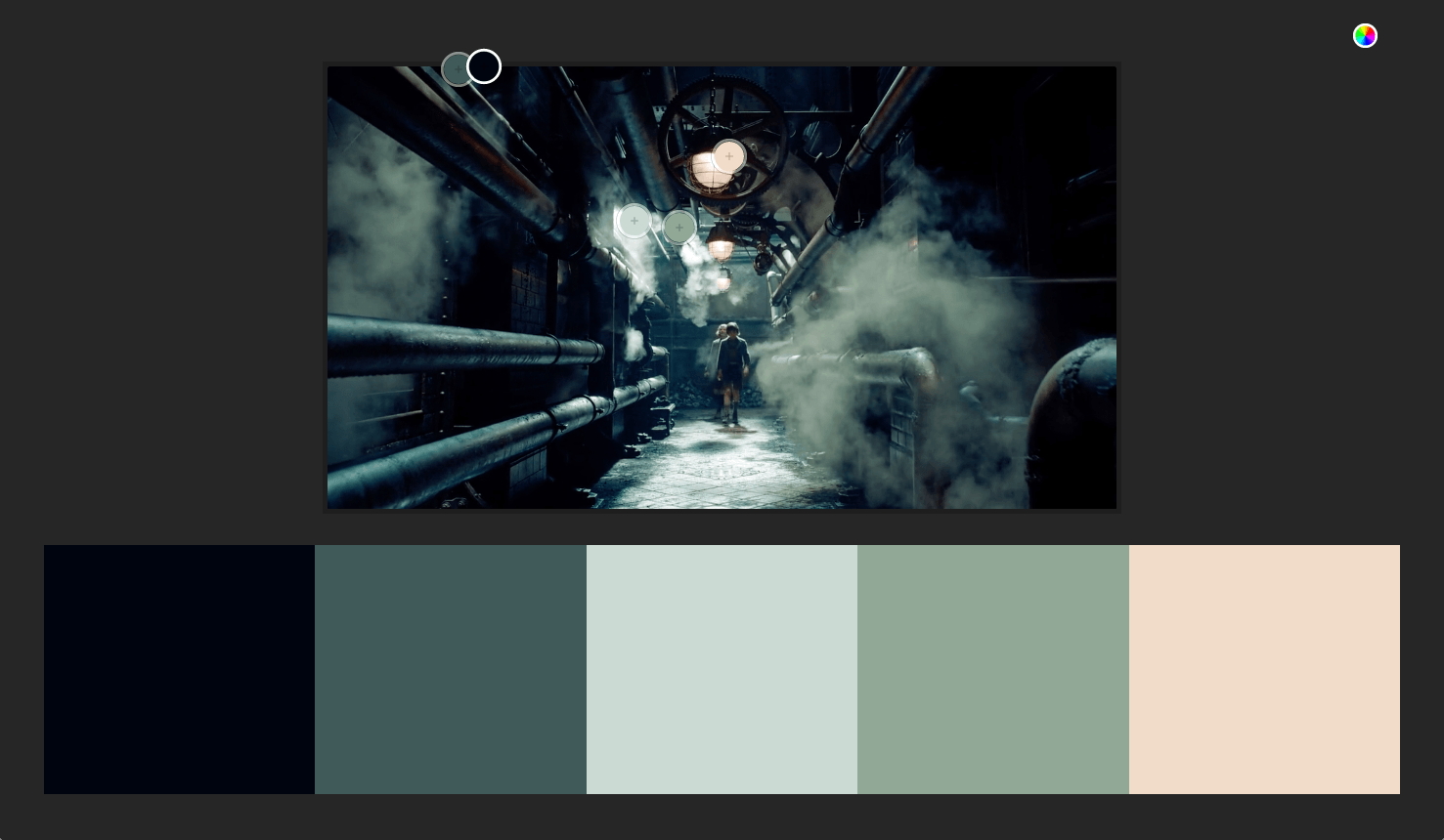
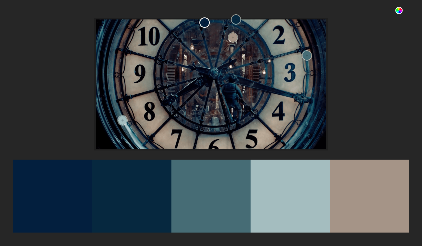
I thought it might be fun to base Elemez’s colour palette on Hugo’s, so I took screen captures at different times during the film. Here are four that show how how clever Hugo’s colour graders were in achieving a real relationship between the colours that they used throughout the film.
I then used Adobe’s Kuler tool to extract colours from those screen captures. Kuler lets you extract colours from uploaded images and choose between palette options such as ‘colourful,’ ‘bright,’ ‘muted,’ and ‘deep,’ each with subtly different characteristics. Kuler extracts five colours, which coincidently is the number of sections of the Elemez app. These are the selections that influenced the colours in our design.
Our brief was that an application that looked different from other applications and especially its competitors and I think that the colours we chose helped us to achieve that. I do know that a colour palette inspired by a film helped a lot with that too and I certainly don’t think we’d have arrived at that particular combination of colours had we not been inspired by Hugo.
Next time you’re looking for inspiration for colours in a design, look somewhere different. You don’t know what you’ll find and that’s part of what makes what we do such fun.