Eleventy in a Box
A premium Eleventy starter kit for designers and developers who want to spend less time setting up the same project structure and more time designing distinctive websites.
I gave a new talk on designing inspired style guides last week at Design Exchange Nottingham. It was a really good night, a fabulous audience which was double their normal attendance and I also got the chance to sink a few drinks with my old friend Harry. It’s very likely that I won’t give this talk again in Europe this year, and I wanted to share it with more people, so I’ve written a transcript to accompany the slides. NB: This page contains 8Mb of images. I’ve optimised them as much as possible, but you probably don’t want to load this page using your mobile data plan.
Hi. I’m Andy Clarke and I’m an art director and website designer at my company Stuff & Nonsense.
The slides for this talk are available on my Speakerdeck and I’d love it if you’d share them.
At Stuff & Nonsense I specialise in making distinctive and effective creative work for the web. Work that goes beyond making a digital product or website something that people find easy to use, by making it something they like and remember using through creative design.
A good deal of my work over recent years has involved creating design systems, pattern libraries and style guides for clients including SunLife and WWF. These tools have become incredibly fashionable, with articles, talks and even entire conferences like Clarity devoted to them.

Perhaps the most well known design system methodology used on the web today is Brad Frost’s Atomic Web Design. Brad’s written a book about Atomic Web Design and he was kind enough to include me in the acknowledgements:
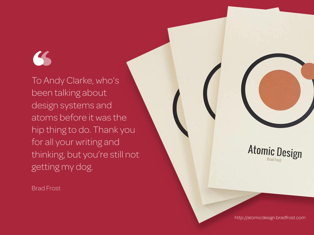
“To Andy Clarke, who’s been talking about design systems and atoms before it was the hip thing to do. Thank you for all your writing and thinking, but you’re still not getting my dog.”

(My Instagram feed’s full of Brad’s dog Ziggy and other peoples’ babies.)
I’ve been writing about design system thinking since 2012’s Smashing Book #3 where I introduced the idea of “designing atoms and elements,” a process that separates the atmosphere of a design from its responsive layout.
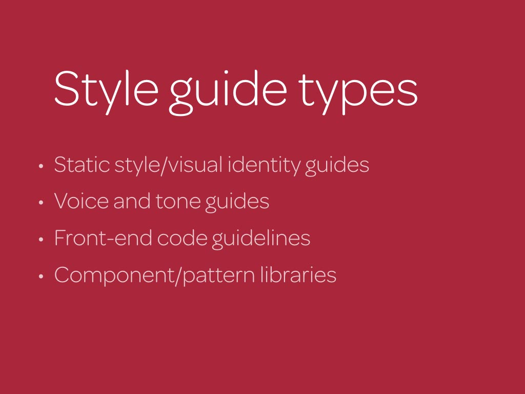
“Style guide” is an umbrella term for several types of design documentation. Sometimes we’re referring to static style or visual identity guides, other times voice and tone.
In my work, and I suspect in most of yours, when we talk about a living style guide for the web, we’re combining visual identity guides with component/pattern libraries.
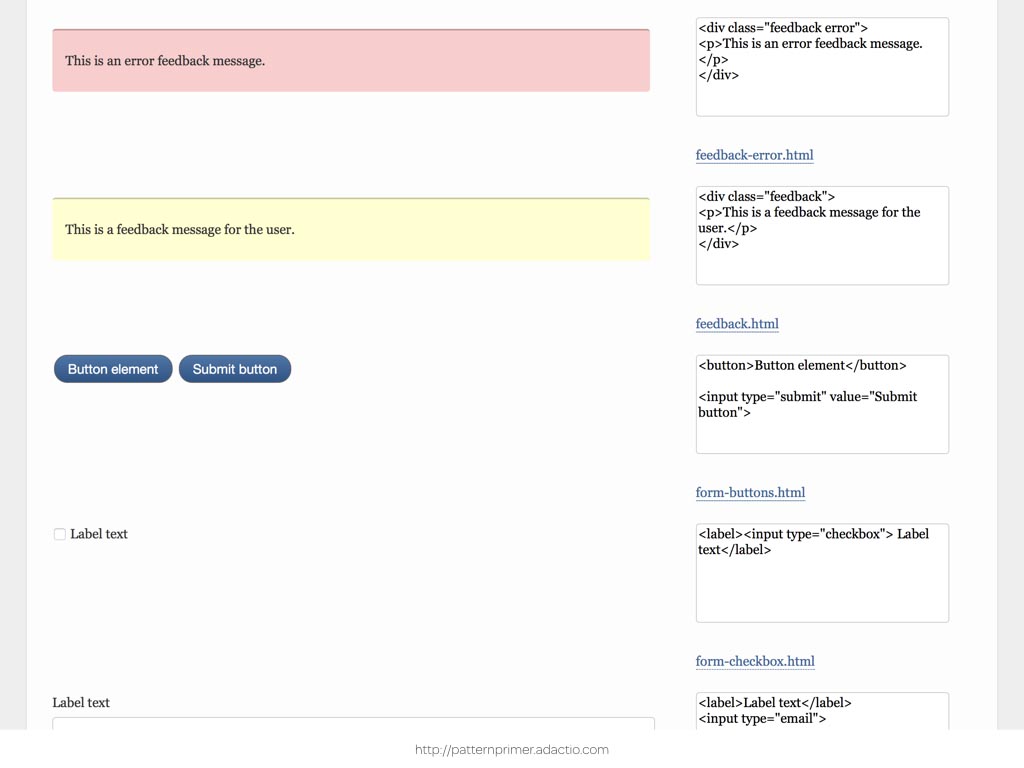
These all offer something different but more often than not they have something in common. They look ugly enough to have been designed by someone who enjoys configuring a router.
Sadly the importance of creative, thoughtful design in a style guide is lost on some people, who dismiss it as decoration that’s less important than functionality. OK, that was mean, not everyone’s going to think an unimaginative style guide design is a problem. After all, as long as a style guide contains information people need, how it looks shouldn’t matter, should it?
Many miss the fact that beauty in design complements functionality rather than detract from it. Creative design enhances someone’s engagement with a tool such as a style guide and amplifies the important information that it contains. This means that to be effective, a style guide should present its content in appealing and engaging ways.
Interest in design systems has also meant that reproductions of corporate design manuals have become popular. This one is from British Rail.

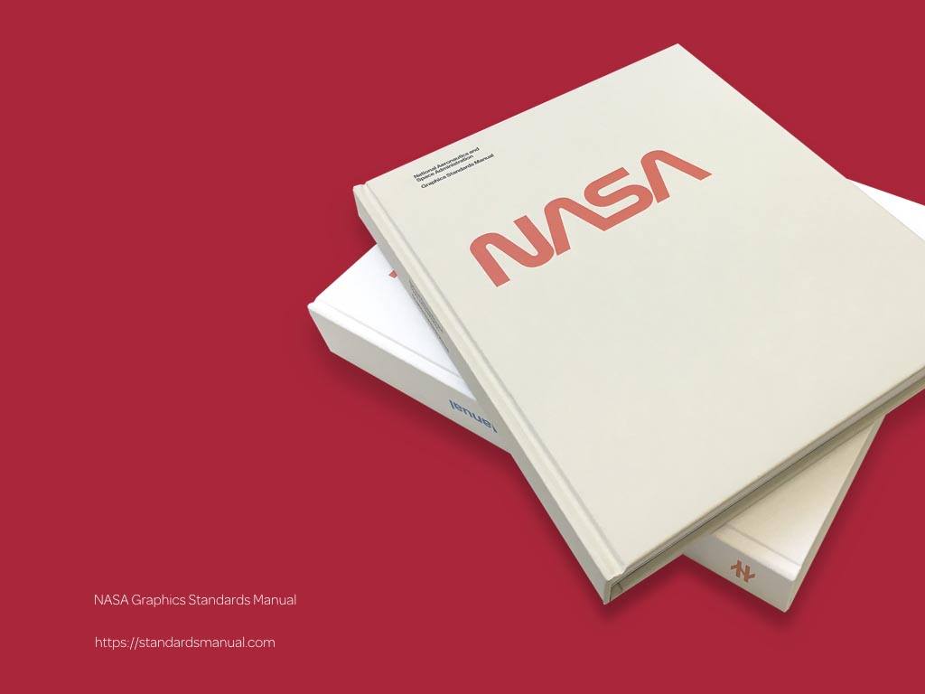
The NASA Graphics Standards Manual describes the design of everything from a business card to the branding on a booster rocket.
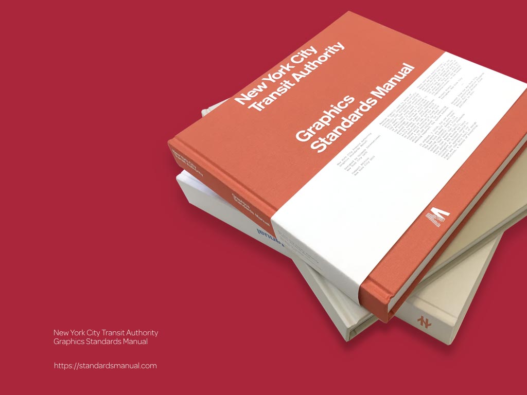
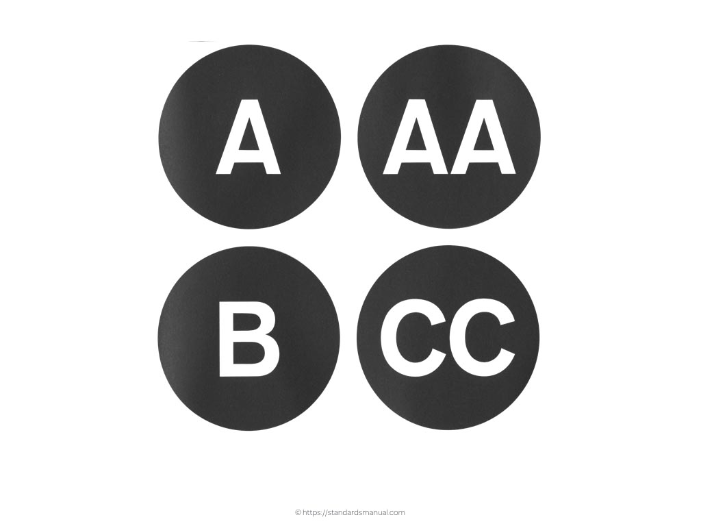
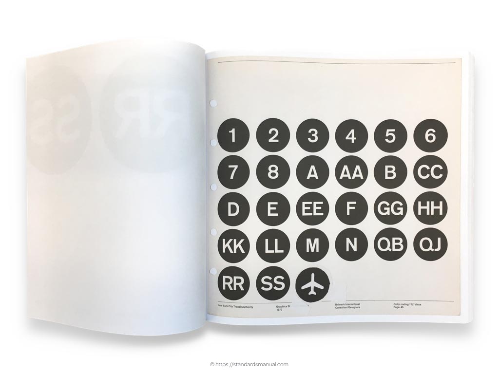
New York City Transit Authority Graphic Standards Manual includes the most complete examples of how to use Helvetica that I’ve ever seen.
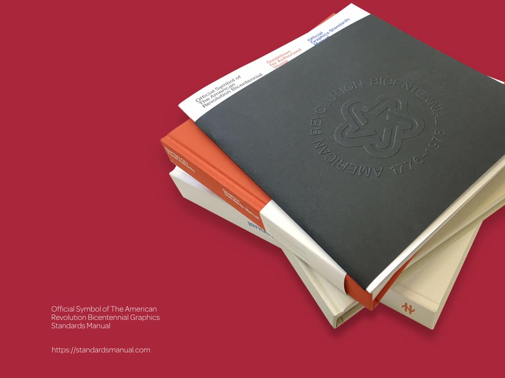
Finally the Official Symbol of The American Revolution Bicentennial Graphics Standards Manual (phew) explains not only its symbol should be used but how it was created. This is an important point that I’ll come back to later.
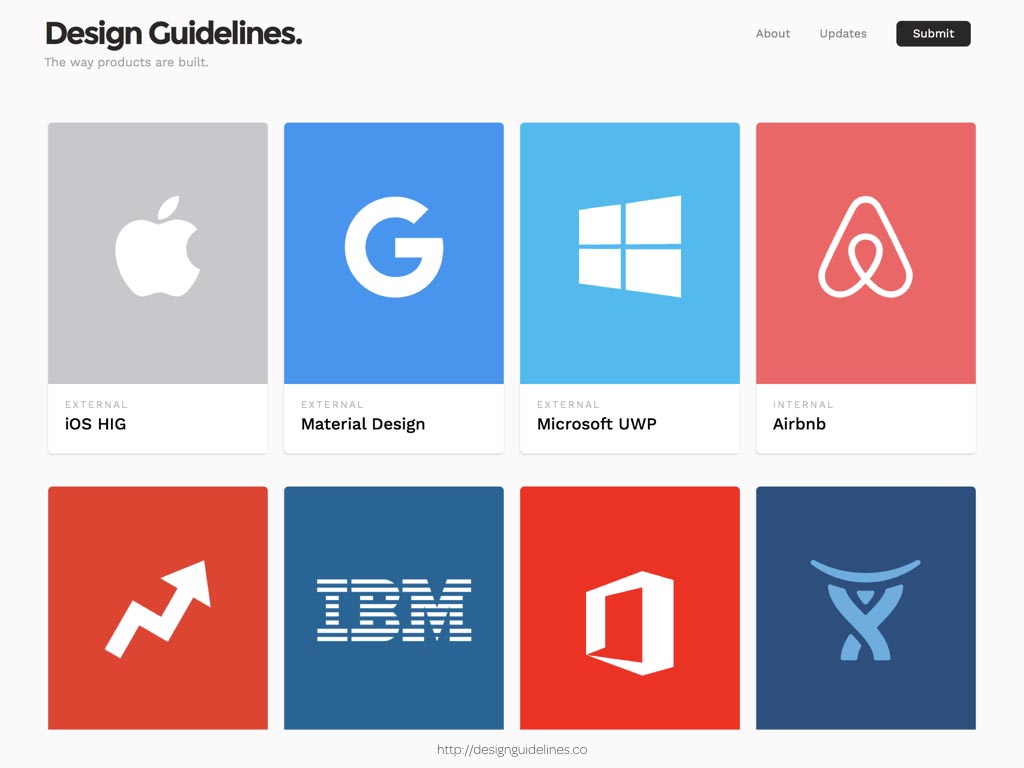
There are now collections of design guidelines online, including this one which includes work from Apple, IBM and Microsoft.
The problem with uninspiring style guides is that not everyone needs to take the same information away from them. If you’re looking for markup and styles to code a ‘media’ component, you’re probably going to be the technical type, whereas if you need to understand the balance of sizes across a typographic hierarchy, you’re more likely to be a creative. What you need from a style guide is different and yet so many style guides follow the same patterns.
I’ll start by looking at colour, which alongside typography, colour’s one of the most important ingredients in a design. Colour communicates personality, creates mood and is vital to an easily understandable interactive vocabulary. So you’d think that an average style guide would describe all this in any number of imaginative ways. Well, you’d be disappointed, because the most inspiring you’ll find looks like a collection of chips from a paint chart.
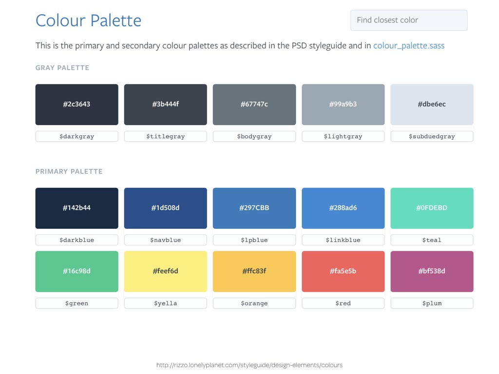
Lonely Planet’s Rizzo does a great job of separating its Design Elements from UI Components but you’ll struggle to get a feeling for Lonely Planet’s design by looking at their colour chips.
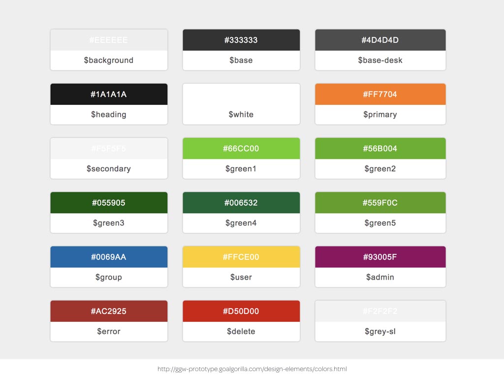
Greenpeace’s style guide uses the same approach.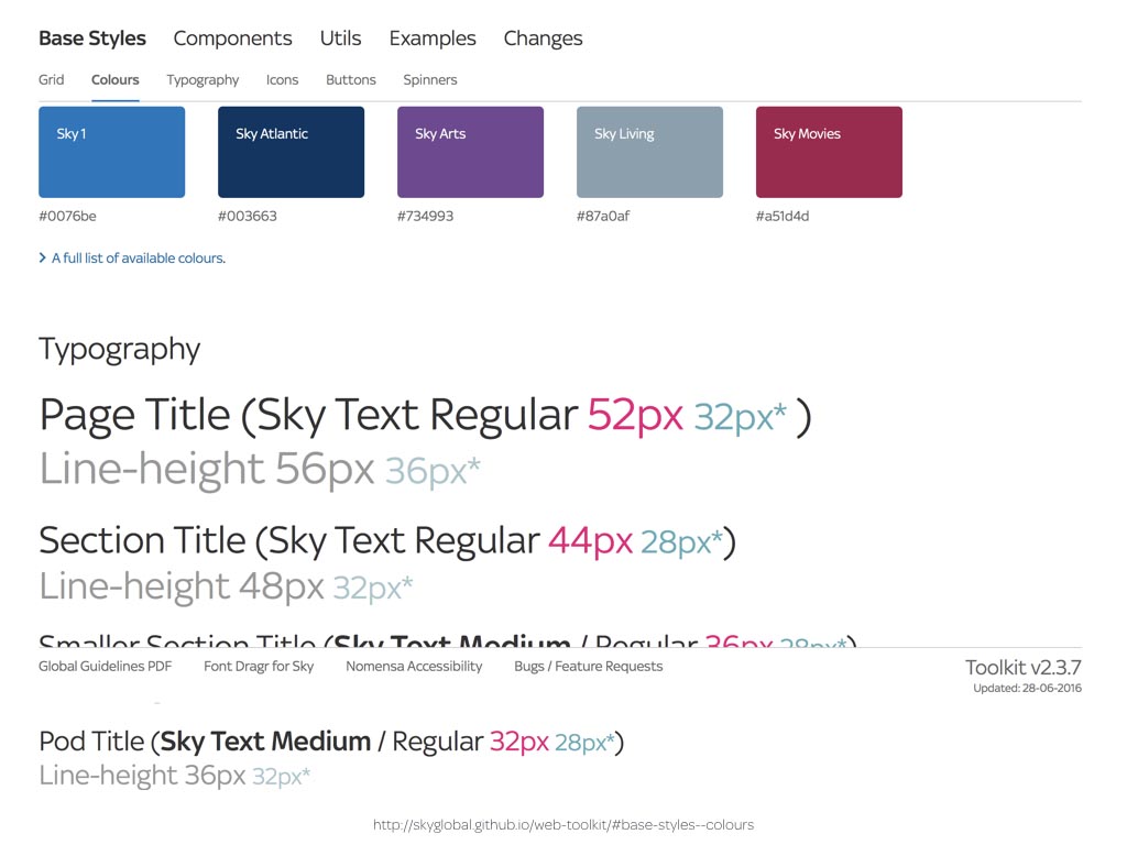
As did Sky’s old web toolkit.
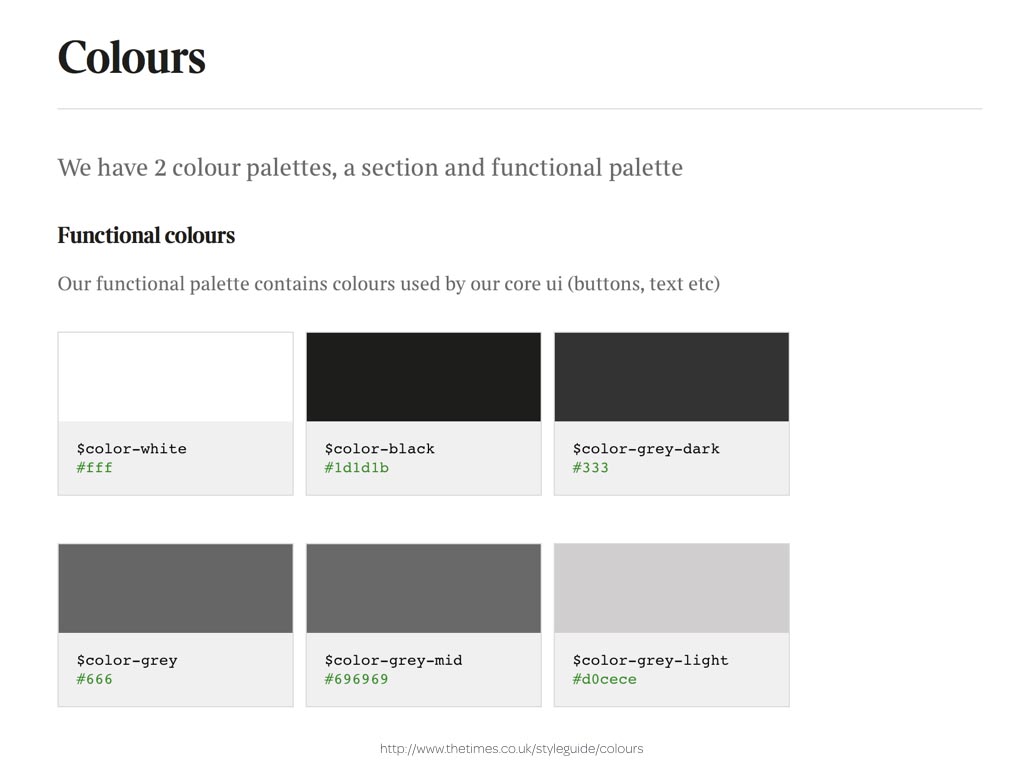
And The Times’ functional palette.
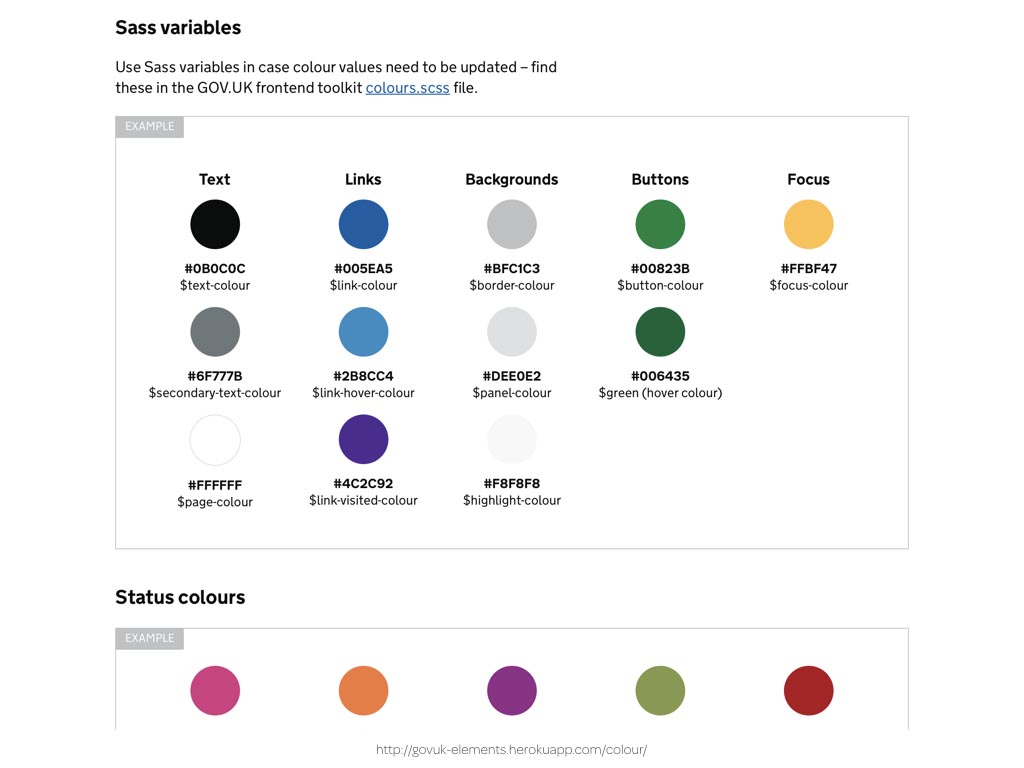
GOV.UK—not a website known for its creative flair—varies this approach by using circles, which I find strange as circles don’t feature anywhere else in its branding or design. On the plus side though, their designers have provided some context by categorising colours by usage such as text, links, backgrounds and more.

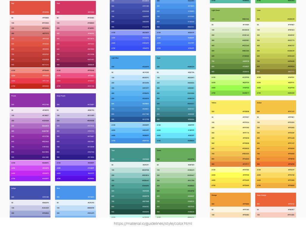
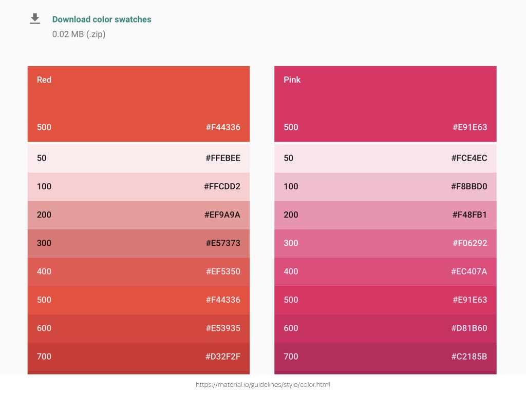
Google’s Material Design offers an embarrassment of colours but most helpfully it also advises how to combine its primary and accent colours into usable palettes.
Few style guides offer any explanation and even less by way of inspiring examples. Most are extremely vague when they describe colour.
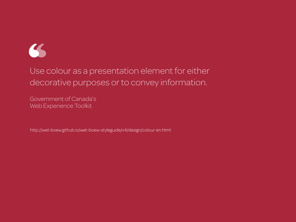
“Use colour as a presentation element for either decorative purposes or to convey information.”
The Government of Canada’s Web Experience Toolkit states, rather obviously.
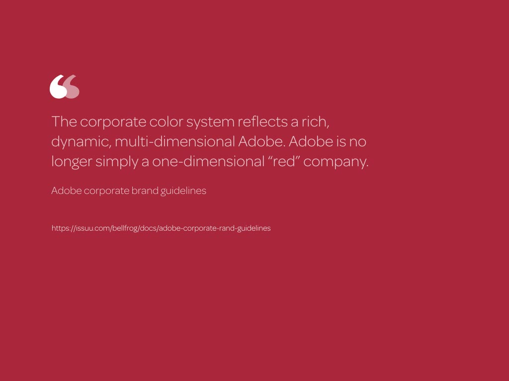
Adding more colours to their palette has made Adobe “rich, dynamic, and multi-dimensional.”
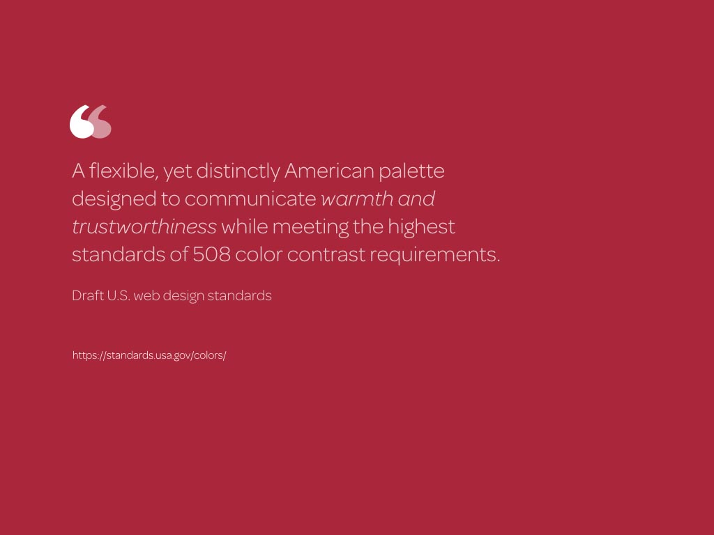
I’m unsure what makes the Draft U.S. Web Design Standards colours a “distinctly American palette” but it will have to work extremely hard to achieve its goal of communicating “warmth and trustworthiness” now.
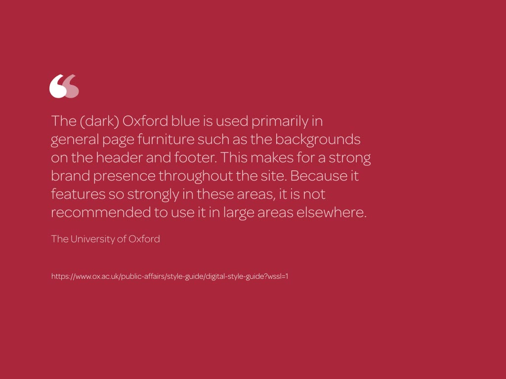
The University of Oxford is much more helpful by explaining how and why to use their colours:
“The (dark) Oxford blue is used primarily in general page furniture such as the backgrounds on the header and footer.”
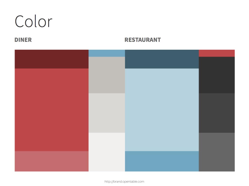
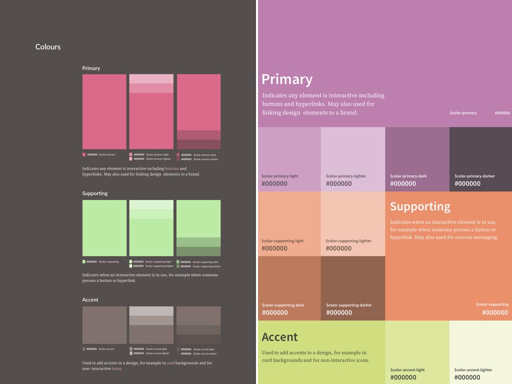
The designers at OpenTable have cleverly considered how to explain the hierarchy of their brand colours by presenting them and their supporting colours in various size chips. It’s also obvious from OpenTable’s design which colours are primary, supporting, accent or neutral without them having to say so.
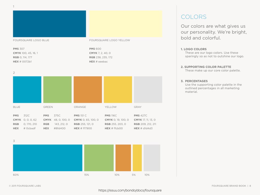
Foursquare helpfully prescribe the percentages of colours that make their marketing materials distinctive, but there are many more imaginative ways to describe colour.
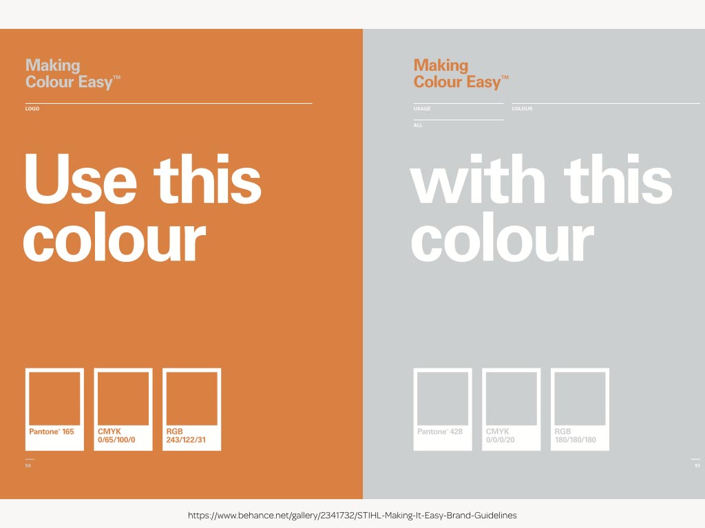
STIHL’s brand book—itself an example of thoughtful graphic design—states couldn’t be clearer when it says “use this colour with this colour.”
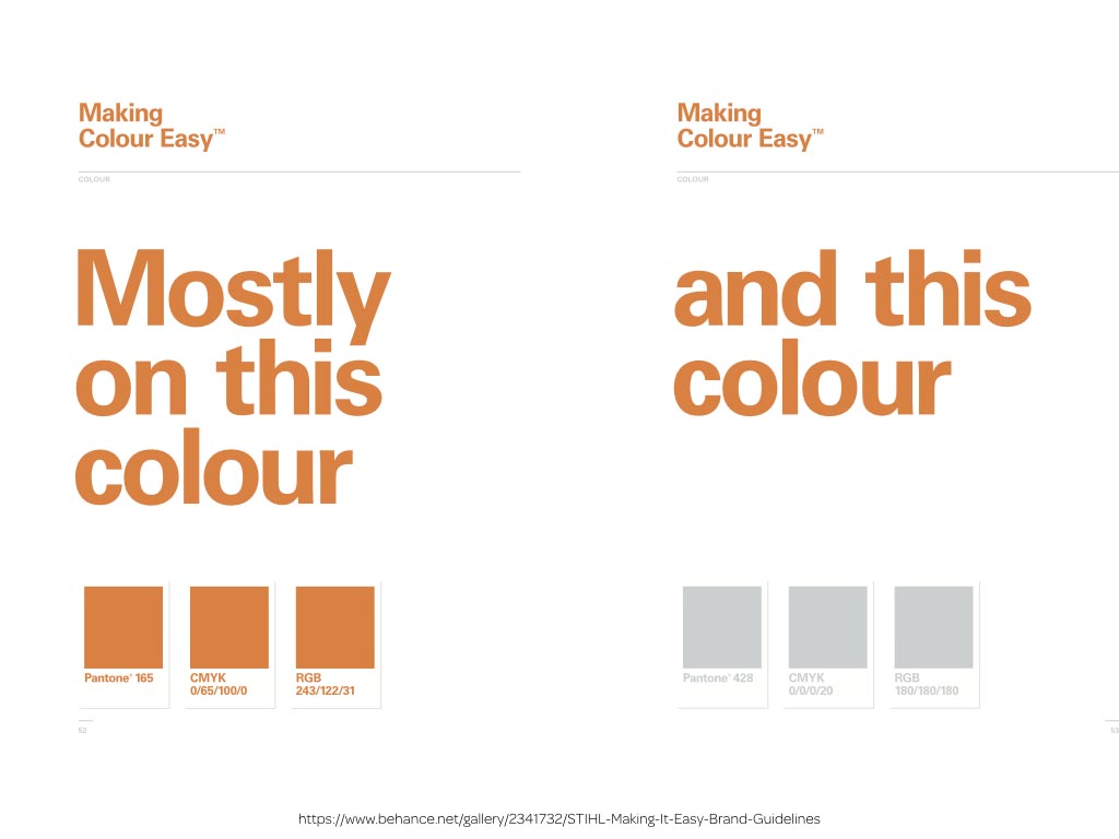
It presents its information clearly and in a way that also expresses the personality of the STIHL brand.
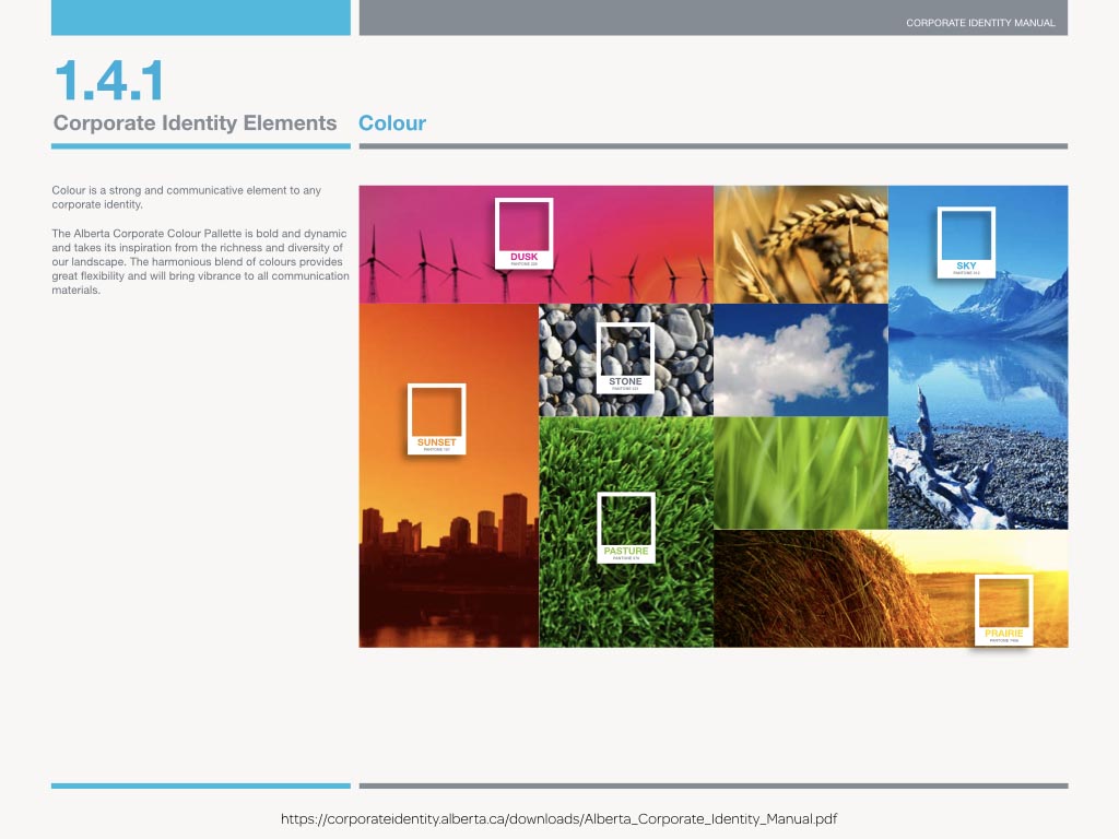
The designers of Alberta’s Corporate Identity Manual cleverly combined their colours with images of the region that inspired them.
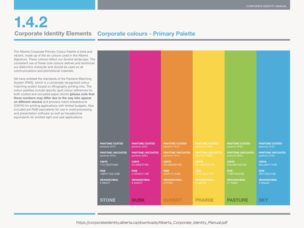
Larger blocks of colour give people a stronger feeling for a design without making it difficult to find information about those colours.
The interplay of colour and typography should be demonstrated in a style guide to ensure that people understand what’s acceptable in terms of colour contrast accessibility.

For some organisations, brand books have developed into an art form.
If you find them as inspiring as I do, remember that’s it’s not enough to simply copy their appearance. We should turn that inspiration into a design that works for our clients and our medium.
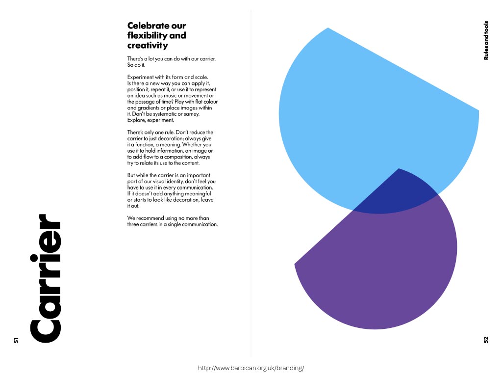
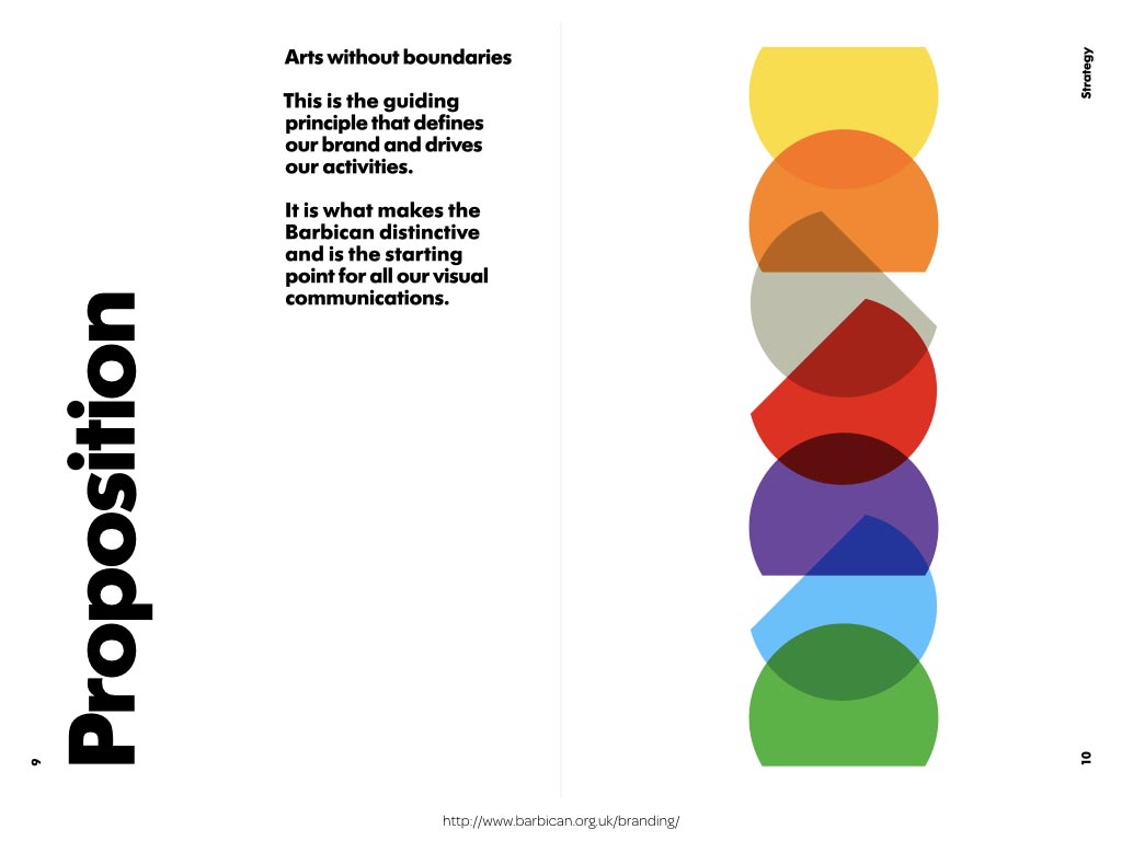
For example, this page from the Barbican’s brand book suggests SVG shapes and CSS blend modes.
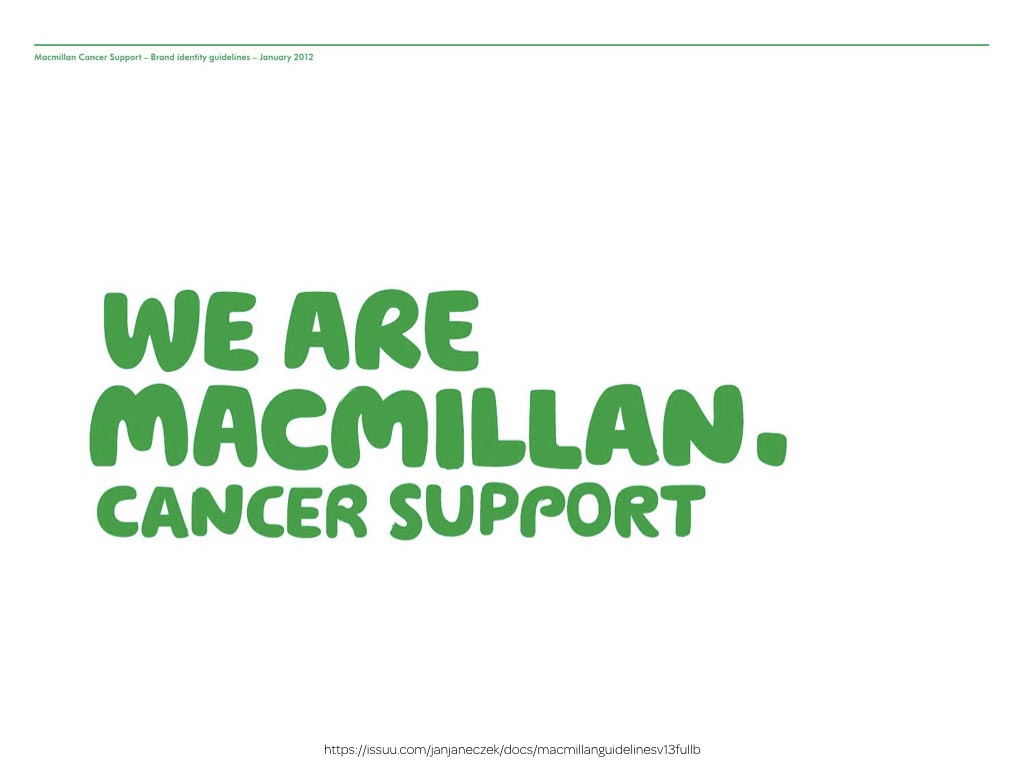
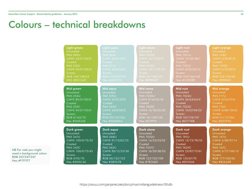
The distinctive personality of MacMillan Cancer Support’s visual identity has been brought to every page in their brand guidelines.
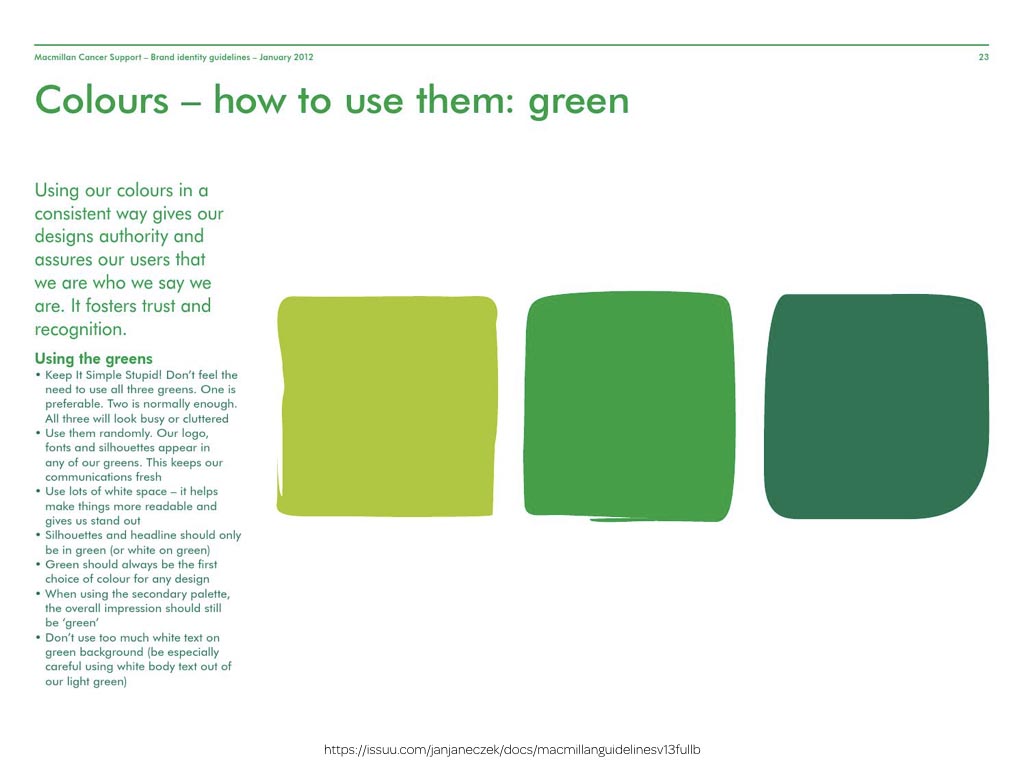
MacMillan’s colour chips do match their style.
But we get a much better understanding of their visual identity when those same colours used in more imaginative ways.
Of course in living style guides and pattern libraries, we often need to present information about colour values. This offers a fabulous opportunity to be creative, perhaps by designing an interactive UI that helps everyone get what they need.
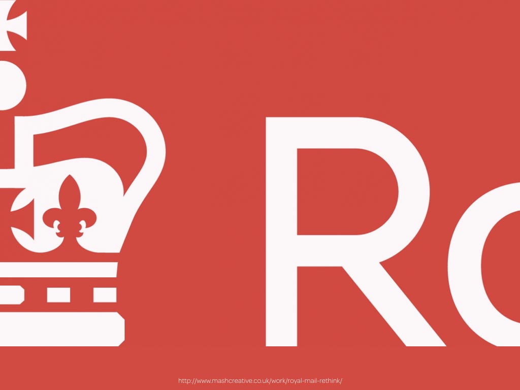
The Royal Mail is one of Britain’s most recognisable brands.
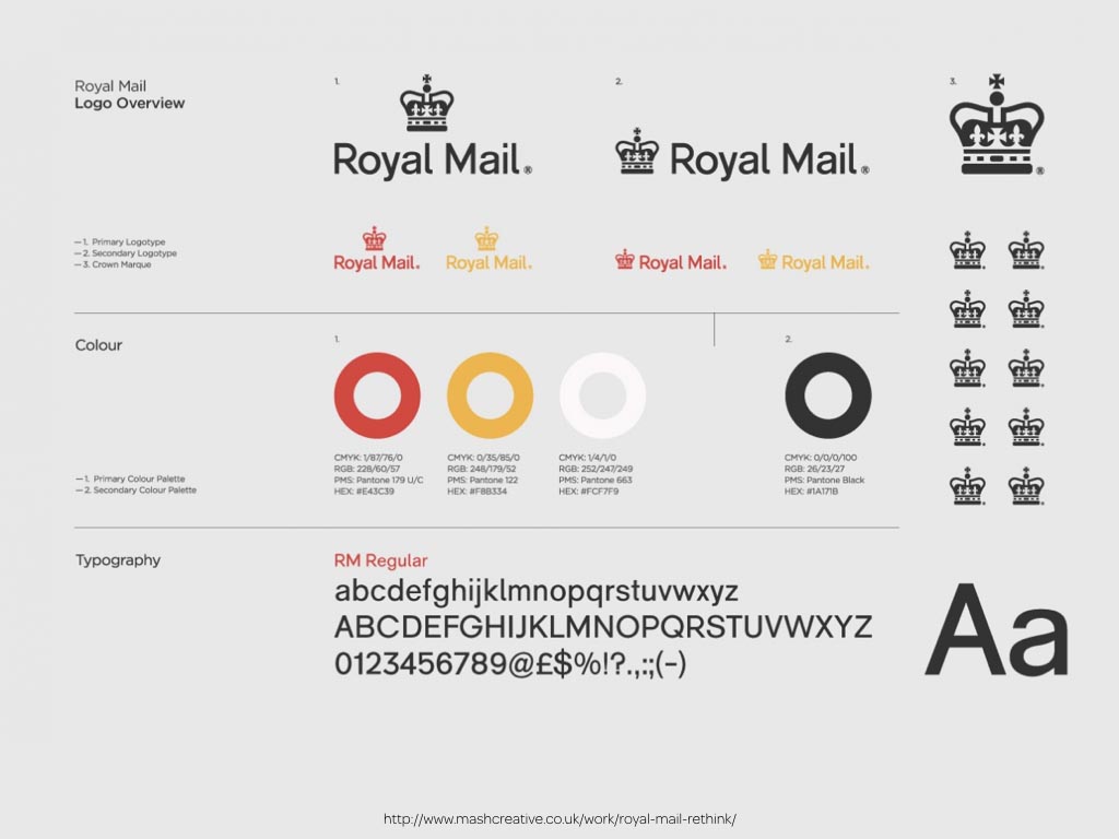
This page from their brand book is especially effective because it brings colour, iconography and typography together on a single page to create an immediate impression.
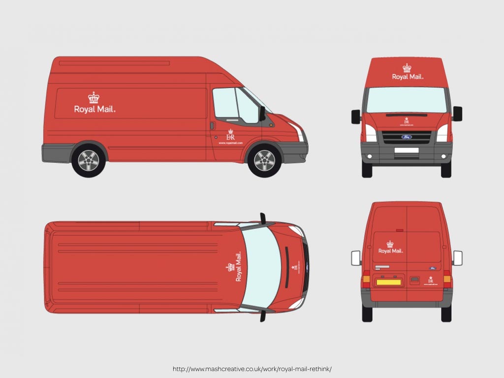
And what could be more iconic than Royal Mail’s livery?
Colour chips can be an effective way to present colour information, but they don’t have to be rectangular. Filling playful shapes with colours can better connect them to a brand.
The designers of frozen yoghurt maker Yogen Fruz’s brand manual did exactly that.
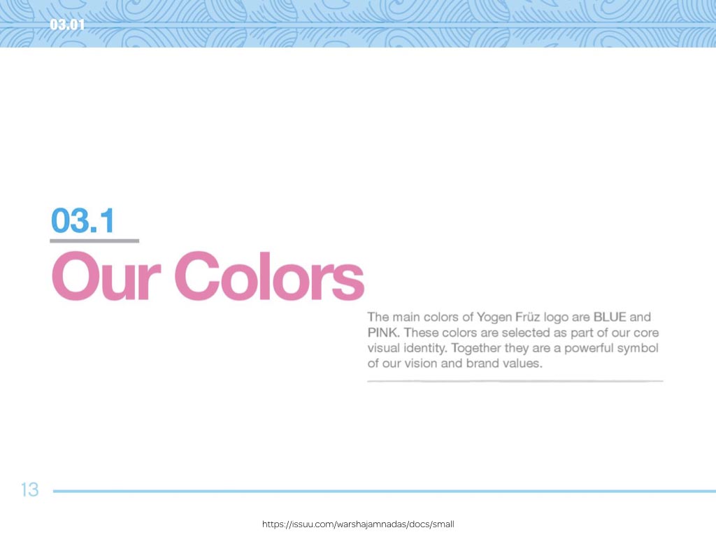
Yogen Fruz don’t just explain their colours.
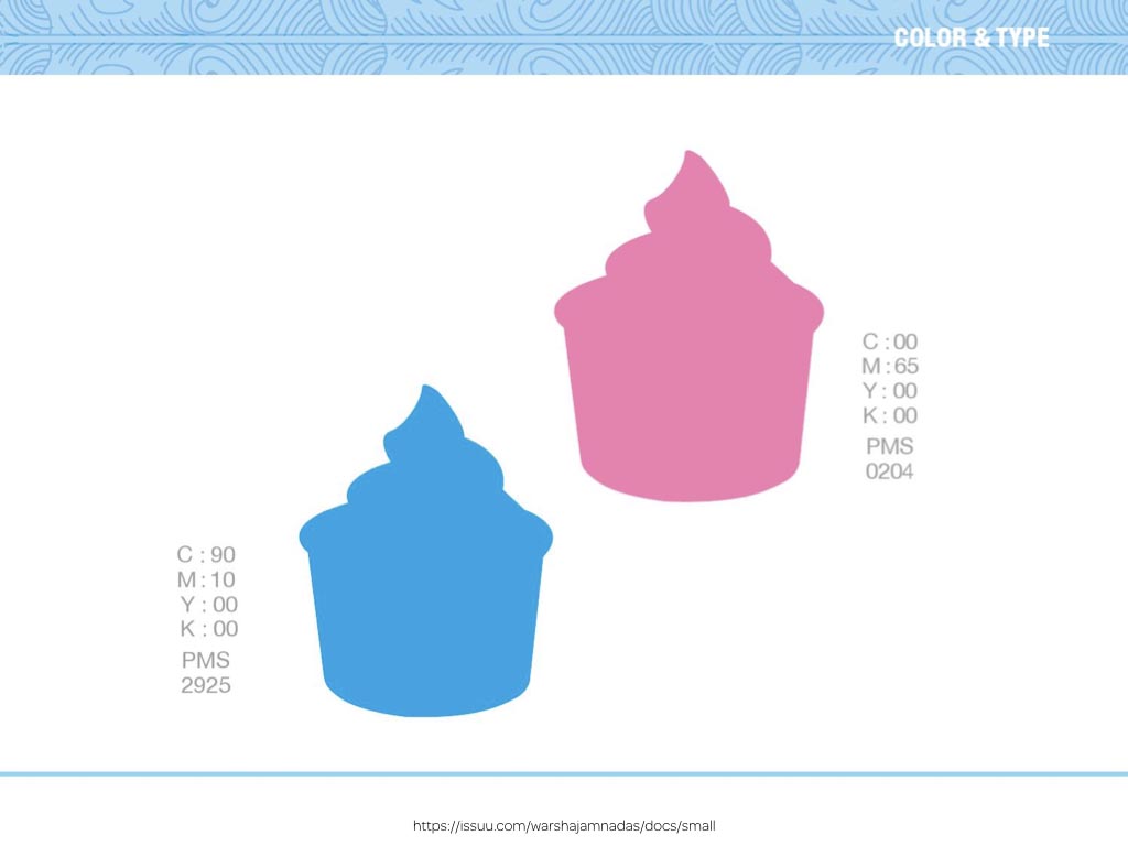
They tastefully display them inside silhouetted tubs of their frozen yoghurt, conveying their personality as well as their colour information.
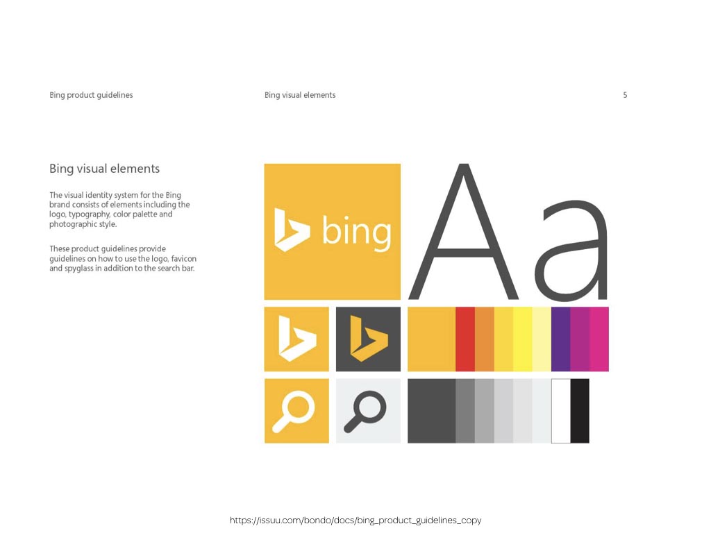
Style guides with personality make a better impression. This page from Bing’s product design guidelines brings together their, colour palette, graphic styles, logo and typography to demonstrate how combining them creates the Bing visual identity system.
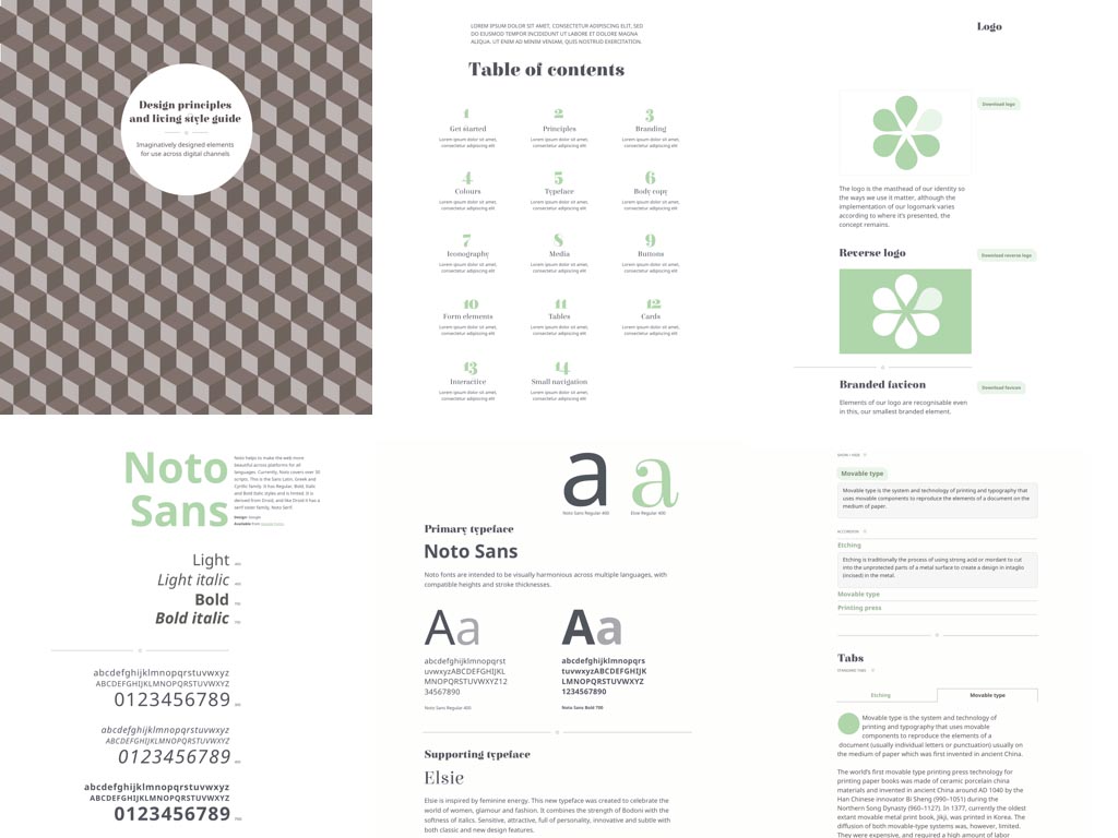
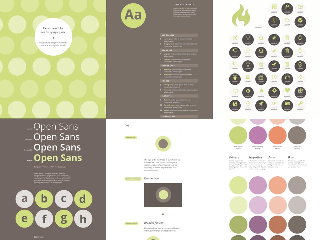
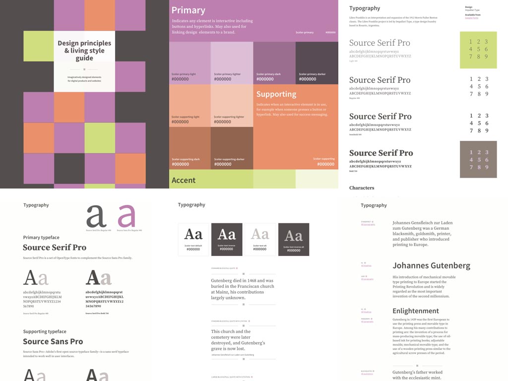
I believe that style guides should inspire and well as inform the people who use them. That’s why I’ve created Inspired Guides.
Inspired Guides are thoughtfully designed style guide templates that are beautiful as well as functional. They’re easy to work with, responsive by default and can be hosted anywhere.
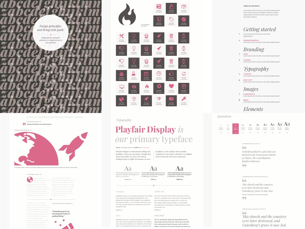
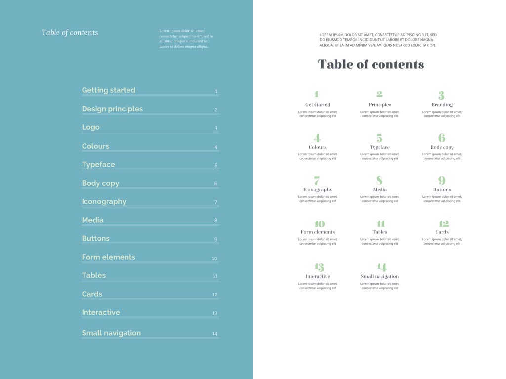
Each set contains pages for common design elements including, design principles and tokens, branding colours and logos, typography, media, form elements and buttons, tables plus interactive and navigation elements.
Inspired Guides come connected to popular Google Fonts, but are easily configured to include Typekit or self-hosted fonts. They demonstrate how to get the most from even the most common typefaces.
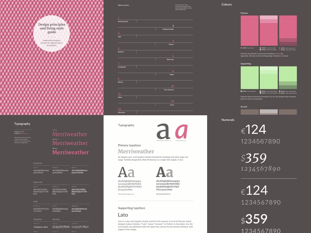
I’ve used Sass to make changing colour variables across all pages within the style guides incredibly quick and simple. If you’d prefer not to use Sass then you can work with compiled and commented CSS.
Inspired Guides are a great choice for creative people who don’t want Node.js, npm or other complicated technical solutions to get in the way of making an inspired style guide. I’ve developed them with beautifully semantic HTML, CSS, SVG and a little bit of native Javascript.
I’ve also removed all dependencies, so you won’t need a framework or any particular software or toolset to make an inspiring style guide.
I didn’t intend Inspired Guides to be another of countless web design frameworks but I have made them compatible with Bootstrap and Foundation so that you can easily add components from those frameworks into your inspired style guide.
Inspired Guides are designed for agencies who create style guides for their clients. They’re ideal for independent graphic and web designers who work with clients and for in-house teams at established organisations or start-ups. They’re available to buy as individual sets and in packs containing either three or six themes.
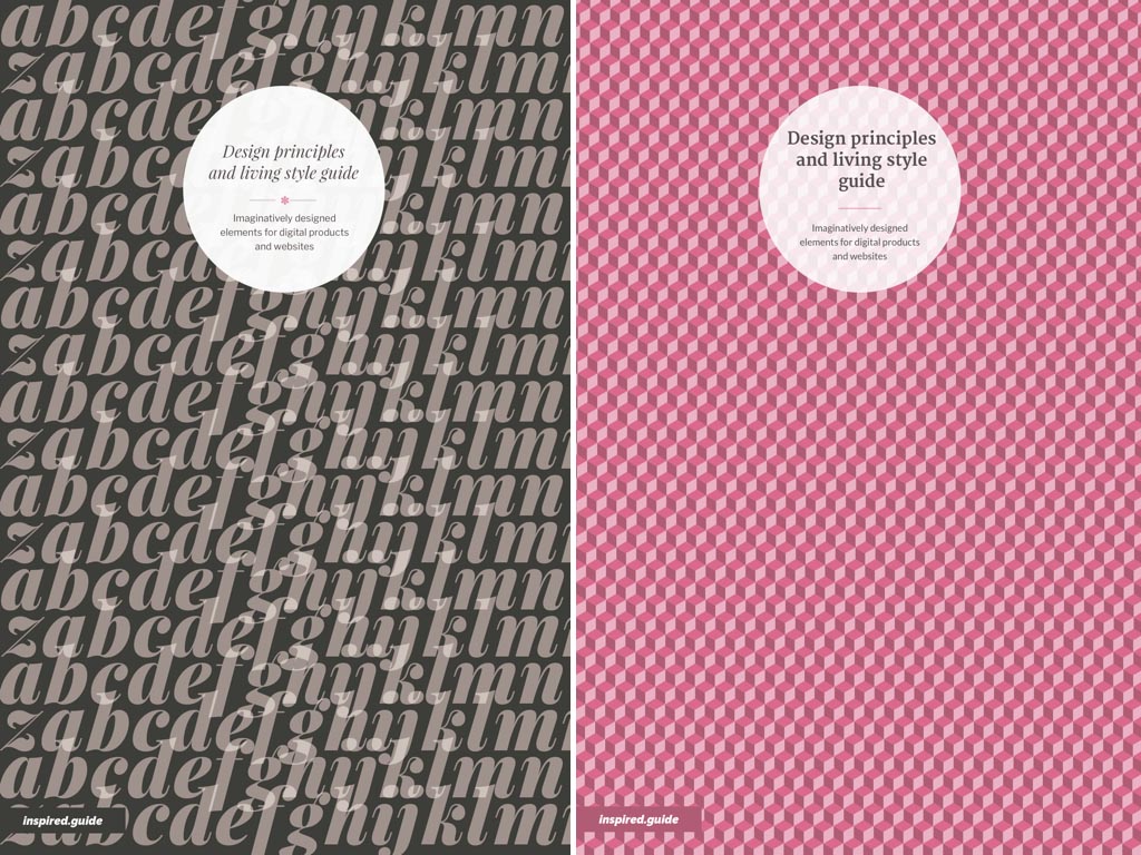
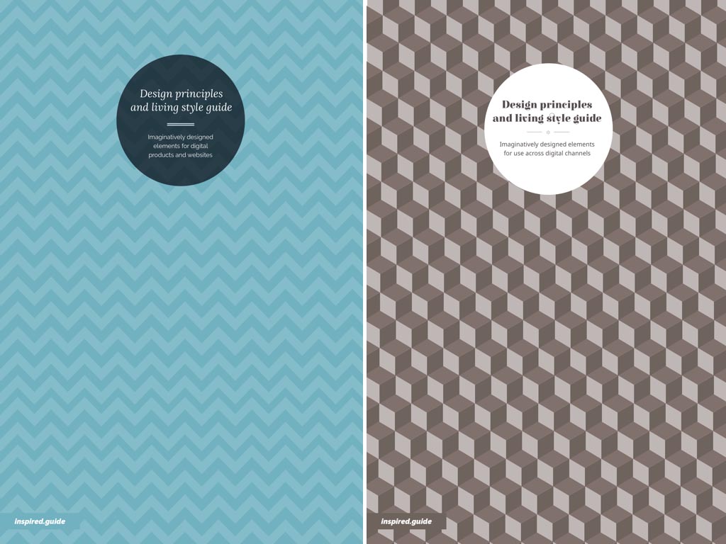
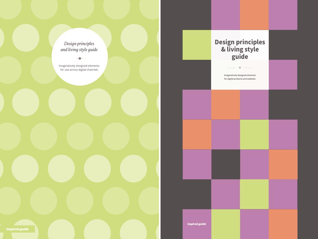
If you want to improve how you present colour information in your style guides, there’s plenty you can do. For a start, you needn’t confine colour information to the palette page in your style guide. Find imaginative ways to display colour across several pages to show it in context with other parts of your design. Here are three Inspired Guides ‘cover’ pages that are packed with colour and make an immediate impression.
A visual hierarchy can be easier to understand than labelling colours as ‘primary,’ ‘supporting,’ or ‘accent,’ so find creative ways to present that hierarchy. You might use panels of different sizes or arrange boxes on a modular grid to fill a page with colour.
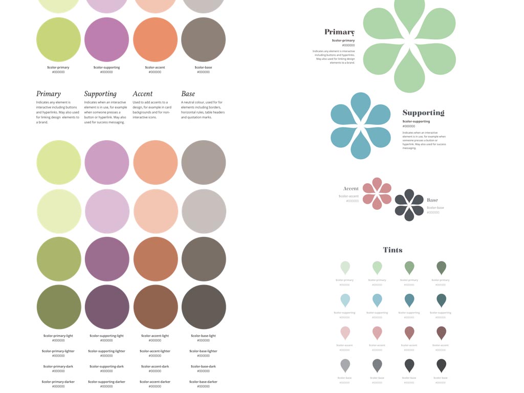
Don’t limit yourself to rectangular colour chips, use circles or other shapes created using only CSS. If irregular shapes are a part of your brand, fill SVG silhouettes with CSS and then wrap text around them using CSS shapes.
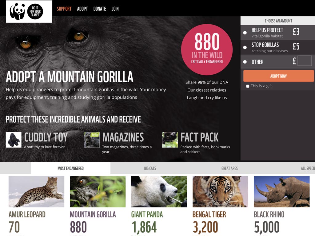
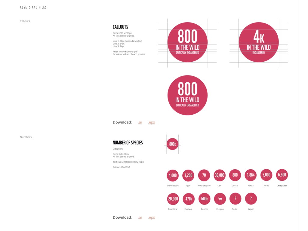
In a project last year for WWF UK, we redesigned their fundraising adoption and donation pages. To deliver the page designs they needed within the time their budget allowed, we first made a design system.
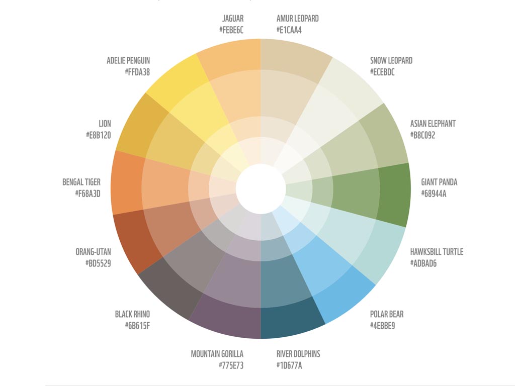
We took colours from their brand palette and assigned a different colour to each species available for adoption. We incorporated light and dark tints of each colour into an interactive colour wheel where each slice is a link to more information about using that colour.
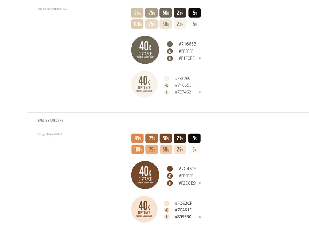
The resulting style guide includes important information about colour contrast and accessibility alongside examples of how combinations of each colour should be used.
For the style guides I design for my clients, I go beyond simply documenting their colour palette and type styles and describe visually what these mean for them and their brand.
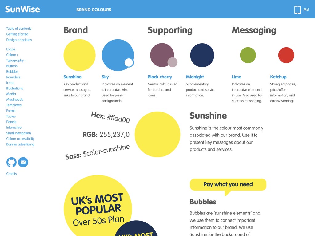
For example, on a recent project for SunLife, I described their palette of colours and how to use them across a series of art directed pages that reflect the lively personality of the SunLife brand.
Information about HEX and RGB values, Sass variables and when to use their colours for branding, interaction and messaging is all there, but in a format that can appeal to both creative and technical people.
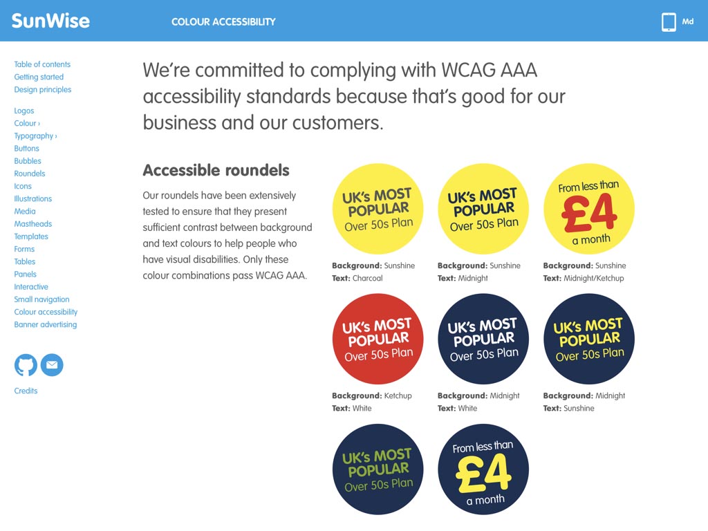
I also included information about colour contrast accessibility because understanding why certain combinations of colours are inaccessible can reduce testing times and avoid arguments about colour choices.
I work to find distinctive ways to present colour to better represent the brand and also to inspire designers. For SunLife I made header graphics that show the fun side to their personality.
I experimented with ways to communicate colour hierarchy through using various sizes and quantities of their trademark circle device.
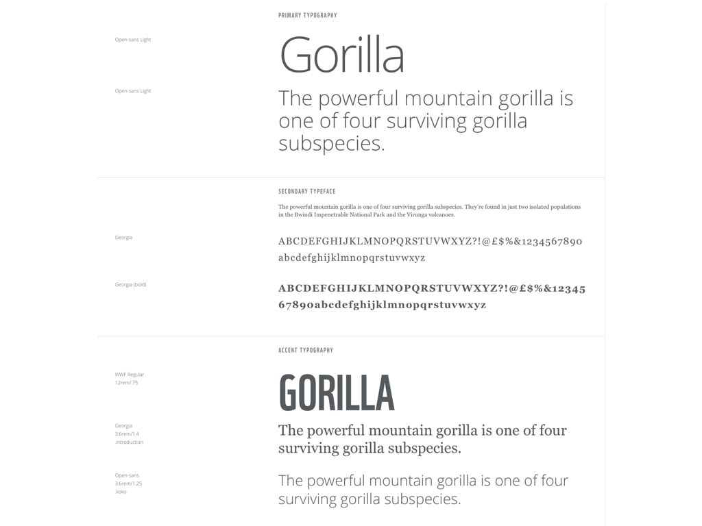
Alongside colour, typography will probably be the defining aspect of any design. We’re very fortunate now to be able to use any number of web-fonts and we’re not limited to using only fonts installed on a person’s device.
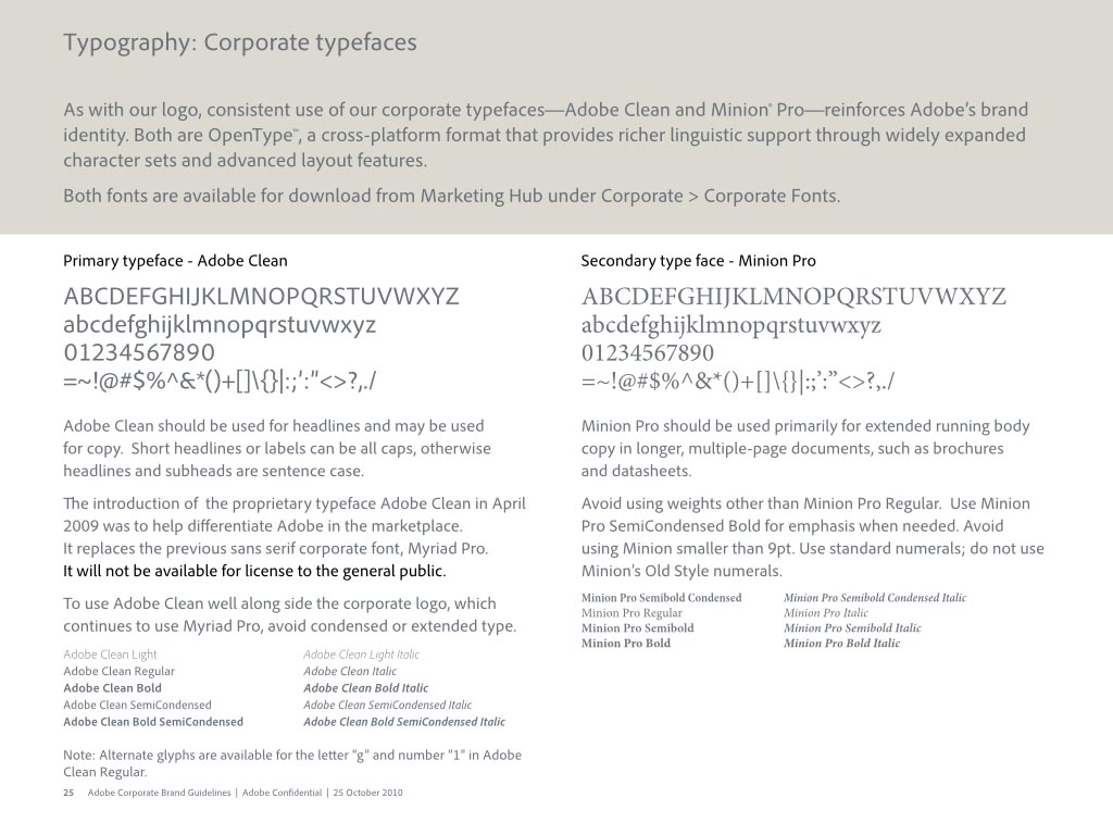
You might imagine that with so many beautiful typefaces available, style guide designers would constantly create inspiring ways to present them. You’d be disappointed though. Even Adobe, the owners of the Typekit and numerous fonts have failed to make the most from their fabulous fonts.
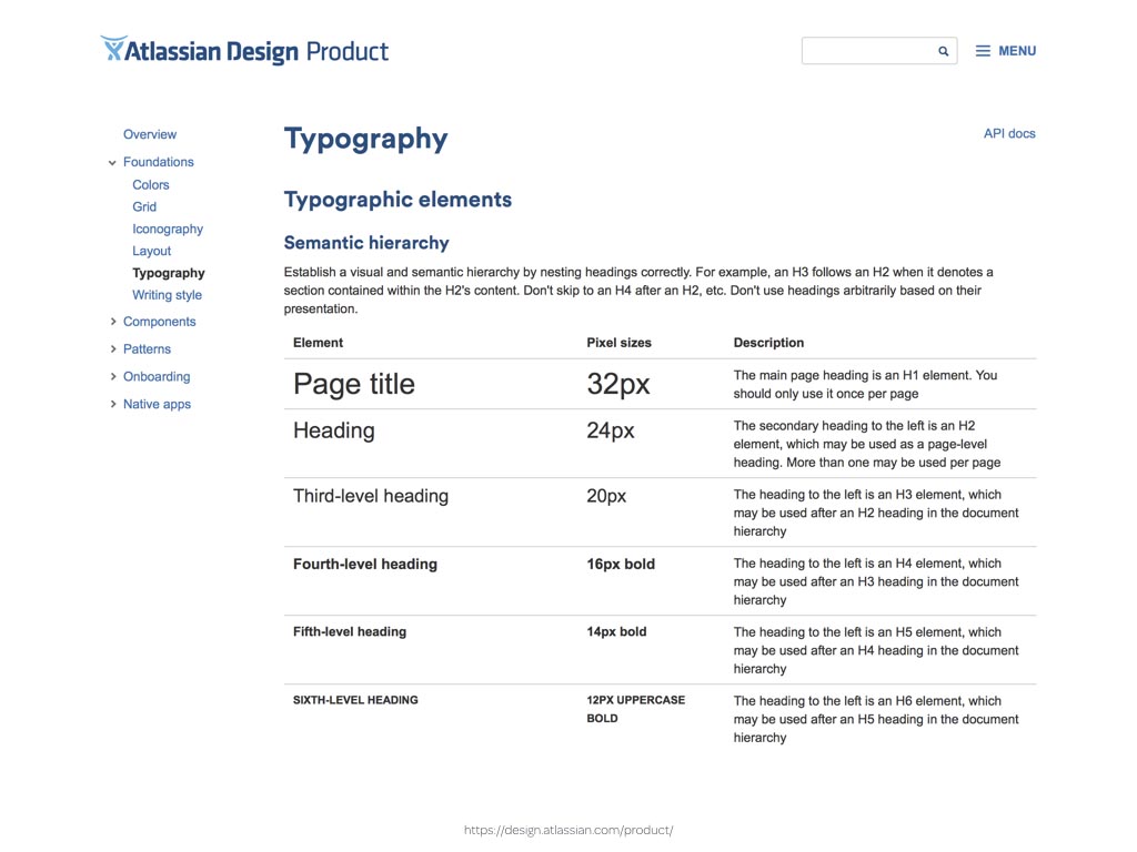
Most component pattern libraries offer documentation but not inspiration. While information about type sizes is important, so is the context in which type is used, the treatment of type at different screen widths and the way that type elements interact with each other.
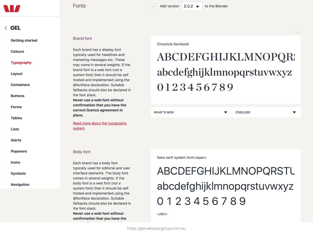
Many style guides fail in demonstrating this and even the best examples, including this GEL from WestPac in Australia, shows only a typeface’s basic set of characters and not the context including other elements and white space.
As it’s a publication with mostly written content, it would be more inspiring and informative to see examples of actual headings instead of greeking text.
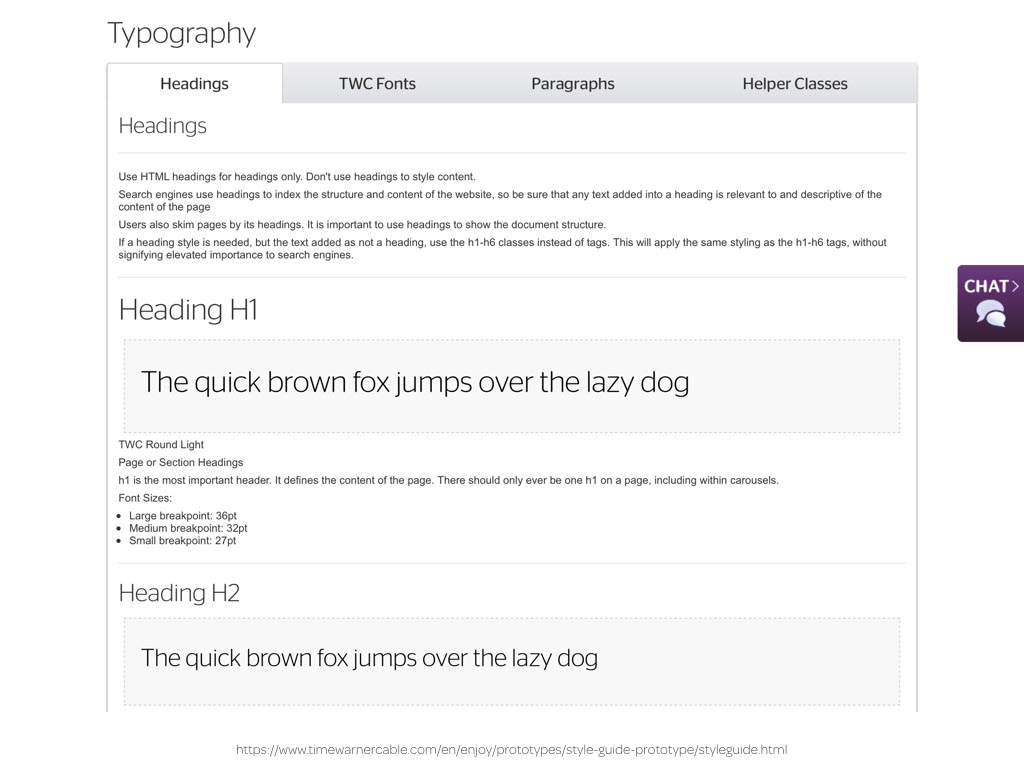
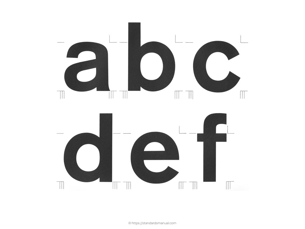
People use “the quick brown fox jumps over the lazy dog’ as it contains every letter in the english alphabet.
We can use our imaginations to better demonstrate the characteristics of a typeface quicker than any fox and with more careful consideration than a lazy dog.
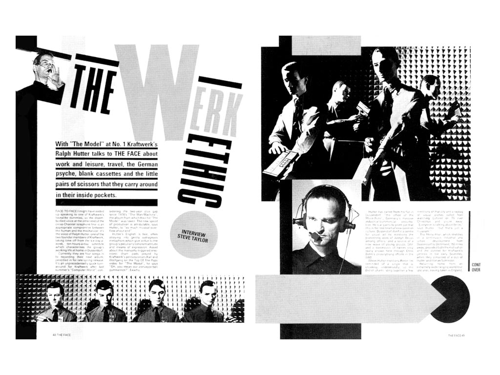
Over the past few years I’ve been rediscovering the work of accomplished art directors and graphic designers. As someone who studied Fine Art and not graphic design, much of their decades old work is new to me. In particular, I’ve been inspired by Neville Brody’s distinctive layout and typography design for The Face magazine in the early 1980s.
Learning about this work has convinced me that there’s much more we can do to communicate our use of type within a style guide.
By looking at inspiration from other medium, including print, we can learn ways to combine colour and typography to better communicate the personality and spirit of a brand as well as how to use its assets.

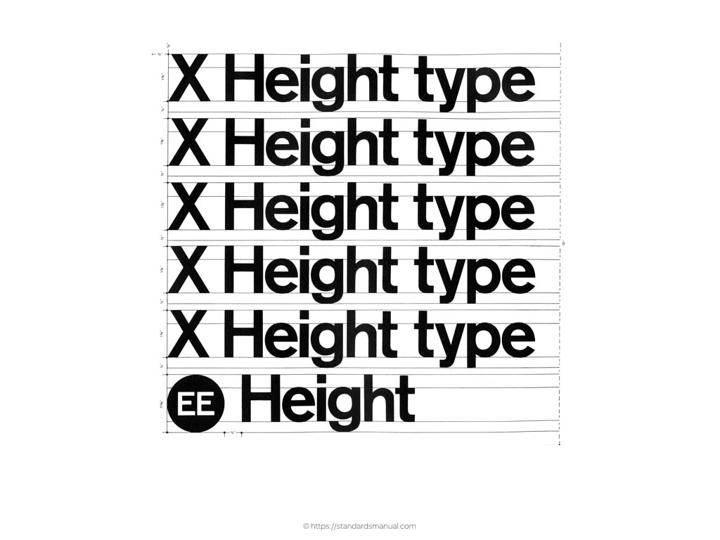
The New York City Transit Authority Graphic Standards Manual immerses a reader in the details of Helvetica, more than any other publication that I’ve read.
It showcases not just letters, but the all important and often fascinating numerals that so often get left out when making style guides.
By viewing character up close, we can get a better feel for what gives them their personality.
When illustrating type, we should also explain how its characteristics of size, thickness and weight inform the design of other elements including symbols.
Understanding how to design typography so that it’s legible and readable when presented light on dark is something that’s missing from most of the style guides I’ve read.
As is how typefaces work in combination with other icons and symbols.
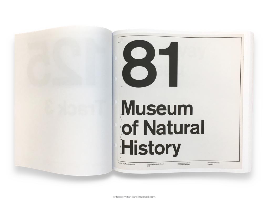
This page from the New York City Transit Authority Graphic Standards Manual does a fabulous job of demonstrating how Helvetica’s numerals and letters of different sizes combine to create a design that would look at home on the New York Metro.
Style guides should inspire designers by demonstrating potential applications for typography and other design elements. The NASA Graphics Standards Manual does just that.
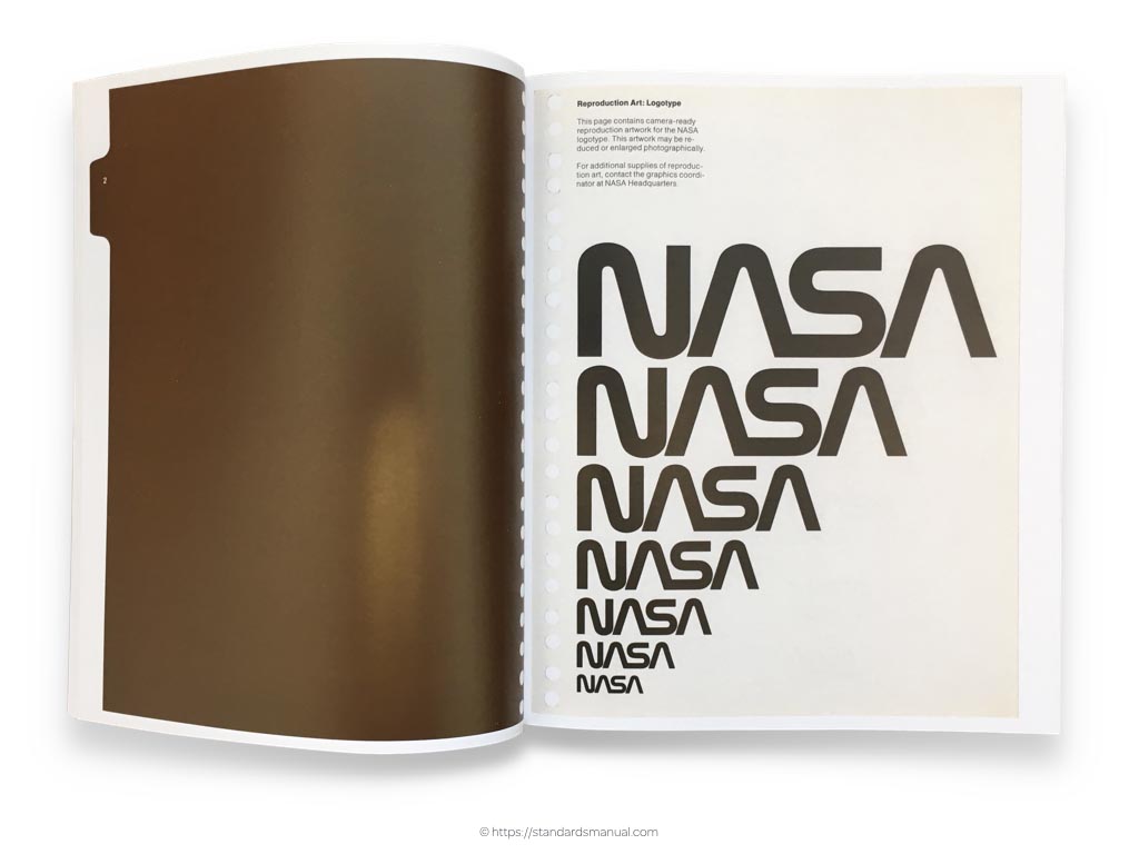
It first presents NASA’s iconic logo.
I enjoy how the designers have explained the background to the typefaces they’ve chosen and I know from experience that including explanations like this in a style guide can help people see that fonts are the result of creative processes that should be supported by buying them and not just commodities that come installed on a device.
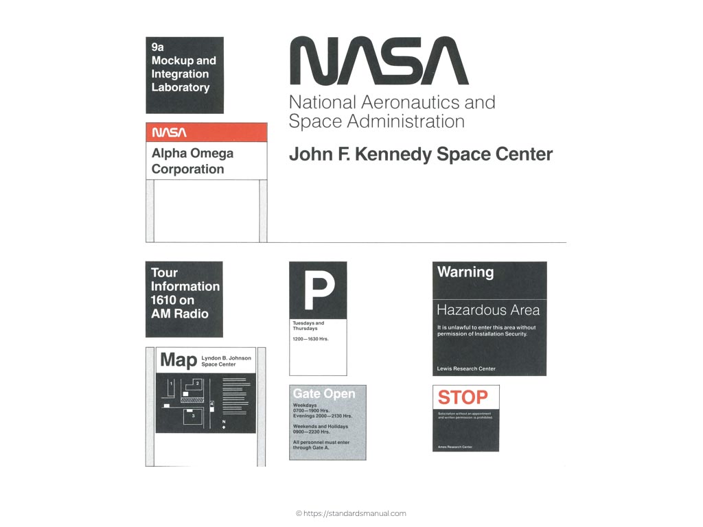
NASA demonstrate how to use their branding on signage.
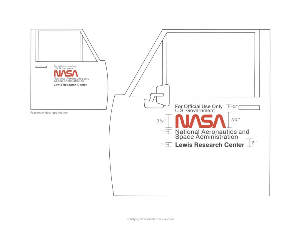
As well as on vehicle livery.
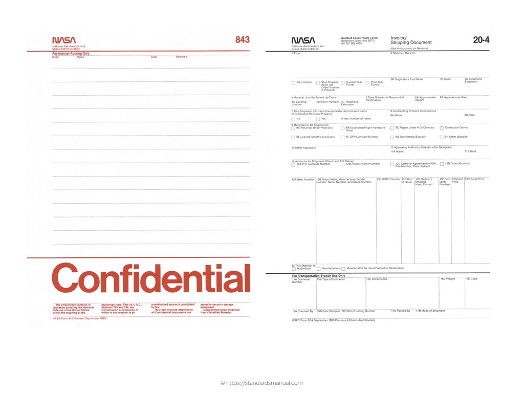
It’s also important to demonstrate how to use typography on even the most mundane items. These are paper forms from NASA, but they could as easily have been email newsletter templates or signatures which all benefit from better typographic design.
In Inspired Guides, the typography pages include examples of cases, styles and weights of both primary and supporting typefaces. I’ve included information about white space and well as demonstrating how type treatments should vary when presented light on dark.
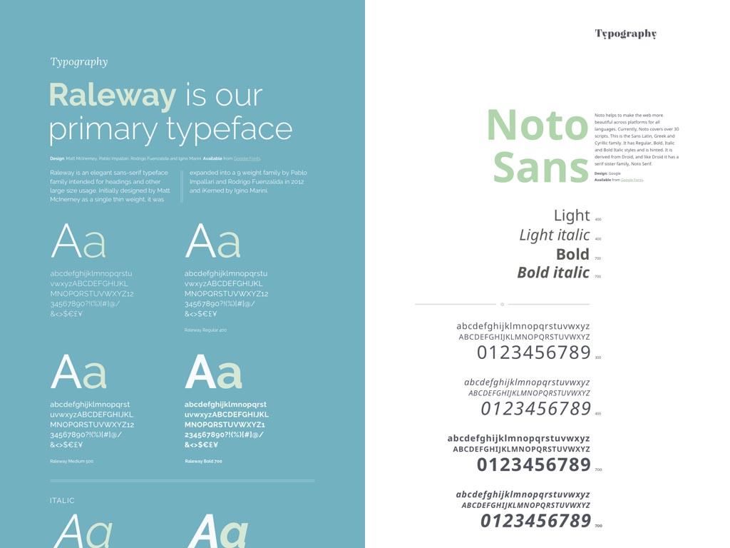
Inspired Guides come connected to popular Google Fonts, but can be easily configured to include Typekit or self-hosted fonts. As a design often includes as supporting as well as a primary typeface, we’ve suggested pleasing pairings and devised interactive ways to show the relationship between two typefaces.
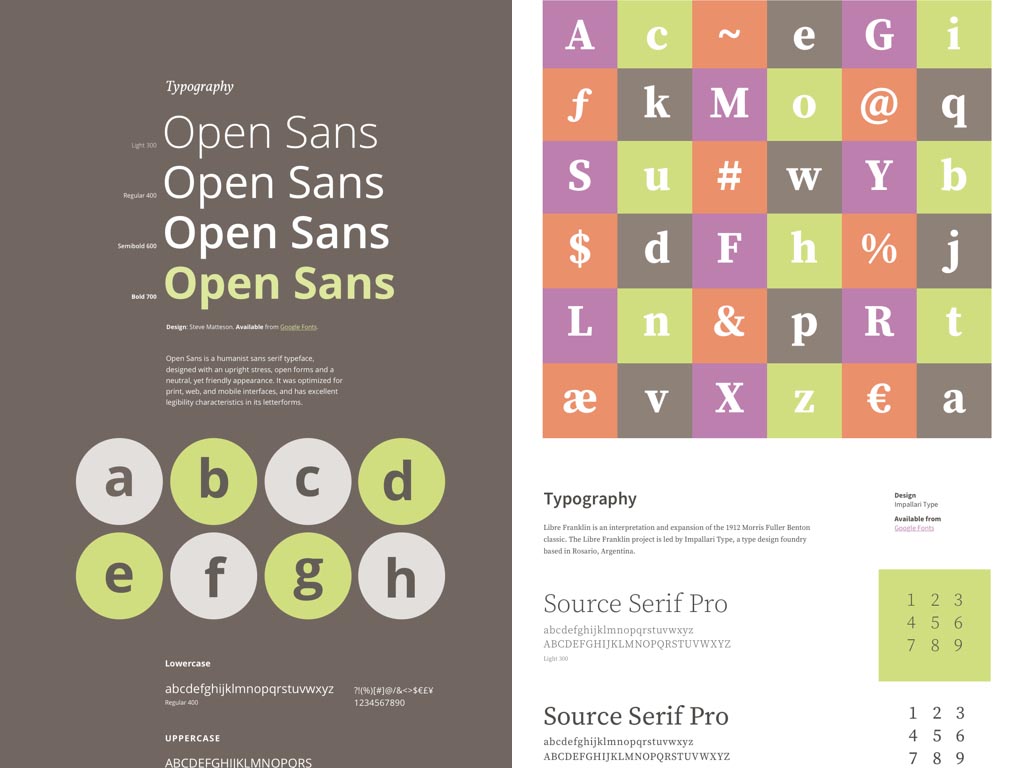
Many typefaces contain distinctive letters, numerals or symbols, so some of our designs offer space to showcase them.
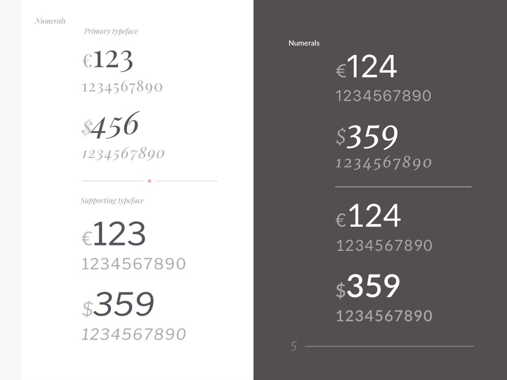
Rather than overlook numerals, I’ve designed pages to showcase them and most importantly when and why someone should choose to use numerals from a primary or supporting typeface.
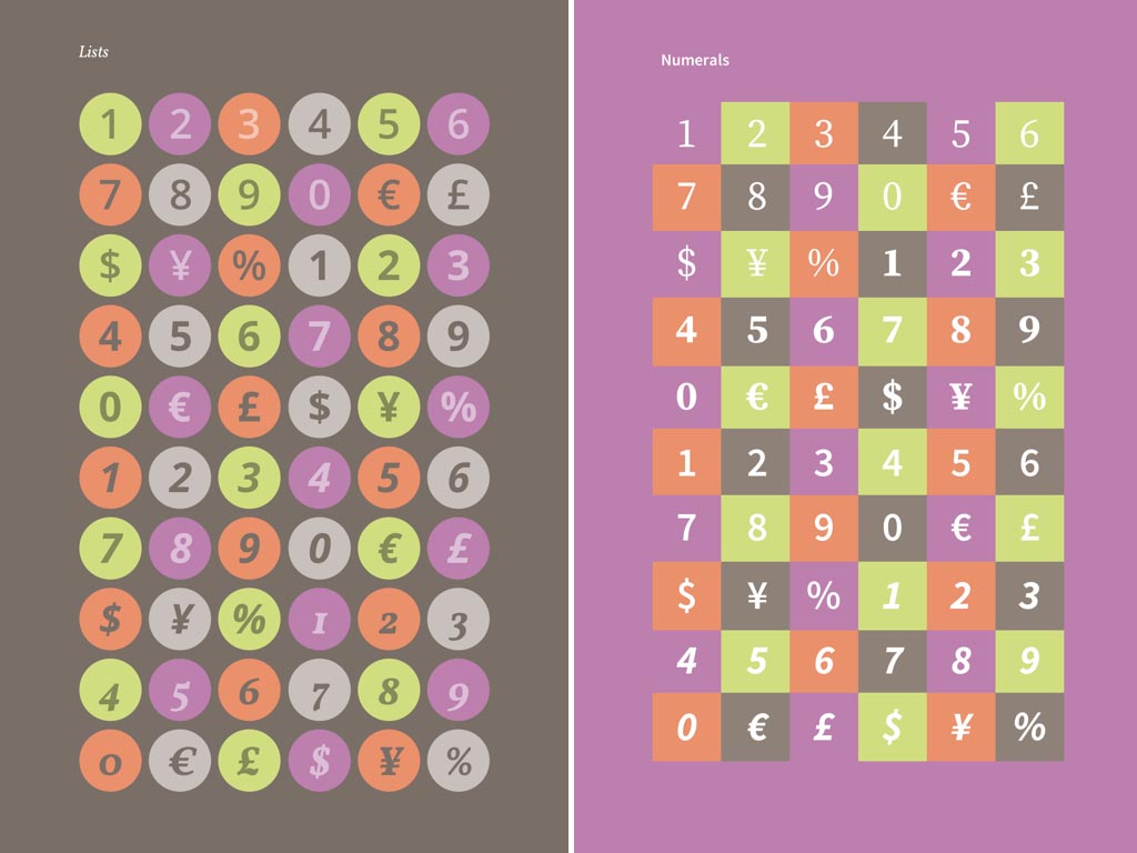
Pages of numerals can be fun, so find ways to display them that are as attractive as they are useful. These collections of numerals and symbols are marked up with an ordered list and styled using Flexbox.
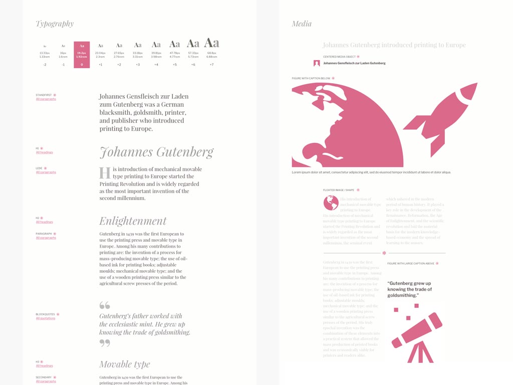
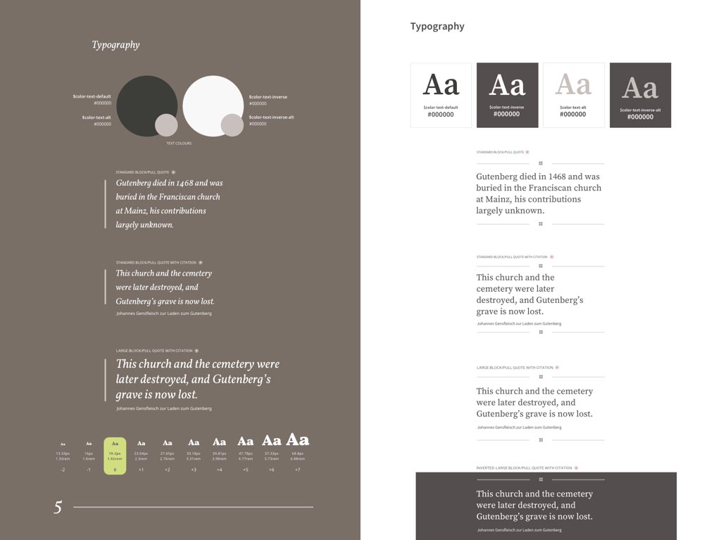
To give people a better understanding of how to use them, as well as breaking type down into its component parts— headings, paragraphs, lists and quotations—it’s important to show them in combination with other elements. For example, large images provide scale for the size of caption text.
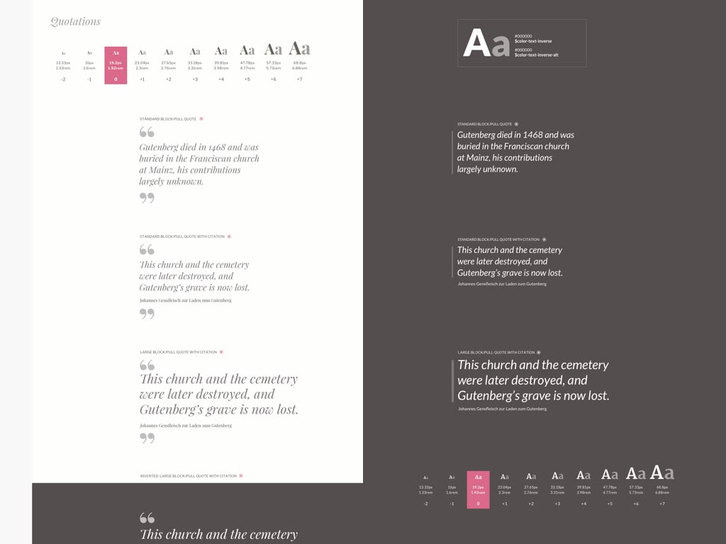
Provide extra context by demonstrating a type element alongside a typographic scale and provide information about colour at the same time.
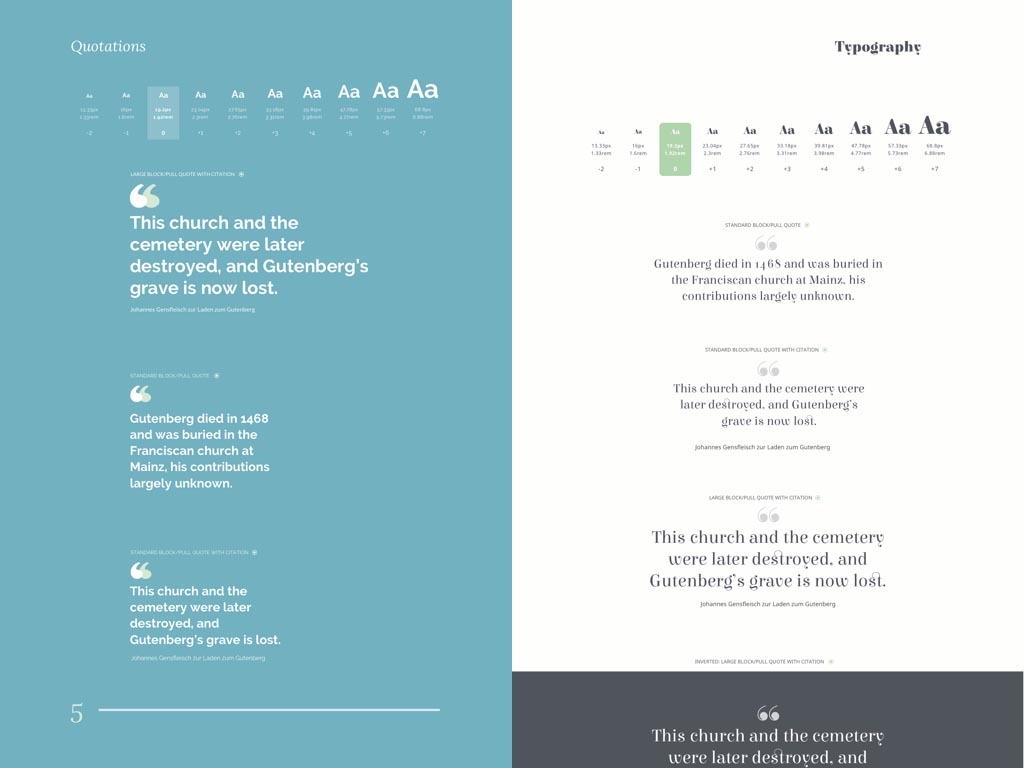
Use the process of designing a style guide to expand your repertoire of designs for elements that often get forgotten, such as block and pull quotes.
Take the opportunity to bring designers and developers together around the style guide to talk about the possibilities for creative design without sacrificing performance or responsiveness.
Without guidelines to follow, when we were designing for WWF UK, we had to think very carefully about how to set their already chosen typefaces. We experimented by making simple type sheets in HTML and then testing them on several devices so that we could understand the minimum and maximum sizes to use.
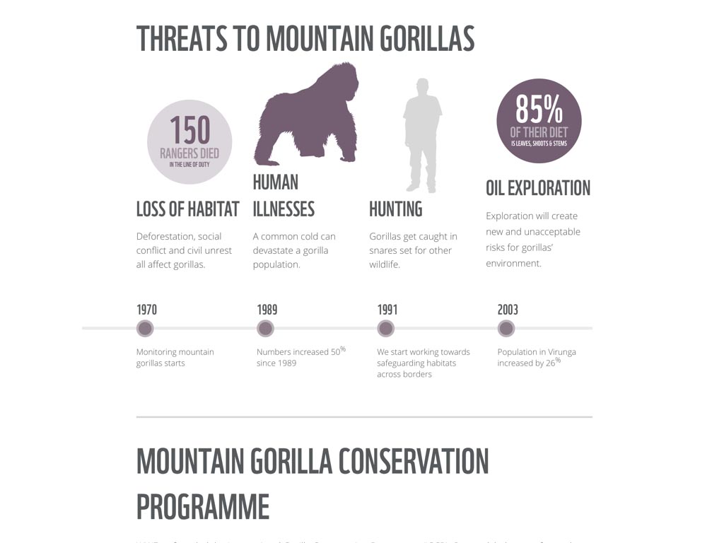
The style guide that we designed for WWF includes a breakdown of type elements as well as organisms and even full templates to give the fullest impression of our typographic design.
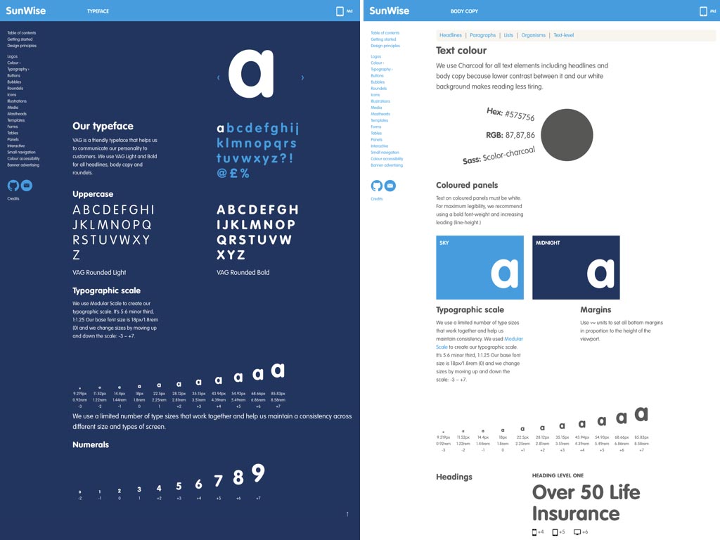
We took a similar approach in our more recent work for SunLife, demonstrating the personality of their VAG Rounded typeface through an interactive UI alongside information about our modular scale and use of colour.
The SunLife style guide is responsive by default and includes larger organisms, banners and common navigation, to ensure that all parts combine to create a coherent whole.
To be effective a style guide’s typography shouldn’t be reduced to its constituent parts and should instead be seen as an ensemble of type elements that each play a part in the design while complimenting each other.
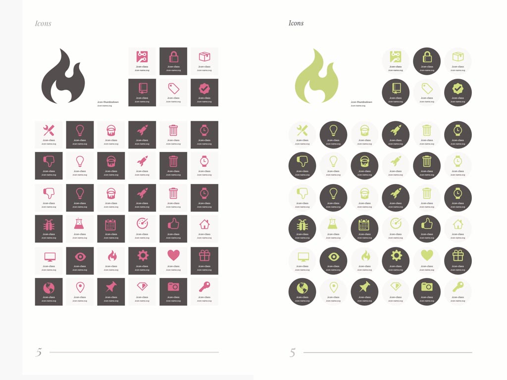
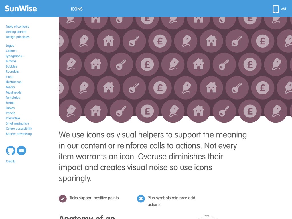
Let’s turn the spotlight on how style guides and component pattern libraries routinely display iconography as graphic images and icons are an important element in the design of many digital products and website.
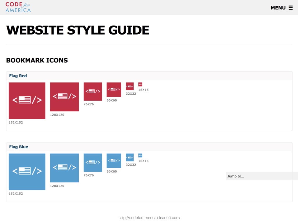
The Code For America style guide presents their icons at several sizes but the designers at ClearLeft haven’t explained how the design of those icons should adapt when reproduced at very small sizes. They’ve also missed an opportunity to demonstrate an example of adaptability and responsiveness by not using alternative crops within a ‹picture› element.
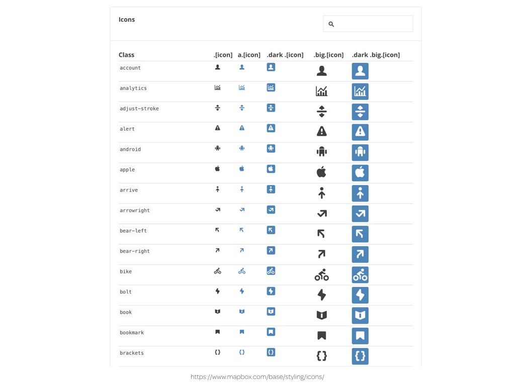
With so much creative effort spent on designing them, you might expect that, alongside actual size reproductions, designers would be aching to reproduce icons large enough for us to appreciate their details. I wish that Mapbox style guide designers had thought harder about designing an icon viewer that combines necessary information with an imaginative interface that makes the most of their icons.
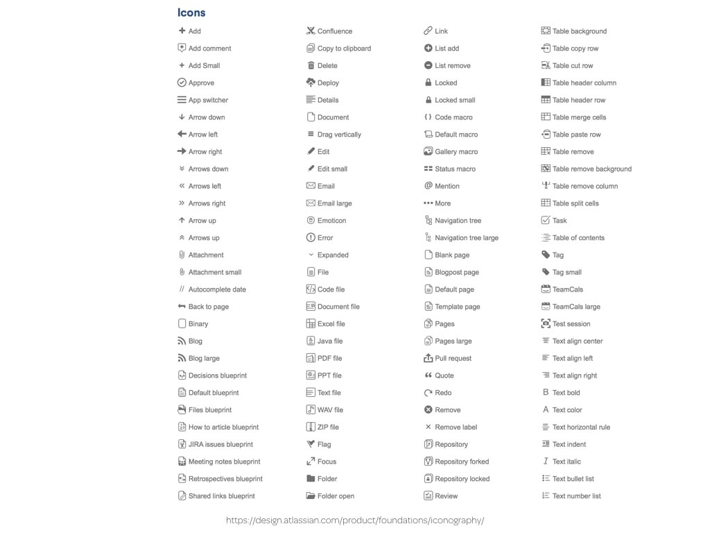
Sadly, Atlassian’s icons style guide says nothing about how to create new icons that match their existing set.
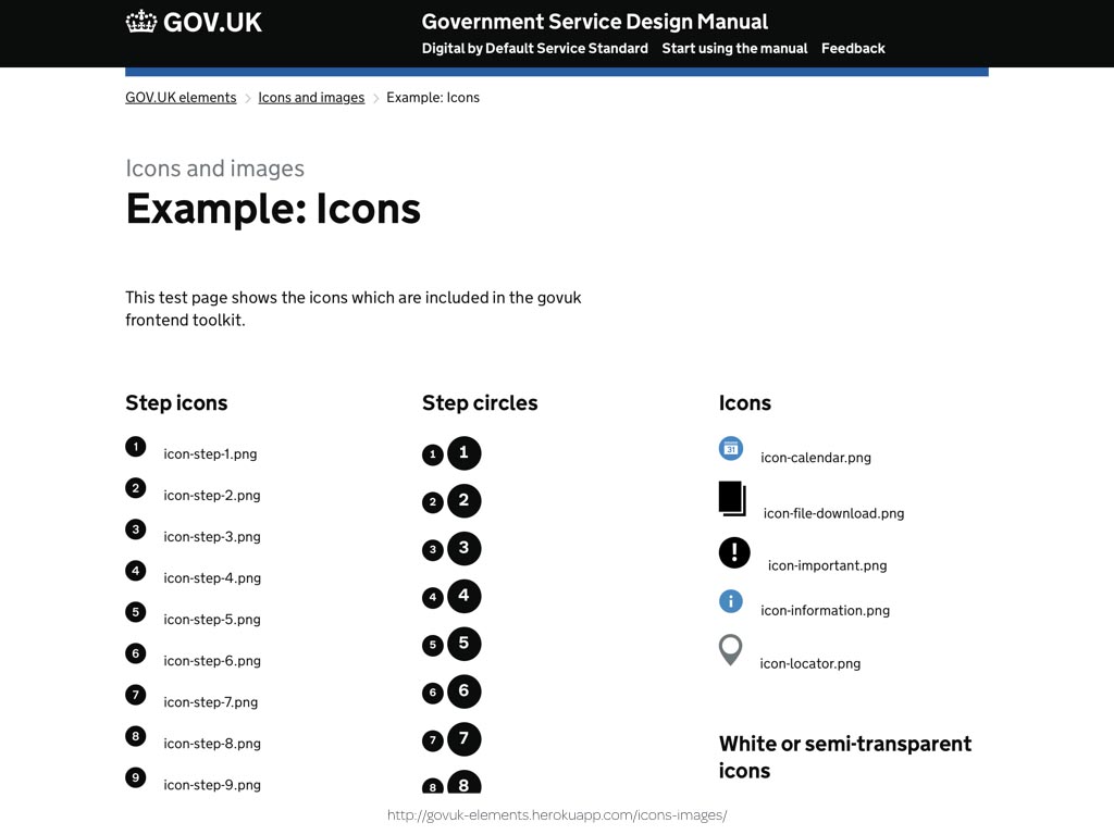
Meanwhile at GOV.UK, I’ve finally found those circles.
It’s easy to poke fun, especially at GOV.UK, but it’s hard to get the design of a style guide right because they often have different audiences in designer and developer who need different things from a guide. Developers might need file names and CSS class attribute values, while designers may need to learn how to create new icons with the same visual styles as existing ones. Satisfying both needs might be difficult, but the challenge is no more difficult than those we face every day when designing our products and websites. I’m convinced that we can do much better.
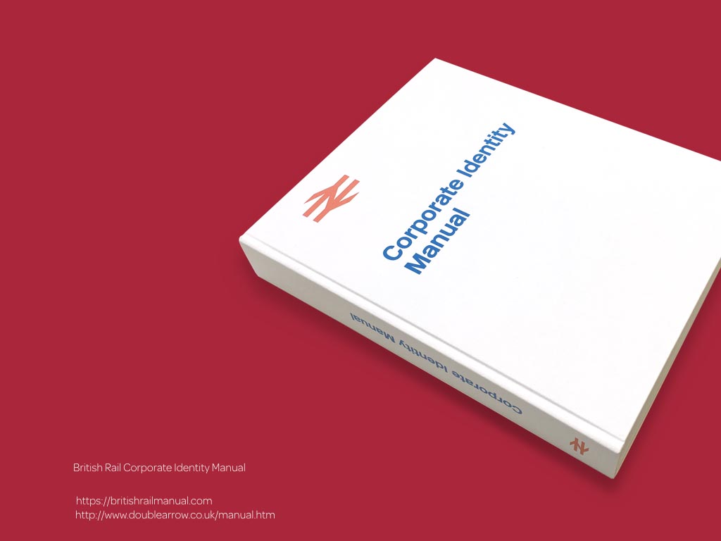
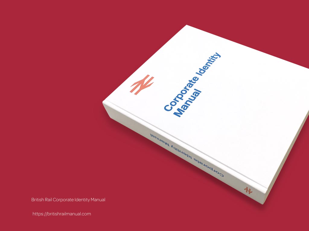
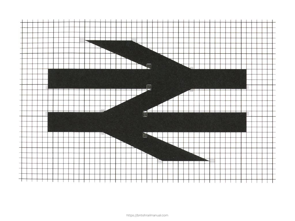
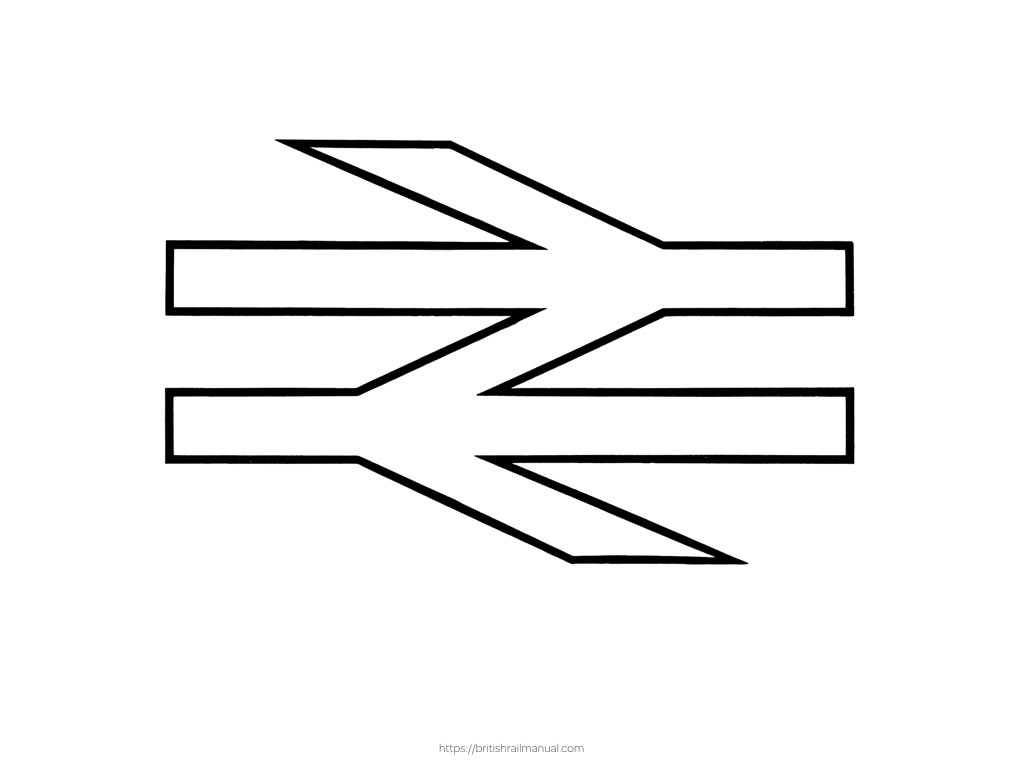
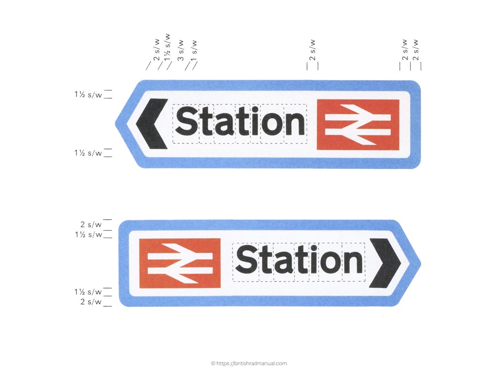
You might feel more than a hint of nostalgia when looking through British Rail’s Corporate Identity Manual.
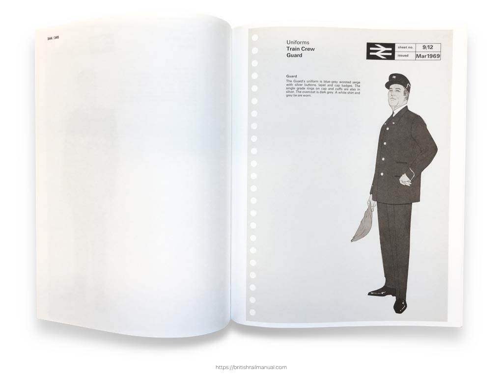
It’s iconic visual identity extends to its locomotives and the uniforms of people who used to run them.
The best style guides explain the ‘why’ and well as the ‘how’ and this is especially true when it comes to the design of logo marks and symbols. As someone who didn’t study graphic design, I’m fascinated by explanations of how symbols were created.
Understanding the thinking that went into designing a symbol can help people appreciate how and where to use variations of it.
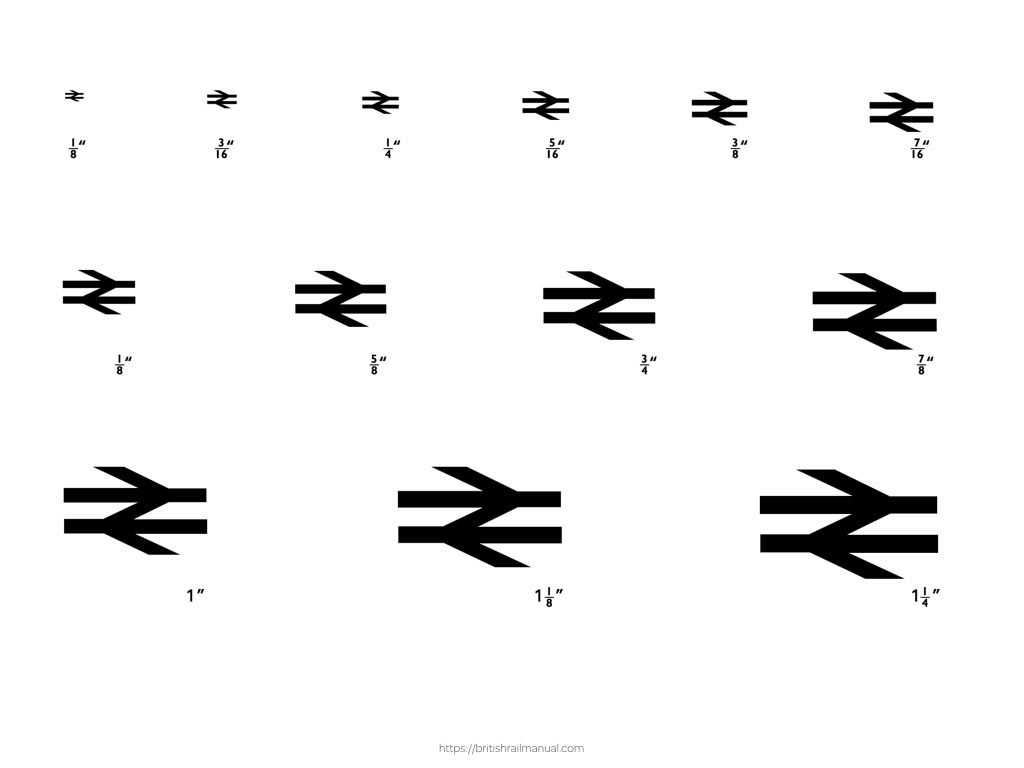
This matters more than ever now that a symbol could be reproduced at any number of sizes across a vast array of devices. Responsive style guides can themselves demonstrate the appropriate size or version of a symbol so that it remains clearly recognisable.
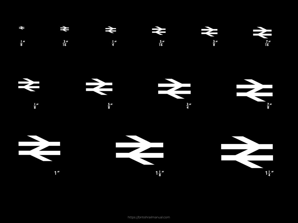
This is especially important when light coloured symbols are used against dark backgrounds.
Colour, icons and type should compliment each other within a design and style guides should demonstrate how to combine these elements to achieve the most effective result. I love the precision involved in designing this signage and is it only me who thinks that these could be the best designed website buttons of all time?

Knowing how an icon’s been designed goes hand-in-hand with understanding how to use it.
Fully appreciating principles and proportions makes working an icon into a design at the right size and with the appropriate amount of white space around it much easier.
Of course not every icon or symbol needs precision.
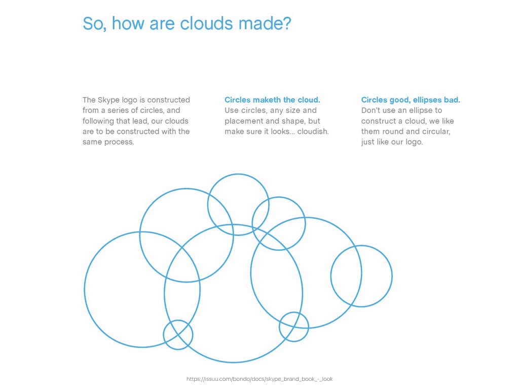
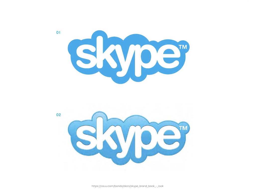
I’m always amused when I read that to “maketh” the Skype cloud, we can “use circles, any size and placement and shape, but make sure it looks… cloudish.”

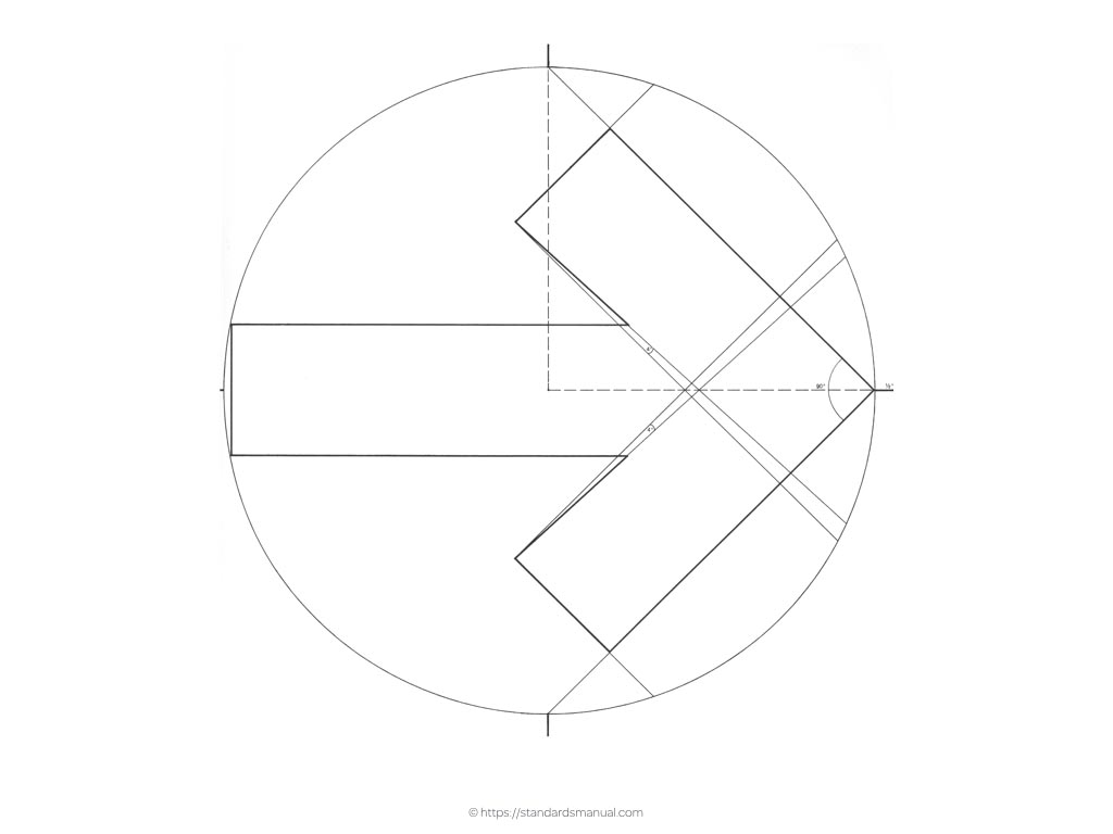
In stark contrast, the Official Symbol of The American Revolution Bicentennial Graphics Standards Manual goes into great detail when it describes how their symbol was created.
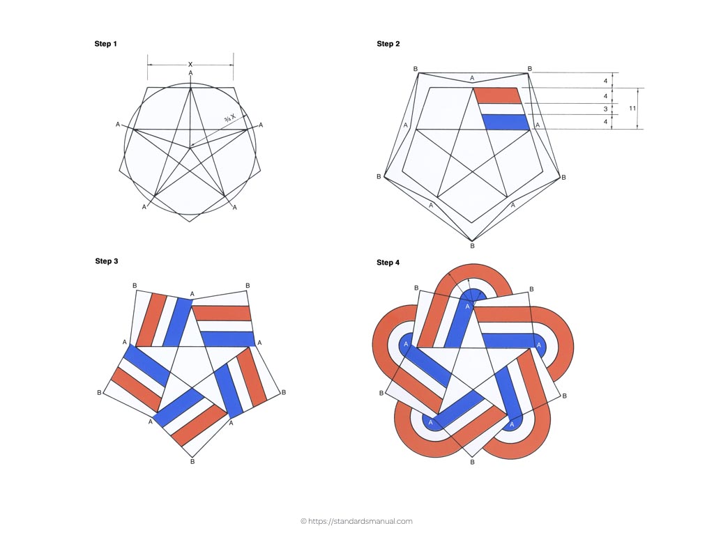
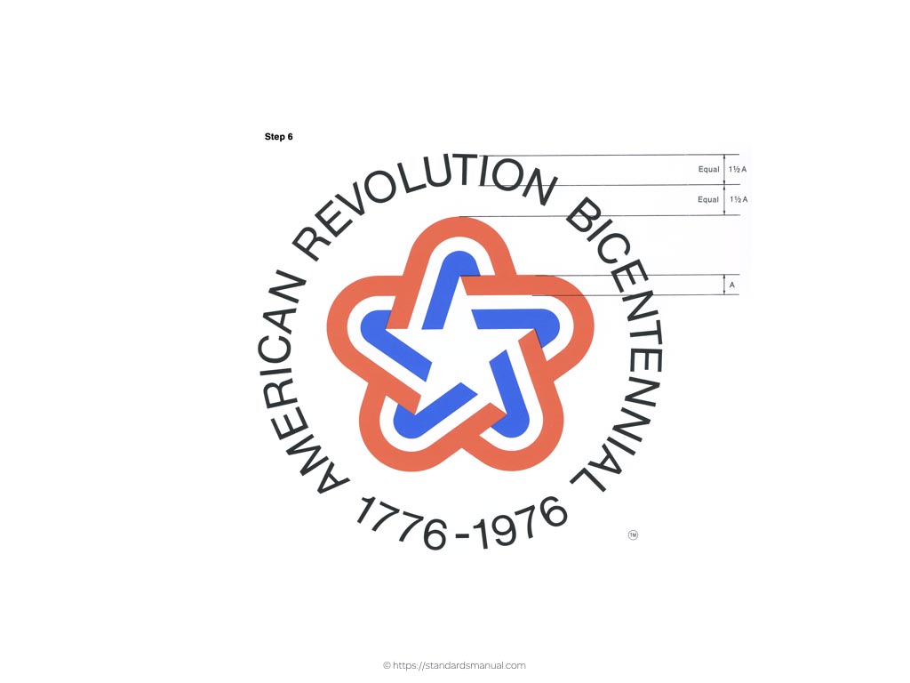
The manual painstakingly describes maintaining proportions between the symbol and surrounding text.
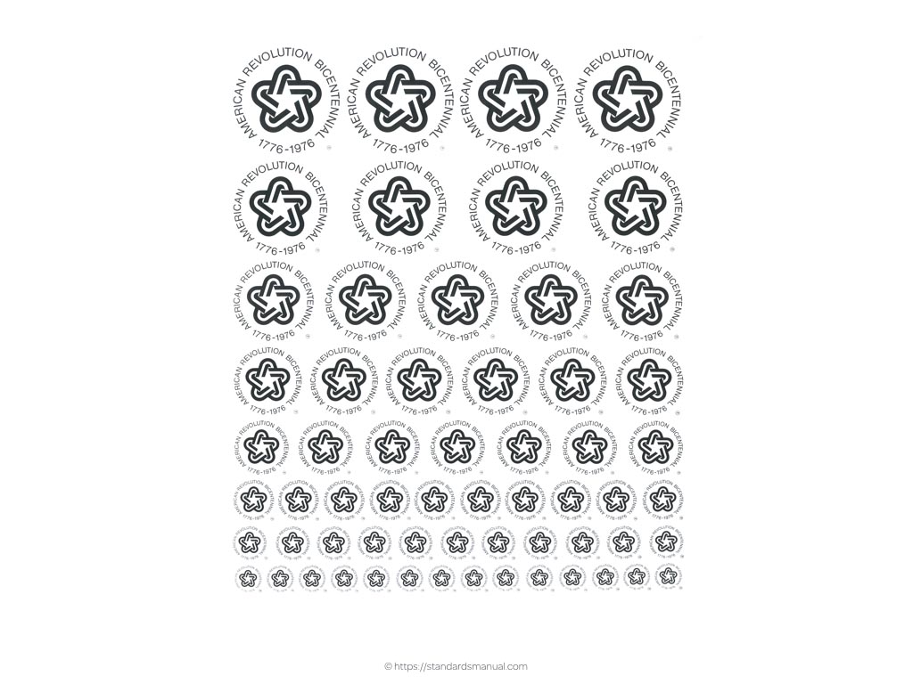
What interests me is whether those proportions are applied to every size of symbol?
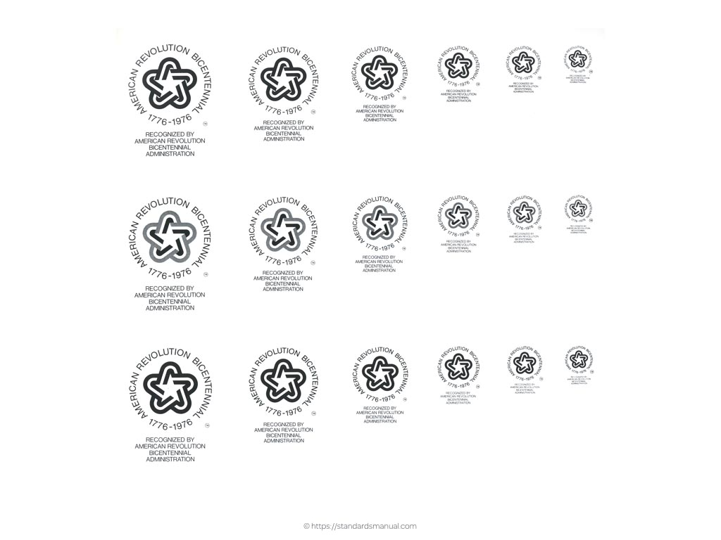
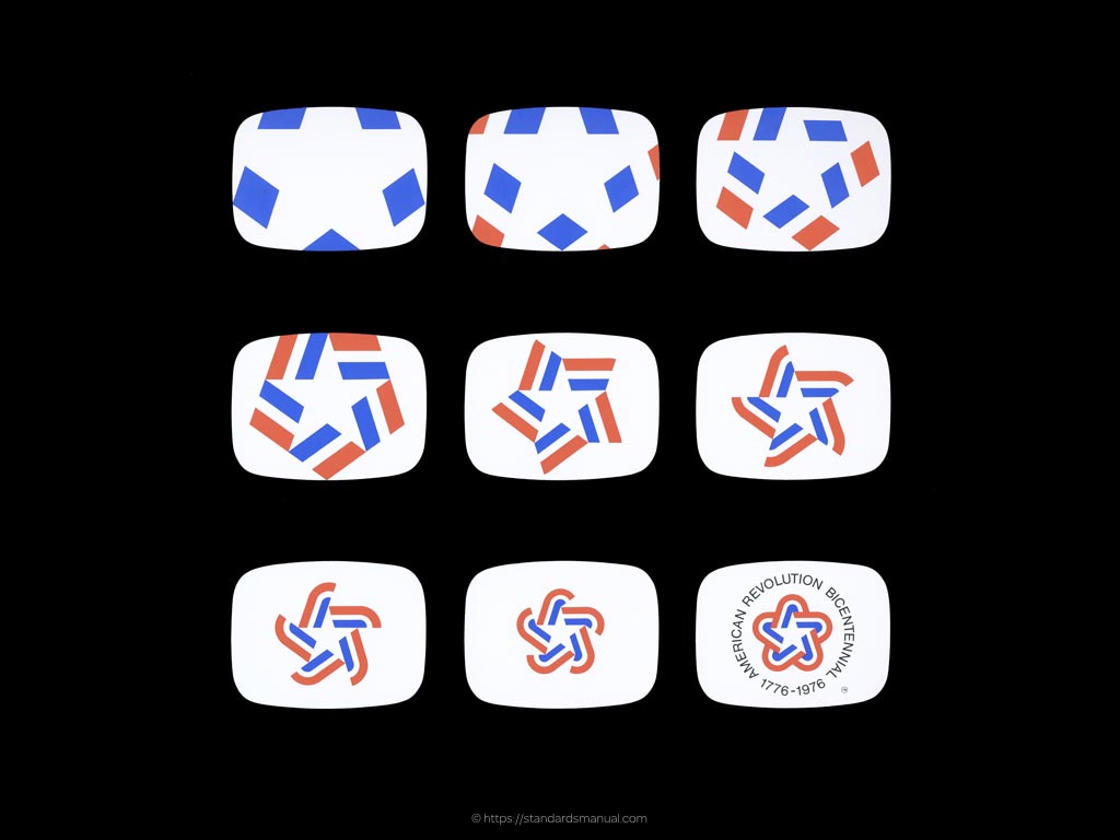
Reproductions of graphic design manuals like the Symbol of The American Revolution Bicentennial are the perfect place to look for inspiration to improve the beauty and effectiveness of our style guides and component pattern libraries.
I’m currently working on ways to present iconography in Inspired Guides, while ensuring that people with different needs can find the information and inspiration that they’re looking for.
For the style guide I designed for SunLife, I went beyond simply documenting the icons that we’d chosen and adapted for them and to use the icons themselves to add personality to the style guide itself. As with almost all of the pages in their style guide, the icons page was thoughtfully art directed to explain the anatomy of an icon, how to design one with correct proportions and when and where to use it.
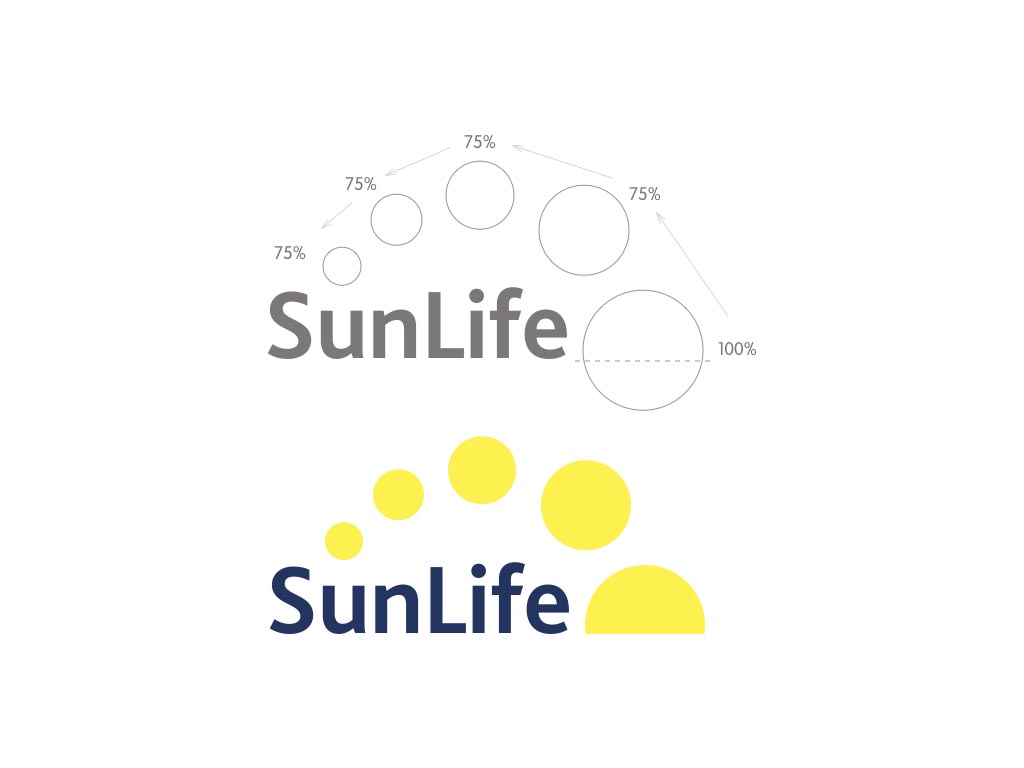
For example we adjusted the SunLife logo so that each circle is 75% larger than the one before it in the sunrise.
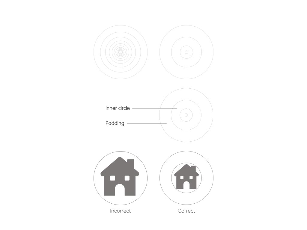
Our style guide explains how we used those proportions to create a grid which should form the foundation of all new icon designs in the future.
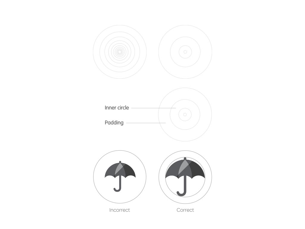
We described using those same principles to create new graphic illustrations, so that every graphical element has a relationship with the proportions in the SunLife logo.

Explaining these processes clearly to future designers will help to maintain standards and consistency as their collections of icons and illustrations grow.
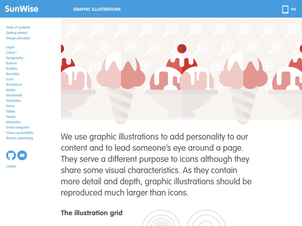
And because showing is always better than telling, we used those same graphic illustrations across the SunLife style guide to help bring it to life.
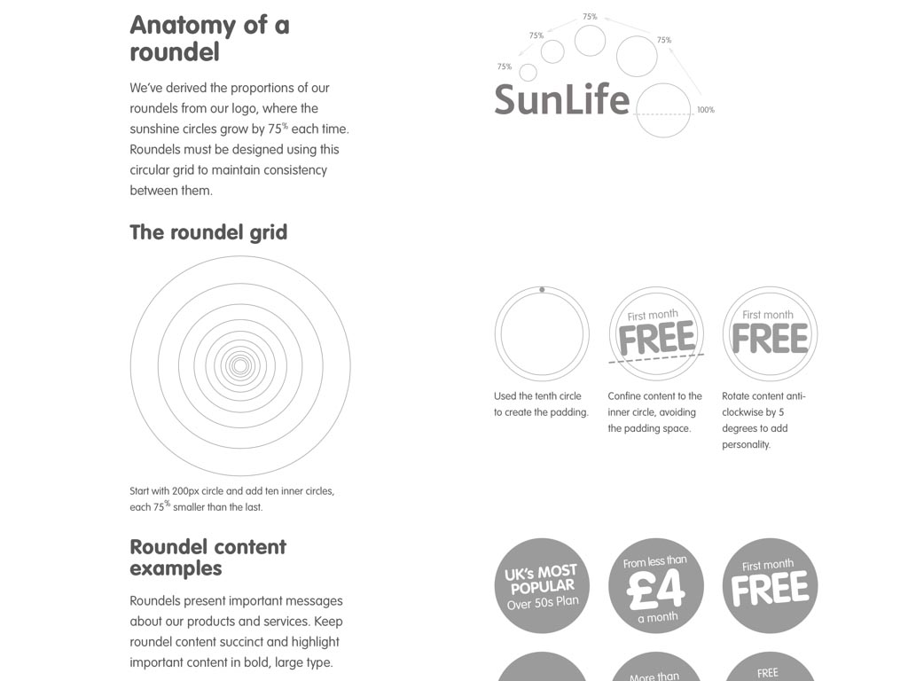
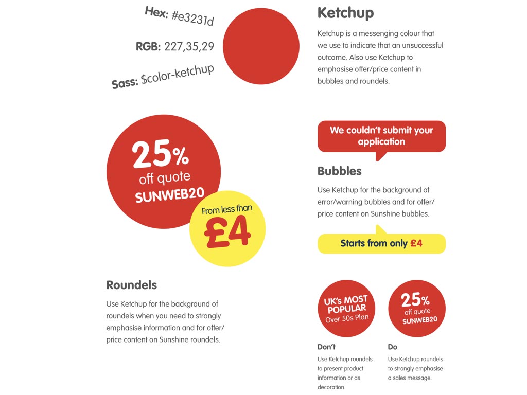
SunLife had existing graphic devices, including roundels and bubbles, but no clear system on how to use them. As a result there was a disconnect between how they used these devices in print versus on digital channels. It was our job to establish and then explain in the style guide how roundels should be made, what types of content they should include and what colours they should be to help communicate the correct messages.
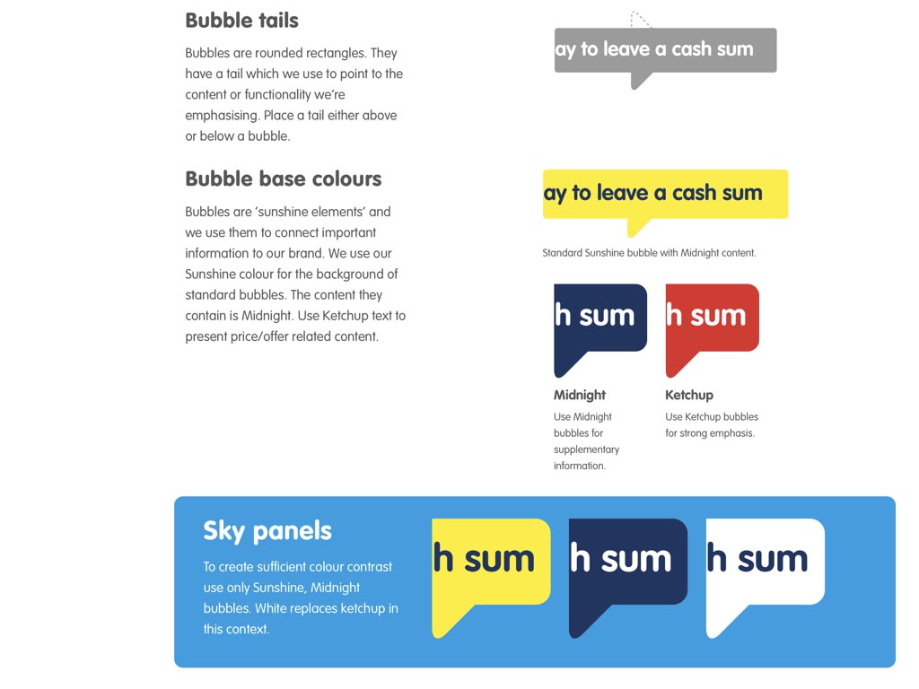
We took the same approach with SunLife’s bubbles which became a natural fit for help text and feedback messages online.
In all the work that I do, I try to improve not only how something looks, but how effective it is through creative design. Style guides should be much more than guides to a library of patterns. They can inspire people to make better designs. They can teach people the value of good design and why it’s so important to keep standards high.
A style guide’s the perfect place to experiment if you’ve been aching to experiment with new design and layout techniques such as CSS Grid and Flexbox, free from the normal constraints of browser support.
For Inspired Guides I wanted to stretch expectations about what a style guide developed with HTML and CSS could look like and my own knowledge of how to use new technologies. Inspired Guides are full of subtle uses of CSS blend modes, calc, feature queries and Flexbox which I hope will inspire people to learn more about how to use those technologies.
A style guide is also the perfect place to write the history of your design, stories that are so often lost due to the fast pace of today’s design and development environments. Instead of showing only finished work in a case study on your website’s portfolio, write about your thought processes and show how you design evolved through its iterations. This information is important in helping to document the history of web design.
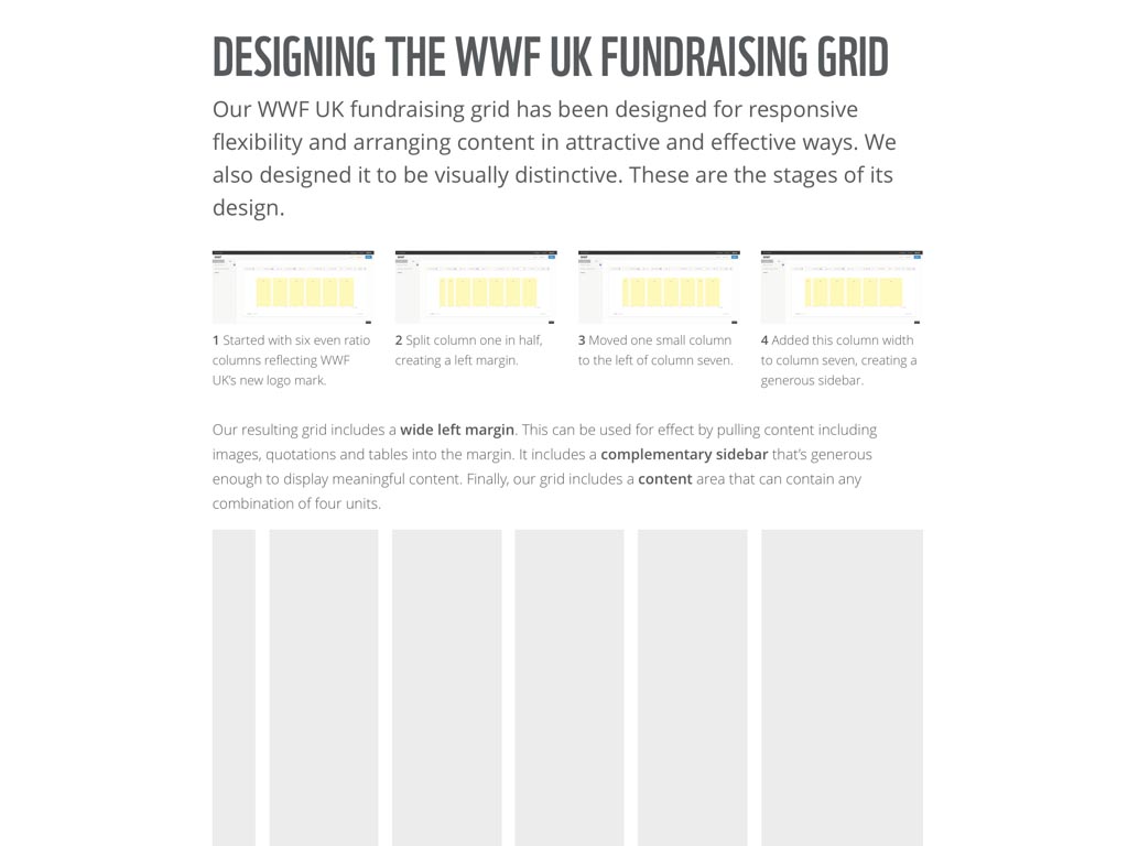
When I designed a style guide for WWF, I devoted several pages to explaining how and why I’d designed an unusual asymmetrical grid. I also showed the steps I’d taken and the tools I’d used.
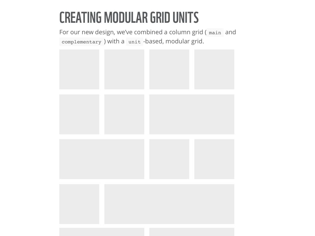
Parts of my design for WWF were based on a modular grid system which is rarely used online, so the style guide was the perfect place for me to write about that system to help educate the designers who would be using it on future projects.
WWF liked my style guide design so much that they christened it Bamboo. The next step will be to use Bamboo as a tool for hosting offline as well as online assets.
The best systems are based on a solid set of design principles, so it’s important that a style guide explain those principles.
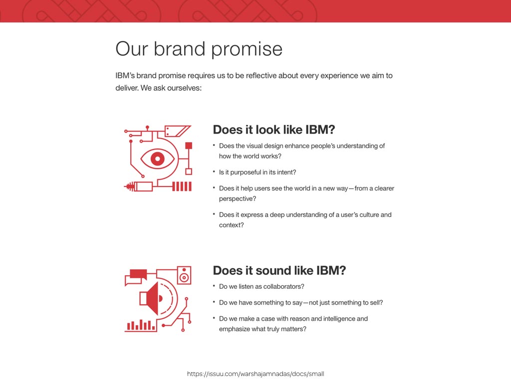
These are something that IBM’s brand promise describes well.
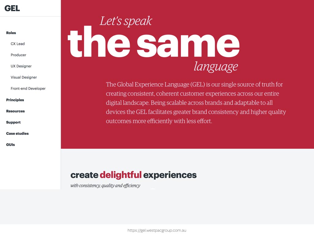
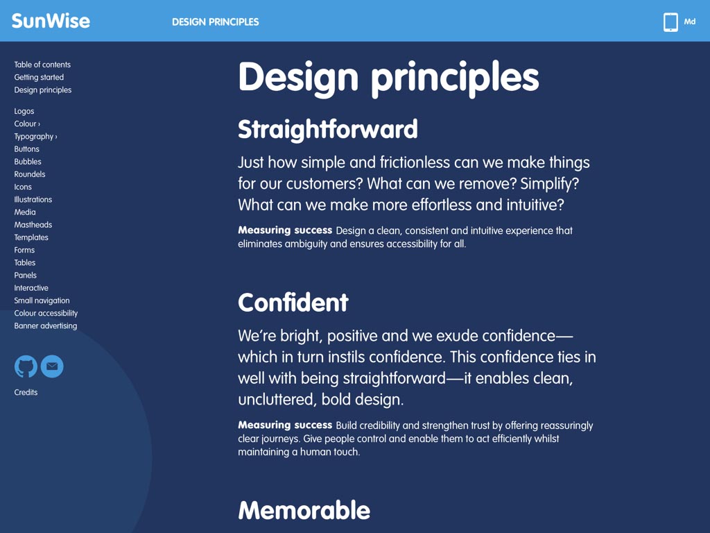
WestPac’s GEL does it even better by bringing together a wealth of material that’s relevant for people in designer, developer and other roles.
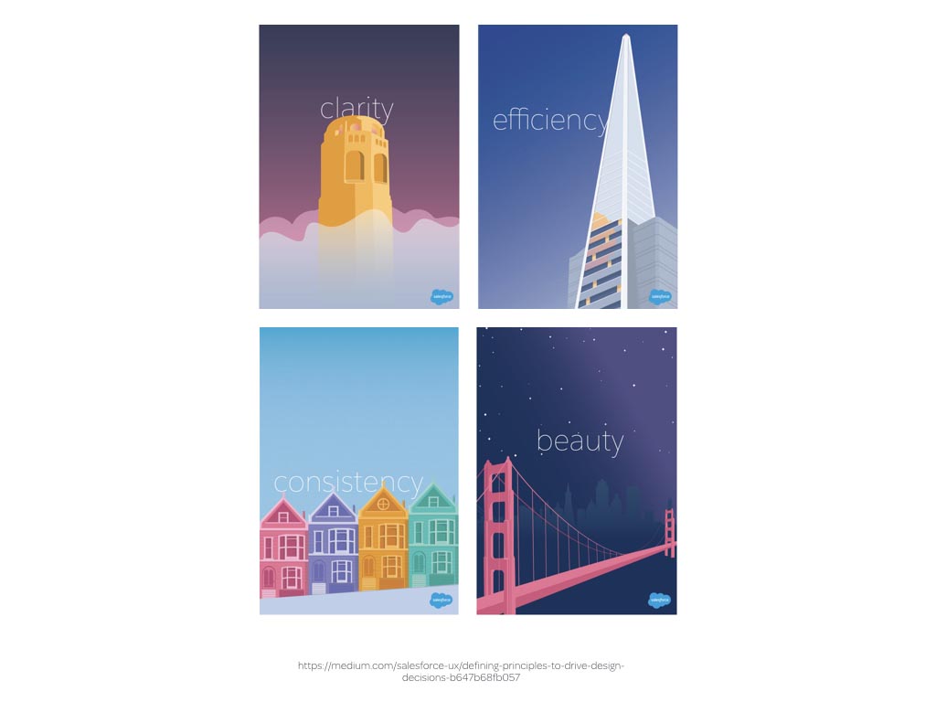
Why not bring your design principles off the screen and into the three-dimensional world? An intern at Salesforce designed these beautifully design principle posters featuring San Francisco landmarks like the Golden Gate Bridge and these now remind people at Salesforce of their design principles everyday.
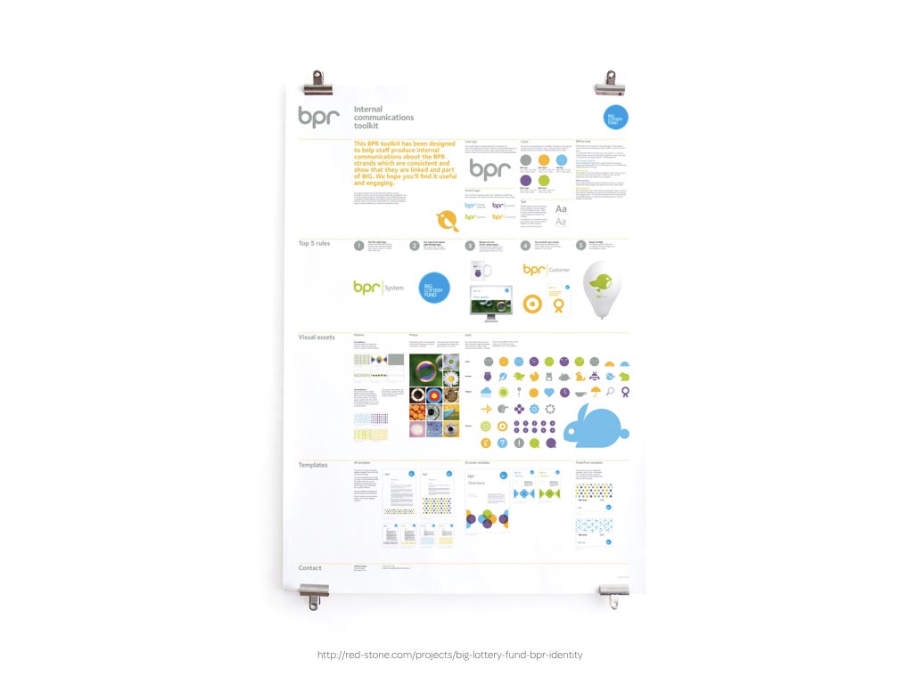
In fact, you might choose to break the model altogether and combine all the elements of your visual identity and patterns into a single sheet poster that your designers, developers and third-party suppliers can hang on their walls.
I hope that I’ve inspired you to think more creatively about the design of your own style guides, component and pattern libraries and why that’s important in improving how well they inspire and inform them.
If you’d like to hire me to help you design your style guide, I’d be happy to hear from you, and look out for Inspired Guides. I hope that you have as much fun using them as I had designing them.
Thank you very much for listening.
A premium Eleventy starter kit for designers and developers who want to spend less time setting up the same project structure and more time designing distinctive websites.
Contract Killer is plain and simple and there’s no legal jargon. It’s customisable to suit your business and has been used on countless web projects since 2008.
Free compound grid and modular grid layout generators, plus a set of HTML/CSS layout templates you can call on to make more interesting layouts, available to buy.