Designing your website like it’s 2018
It’s 20 years to the day since my wife, and I started Stuff & Nonsense, our little studio and my outlet for creative ideas on the web. Over on 24ways, it’s also my fourteenth article, this time how to Design your site like it’s 1998. It’s a tongue-in-cheek look back at how we developed websites when I started my company, complete with not so old favourites like font elements, frames, layout tables, and spacer gifs.
I can imagine many people reading that article and thinking “This is terrible advice because we don’t develop websites like this in 2018.” That’s true. So, to bring things up to date, I want to explain how I now develop websites in 2018.
Meaningful markup
In 1998, I hadn’t learned the importance and value of meaningful markup. Like others at the time, I was using a visual editor; first Microsoft FrontPage 98, then (Macromedia) Dreamweaver a few years later. Today, we might scoff at using tools like these to write HTML but are more than happy to use frameworks like Bootstrap. I often ask myself, “Are frameworks really that different to visual tools like FrontPage?” I say “no” because they both sacrifice semantics for ease and speed in development. That’s why I insist on hand-written HTML and have banned frameworks from my projects.
I didn’t think that way in 1998 and my markup then was entirely used for presentation. Because I wanted to control how my design was displayed as much as possible, I used frames on almost every website, often to the extent of nesting multiple sets of frames in what were known at the time as Letterbox frame sets:
<frameset rows="50,*">
<frame name="navigation">
<frameset cols="25%,*">
<frame name="sidebar">
<frame name="content">
</frameset>
</frameset>
Letterbox framesets were a common way to deal with multiple screen sizes. In a letterbox, the central frameset had a fixed height and width, while the frames on the top, right, bottom, and left expanded to fill any remaining space.
Of course, this being pre-CSS, I developed every one of my pixel perfect layouts using a complicated nest of <table> elements, plus tiny transparent “shims” or “spacer” images:
<table width="800" align="center">
<table>[…]</table>
<table>
<table>
<table>[…]</table>
</table>
</table>
<table>[…]</table>
<table>[…]</table>
</table>
Today, things couldn’t be more different. Since 2014, we’ve had HTML5 elements including <header>, <article>, <main>, <aside>, and <footer> to improve semantics and accessibility. We also have the CSS properties and selectors we couldn’t have imagined in 1998 which should remove almost all presentational aspects from HTML. In place of inappropriate tables, I now write meaningful, minimal markup:
<body>
<header>[…]</header>
<main>[…]</main>
<div class="h-card">[…]</div>
<div class="h-card">[…]</div>
<footer>[…]</footer>
</body>
One of the biggest changes in how I write HTML today is that instead of starting from the visual layout, I now start with markup by using the most appropriate elements which describe my content. Often, this minimal markup is all that’s needed for small screen designs. I only add further elements when they’re absolutely necessary for implementing a more elaborate design on larger screens. Whereas once I validated every page only after I’d completed it, today I validate and preview my designs on small screens before I move onto larger ones.
Powerful CSS
Because my markup is largely free from presentational attributes and elements, I use every CSS property and selector I can to keep it that way. Whereas developers often prefer to simplify specificity by adding object-orientated class attributes to almost every element, I use attributes as they were intended, to style elements without using additional class attributes. For example, instead of writing:
.main__img--left {…}I use an attribute selector which applies styles to an image where img-l is found somewhere in the file name:
[src*="img-l"] {…}I take a forward-thinking approach to all the CSS I write and mostly choose to work on projects where I needn’t look back to the limitations of older browsers. Today, every one of my projects involves using:
- Web fonts, OpenType features, and flexible typography
- CSS Grid for overall page layout
- Flexbox for developing flexible components
- CSS Shapes to enable text to flow around polygons
- Multiple backgrounds, background sizing, and CSS gradients
- SVG for scalable graphics
CSS Custom Properties
After a few years using first LESS, then Sass, I’ve now abandoned all CSS pre and post processors and use only CSS Custom Properties (variables.) Like variables in LESS or Sass, CSS Custom Properties mean I don’t have to repeat colour, font, or size values multiple times in a stylesheet. My stylesheets start by defining variables for text, including a modular typographic scale:
:root {
--font-family: 'Merriweather', serif;
--font-size-large: 1.424rem;
--font-size-medium: 1rem;
--font-size: .889rem;
--font-size-small: .79rem;
--lineheight-text: 1.6; }
Followed by my colour values:
--color-background: #fbf6fb;
--color-border: #c9e9f2;
--color-text-default: #2b2b2b;
--color-text-link: #245eab;
Then finally my spacing and other utilities:
--grid-gap: 2vw;
--max-width: 80rem;
--spacing-small: .5rem;
--spacing: .75rem;
--spacing-medium: 1rem;
--spacing-large: 1.5rem;
Unlike a preprocessor variable though, CSS Custom Properties use the cascade, can be modified by media queries and other state changes, and can also be manipulated by—I prefer native—Javascript.
Styling typography
Needing to repeat the value of the face and size attributes on every element on all pages on my websites seems ridiculous now:
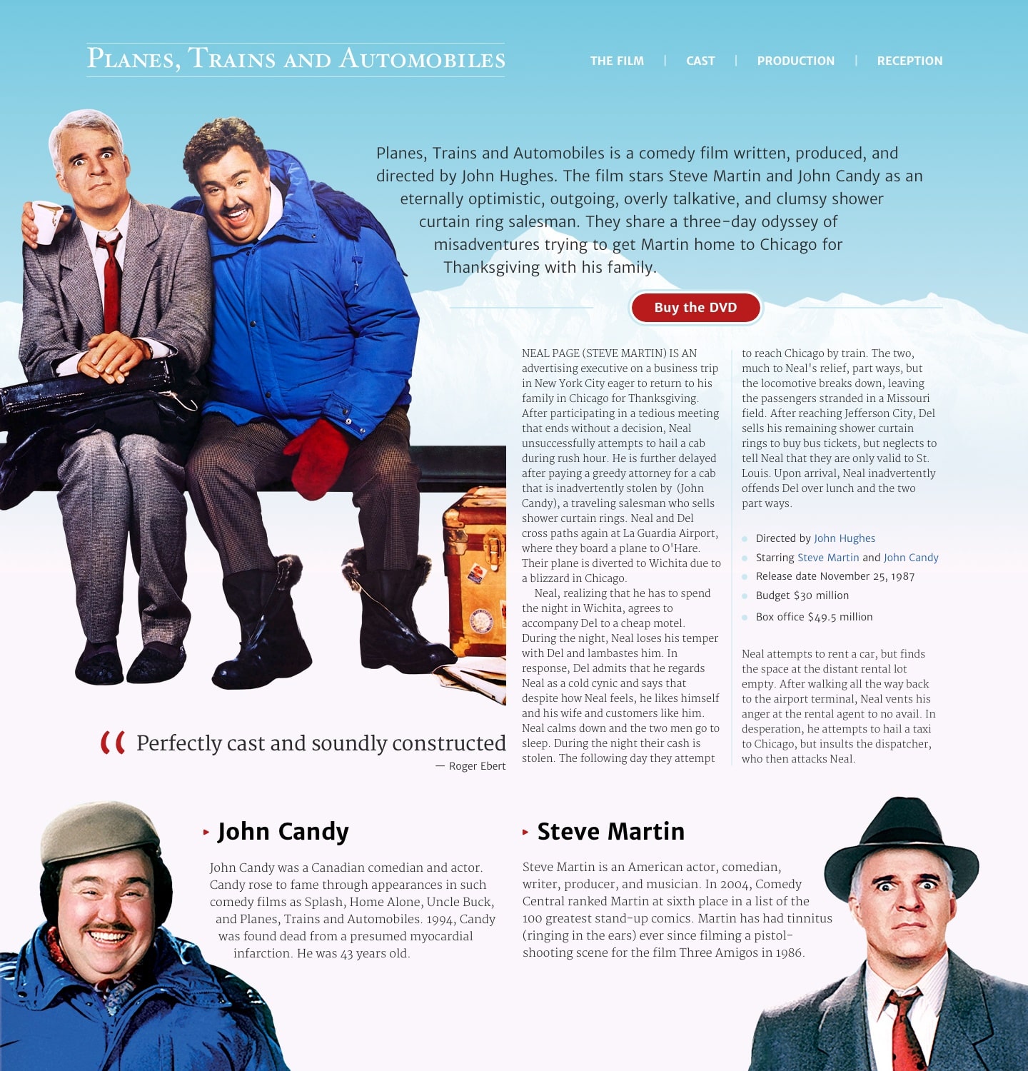
<font face="Arial" size="4"><b>Steve Martin</b></font>

<font face="Arial" size="2">An American actor, comedian, writer, producer, and musician.</font>
Today, I have access to countless fonts, many of them free:
<link href="https://fonts.googleapis.com/css?family=Merriweather+Sans:300,700|Merriweather:300,700" rel="stylesheet">I can also utilise many font’s OpenType features in CSS to control cap styles, ligatures, and numerals:
font-variant-caps: titling-caps;
font-variant-ligatures: common-ligatures;
font-variant-numeric: oldstyle-nums;
Although control over typography isn’t perfect yet, the difference between what I could typeset in 1998 and what’s possible now is enormous.
Styling backgrounds
For a long time, adding colour gradients to a design involved making narrow images and repeating them horizontally across the background of an elements. After years of waiting for the specification to stabilise, today applying either linear or radial gradients using only CSS is easy. Whereas layering background images used to require extra, nested elements, I now frequently make use of multiple background images on a single element:
html {
background-color: var(--color-background);
background: url(img/body-bg.png), linear-gradient(rgb(115,200,224) 0%, rgb(254,247,251) 50%, rgb(254,247,251) 100%);
background-position: 0 240px, 0 0;
background-repeat: no-repeat, repeat-x; }
CSS layout
Thanks largely to people like Rachel Andrew, not only are tables no longer used for layout, but neither are the floats which replaced them. Grid has simplified the implementation of even the most complex compound grid down to just a few lines of CSS:
body {
display: grid;
grid-template-columns: 3fr 1fr 2fr 2fr 1fr 3fr;
grid-column-gap: var(--grid-gap); }
Flexbox has made it easy to develop flexible components:
header {
display: flex; }

header > h1,
header > nav {
flex: 1; }
I now use Flexbox for countless elements, often combining it with Generated Content to add detail to my designs without additional, presentational markup:
.cta {
display: flex;
align-items: center;
justify-content: center; }

.cta:before,
.cta:after {
content: "";
display: block;
height: 1px;
flex: 1;
border-top: var(--border-width) solid var(--color-border); }
In 1998, the way I implemented colourful list-style markers was a now hilarious combination of table cells, a circular graphic, and a spacer:
<table border="0" cellpadding="0" cellspacing="0">
<tr>
<td width="10"><img src="li.gif" border="0" width="8" height="8"></td>
<td><img src="spacer.gif" width="10" height="1"></td>
<td>Directed by John Hughes</td>
</tr>
</table>
Today, I regularly use Generated Content to add details to my designs without needing to resort to such presentational HTML hacks:
main li:before {
content: '\25CF';
margin-right: var(--spacing-small);
color: var(--color-border); }
CSS Shapes
For a long time I was frustrated not be able to flow text around irregular shapes including polygons. Then, in 2013, Sara Soueidan wrote an article about CSS Shapes which really excited me, and since then they’ve become a major part of my editorial style:
@media screen and (min-width : 64em) {
[src*="main-img"] {
float: left;
shape-outside: polygon(…);
shape-margin: 40px; }
}
Shapes are one of those beautiful properties which have no real impact on browsers which haven’t yet supported them as because they require an element to be floated, older browsers merely ignore the shape without affecting the layout of a page.
Sara’s also been a strong advocate for and educator on SVG over the past few years and today, I implement almost graphic element using scalable vector graphics:
<header>
<h1 title="Planes, Trains and Automobiles">
<svg xmlns="http://www.w3.org/2000/svg"
viewBox="0 0 587 48">[…]</svg>
</h1>
</header>
Multi-column layout
Although it’s implementation in browsers isn’t yet perfect—even after over ten years of me using it—I still use Multi-column layout regularly to create columns in my running text:
aside {
column-width: 16em;
column-gap: var(--grid-gap);
column-rule: var(--border-width) solid var(--color-border); }
Multi-column layout is just one more example of how I now use CSS for a reason it was designed, to remove presentation information from HTML and keeping that markup accessible, fast, and flexible.
Now, I think it’s apparent that I’m an HTML and CSS enthusiast. For twenty years, using them has been an opportunity for me to learn techniques and tools. Understanding how to use HTML and CSS—for bad and good—has made me a better designer, but as I wrote in my article for this year’s 24ways:
It’s dangerous to believe with absolute certainty that the frameworks and tools we increasingly rely on today—tools like Bootstrap, Bower, and Brunch, Grunt, Gulp, Node, Require, React, and Sass—will be any more relevant in the future than font elements, frames, layout tables, and spacer images are today.
The biggest lesson I’ve learned over the past two decades is that techniques and tools come and go with increasing regularity, but the importance of learning how to develop meaningful markup and use CSS appropriately will be as important twenty years from now as it today.
Happy Christmas everyone.