Designing For A Beautiful Web
When I set out to design the site to launch For A Beautiful Web I knew that I wanted to set a new tone and arrive at something a little unexpected. One of the ways that (I hope) I have achieved that level of unexpectedness was to turn to a classically trained artist, rather than a web designer for creative direction.
Back in the mid-eighties I studied printmaking at art school and while I've not picked up ink and rollers for far too many years, I've kept a huge passion for all types of printmaking.
Putting my feet up on my desk while researching printmaking on Flickr late last year, I came across the amazing work of Ophelia Chong, an artist who lives and works in California. I immediately fell in love with her letterpress printing over found objects and antique prints and I knew from later speaking to her that she would be a great person for me to collaborate with.
Ophelia is not a web designer and I wanted to see how different the site could be if she drove the design process. So I worked first on layout and structure, then sat back and handed her the creative reigns.
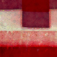
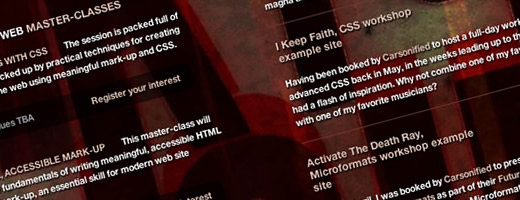
While Ophelia got her hands inky in her studio, I set about turning my layout designs in XHTML and CSS prototypes. When we were both finished I took several of her hand-printed images and applied them as background images to my pages. I honestly didn't know what I was going to see, so the results were certainly unexpected.
After a few days of experimenting with different artwork, we decided on one direction and Ophelia went back into her studio to hand-print the logotype and headings in wood and letterpress. I then tried really hard to ensure that the web design elements that I was adding didn't visually dominate her artwork. In-fact I wanted to make my work as invisible as I could.
A sense of not knowing
One of the fascinating aspects of collaborating with Ophelia was a sense of not knowing what direction the design might take. Of course I knew what I wanted to achieve from the site in terms of content structure and layout, but I really enjoyed separating these from the aesthetic aspects of the design and letting Ophelia's artwork drive the direction.
I suppose that this process was a little contrary to how most designers would approach a project. After experimenting with handing creative control to an artist rather than a web designer, I know that I'm going to do it again as the result is very different from my usual style. That's what I wanted; unexpected. I hope you like it. Over the next few months I aim to experiment more with how different printmaking techniques can change the character of the site without changing its content or structure.
Thanks
My thanks also go to my good friend and colleague Owen Gregory for his wonderfully detailed work inside Expression Engine. Ian Lloyd for writing a unique script for this site's background dimming toolbar and to Glenda Sims for the accessibility thumbs up. More thanks go to Cole Henley, Dave Shea, Dan Rubin, Kevin Tamura, Jeffrey Zeldman and too many more to name, who helped me test the site before today. I appreciate your sometimes direct, but always helpful criticism.
So say hello
to For A Beautiful Web. I'm as excited as a very excited person who has a special reason to be excited.
