Designing New Internationalist magazine pages
Today I want to share and invite your feedback on my work on the New Internationalist magazine pages.
Again, a few rules of the road
-
What you are looking at is (developed) work-in-progress, not a finished piece. I am very open to constructive criticism about ways to improve what I'm doing, in-fact I really want to hear it, whether you're a reader of New Internationalist or not.
-
Are you a reader of New Internationalist? Do you work there or are you a member of the co-op? Are you a web geek interested in the redesign process? It would really help me a lot if I knew a little about you when you comment.
-
So far my process has focussed on content architecture, layout and problem solving. What you're looking at is not my completed visual design proposal for New Internationalist, although it does contain some elements that are part of my thinking, particularly in relation to typography, content readability and minimalism.
-
The prototype layouts that you will see contain active hyperlinks to other layouts that I'm working on. Some of these are more developed, others less so. I'll give you an opportunity to comment on everything as this process continues, but for now I'd like to keep the conversation focussed and hear your thoughts on the home page.
-
These layouts have not been tested (yet) in Internet Explorer 7/8. If you use that browser, things could be a little stinky. To view these layouts, you'll need a browser like Firefox 3 or Safari.
-
Nothing that I give you access to as part of this open design process can be reused, repurposed or otherwise recycled.
(Before we start, if you have been following the design of the home page, you might be interested in taking a look at my most recent iteration that takes into account the comments that readers raised.)
Designing New Internationalist magazine pages
If you haven't visited New Internationalist before, take a look at its current issue page.
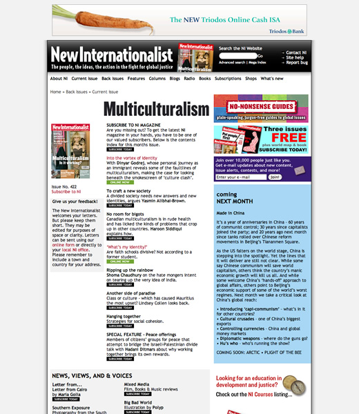
The New Internationalist current issue page
Back?
Parts of my job are:
- Make magazine content easier to find and browse
- Design the content for better readability
- Encourage the sale of books relevant to the content
I am also introducing one other important factor of my own into the brief, that of time and context. More about that later.
One thing you may have noticed is that I have removed Current Issue, Back Issues, Features and Columns from the main navigation. By eliminating these redundant links, the main navigation can now focus on New Internationalist's most important properties. One single, simple Magazine link takes a reader to the newly designed magazine issue page for the current issue.
The new magazine issue page design aims to convey the same, or more content, inside a layout that is easier to understand. With its selection of entry titles and summaries, sections and lists, it should allow ample flexibility for the editors to present an issue's content in several different ways. This layout also provides easy access to all of the sections and pages that I removed from the main navigation.
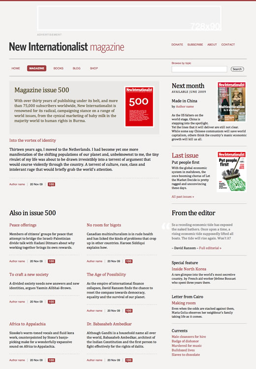
Magazine issue page layout (top) (View in your browser)
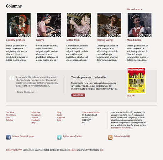
I have also introduced issue pagination, so that a reader can page through issues in order on all but the current issue. Where the layout contains the current issue, the top-right area of the page highlights what is coming in the next (as yet unpublished) issue and invites the reader to subscribe. I have also made the columns more visual and introduced a scrolling panel.
Magazine issue page layout (bottom) (View in your browser)
Archives
Two pages make up the current live site's magazine archives; the last twelve issues and the full list of back issues, organized by year. I don't feel that either are as effective as they could be.
My redesign combines both these pages into a single layout that contains a tabbed interface that can hold an entire decade of issues.
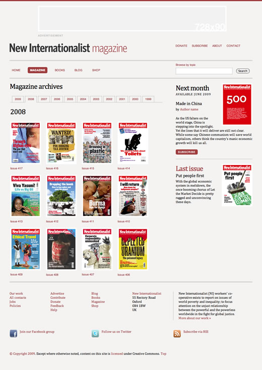
Magazine archives (View in your browser)
Magazine articles, context and time
Look around the web, at sites like BBC News, The Nation or Huffington Post (all sites I read everyday) and you'll find they all share something in common. No matter how new or old, important or trivial an article might be, it is always squeezed into the same article template. I think that New Internationalist can improve on that.
This division of magazine articles into two different layouts aims to:
- Emphasize current articles
- Provide a more relaxed reading experience
- Create a clear hierarchy between the old and the new
I believe that understanding the context in which an article is written is vital to fully understanding its content. For example, an article about MP's expense abuses might have mattered less in a boom than it would now, in a downturn. Both these new layouts aim to put an article into the context of the magazine in which it was published, alongside links to other articles from the same column, published at different points in time.
In my redesign, articles from the current issue of the magazine will be presented in a layout that is a dramatic departure from the norm. My new layout presents content in a narrow column that has been optimized for readability. I have also removed the sidebar and along with it any distractions away from reading the content.
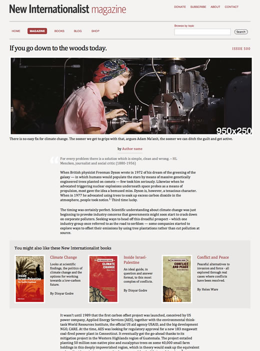
Current magazine articles (View in your browser)
Older articles, from past issues, will be presented in a more conventional two-column layout complete with a sidebar for advertising, navigation and other content.
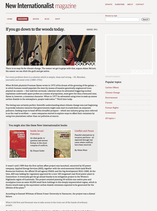
Older magazine articles (View in your browser)
And there's more
While this selection of related layouts are less discussion worthy, I'd also like you to see:
- Current, live New Internationalist magazine page
- Redesigned magazine issue
- Redesigned archives
- Redesigned current article page
- Redesigned older articles page
Feel free to comment on how you think I can improve. I will really value your contributions. (gulp)